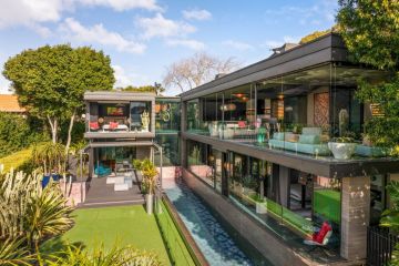
The Block 2021: 5 glamorous kitchen trends from this season
The kitchen has arguably never worked harder than now. It’s more than simply a spot to cook and dine; it’s a stylish workspace and a place in which to connect and find comfort.
Investing in any element of the space can prove invaluable, not only for daily life, functionality and good looks, but for adding value to your home.
Renovating your kitchen? The couples on The Block delivered plenty of ideas for Kitchen Week. Pull inspiration from the key trends for this hard-working space.
Beautiful benchtops
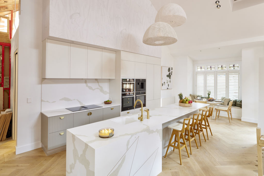
Sumptuous benchtops were under the spotlight, thanks to Josh and Luke’s sexy timber top, Mark and Mitch’s Caesarstone with gold detailing, and Tanya and Vito’s imported terrazzo.
“What’s not to love about these materials?” asks designer Liz Hall from Studio Apercu. “Each brings its flavour and, using visual and tactile textures, creates interest and a sense of authenticity.”
Designing a kitchen is an opportunity to create a personal space that suits your lifestyle. Hall says it’s crucial to consider the benchtop material’s durability, maintenance requirements, sustainability and design compatibility.
“A perfect marble benchtop in a magazine is easy to fall in love with,” she says. “But if you’re too busy multitasking to wipe up pasta sauce spills, then that beautiful benchtop will have permanent stains! If you desire the sophistication of stone, engineered stone provides that look in an easily maintained material.”
Butler’s pantry
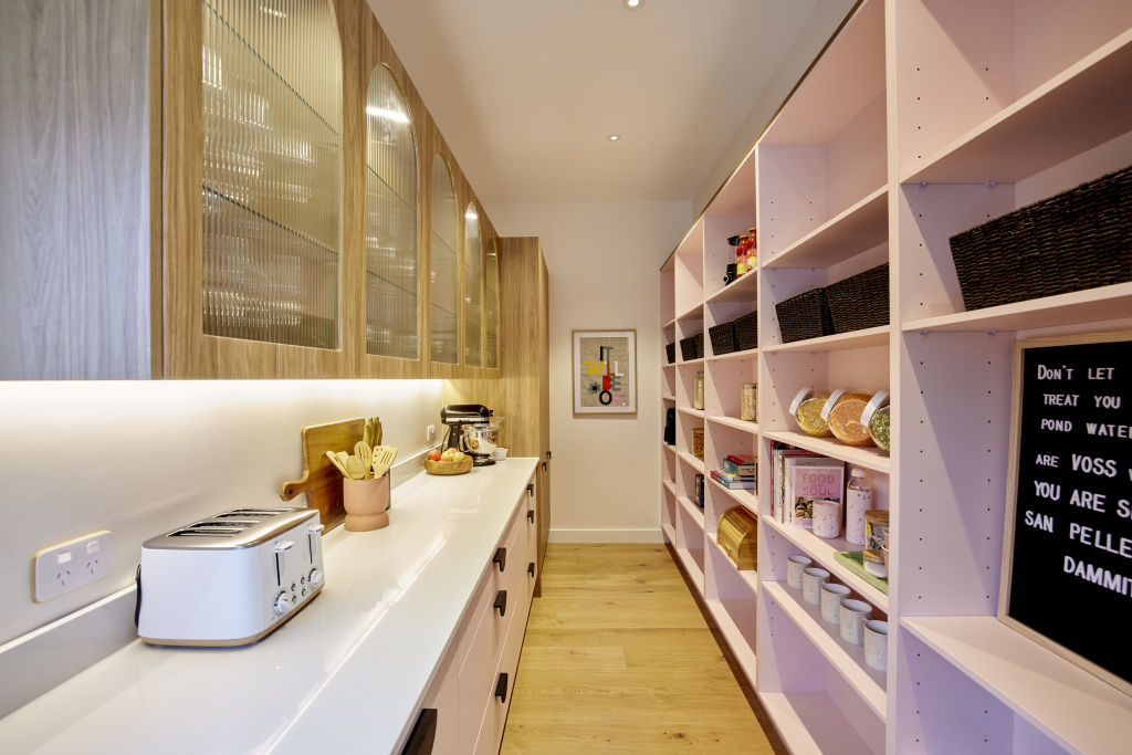
While Mark and Mitch’s deep-drawer “modern pantry” lost points with the judges, the functional and glamourous butler’s pantry proved a winner. Kirsty and Jesse’s gingham-wallpapered space enchanted the judges, and Neale said Tanya and Vito’s pink pantry “filled him with joy.”
“As an extension of the kitchen, it’s important to create harmonious connection between them with considered material selections,” says designer Angie Rogers from Interior Tailor Company. “Embrace bolder design and luxurious tactile elements, like benchtops and hardware, for a space that makes you smile.”
A mini kitchen within the central kitchen’s footprint, a well-planned butler’s pantry should embrace storage and space for food preparation and conceal clutter when entertaining.
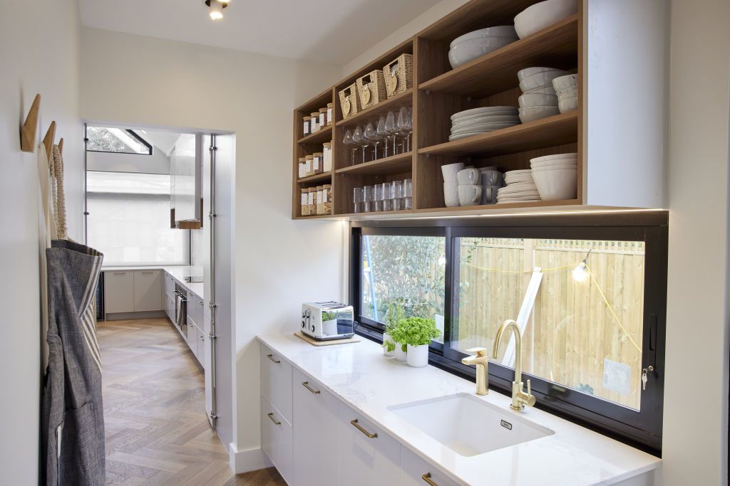
“There should be ample bench space for appliances, fridge, second oven and dishwasher, as well as open shelving,” Rogers says.
While Shaynna felt Ronnie and Georgia’s lacked “wow-factor”, she was impressed with their Marie Kondo-inspired organisation.
“I love open front drawers that you can pull out and see contents clearly,” Rogers says. “Clear Perspex boxes are ideal for storing similar categories, and matching clear containers for things like pasta and flour. They’re fun to label too.”
Statement pendants
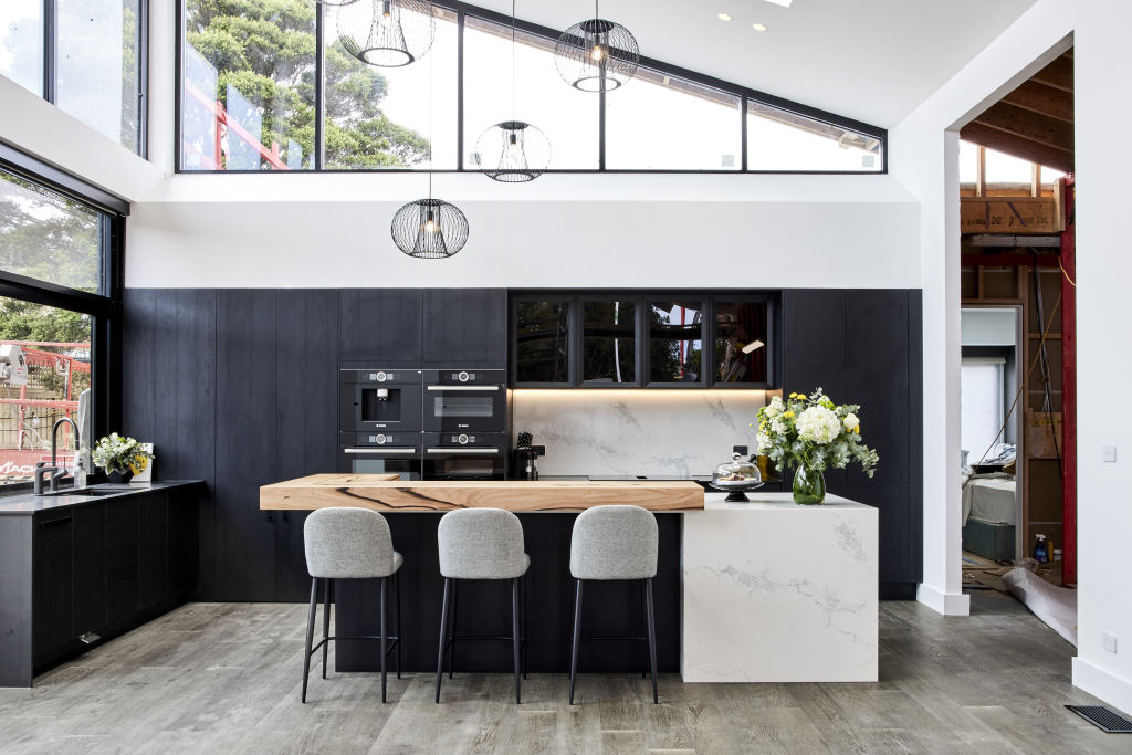
The look-at-me light fixtures which wowed the judges prompted Neale to proclaim it “pendant week”.
Beautiful lights serve as mood lighting, brighten a workhorse kitchen or create a feeling of spaciousness. From modern masterpieces to sculptural head-turners, it’s a trend to relish. Interior stylist Bea Lambos agrees and says size, scale and beauty are all considerations.
“Bigger isn’t always better,” she says. “Determine if it will be a sympathetic addition. If your kitchen is heavy with lines or curves, choose a pendant that’s the opposite; for example, add a linear light to a kitchen with shape, and vice versa.”
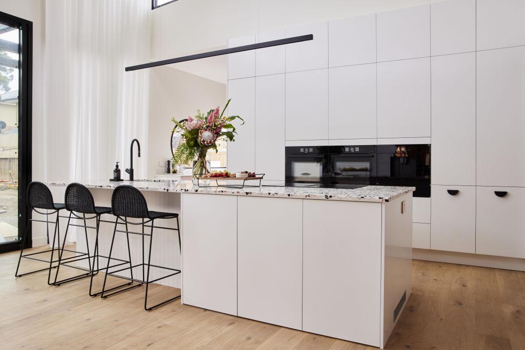
Purpose and beauty go hand-in-hand. For Shaynna, Josh and Luke’s pendants over the central island provided good looks but poor functionality.
“Task lighting is important, so if it’s beneath a pendant, light quality needs to be part of the equation,” Lambos says. “We feel good basking in a warm glow. Think of your favourite restaurants and the light they use, and replicate at home. Consider dimming abilities for ambience too.”
The breakfast nook
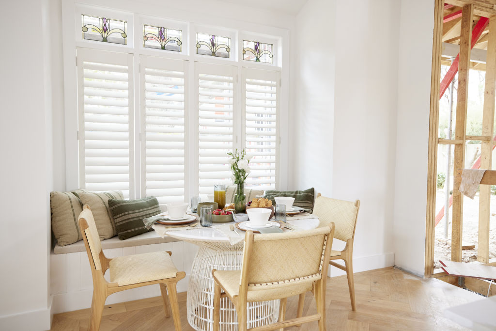
Mark and Mitch’s light-filled breakfast nook struck a chord with the judges for its “modern traditional” styling and clever built-in seating.
“A freestanding table can be moved to make getting in and out easier,” says Hall. “Freestanding chairs add a degree of formality and built-ins a more relaxed vibe. Together they provide flexibility.”
A more relaxed alternative to the formal dining space, a breakfast nook can make a small space purposeful.
“It can have a multitude of configurations,” agrees Hall. “If it isn’t comfortable, though, it won’t be used. It’s important to match the type of nook to the available space and its purpose.”
Coloured cabinetry
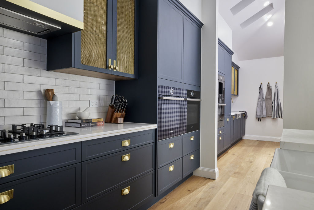
“I’ll never say no to colour in the kitchen!” Lambos says. “Cabinetry is no longer just for storage and practicality. It’s considered a piece of furniture and can bring energy to a space.”
Kirsty and Jesse’s navy cabinetry with brass hardware stunned the judges with its beauty, and Tanya and Vito’s soft pink made their built-ins stand out.
“When choosing colour, go with what makes your heart skip a beat,” Lambos says. “Don’t go with trends. It can be an expensive mistake when colour is wrong.
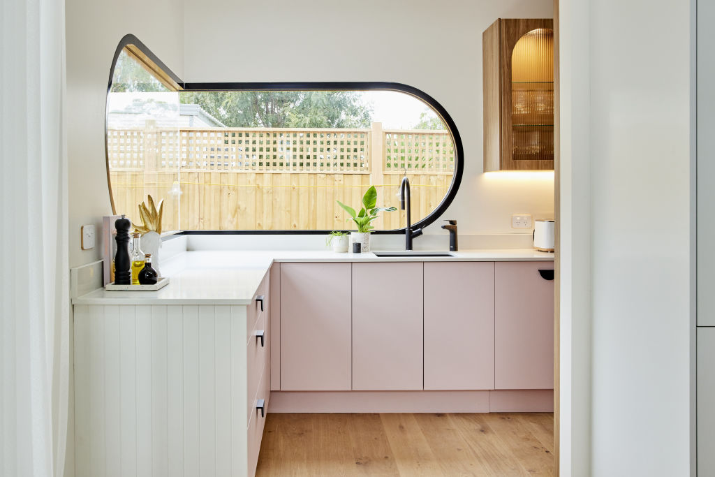
If you want a feature to stand out, add colour. If you don’t like your cabinetry, then think less vibrancy and a more tonal choice.”
When selecting hardware, “touch and feel” is the ultimate measure.
“Anything that feels good in your hands will be perfect for opening cabinetry,” Lambos says. “Leather is a favourite and anything made from glass or crystal. Adding that unexpected sparkle and light is a beautiful, unexpected feature.”
We recommend
We thought you might like
States
Capital Cities
Capital Cities - Rentals
Popular Areas
Allhomes
More

