The Block 2021: Here are the spaces each team is fixing for their re-do rooms after the judges' feedback

We’ve hit the halfway mark on The Block and despite having so much left to do in their homes, the teams have got a chance to fix some mistakes this week. Yep, it’s time for redo rooms.
So far, the teams have delivered bedrooms and bathrooms, although some of the spaces have copped plenty of criticism and negative comments from the judges.
Thankfully Scott Cam has given them a chance to fix some mistakes. They’ve even got a bit of extra cash thanks to hipages to get their redo rooms sorted.
Here’s a closer look at what room each team has chosen to tackle this week, and a look back at what the judges had to say about it the first time around.
Ronnie and Georgia — walk-in wardrobe
Judges’ score: 23.5 / 30
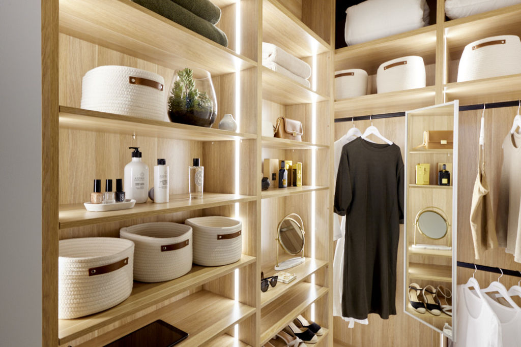
In House 1, Ronnie and Georgia are going to fix their walk-in wardrobe, which easily cost them the win in Master Bedroom Week.
The couple delivered an incredibly beautiful bedroom with soaring ceilings, considered details and an impeccable colour palette, but it was the size of the walk-in wardrobe that let them down.
“Hmm. This is teeny-tiny. I’m fairly shocked. There’s a little bit of hanging there, double hang here, some long hang… This is probably not even enough for one person,” Shaynna said of the space.


-
The Block 2021 listings are now live. See them here.
For Darren, the layout of the space was wrong and they didn’t allocate enough of the room to the walk-in wardrobe.
“That divine bedroom, to have a miniscule walk-in wardrobe like this, to me this is planning gone wrong,” Shaynna said.
“This master bedroom has honestly got to be one of the most beautiful master bedrooms I’ve seen in 11 years of judging The Block. I wish I could stand here and say the walk-in-robe is done the same,” Neale said.
Mitch and Mark — week 1 guest bedroom
Judges’ score: 22.5 / 30
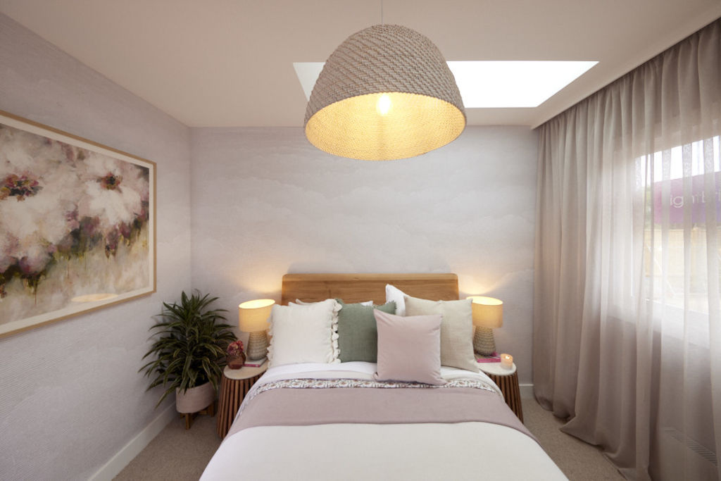
The stylish granddads made their big return to The Block with a soft, romantic styled room, which was something new for them. Although, the judges were less than impressed with the room and went to town with their feedback.
“I actually feel quite claustrophobic in here. It feels very, very small — oppressively small, actually,” Neale said as he looked around the room.
The room just didn’t have the Mitch and Mark pizzazz and sparkle the judges were expecting and it really showed in their comments and scoring.
“It’s just not the detail that I would have expected from Mitch and Mark,” Darren said of the space.
“I’m finding this a little bland — very pared back, but not necessarily in a good way.”
Tanya and Vito — master en suite
Judges’ score: 22.5 / 30
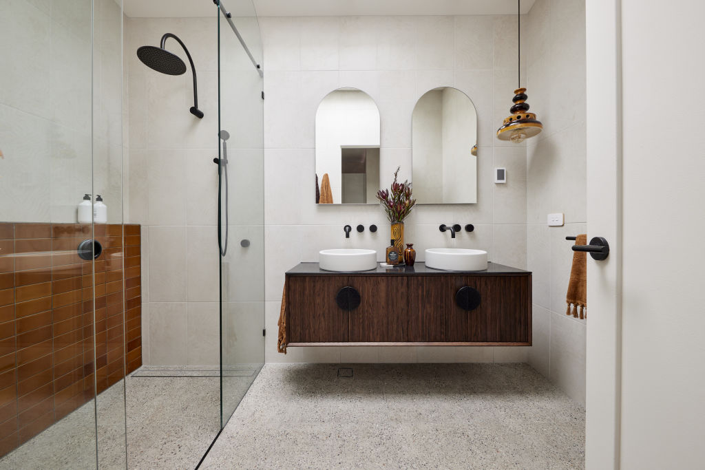
It was the most recent room the couple delivered, but the one that needed the biggest fix, their master en suite.
Tanya and Vito opted for a “new world-meets-old world” styling approach, including a vintage pendant light and matching vases. But it was the brown tile that proved to be more than just a polarising design choice.
“I love the character in here and the courage to make the choices to use that ceramicware, to use that lamp, to use that brown tile, which should truly be hideous… that I don’t hate,” Darren said.
“The problem I have with that tile though is that it’s highly likely a buyer will hate it.”
Neale echoed the same concern, he felt the couple had created a ’70s motel vibe in the space, but then changed his mind.
“I said ’70s motel just now but I think I was being kind. It reminds me more of an old-fashioned public toilet. People are gonna want to rip it out. I think, guys, stop the brown!” he said.
While Shaynna did like some of the features in the room, she was concerned that House 3 was getting a bit too eclectic, causing the market for a potential buyer is shrinking fast.
Josh and Luke — main bathroom
Judges’ score: 20.5 / 30
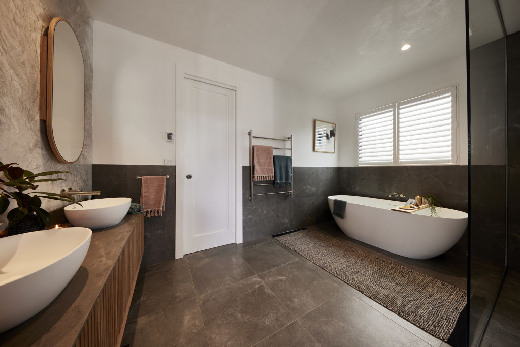
For their main bathroom, the twins went with a Jack-and-Jill-style bathroom which could only be accessed from two guest bedrooms.
As they walked in the judges were all wowed by the size they had allocated for the bathroom, but it wasn’t long before a few weird design choices started to emerge.
Josh and Luke went with Venetian plaster above the tiles on the walls and extended it onto the ceiling, a choice which Darren declared as “weird”.
“Having this shiny ceiling? It doesn’t really add anything,” Shaynna said. “So wasting money on all that — and that would not have been easy, because it’s absolutely beautifully done.”
She went on to blast their styling as “atrocious”, especially the chunk of cheese and chocolates on the bath caddy.
“It just feels, to me, incredibly dated. This bathroom, to me, I mean you say ‘masculine’, I say ‘cold’,” Neale said. “I feel like I never want to see this grey, grey, grey palette again in a bathroom.”
Neale continued to critique the room: “I just feel that walking in here there’s not a single thing that I haven’t seen many, many, many times before.”
Kirsty and Jesse — week 1 guest bedroom
Judges’ score: 23 / 30
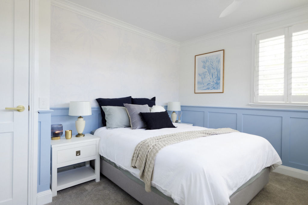
For their first official room on The Block, Kirsty and Jesse continued the Hamptons design they started in their challenge room, but it wasn’t quite a win with the judges.
Shaynna felt like the couple did well with the space, which will definitely appeal to a wide range of buyers thanks to the Hamptons style, but it just wasn’t the right blue on the wainscotting on the wall.
Despite nailing the design, the colour they used on the walls wasn’t quite right, and the judges weren’t happy with the end look.
One of the biggest drawbacks of the room was the windows facing the bed, which Neale wasn’t impressed with.
“I’ve almost got this overwhelming urge to take this window and pull it down… How beautiful would that have been,” he said.
The judges were left wanting more, with one side of the room feeling unfinished, due to the lack of impact on the wall with the shutters.
This article was originally published by Nine.com.au. Reproduced with permission.
We recommend


We thought you might like


States
Capital Cities
Capital Cities - Rentals
Popular Areas
Allhomes
More
