The Block 2021: The rooms we didn't see revealed on TV
We saw a lot of rooms revealed during the 12 weeks of The Block, but there were a few we didn’t get to see on TV.
While working on the rooms up for delivery each week, Kirsty and Jesse also completed another bedroom, bathroom, rumpus room, stairs and second storey hallway.
Mitch and Mark added a fourth bedroom, which was only talked about on the show.
And Josh and Luke took on judges Shaynna Blaze, Darren Palmer and Neale Whitaker’s advice by making changes to their living and dining rooms, fourth bedroom and wine cellar/home cinema.
-
The Block 2021 listings are live. See them here.
Mitch and Mark
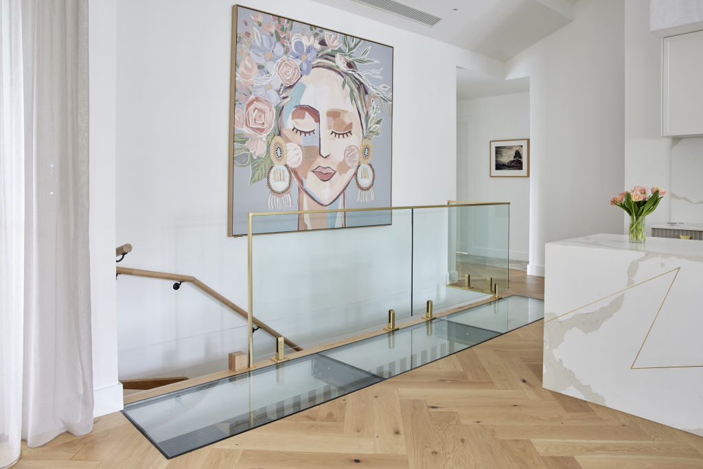
Mitch and Mark added a glass floor — or catwalk if you prefer — above the stairs to their basement. This lets light flow through to downstairs and provides an architectural feature to the room.
Mitch and Mark’s fourth bedroom continues the pared back aesthetic they’ve featured throughout the entire house. The couple have used neutral tones to provide a room that will suit any taste and can easily be transformed into a different style.
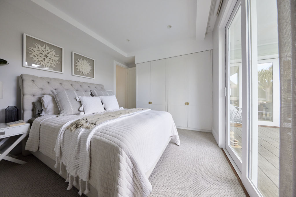
The lucky guest who uses this room will feel like they’re in a resort, with glass doors providing a view to the pool and tropical backyard right from the bed.
Mitch and Mark were praised for the bed styling in their other guest bedroom, and they’ve nailed it here too.
Josh and Luke
Shaynna, Darren and Neale were shocked when they walked through the entrance to Josh and Luke’s home to find half a wall gone and the rest unpainted.
Now the entrance is picture perfect, offering a great view to the newly positioned living room and stylish kitchen.
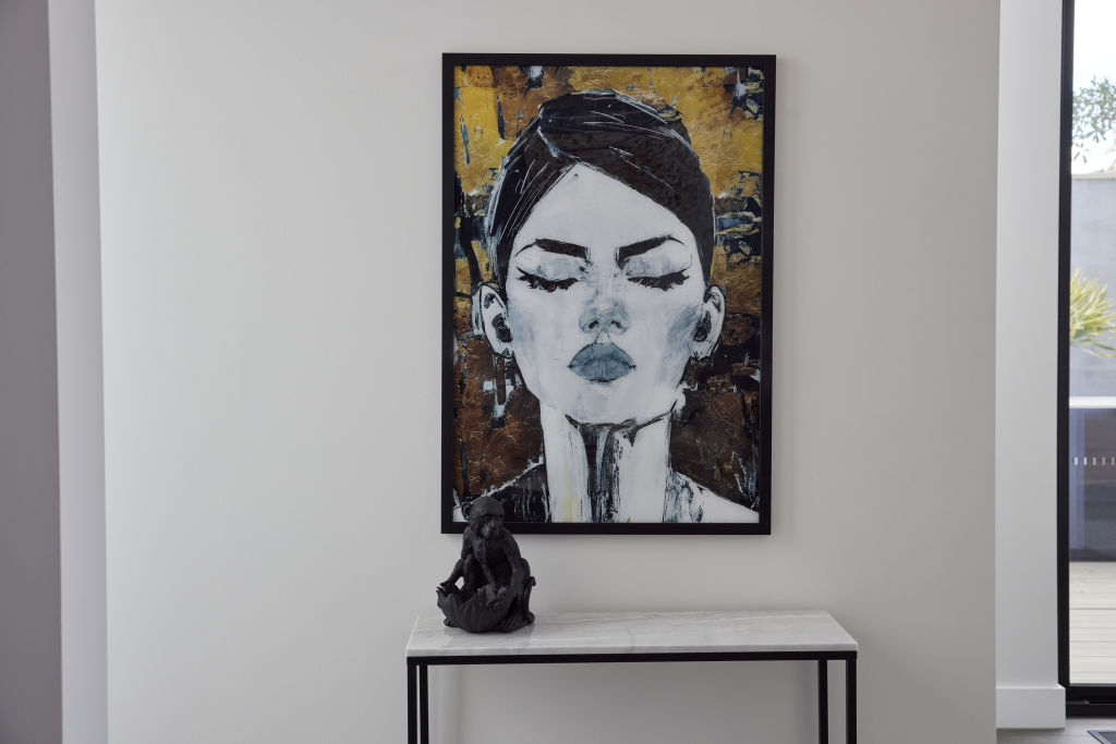
The other side of Josh and Luke’s entryway has a handy table for keys and mail, along with a quirky figurine and artwork.
Josh and Luke originally had their dining room next to the kitchen, with the living room tucked away off to the side.
The judges were adamant the spaces didn’t work in those positions and needed to be flipped. This is what they look like now after those changes.
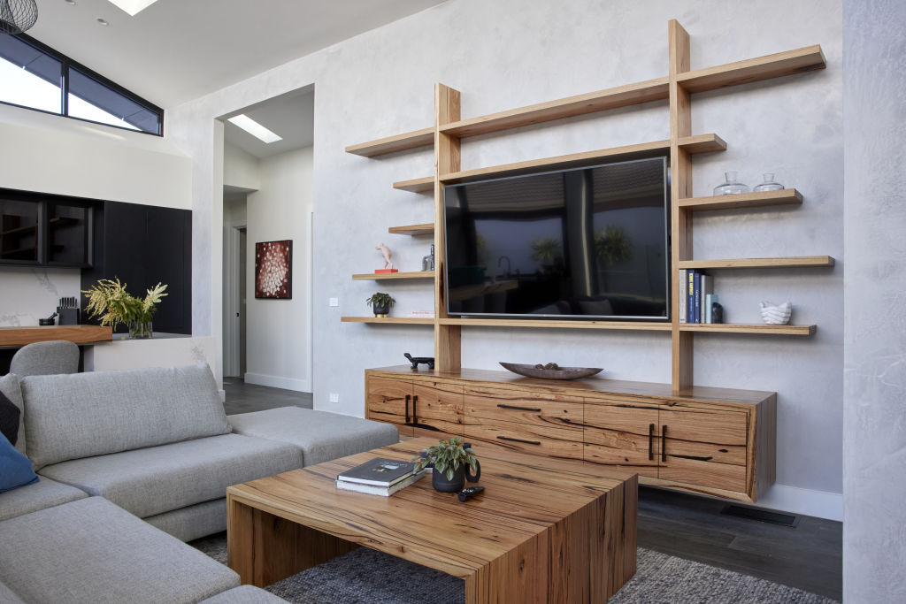
The living room features a stunning entertainment unit made by Christian Cole, who also designed the twins’ dining table and kitchen benchtop.
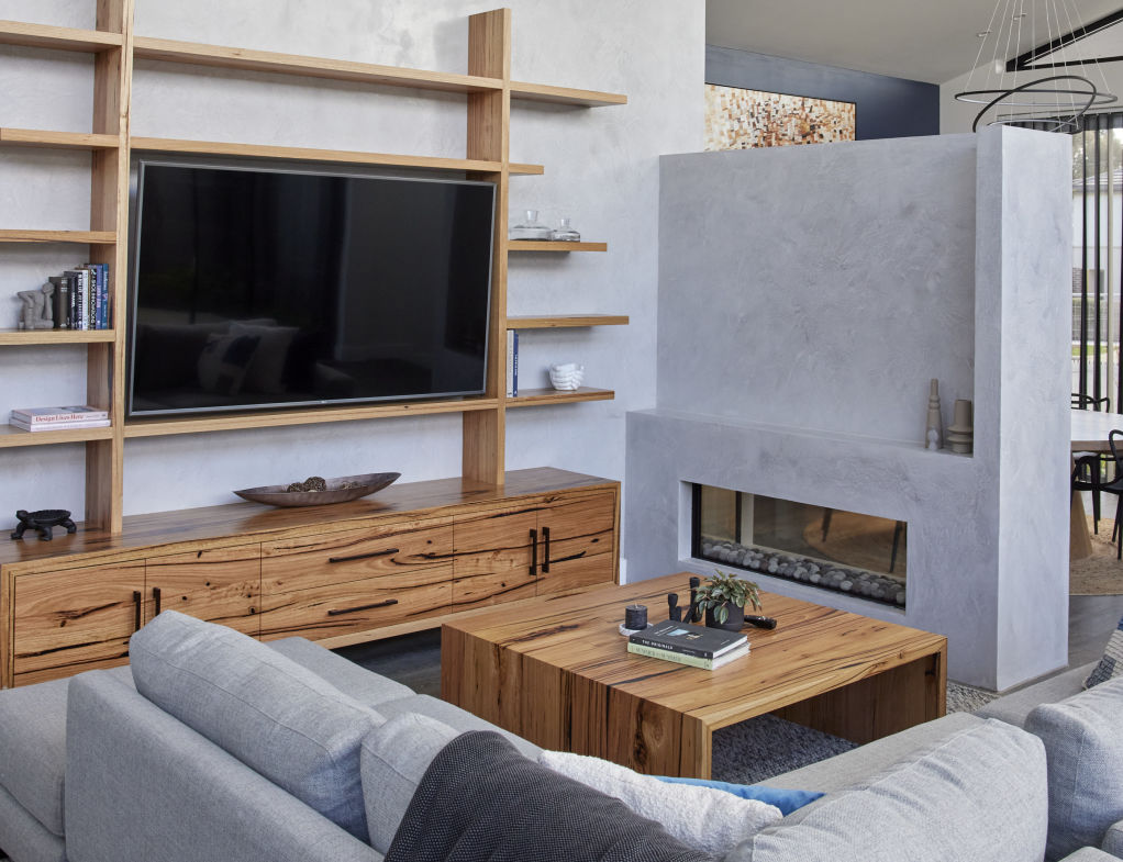
Fans of The Block will also recall the struggle Josh and Luke’s plasterer had to get the wall above the fireplace to have the same shade of Venetian plaster as the main wall. Well, this is how it looks after some tweaking to make it lighter.
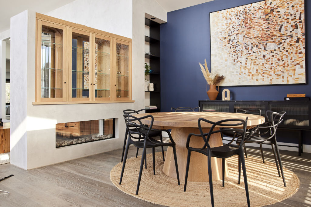
On the other side of the fireplace wall is the dining room. The size of the dining table fits much better in this space, while the stunning artwork pops against the blue wall.
Shaynna, Darren and Neale couldn’t believe it when they walked into Josh and Luke’s fourth bedroom to find it was styled as a study and had an en suite so tiny it couldn’t fit a shower door.
The twins realised, with some help from Georgia, that they had to get rid of the en suite to make a bigger bedroom, and of course add a bed.
The bed is tucked behind a wall, which helps soften the light coming from the skylight if you’re having a sleep in.
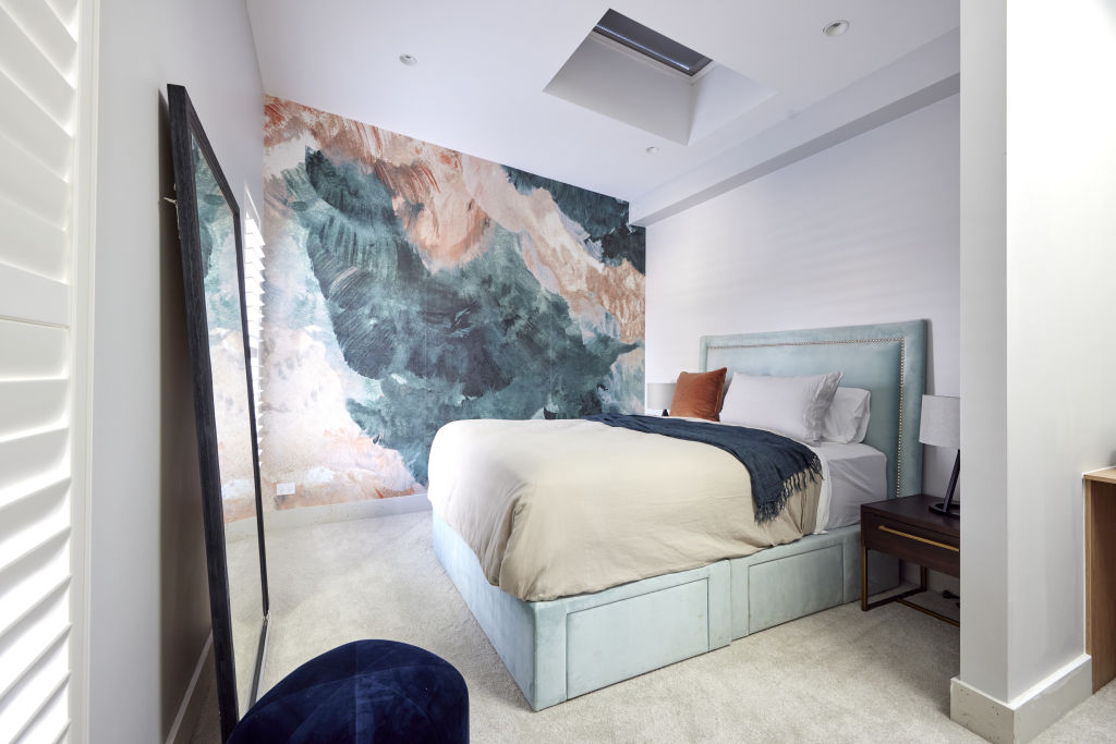
The bed features velvet textures and bold tones reflecting the colours in the artwork on the adjacent wall.
After getting rid of the en suite from the fourth bedroom, Josh and Luke took inspiration from architect Julian Brenchley‘s original floor plans and added another bathroom behind the garage.
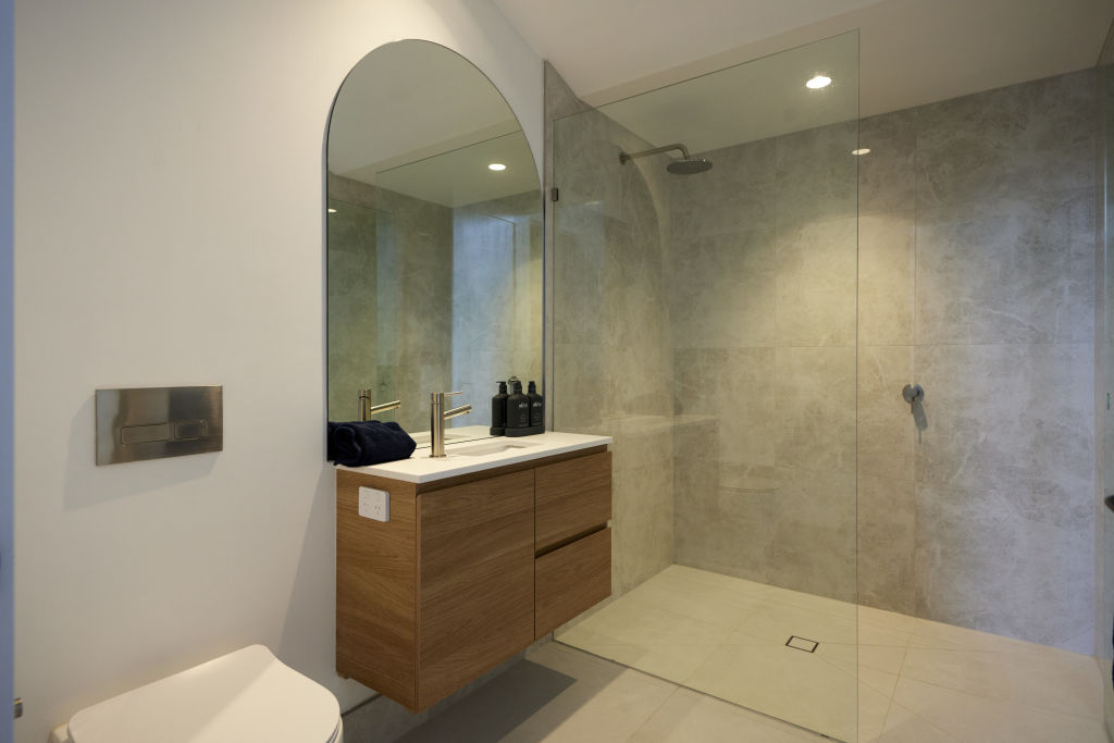
They’ve gone for a warmer grey than their main bathroom, another space that was slammed by the judges for having a “cold” vibe.
The twins’ wine cellar and home cinema got some of the worst feedback all season. Neale described the space as “useless”, while Shaynna felt like she was in a “festering pit of negativity”.
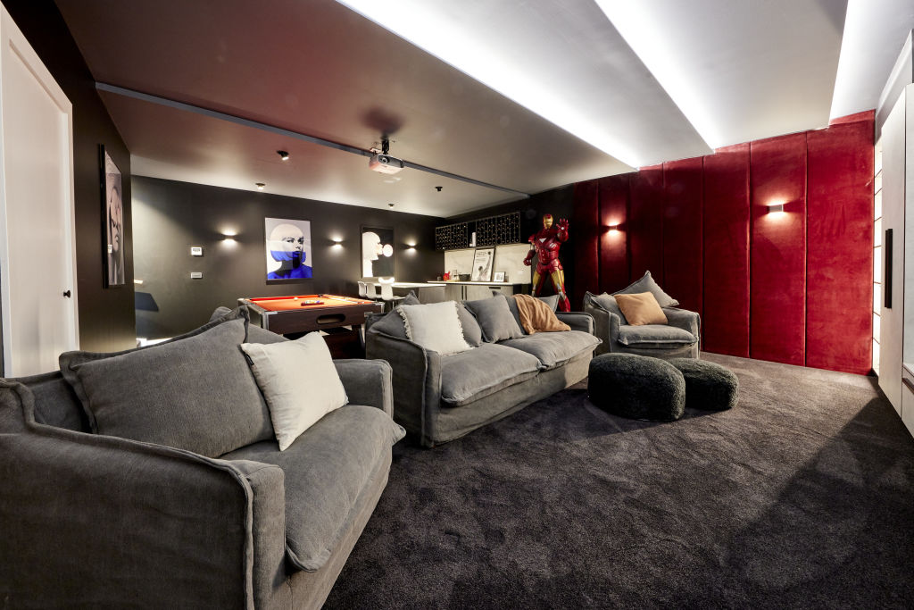
Since that feedback Josh and Luke have added a pool table, and swapped out their commercial-looking chairs for cosy looking sofa and armchairs.
But they’ve kept Iron Man right where they left him.
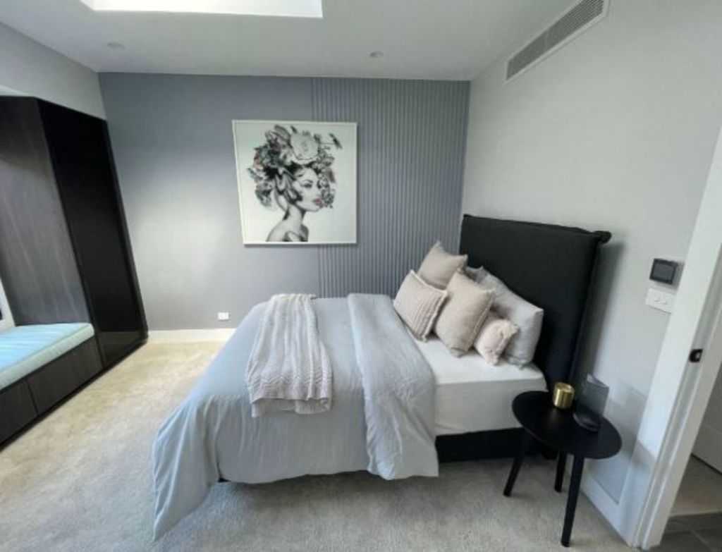
Josh and Luke’s second guest bedroom was another of their panned rooms. So the boys have reworked the space, changing textures and colours to tie in better with the rest of the house. They’ve also moved the bed to face the window.
Kirsty and Jesse
Kirsty and Jesse had the largest and only two-storey property on The Block, which meant they completed more rooms than were shown to the judges.
First up is their staircase which leads to their second floor.
Short on money by the end of The Block, Kirsty and Jesse gave the staircase a simple look with white paint, oak handle and steps, with minimal artwork and a chandelier.
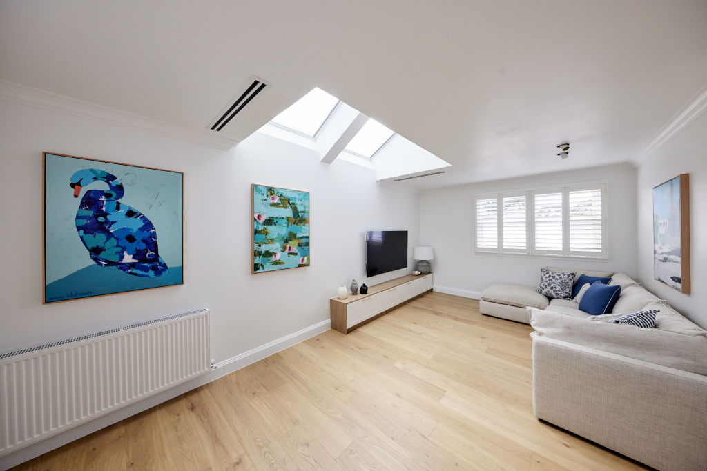
This is Kirsty and Jesse’s rumpus room. They’ve opted for minimal styling to finish the space and show buyers how it can be used.
The couch, styled with cushions to give pops of the home’s signature blue style, looks like a comfy place to hang out.
Kirsty and Jesse’s hallway was the centre of controversy after the couple won Hallway, Laundry and Powder Room Week without finishing it. But the couple were only asked to deliver their downstairs hallway, along with a laundry and full bathroom, so everything was actually above board.
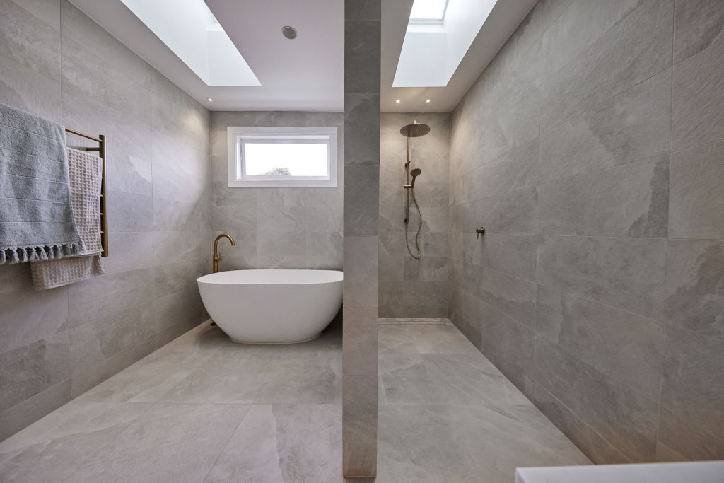
Kirsty and Jesse’s bathroom is a very simple design that provides everything a buyer will need in the space. The new owners can put their own stamp on it with additional styling once they move in.
The vanity features a cute beige basin, gold handles and lots of storage.
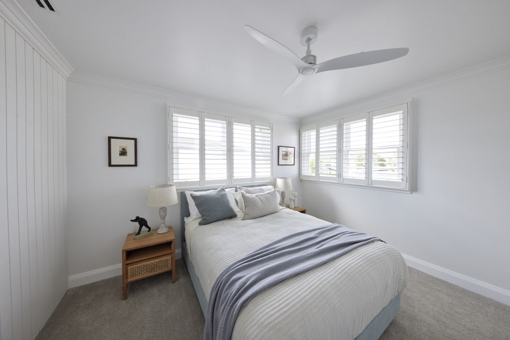
For their fourth bedroom, Kirsty and Jesse carried through the blue and white Hamptons palette from the rest of the home.
This article was originally published by Nine.com.au. Reproduced with permission.
We recommend
We thought you might like
States
Capital Cities
Capital Cities - Rentals
Popular Areas
Allhomes
More
