The Block 2022: 5 bathroom trends to come from this week's room reveals
Good bathrooms function, but beautiful ones perform and for the bathroom obsessed and teams on The Block, there is no more important room.
“Bathrooms hover between being a sanctuary and a workhorse,” agrees designer Martine Cooper. “Creating one that looks and feels good and operates well is key. It’s also one of the most profitable rooms to renovate, so it’s an important room to consider.”
While Bathroom Week is always challenging, the teams had the added pressure of creating contemporary bathrooms in classic country homes. The result is five very unique spaces. We asked industry experts for their take on the key trends that have driven them.
- The Block 2022 listings are now live, and updated weekly. See them here.
Modern Country Style
One of the most challenging aspects of renovating an old home is finding the right balance between classic and contemporary.
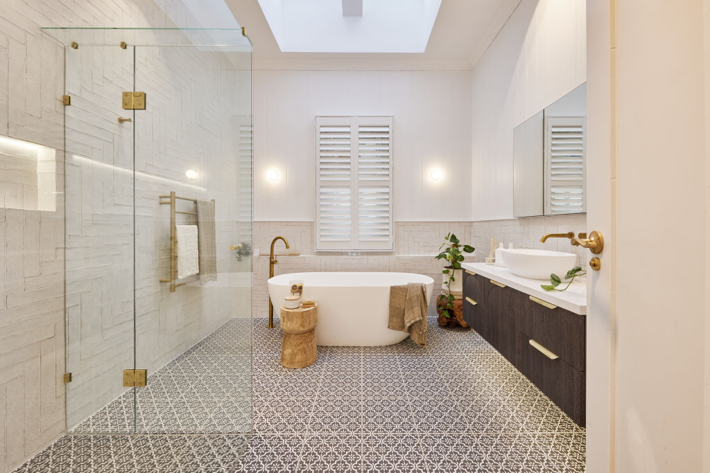
Winners Omar and Oz orchestrated a perfectly balanced space that speaks to modern-day living and country style, while Ankur and Sharon’s bathroom, complete with shiny brass fittings and a mix of heritage detailing, was deemed “not respectful to the home’s heritage” by judge Shaynna Blaze.
“There are no hard rules about mixing eras,” says designer Liz Hall from Studio Apercu. “It’s more important to speak to the home’s heritage and retain and restore original elements that speak to its history.”
Rachel and Ryan’s raw timber vanity got the nod, proving you can pair natural elements like wood and stone for a contemporary yet country-style result.
“Combining crisp elements with warm, textural country touches like a warm timber vanity is a perfect way to combine styles,” she says.
Statement Tub
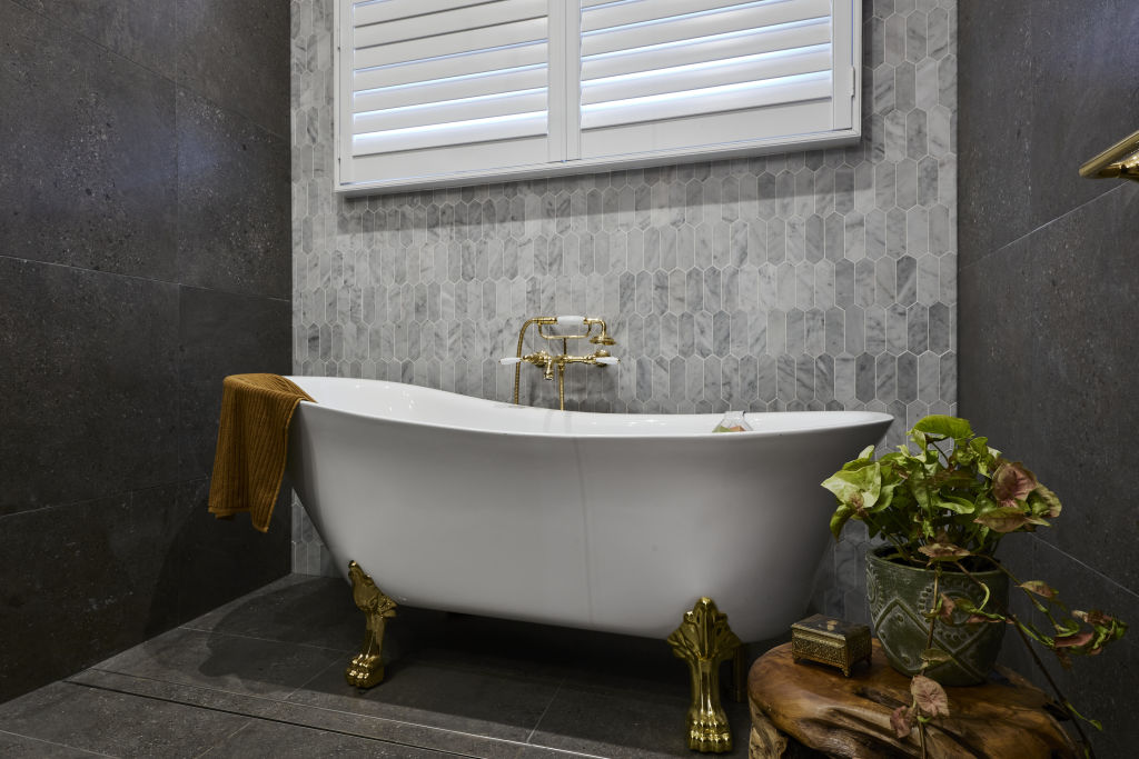
Classic clawfoot baths dominated this week, with Omar and Oz declaring the timeless style a “masterpiece”.
“A tub with flare instantly elevates any bathroom,” agrees Cooper. “It’s classic in a period home and works nicely in a contemporary addition. It’s a large impactful fixture, so consider it carefully within the space’s design.”
Along with this classic style, circular and corner baths also imbue elegance. “Choose your tub based on your space’s aesthetic,” suggests Hall. “A clawfoot tub suits a traditional bathroom, an egg-shaped composite stone fits a contemporary space, and a wooden soaking tub looks great in a Japanese-inspired bathroom.”
Luxurious materials like cast iron, copper, marble and porcelain are durable and keep bathwater piping hot. “They’re expensive, so if you’re on a tight budget, consider acrylic or fibreglass options,” she suggests.
Curves
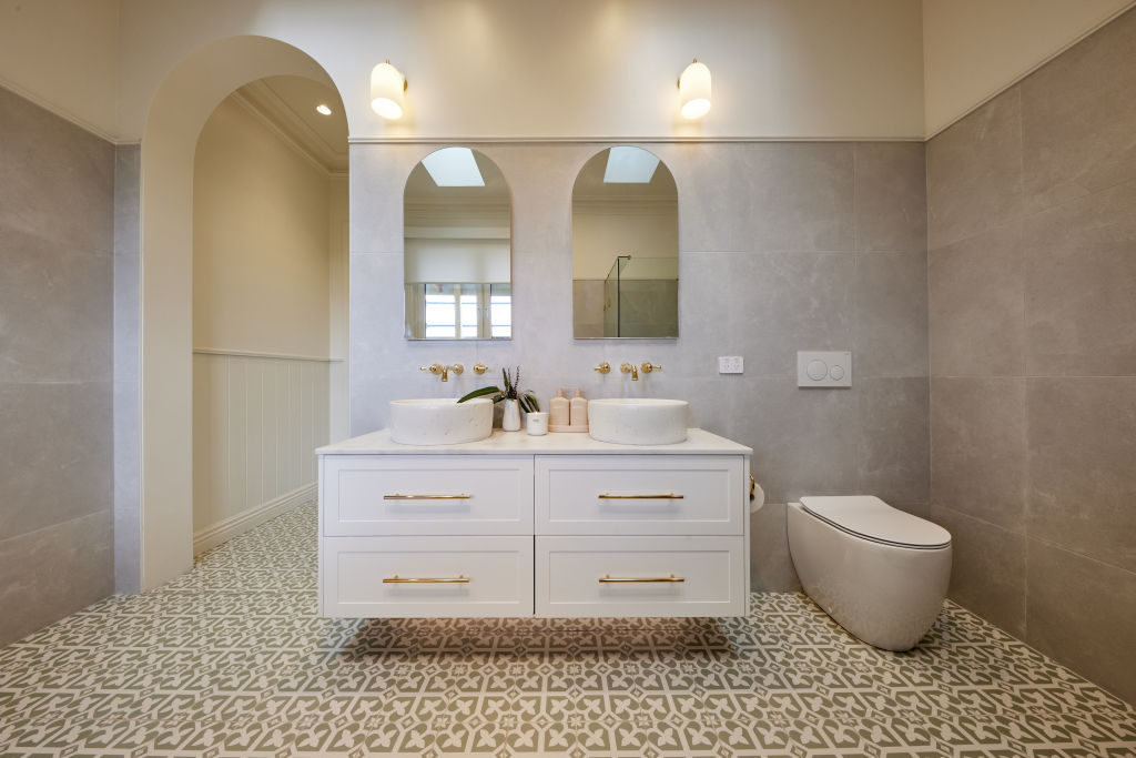
Studies show we are drawn to curvaceous elements evocative of nature.
“They feel cocooning, nurturing and calm,” agrees designer Angie Rogers. “In the bathroom, they add quiet luxury and offset the harder linear materials used in this space.”
Jenny and Dylan were ahead of the curve with their unique take on a classic country bathroom. Their repetitive curved features in the form of arched mirrors and door frames impressed the judges, with Darren Palmer intrigued by the “sense of rhythm” created.
“Add a curved bath or vanity, curvy tapware and lights, or install a curved shower wall, doorway or tiles,” Rogers suggests. “When it comes to curved surfaces, avoid glossy and choose something soft and matt that provides a luxurious finish.”
Tile Mash-Up
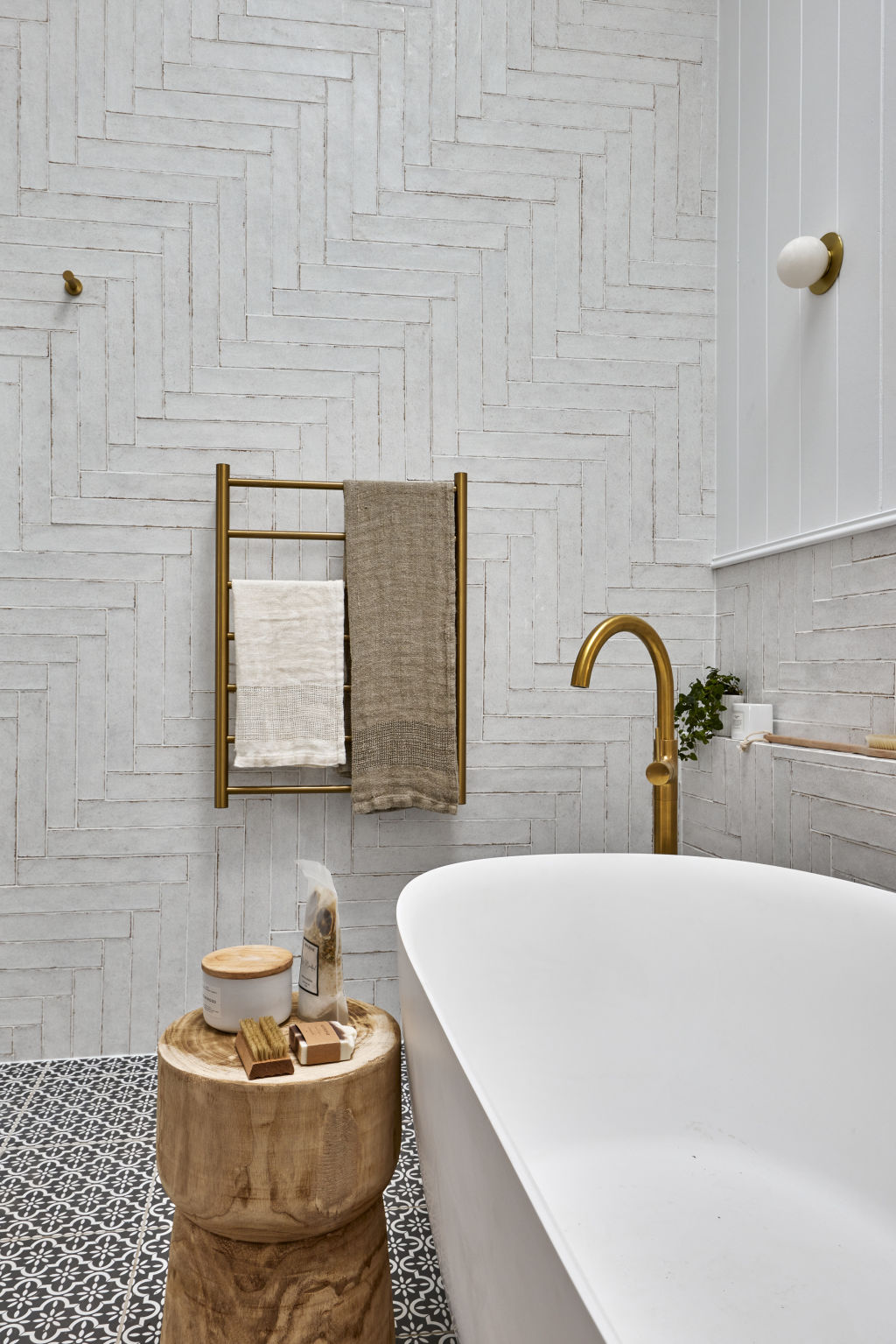
When it comes to tile combinations – more is more. The couples had fun dialling up the drama this week with unexpected tile mash-ups. “It’s an impactful look,” says Rogers. “It’s also cost-effective for creating an amazing space.”
Large-scale patterned tiles act like artwork, while lighter solid versions take a space from bleak to chic and make small spaces feel capacious. It was a hard lesson learned by Ankur and Sharon, whose moody palette of marble hexagonal tiles and bluestone was slammed by the judges.
“Colour, scale and proportion are critical,” says Rogers. “A larger format tile and smaller style is a good balance alongside a consistent colour range and maximum of two or three tiles.”
“You beauty!” was judge Neale Whitaker’s reaction when this week’s winning bathroom was revealed. The judges agreed Omar and Oz had achieved the impossible – the combination of patterned floor tiles, 90-degree herringbone tiles and VJ walls.
“The linear elements of the VJs are offset by the differing angles of the herringbone, so they don’t compete,” Rogers says. “For those nervous about mixing and matching, try mixing wall tiles and heavily pattered floor tiles; it’s less overwhelming.”


Statement Lighting
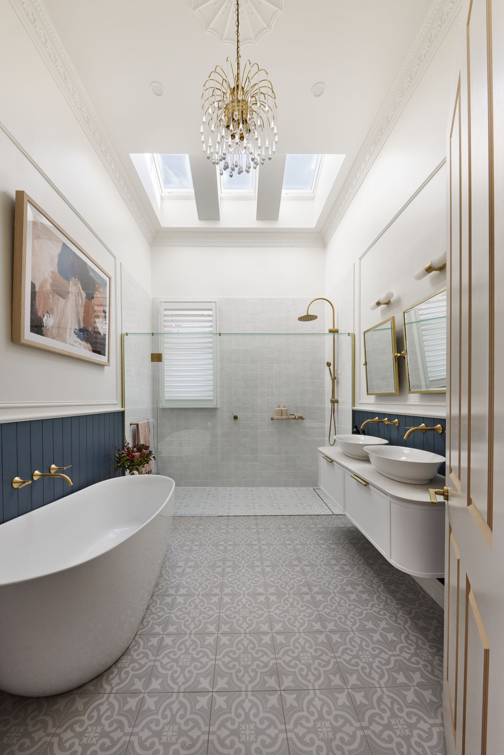
Next to task lighting, essential for daily rituals, statement lighting plays an important role. From elegant chandeliers and ambience-making dimmers to sophisticated wall sconces, the right light elevates a bathroom like no other design element.
This week, they were popular, with Tom and Sarah-Jane’s a standout. The home’s original classic pendant was scrubbed clean by the couple and restored to its original beauty.
“Beautiful lighting should never be underestimated,” says Rogers. “It conveys sophistication. Take a trip to a luxury hotel; they do bathroom lighting impeccably.”
Sharon’s choice of an art deco light and heritage-style ceiling rose lost points with Shaynna for its eclectic pairing, but Rogers disagrees and says it’s a winning combination. “Don’t be afraid of bringing in a contemporary twist for something unexpected,” she says. “Just ensure it’s crafted from restrained materials, has clean lines and hangs low from the rose, so there is breathing space between the two fixtures.”
We recommend
We thought you might like
States
Capital Cities
Capital Cities - Rentals
Popular Areas
Allhomes
More
