The Block 2022: 5 key trends to take from the kitchen reveals
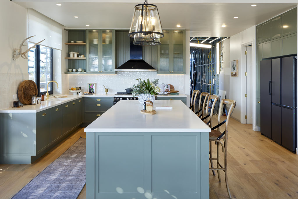
Scott Cam proclaimed that this season’s kitchens were “the biggest kitchens we’ve ever seen” on The Block. The scale of the rooms certainly provided the perfect palette for extravagant appliances, expansive entertaining areas and dramatic styling.
Although Tom and Sarah-Jane took out another win, scores were high across the board with contestants delivering kitchens that balanced warm, rustic elements with clean, modern lines.
We spoke to design experts who shared some key trends emerging from the kitchen reveals.
-
The Block 2022 listings are now live, and updated weekly. See them here.
Statement appliances
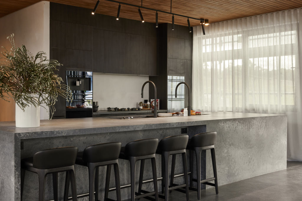
This season, kitchen appliances took centre stage with a ‘bolder is better’ approach.
The judges loved the focal point created by Tom and Sarah-Jane’s impressive oven and feature rangehood, and admired the purpose-built storage for charcuterie and cheese.
As Neale Whitaker pointed out, Omar and Oz had a wealth of “kitchen bling” to work with after winning the appliance package. With spectacular features like the galley sinks in the main kitchen and butler’s pantry, they still managed to produce a tastefully subtle design.
According to interior designer Mairav Whitten, “The draw of statement appliances is their wow factor, especially when they’re on view in an open floor plan. Nowadays, restaurant-grade appliances can be incorporated in the average kitchen without sacrificing style and warmth.”
“Including statement pieces gives you the opportunity to create a proper ‘cook’s’ workspace,” adds designer Emma Stergoulis. “As long as you’re mindful of the kitchen’s scale and don’t sacrifice any valuable storage or prepping areas, you can create an inviting kitchen with the capacity to host large feasts.”
Kitchenware on show
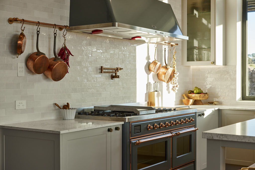
The contestants put kitchenware on display with show-off shelving and spiffy styling. Pots and pans, rows of glassware and stacks of crockery were in clear view on hanging racks, shelves and in nooks set into island benches.
It’s a trend that makes perfect sense for a country kitchen, according to Whitten. “Country style isn’t supposed to be pristine and clutter free – quite the opposite in fact. It’s often characterised by a bit of a charming disarray.”
Whitten loves the idea of putting second-hand or vintage kitchenware like wooden bowls, stoneware, rolling pins and wooden spoons on display, and observes that “The patina and character of such items can’t be obtained from modern, mass-produced equivalents.”
As Stergoulis points out, “Country-style kitchens are often working kitchens based on a ‘farm to plate’ ideology, and having things on display is part of this story. If you have special cooking items, it’s lovely to show them off. As a bonus, if you use them regularly, you won’t be rummaging at the back of the cupboard for them.”
Mixed metals
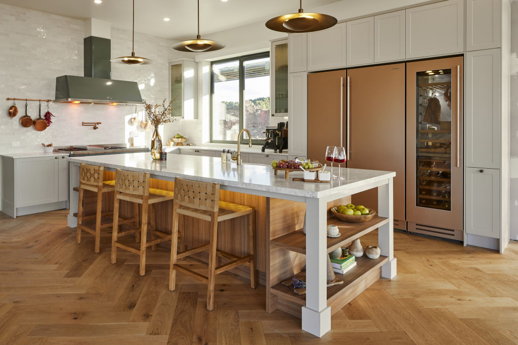
“If you were playing by the rules, this shouldn’t work but somehow it does,” Darren said, in reference to Tom and Sarah-Jane’s combination of brass, copper, rose gold and steel. He explained that the look came together because they tied the hue of each metal to another colour in the kitchen.
“When using a statement metal like rose gold or polished brass, mixing it with a duller metal such as brushed chrome or brushed nickel helps to add balance,” Stergoulis says.
She advises sticking to a couple of metals and ensuring they are complementary with others around the kitchen, like window frames, for example.
“Studying the undertone can help determine which metals’ finishes go together,” Whitten says. “In general, brass, copper, gold and nickel have warm undertones, while stainless steel, chrome and other silver metals give off a cooler look.”
Combining textures
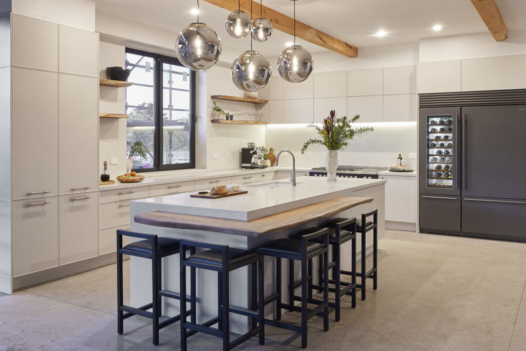
Judges praised contestants for creating a feeling of country warmth with accents like subway tiling, rustic timber floors, intricate ceiling beams, elaborate cornices and decorative cabinet finishes. Plush rugs, billowy curtains and the occasional, well-placed artwork added to the rich textural effect.
“This approach is all about giving a kitchen depth,” Whitten says. “Clean lines and hard surfaces are replaced by layers of tactile materials. A blend of natural and industrial textures can create rustic charm but with a modern twist.”
“It’s easy to end up with a modern streamlined kitchen which lacks character,” Stergoulis adds. “You can add interest with things like a timber finish on the cabinetry, a stone benchtop or textural tile splashbacks. Adding a profile to the cabinets provides depth, as do statement handles and tapware.”
Luxury butler’s kitchens
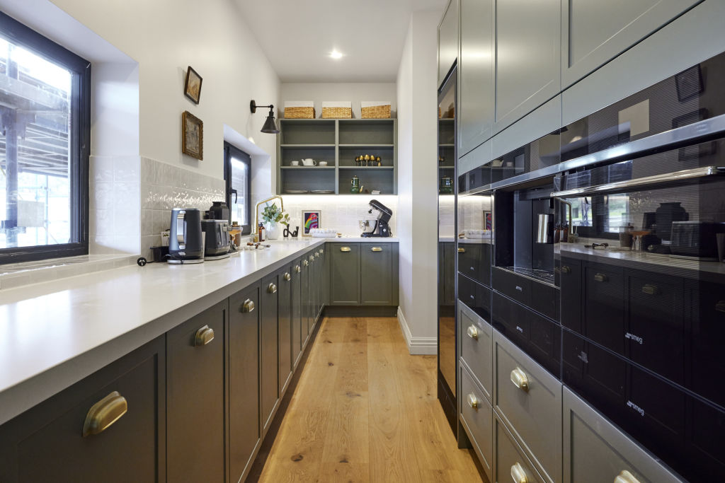
This season’s generously sized floor plans allowed contestants to go all out with butler’s kitchens that were the ultimate in scale, luxury and glamour.
“While it may seem like an indulgence, the truth is that it’s one of the most useful features you can have in a kitchen,” Whitten says.
“While most of us are unlikely to have a butler in residence, a butler’s pantry is an ideal space for prepping, dumping dirty dishes, and keeping the cooking chaos separated from your dinner party guests.”
Stergoulis cautions that the cost may come close to that of a primary kitchen, as well as taking away valuable functional space.
“A compromise for the space and budget-challenged renovator would be to configure your laundry with direct access to the kitchen and have it double as a butler’s pantry on the occasions you want to hide mess from guests. Or you could simply add a smaller walk-in pantry with some bench space to hide dirty dishes when you host a dinner party.”

We recommend
States
Capital Cities
Capital Cities - Rentals
Popular Areas
Allhomes
More
