The Block 2022: 5 trends to come from the master bedroom and walk-in wardrobe room reveals
The Block’s Master Bedroom Week has delivered on this season’s brief to showcase luxury country living, with judges praising contestants for rooms that would be sure to “pull on buyers’ heart strings”.
Here’s what industry experts are saying about some of the key trends that shaped the stunning master bedroom and walk-in wardrobe styles.
Colours inspired by nature
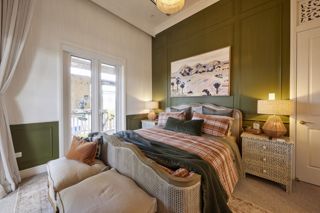
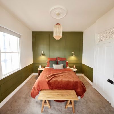
Olive and sage, in particular, have proven ultra-popular with contestants, as have russet, copper and warm brown tones. They’ve been featured everywhere in the master bedrooms from walls and wainscoting to textiles and soft furnishings. Tom and Sarah-Jane’s winning bedroom was a prime example.
“A green colour palette can have a powerfully calming and restorative effect,” says designer Mairav Whitten. “It can soothe our senses and provide the soft backdrop needed to adjust to the constant chaos in our lives.”
As designer Emma Stergoulis points out, “Greens and burnt oranges are complementary and help each other ‘sing’. Tan leathers, tactile burnt orange or russet fabrics and soft furnishings add the perfect amount of warmth to the calming effect of green.”
When it comes to green, it’s better to use a more muted or grey shade, Stergoulis adds. “This mimics the natural palette of the bush or countryside and is also more calming.”
Bedroom feature walls
Ankur and Sharon’s attempt at a bedroom feature wall in the house decider challenge missed the mark with its log cabin vibe and raw wooden planks. Although they questioned the expense, the judges thought the padded velvet feature wall in their master bedroom was much more in keeping with the luxe country theme.
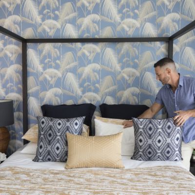
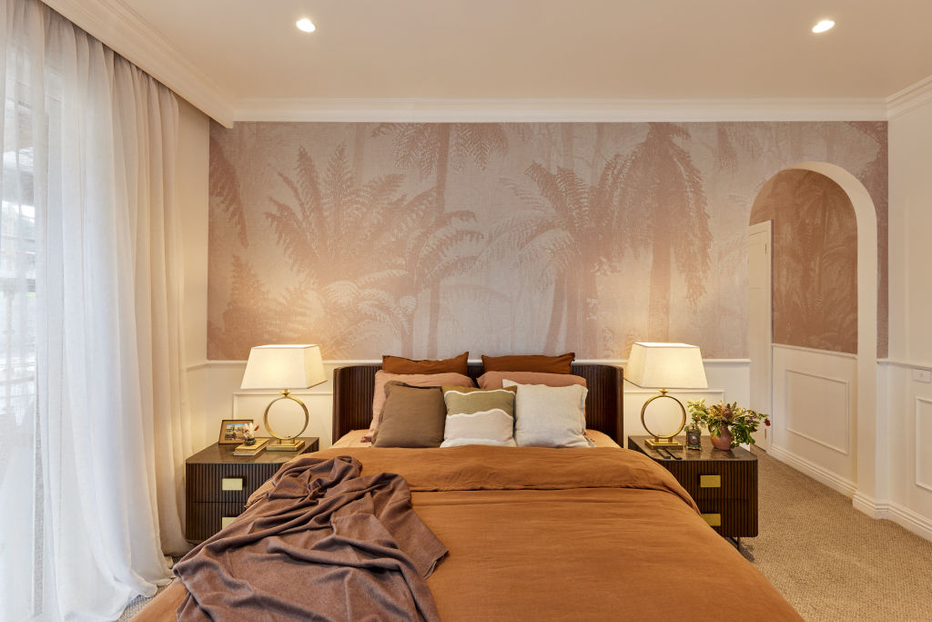
While the judges thought Dylan and Jenny’s room lacked glamour, their creative use of a textured Grafico wallpaper feature behind the bed was definitely a step in the right direction.
“Feature walls are making a comeback,” Whitten says. “They’ve progressed from the use of a single block of colour to more textural surfaces, such as timber, wallpaper, fabric panels and tiles.”
Stergoulis says they “allow you to add interest to the room without overwhelming it and can also be a great way to help focus the eye”.
“For example, vertical panelling can lead your gaze up and give an illusion of height,” she says. “Darker colours can help create a more cosy feel.
“When creating a feature wall, use your surroundings – whether coastal, urban or bush – and the era of your home as your colour and pattern inspiration.”
Stacked stone fireplaces
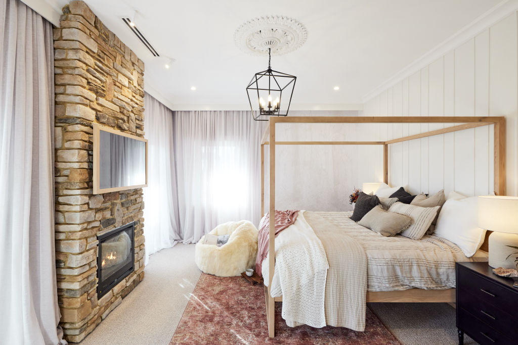
Rachel and Ryan’s stacked stone fireplace was an example of art meeting architecture and was all the more impressive for being successfully completed in half a day. Darren called it a “stunning centrepiece” and even hugged it!
Stergoulis advises that, when using stacked stone for fireplaces, feature walls or accents, it’s best to use local materials. “This makes sourcing easier and shows a link between the property and its surroundings.
“Execution is also key here, so get this work done by someone with experience. Otherwise, it can end up looking like a badly assembled jigsaw puzzle.”
Mixing antiques with modern decor
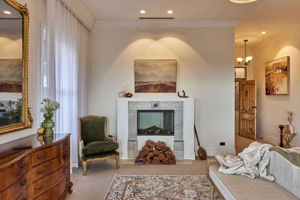
Neale observed that Ankur and Sharon’s use of antiques was “a first” for The Block as the judges walked through the couple’s beautifully repurposed wood and tile door.
A set of mahogany drawers and bedside tables were sourced from an op shop to create a classic French country aesthetic with a contemporary edge – a look Darren described as “eccentric and exciting”.
Whitten believes that antiques can add meaning and says, “A home should be a collection of things you love, not a catalogue of coordinated furniture from a showroom floor.” She believes that to pull the look off successfully, however, “You need to place the pieces carefully so that the juxtaposition between old and new feels fresh and surprising rather than ‘op-shop’ chic.”
Stergoulis agrees that it’s all about getting the balance right. “Too many antiques can make the space look like a museum. Instead, pick a few appropriately sized pieces and use them to inspire the tones, textures and finishes of your contemporary furnishings. Avoid a contrived look by sourcing antiques that relate to the property’s location, or your travels or interests as a homeowner.”
Whitten adds that “repurposing antiques with a new finish or fabric will breathe new life without sacrificing their vintage charm”.
Luxe walk-in wardrobes (The robe-as-a-room)
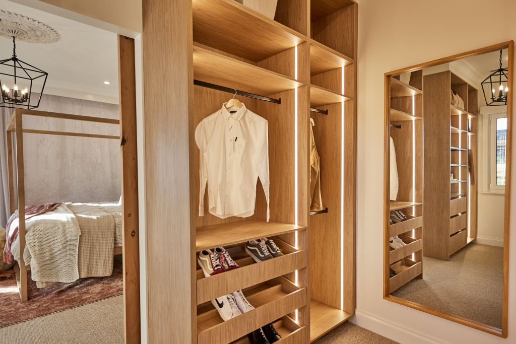
This year continues The Block’s tradition of spectacular walk-in wardrobes, and takes it up a notch. Super-sizing, glam styling, statement lighting and sweeping views – the 2022 robes have it all with fitouts that are every bit as well planned and luxurious as the rest of the house.
The scale of Rachel and Ryan’s robe was particularly impressive, with Neale describing it as a “prime real estate” and something that might even make Carrie Bradshaw envious.
“Walk in robes are a dream addition to any bedroom if you have the space to add them,” Stergoulis says. “For them to work effectively, you really need to consider functional space, minimum storage and ability to move around comfortably and get dressed.”
Whitten agrees that we can still find inspiration here for organising our own robes, even if we have less space than The Block contestants. “It’s the finer details that count,” she says. “Things like open shelving, oversized mirrors, custom joinery and feature lighting all add to the luxe feel of the space.”


We recommend
States
Capital Cities
Capital Cities - Rentals
Popular Areas
Allhomes
More
- © 2025, CoStar Group Inc.
