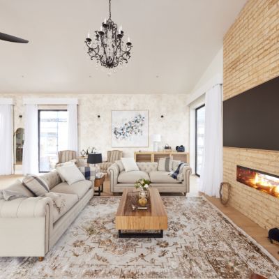
The Block 2022: Here's the room each team is fixing for their redo room

It’s been a whirlwind journey on The Block 2022 so far, with the judges dishing out a number of perfect 10’s, while others have been hit with some constructive criticism.
But with just three weeks to go, Scott Cam has revealed that it’s finally time to undo some of those previous mistakes, and you guessed it – it’s time for redo rooms!
“Some of you have got rooms that the judges feel need to be specced up to maximise your buyers and give you the best chance at auction,” Scotty said at Block HQ.
While the Blockheads continue to struggle with their budgets, they will have to complete another guest bedroom alongside their redo room, with Simonds Homes handing them a generous $5,000 budget for the latter.
Here’s a closer look at which rooms each team will tackle once again this week, and what the judges had to say about it the first time around.
-
The Block 2022 listings are now live, and updated weekly. See them here.
Tom and Sarah-Jane – Living and Dining Room

Tom and Sarah-Jane have delivered a string of rooms which have been highly praised by the judges, but they thought their living and dining room could use a little improvement.
During Room Reveals, Shaynna Blaze said she wasn’t a fan of the couple’s dining table and chairs and felt the couch was too small for such a vast space.
“I feel like there’s this vast space with a couch that’s too small,” she said. “I just feel because of the scale here, something bigger, something grander [would work better].”
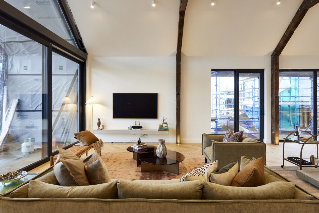
Darren Palmer also spotted a mess of cables on display, saying they were a “huge eyesore”.
The space didn’t give Shaynna the same feeling of cohesion that the couple had previously delivered on The Block.

The judges did describe the overall space as “magnificent”, but said just needed a little bit of work to ensure it impressed buyers come auction day.
Rachel and Ryan – Guest Bedroom
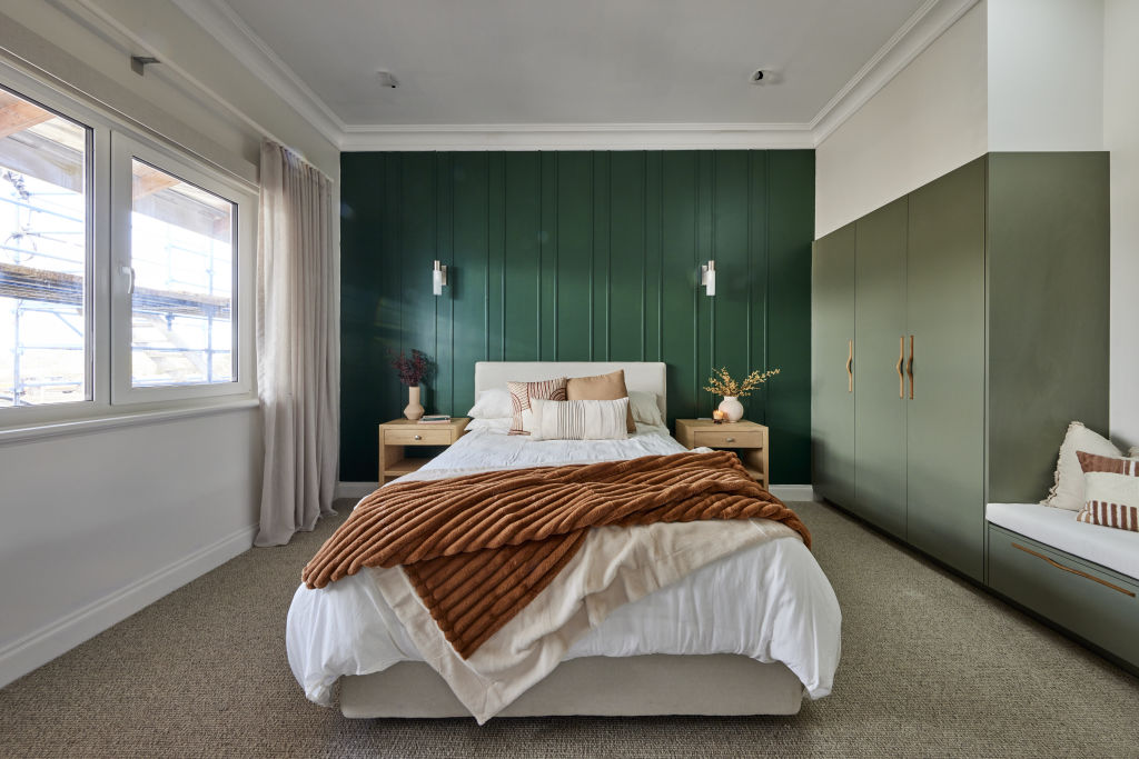
While the judges had a lot of praise for Rachel and Ryan’s first guest bedroom, Darren was quick to point out one very big flaw – it was poorly painted.
“It is really messy. I can see every brush stroke where it’s met with dry paint and wet paint,” he said.
“I can see every roller mark. I can see every imperfection on that paint and it’s distressing me because it needs to be so sharp and precise to work as well as it should. Also I don’t love the colour.”
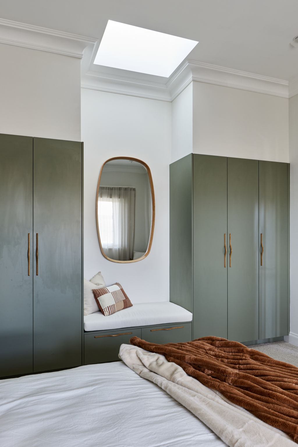
Shaynna also said that the team hadn’t taken the curtains all the way to the ceiling.
“When you’ve got these magnificent ceilings and you’ve got those big cornices you draw your eye to the cornices,” she explained.
“Because it gets a bit lost you take your curtain to the ceiling. You take it to the underside of the cornice and it absolutely adds elegance.”

She also wasn’t a fan of the wall sconces, noting their lack of utility, and said the skylight that the team had installed over the small sitting area wasn’t necessary.
Ankur and Sharon – Living and Dining Room
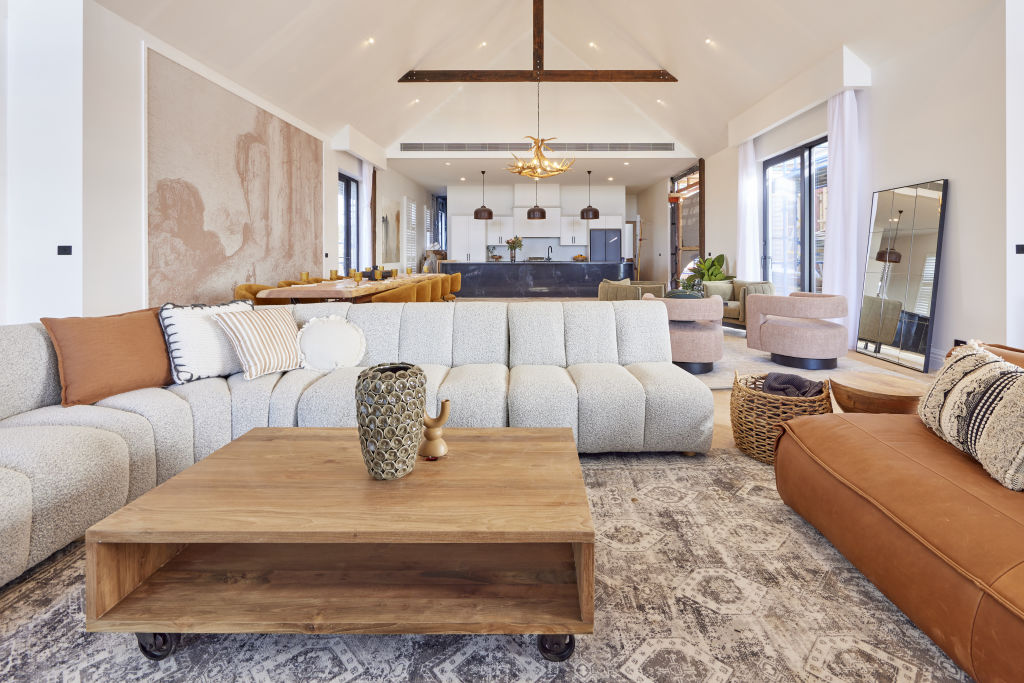
The judges loved the sheer size of the space of Ankur and Sharon’s room, and thought the addition of timber beams really warmed the room up.
However, they were quick to notice a lot of the unfinished parts of the room.
“What’s lacking here are the things that make a house a home, it needs book cases, it needs more artwork,” Neale said at the time.
While he liked the artwork, he felt it was better suited to a commercial space.
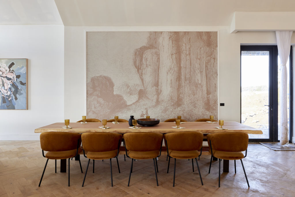
“I feel like I’m in the lobby of a hotel.”
The judges saw the amount of work had crushed Ankur and Sharon, and Darren couldn’t help but cringe at the painting which he says is “so bad”.
They immediately said they believed it should be Ankur and Sharon’s redo room.
“They’ve got some great features but they’re not celebrating them,” Shaynna said.

It’ll be a difficult task for the couple, who have been cut off by Scotty after it was revealed they had gone $53,000 into debt during renovations.
Dylan and Jenny – Living and Dining Room
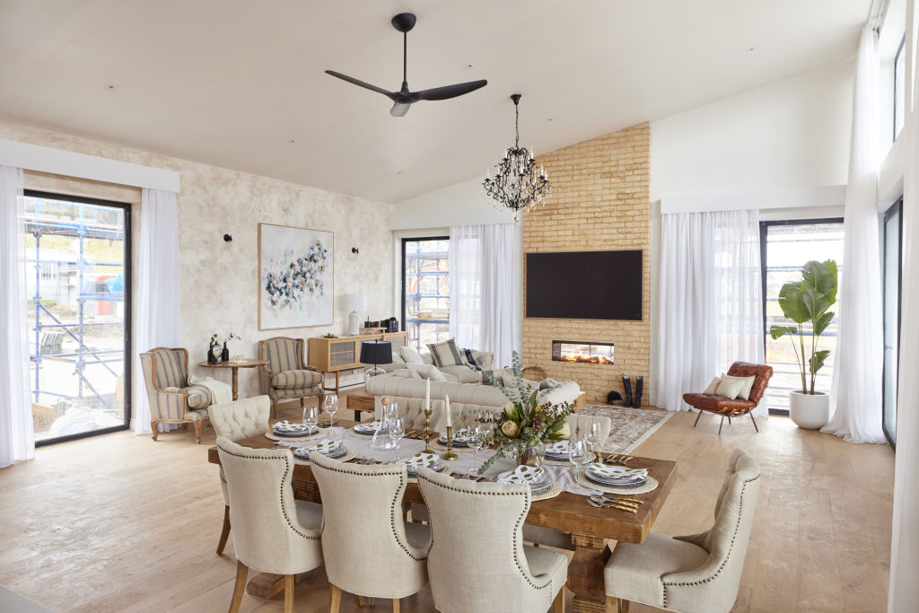
While the judges were impressed with Dylan and Jenny’s living and dining room, they noted that the “very traditional” space didn’t match their kitchen.
“I feel this is more suited for a period home,” Shaynna said.
Shaynna also pointed out that the mix of contemporary and period pieces wasn’t working.
“It doesn’t feel connected,” she explained.
Neale said the room “feels kind of ordinary” while Shaynna thought it could be vastly improved should the couple take out some of the country elements.

Dylan and Jenny have won the past two weeks of Room Reveals, and are hoping to bag a third by making the changes to their living space.
Omar and Oz – Master Bedroom
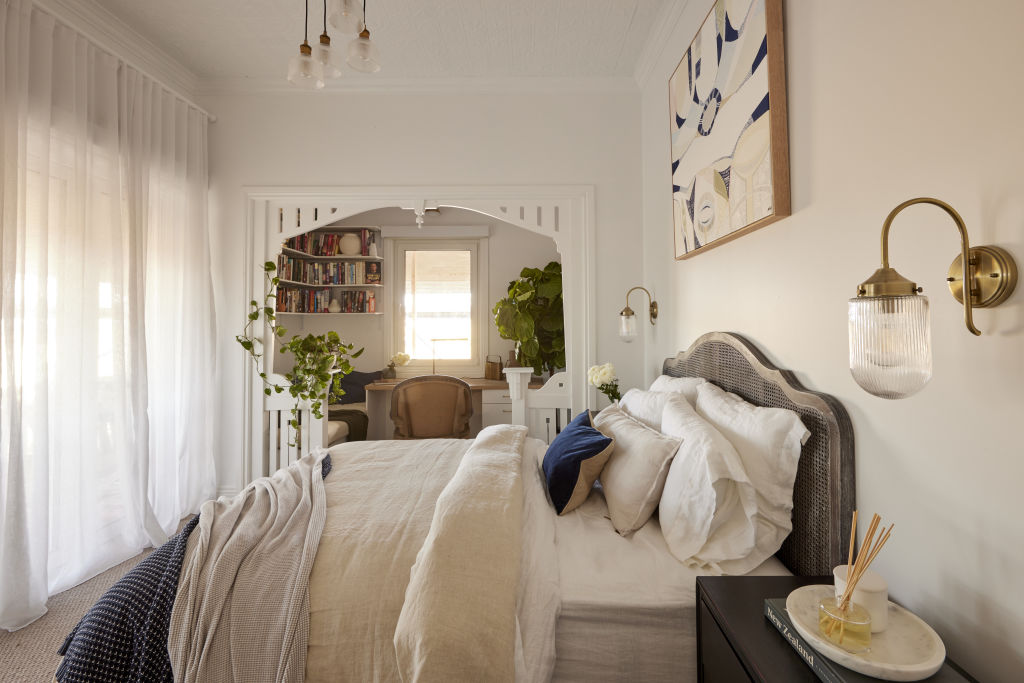
There was one thing that the judges weren’t too impressed with in Omar and Oz’s master bedroom, and it was their library nook.
“I find the whole thing very visually overwhelming,” Neale said. “It’s too much. My eye doesn’t really know where to land.
“Since when did a master bedroom need to give over so much space to a study and reading nook?”
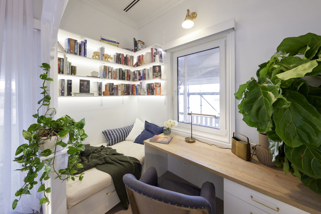
Shaynna liked the idea of a separate space, but thought the boys’ execution was off.
“That nook should be grand. It should be incredible but it’s cluttered,” she said.
One mention of the bookshelves was enough to make Darren shiver.
“You’re better off not looking at those bookshelves frankly,” he said.
“Because those fifteen cent brackets and those one dollar shelves are just cheap.”

It’s going to be a big week for the teams and with a limited budget, we can’t wait to see how they transform their redo rooms.
This article was originally published by Nine.com.au. Reproduced with permission.
We recommend
States
Capital Cities
Capital Cities - Rentals
Popular Areas
Allhomes
More

