The Block 2023 kitchens : Did the contestants get it right?
You know we’re nearing the pointy end of the season when it’s kitchen week on The Block. This is the one that can make or break the houses, as well as the teams.
Kitchens sell houses, so get it right and you’re a step closer to winning, but get it wrong and modifying or “fixing” a kitchen can leave you in something akin to purgatory.
A thoughtful, well-considered and highly functional kitchen can last years. And when an upgrade is due, it can often be done at a cosmetic level, saving a home owner tens of thousands of dollars. Quite simply, a good kitchen can make your day-to-day life infinitely better.
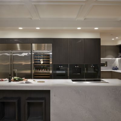
Thankfully, this week there was one move that all the contestants did with gusto: the island bench. And if you’re not sold on them, you may very well not sell your house as successfully as the next person. Data from Domain shows homes that have an island bench have a median price $182,000 higher than houses that don’t. Chew on that!
This week, it’s all about the butler’s pantry. Every team included one and, according to the judges, some did it more successfully than others. I do think we’re starting to see less appetite (excuse the pun) for the not-so-humble butler’s pantry.
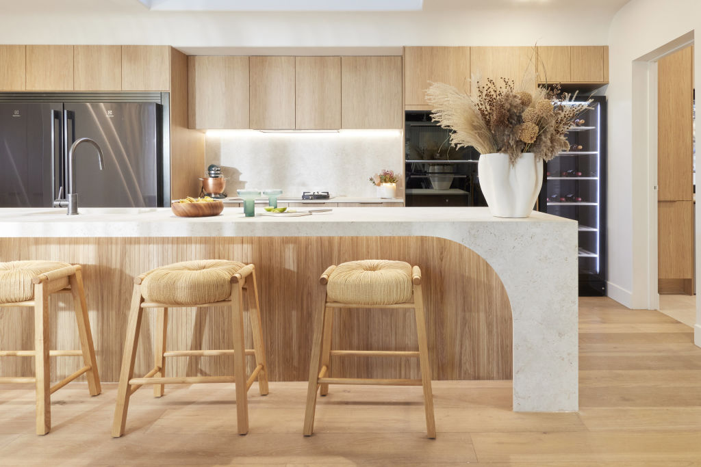
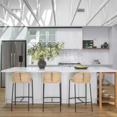
Just how sublime is that rolled ceiling with the skylights in Kyle and Leslie’s house? What’s more, it also stops stark sunlight hitting directly, and creates a beautiful softness to the kitchen no matter the weather.
These guys are so good at making a space pack a lot of punch. They’re stylish and elegant, but they would have got so much more mileage out of the kitchen had they forgone a butler’s pantry.
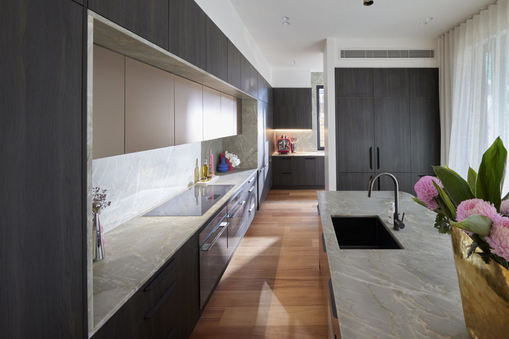
I have lived in apartments with kitchens smaller than a powder room. I know, first-hand, that size does not matter in the kitchen. At 16 square metres, Leah and Ash do have the smallest space on The Block, but that is still a lot of square metres.
They should have stuck to their guns and accepted they didn’t have the space for a separate pantry. But Leah hit shaky ground when she said she thought all “luxury Melbourne houses have them”. (Fact check: they do not.)
There are other ways to make something luxurious – perfect spatial planning and design are perhaps the ultimate in luxury.
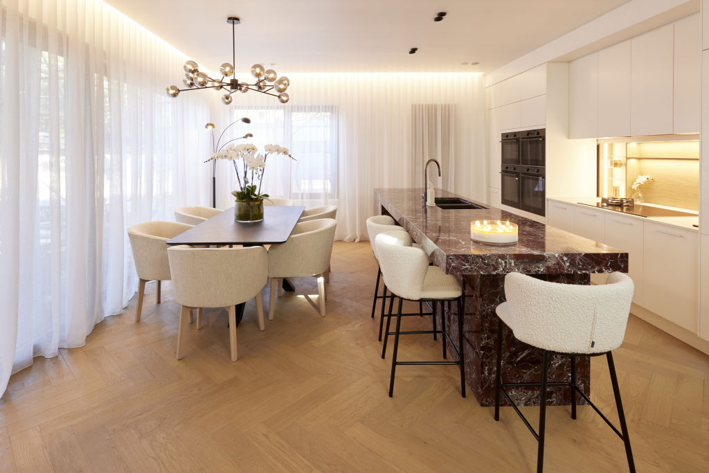
Kristy and Brett’s kitchen delightfully surprised me this week. The colour, weight and scale of their island bench are incredible. It feels bold and safe at the same time – and coupled with the glossy white joinery, it stops everything competing. I really love it.
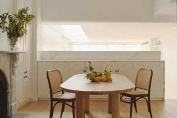
Not so, their dining table, which feels too formal and fussy for me in a room so connected to the kitchen – I would have liked to have seen a more relaxed and informal table and chairs, suggesting how a modern family might use the space. Thankfully, these can easily be swapped out.
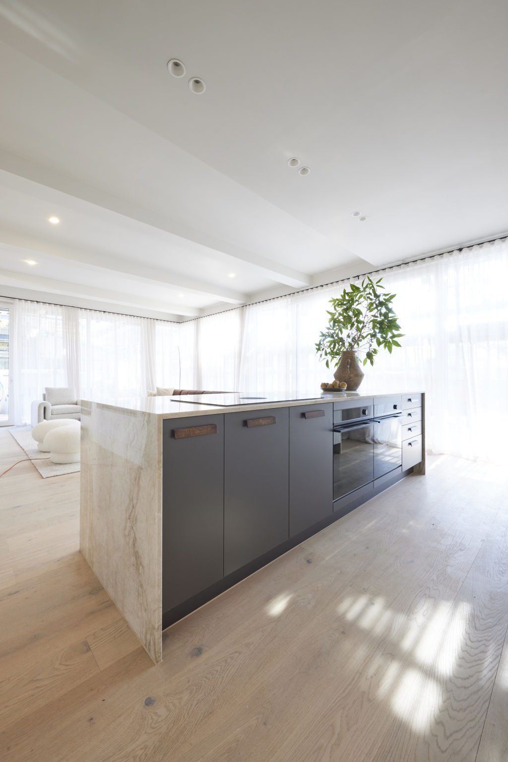
I’m loath to say it, but Steph and Gian, who were on such a winning streak, fumbled this week. Had they been brave enough to not have a butler’s pantry, their kitchen would have been so much stronger and in better proportion with the rest of the house.
And while I thought it was a masterstroke to flip the kitchen and dining space, the island bench would have worked better if it had been reorientated and faced the width of the garden – it would have also created an invisible line between the living and kitchen space, making each space feel like a zone (the key to open-plan living).
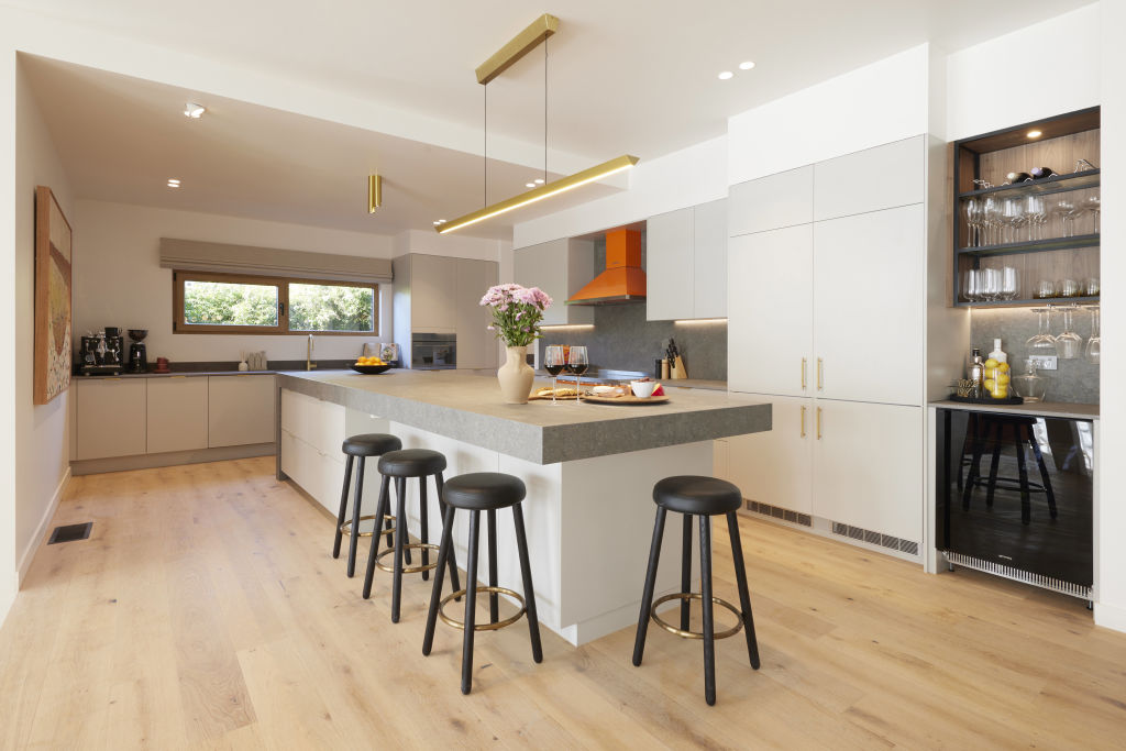
Eliza and Liberty this week delivered the best example of a kitchen that appeals to family buyers in an area like Hampton (but the Veuve Clicquot-coloured oven may be a step too far for some people). I love the small bench that runs perpendicular to the main island bench – a clever trick that allows the island to be almost like a continent and not be interrupted by a sink.
Like the other houses, the girls didn’t need a butler’s pantry, but they were the ones that could absorb the extra space, without it taking away from kitchen itself; so no harm, no foul. Crack open the Veuve, girls!


We recommend
We thought you might like
States
Capital Cities
Capital Cities - Rentals
Popular Areas
Allhomes
More
