The Block 2023 redo room and bathroom reveal: Epic fail for one team, game-changing success for others
Continuing our recaps from our expert panel of ex-Block contestants, who will this year get to spend room-reveal night judging from their couch rather than standing on the proverbial chopping block before Scotty Cam. This week, 2022 contestant Rachel Carr dissects the 10th room reveal of Season 19, 2023.
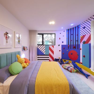
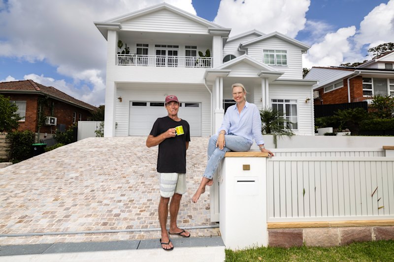
Hello fellow Block lovers! It’s upstairs bathroom and redo week on The Block. And what a fitting week for me to be doing the recap this week, considering Ryan and I were down at The Block as surprise guests for Steph and Gian’s huge 10-10-10 winning kids’ rooms.
I thought I would begin this recap with a little BTS from our visit to Charming Street. And I must say just how surreal it was for Ryan and me to see a Block that wasn’t on mass acreage. I finally understand why all the past contestants who visited us at Gisborne were left gobsmacked. The sheer scale of our Block in no way compares to the other seasons and I realised I never really understood that, or gave that enough credit, until I walked down Charming Street.
As most of you know, our houses sat on four-hectare blocks. Most of us had to drive to see each other, we would call each other with the latest goss (#blocktelephone). Unless you were invited into another house and, in turn, into that week’s space, you really didn’t have much of an idea of everyone else’s design choices for the week, and we all maintained pretty steady friendships with very minimal competitiveness throughout our season.
These guys at Charming Street are all on top of each other daily. They are seeing the furniture deliveries, stone deliveries and bathroom choices. They are overhearing conversations and witnessing dramas within build teams first-hand. It does make me wonder if that is playing a massive part in the interpersonal relationships we are seeing among our contestants. Who can say?
But let’s get on with the recap …
House 1: Kyle and Leslie ($23,898 spend)
I don’t know about the rest of you, but I really want Kyle and Leslie to get a win. I walked through their home and absolutely loved it and was shocked to hear they hadn’t taken out more wins. Hopefully, this is the week for them.
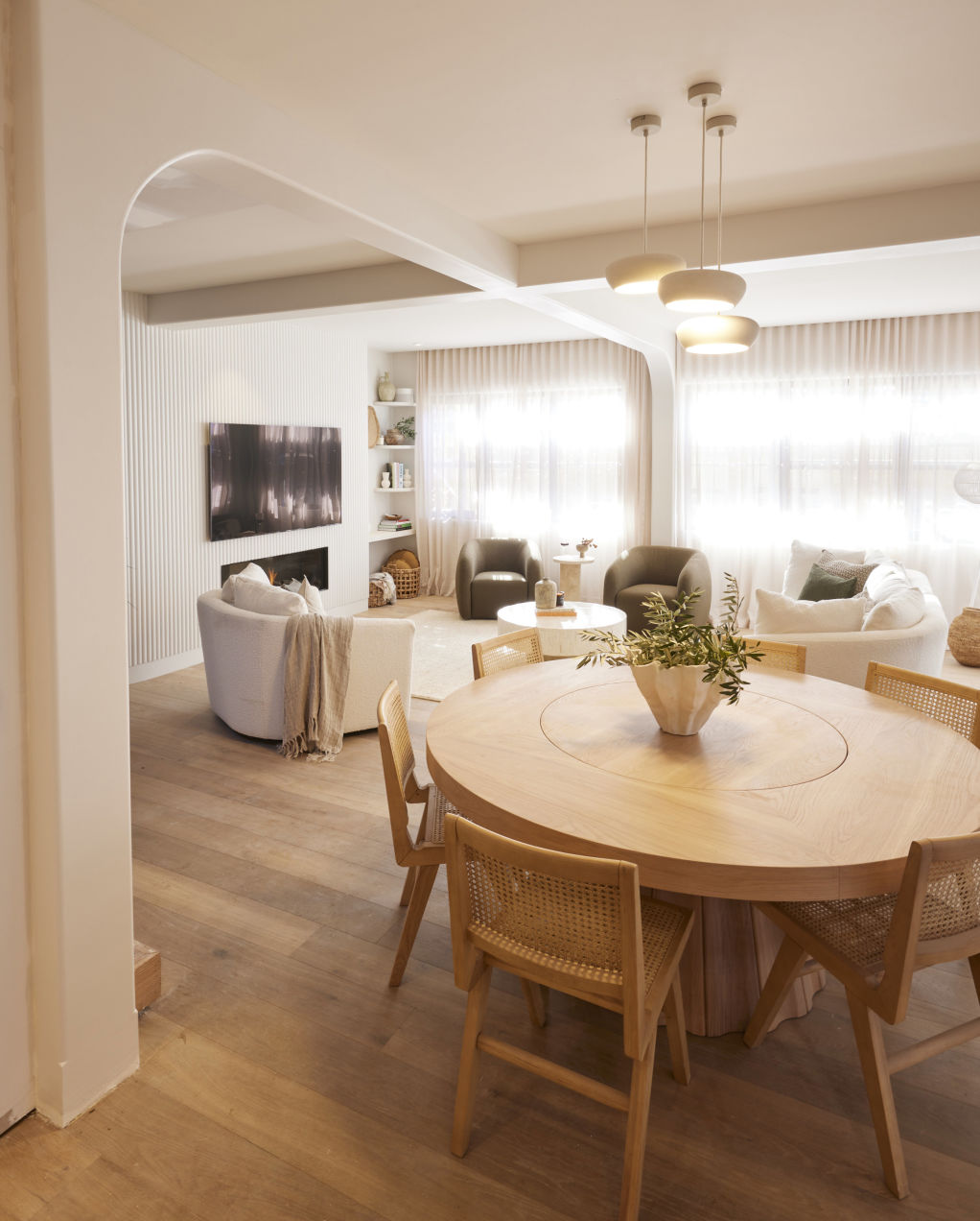
Stepping into Kylie and Leslie’s new living room, I’m obsessed with the sense of calm this space portrays.
The colour palette of greens, creams and oak, and the textures, from the stone coffee table to the boucle armchairs, all mix perfectly to give a feeling of utter serenity. I love their styling, and I think it has come so far from week one – the way those sheers let in just the right amount of light makes this an area I could happily lounge in all day.
But let’s see what our judges think.
It’s claps from Darren, Neale touches the feature wall with a Cheshire-cat grin while Shaynna exclaims, “It’s stunning.” Neale comments on the generosity and openness of the new layout. Darren feels the dining table still creates a blockage into the living space, but then notes that the additional furniture seems proportionally appropriate to a house of this size.
Moving on to their bathroom, the first thing I see is the beautiful ribbed shower screen, and they have used one of my absolute favourite tiles from Beaumont Tiles: The Sonic Terrazzo Nougat Mosaic.
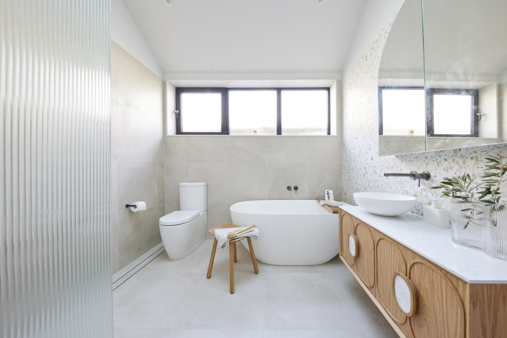
Our judges note this is a kids’ bathroom, and a fancy one at that. Shaynna finds some small issues regarding the toilet and head placement in the bath, to which Leslie replies, “You can face the other way.” Neale does make a comment that I have to agree with: apart from that glorious tile and (for me) the ribbed shower screen, there’s not much more going on in here. Darren thinks the issue is that Kyle and Leslie make great decisions, and then put them in the wrong place.
House 2: Leah and Ash ($26,118 spend)
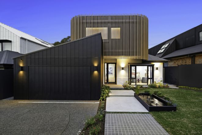
Leah and Ash are redoing their work-from-home space, and I am SO GLAD, because I did not like that space at all.
And now, I LOVE THIS BEDROOM. That statement bedhead paired with that gorgeous stone fireplace, the stunning colour palette of pinks, blues, teal and grey, the artwork and those incredible lighting choices. This is a room I would want to stay in.
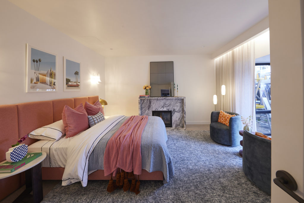
Shayna announces it “a huge success”. While it’s not my style choice, I do have to acknowledge the consistency of style in Leah and Ash’s home. Darren has an “I told you so” moment, noting that the bedroom was a much better choice for this space, rather than a WFH space, and Neale backs him up by saying that presenting this room as a bedroom is sensible as it adds another generously sized bedroom to their floor plan.
Heading into the bathroom I had to laugh, because while we see a bathroom with stunning terrazzo tiles, a fluted bath, curved navy-blue vanity with stunning blue Noodco basins, Kermit-green towels and a gorgeous hot pink orchid, the judges describe this as a simple and practical bathroom for Leah and Ash.
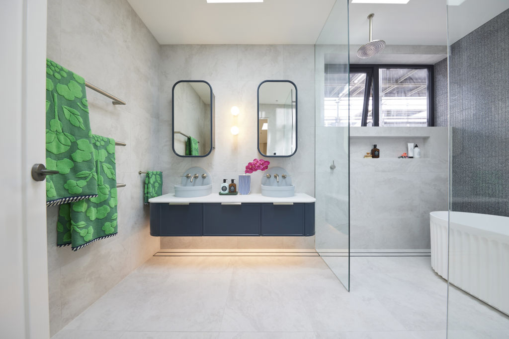
Neale says he was expecting to step into something more playful and finds this bathroom muted. Shaynna disagrees and says the bathroom is elegant and sophisticated, and Darren loves the horizontal towel rail. There is debate around the basins – Neale thinks they look like public drinking fountains, and I tend to agree. Darren thinks the room ticks all the boxes and Shaynna ends with, “Leah and Ash know how to make a statement.”
House 3: Kristy and Brett ($28,603 spend)
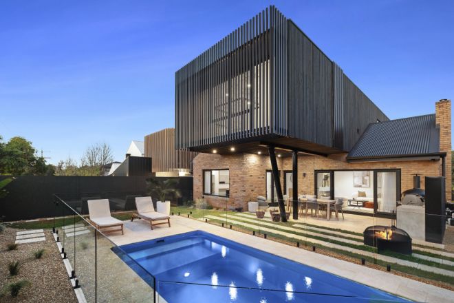
Oh, Kristy and Brett. What a week.
Firstly, I really want to know what those Post-its said. Second … why oh why did you not just tile over the existing tiles? I agree with the judges – that arch had to go (and I would have gotten rid of that clunky shower rail, too), but why did they need to make this so difficult?
For Ryan and my redo room, we painted a wall and added some new furniture. We spent $500 in cash, it took us a couple of hours and we won that week. And this room will still have to be finished in time for sale! I’m so confused as to why they didn’t just complete it this week and give themselves a chance at the win. And what do our judges think?
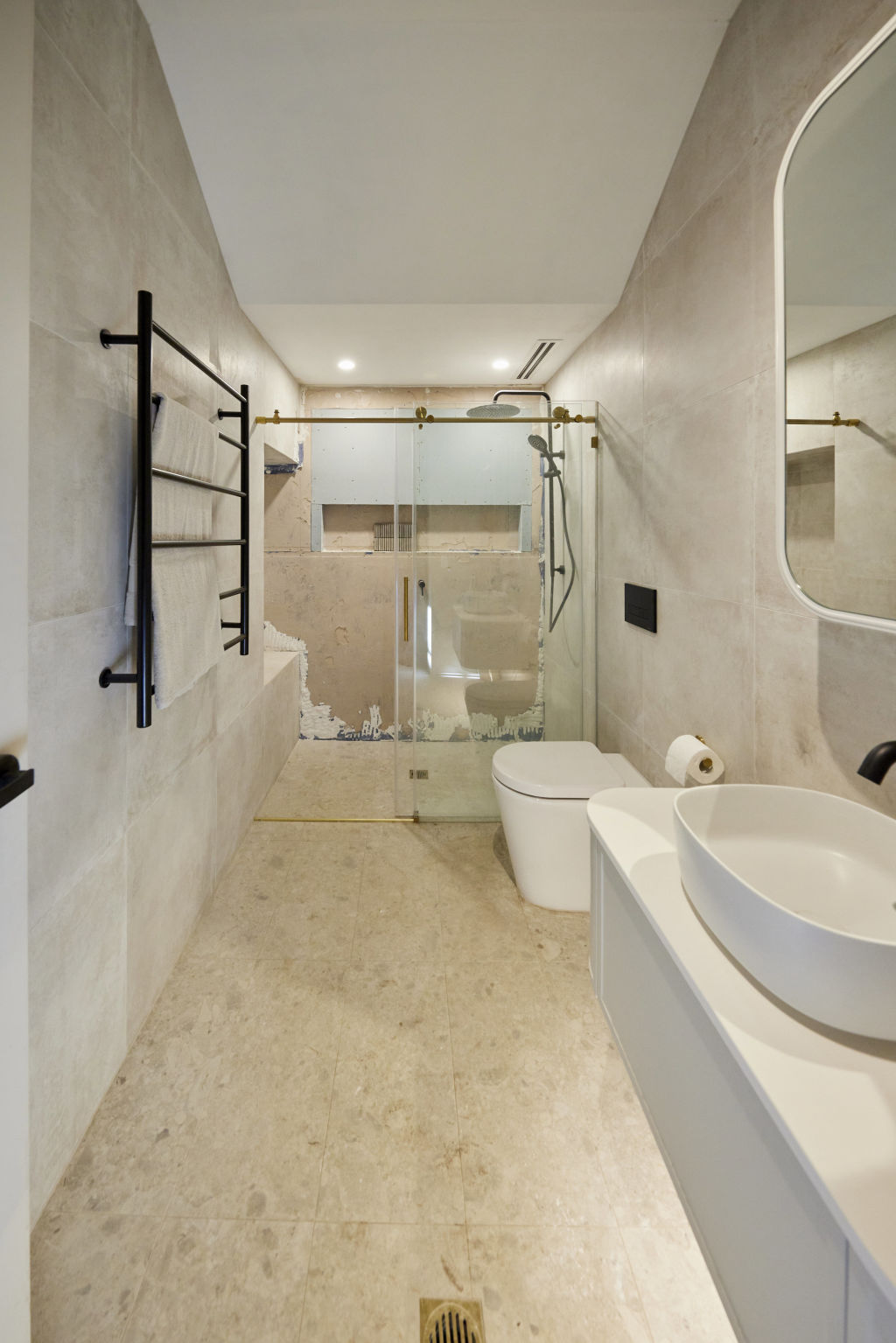
Well, Darren simply opens the door, gives us a “No” and closes the door again. Shaynna walks in and says just how infuriating it is for her to walk into rooms like this and see Post-it notes of excuses (would someone read them to us?!). Darren points out some damning things: Brett is a tiler so could have easily done the work himself; and they are also completing another bathroom this week, and therefore had the right trades already on site, and this should have been the easiest redo room on The Block.
Taking us upstairs to their new bathroom, and all I am thinking is that this is almost identical to the previous bathroom they revealed, and I don’t love that. I do love flow and I always bang on about it, and I think repeating some items is necessary to get that flow, but repeating almost an entire bathroom design, especially on The Block, is a no-go in my eyes.
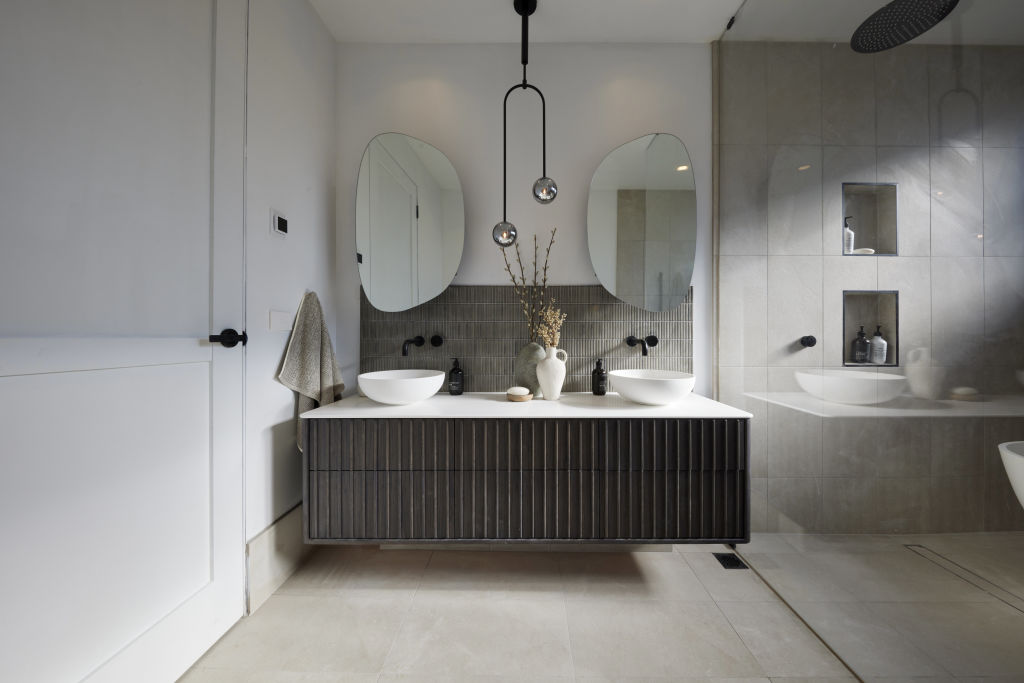
Darren immediately notices this is the same layout as their other bathroom, just with an added bath in the wet area. All judges acknowledge that the same design has been repeated; it doesn’t seem to be met with much criticism, but it’s clearly not being celebrated either.
Then we see just how unfinished the whole room is and it all really comes crumbling down. The basins aren’t plumbed, the toilet isn’t plumbed, and just when Neale thought it was safe to move, his foot knocks off the door stop. The judges notice the room is also not cleaned, it’s rushed and, all in all, it’s chaos.
House 4: Steph and Gian ($55,930 spend)
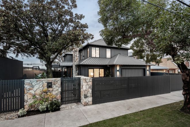
When we met with Steph and Gian at the start of this week, the main cause of concern for us in their redo room was the position of the vanity with the mirrors over the window. I understand the thought behind it for light, but in all honesty, it just did not look good. We went through so many different layouts for this bathroom, but many included moving the toilet and things that would have been much too time-consuming and cost a lot more than what they wanted to spend (even though they are loaded in Block terms).
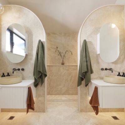
We all knew that the vanity needed to move, and I’m so thrilled with the outcome. The Japandi style they have become known for continues, and Gian tells us this bathroom lends itself more to a Japanese aesthetic, which I can see in the colour palette and styling choices.
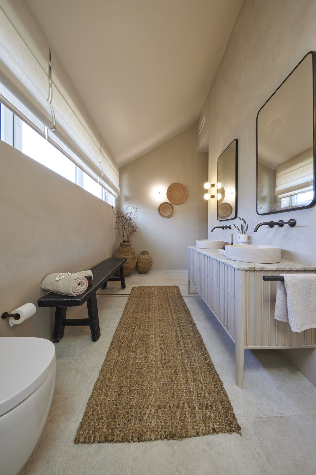
The judges enter and it’s a “Wow” from Neale straight away – “It’s very me.” The judges all agree that moving the vanity to the opposite wall was a huge improvement.
They love the Venetian plaster, and I completely agree. It works so beautifully with the tiles and tapware. And they all agree the bench seat is a masterstroke. Shaynna critiques the shaving cabinets, as Shannya does, but that’s really all the criticism they have of this space.
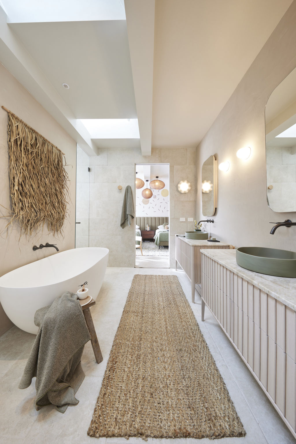
On to the second bathroom, and, as Neale says, WOW! This is just gorgeous. I love the Jack and Jill setup, I’m obsessed with the stunning Noodco sinks, and those towel hooks are incredible. In this bathroom, Shaynna gets the face-level storage she was looking for in their other bathroom, and all is right with the world.
Shaynna notes the textures around this room are quite simplistic, but they add up to a sense of elevated luxury. Darren points out just how beautifully bound all these incredible textures and elements are and Neale thinks it’s the most luxurious kids’ bathroom he’s ever seen. There are a couple of criticisms, though, from Shaynna: she’s not a fan of the glass door, the mood lighting, or the height of the towel hooks (I completely agree, but boy, do I love them aesthetically).
House 5: Eliza and Liberty ($28,664 spend)
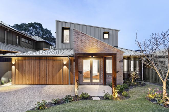
Eliza and Liberty’s redo studio is much better than the previous one, I’m just not sure it’s as good as it needs to be. Personally, I don’t love the wallpaper and I’m confused by the colour palette. I just find it all a little … blah. It is an improvement, but I think they could have done more with a space that is such a selling point to the home.
However, the judges do not agree with me. Darren thinks it’s awesome. Shaynna is relieved and they all love the wallpaper. They also love the new layout and think it’s much more Hampton East than the 2-star hotel vibe it was giving before the makeover. Darren does point out this could have been an absolute hero pool-side cabana and I completely agree: make this space the stuff of dreams, not just a box-ticker.
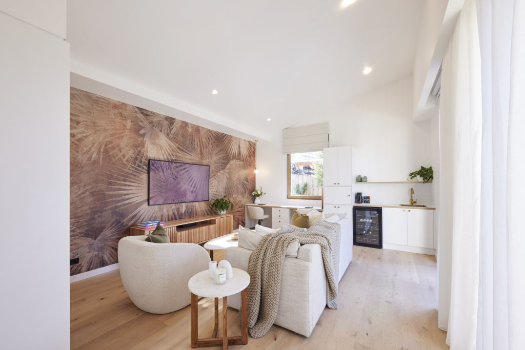
Heading into the bathroom and my feedback could not differ more from their redo room – I absolutely LOVE IT!
The tile choices, mixed with the gold accents, mixed with the terracotta styling items. The only thing I’m not loving is the colour of the Noodco sink – I just think it’s the wrong tone, but other than that, this bathroom is a standout for me.
Darren says “BOOM!” Shaynna agrees that the floor is amazing; it says “fun”, it says “kids”, it also says “sophistication”.
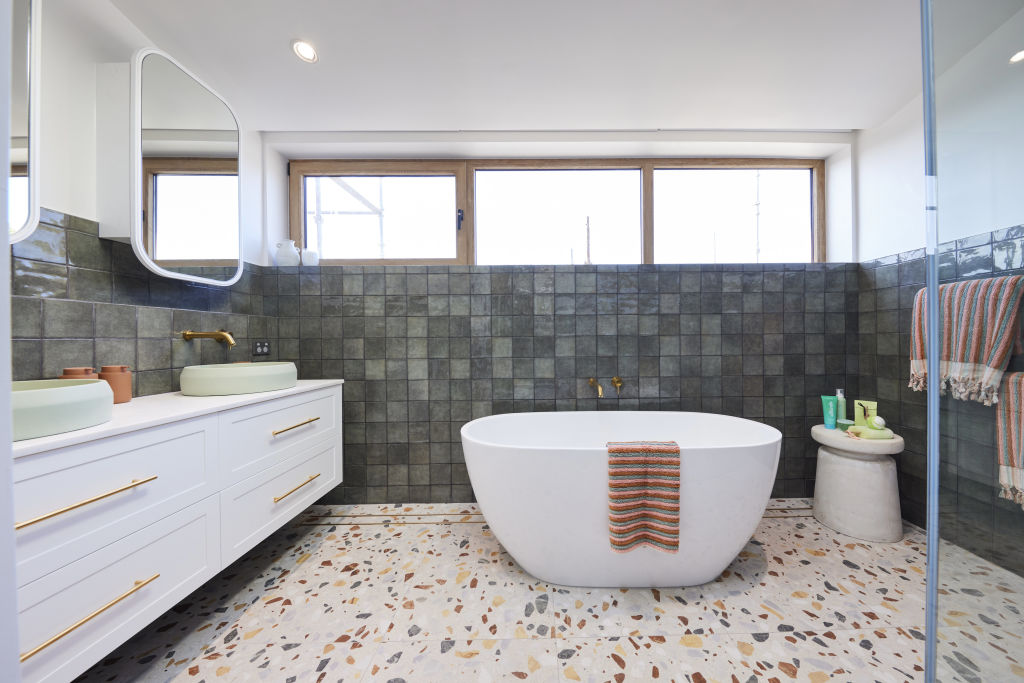
But there is a real difference of opinions here among our judges.
Neale doesn’t love it. He finds the styling tokenistic and basic. Darren is aghast at Neale’s opinions and strongly disagrees, as does Shaynna, who both believe this bathroom is a standout
What do the scores say?
Results:
House 1: Kyle and Leslie with 23.5 points
House 2: Leah and Ash with 27 points
House 3: Kristy and Brett with 18.5 points
House 4: Steph and Gian with 26 points
House 5: Eliza and Liberty with 27.5 points
Eliza and Liberty snatch a shock win by just half a point over Leah and Ash.


We recommend
We thought you might like
States
Capital Cities
Capital Cities - Rentals
Popular Areas
Allhomes
More
