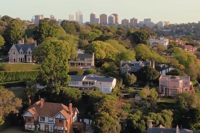
Before and after: The Caulfield mid-century home recognised, reinvigorated and celebrated
Over the past few months Melbourne has endured the heartbreak of losing some inspiring mid-century residential gems. “Tragic demolitions” is what architect Anna Dutton calls them.
But here is a happier story that shows how “weary” old modernist houses can be found, expertly upgraded and extended for modern living, and how their character on the street, and the characteristics of their scale and materiality, can carry into the new amenity without creating the ruptured fault-lines seen in many incongruous extensions.
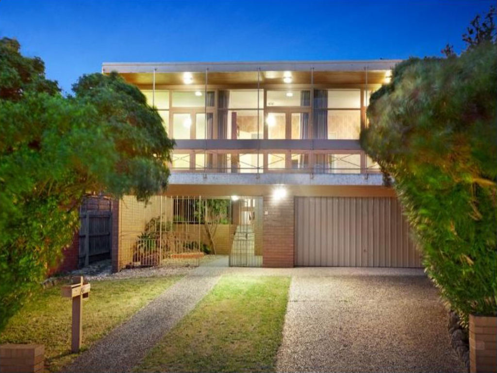
For a family passionate about modernism and on a quest to find a mid-century house they could save, Dutton and the Bower Architecture team followed the brief for the new owners of a small, solid Caulfield 1960s brick house on a big block to celebrate its best features while creating a bigger home “that would have the mid-century glamour but not the glitz”.
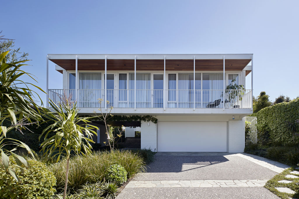
Seeing elegance in the double-level front elevation, where the entry was at the side and via a crazy-paved undercroft, Bower painted the bricks white, changed the clunky balustrade for finer metal uprights, and took the proportional keynote for the new structure from that otherwise unchanged street elevation.
If you drive past today you see a house that, as Bower intended, is apparently “typical of its era”.
But behind the scenes, the story becomes one of an effortlessly accommodating 21st century residence, tailored for a family of four who all work and study from home and thus needed flexible, functional spaces where they could be together, or apart.
A new central courtyard was created by building a double-storey east wing across the back of the block that hides it from a large, overlooking neighbour, and gives the parents an upper level bedroom that looks down on the new pool. The girls’ two bedrooms and study remained in the original wing.
And speaking of privacy, in the middle of the ground level of the new east elevation is an indented, timber-lined deck with a comfy window seat that is a coved outdoor living room which adds yet another get-away option to a house with three more indoors.
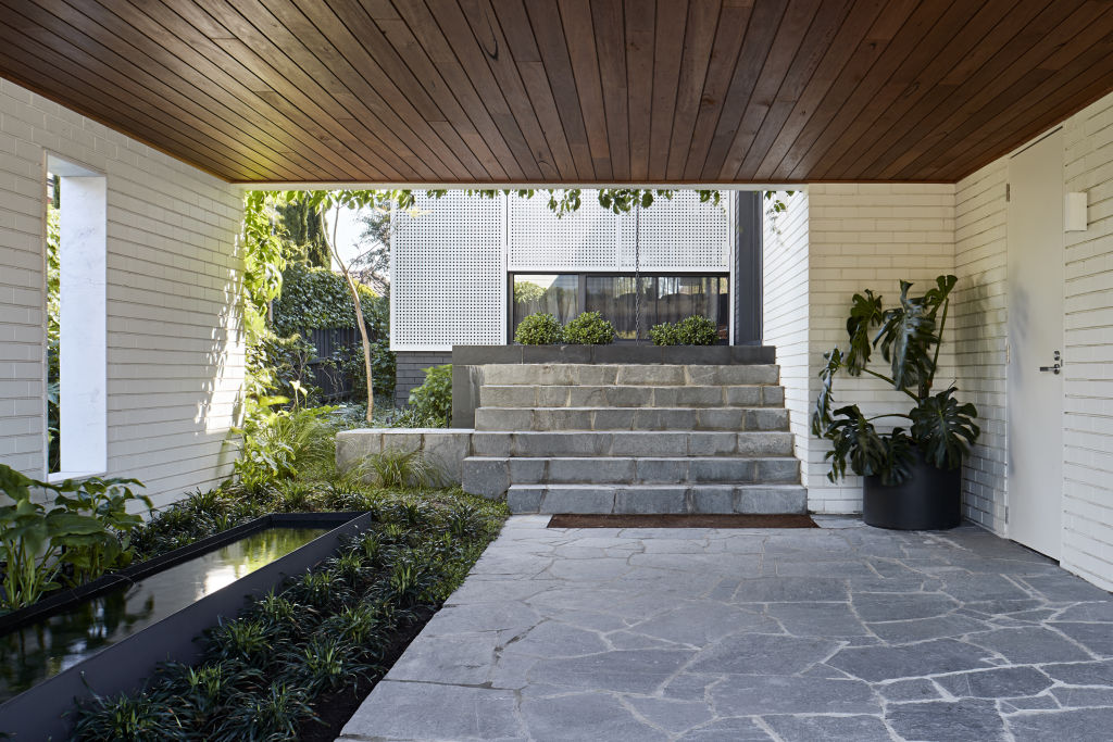
Dutton says by especially respecting the proportions of a 60-year-old house for which the practice can discover no architectural authorship, and in part by replicating its brick and timber-lined materiality and textures, “We’ve been able to stitch the two parts together gently”.
That understates what a practice with a portfolio evidencing a clear appreciation of modernism has achieved here. A geometric patterning and a sense of a house that “journeys through [spatial] contraction and expansion into light and height” are other aspects of the inspiration derived from the old house.
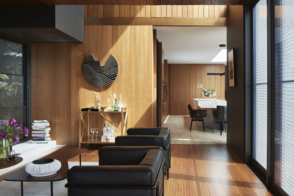
Each room offers a different experience: a cosy blackbutt-lined (ceiling, walls and floor) sitting retreat moves through to a travertine-floored kitchen where not only are there doors to a day study, powder room, laundry and first floor stairwell concealed within the joinery, but a skylight illuminates an Elba marble kitchen island of such substance that it could be a sculpture.
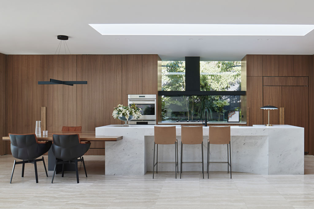
While obviously luxurious in their appointments, these are all functional spaces. The owners, Dutton says, “say they use every space, every day”.
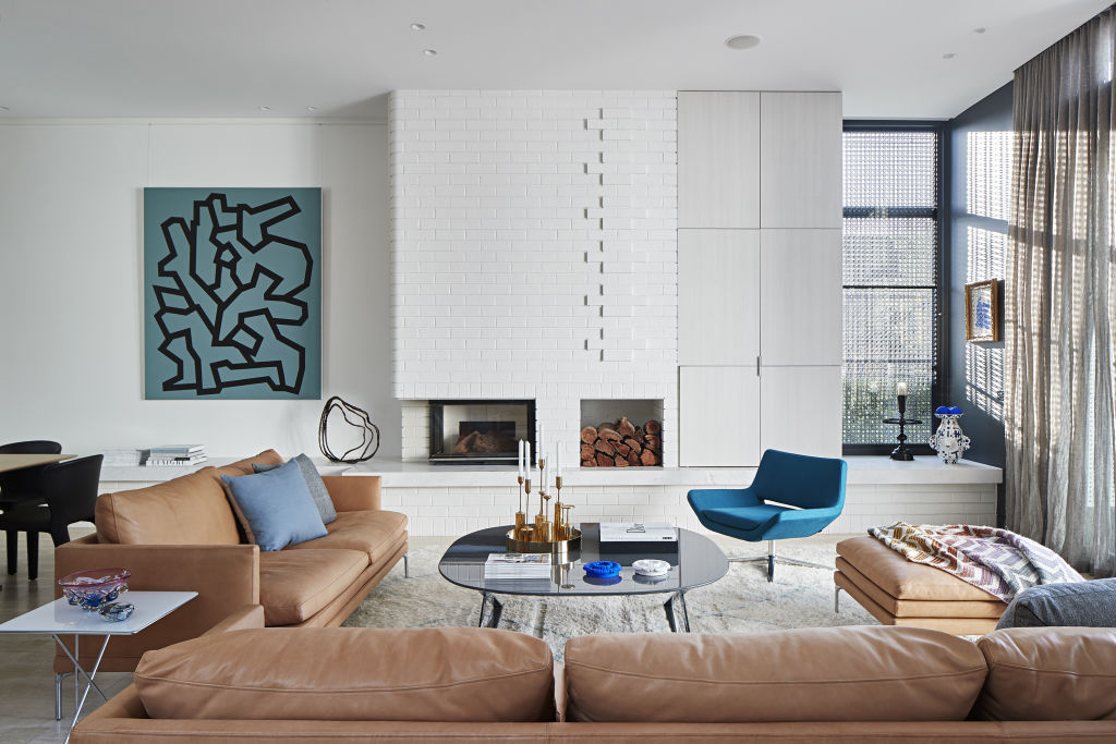
The main sitting room has a patterned white brick chimney breast that surely is an authentic original? But no. It’s another clever Bower contrivance that Dutton says adds up “to memory in brickwork”.
Another lead that was carried through – and yet that is indisputably of today – is the essential white metal screen that gives the entire western face of the new wing shelter from summer heat and glare “and that creates beautiful geometric shadows inside. It’s clearly a contemporary element,” Dutton says.
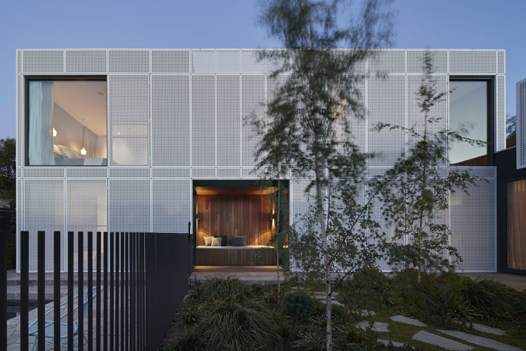
Getting the tricky marriage of site, brief, context, retained and new form to meld is no easy feat. Yet here it not only succeeds but demonstrates something that both a client passionate about championing the mid-century cause and their architect wanted to promote.
“In the midst of so much destruction of this type of house, we wanted to show how a weary mid-century home can be invigorated. We think it’s super important for heritage and diversity not to lose any more houses of this character,” Dutton says.
We recommend
We thought you might like
States
Capital Cities
Capital Cities - Rentals
Popular Areas
Allhomes
More
- © 2025, CoStar Group Inc.
