The colour trends that will be dominating interiors in 2020
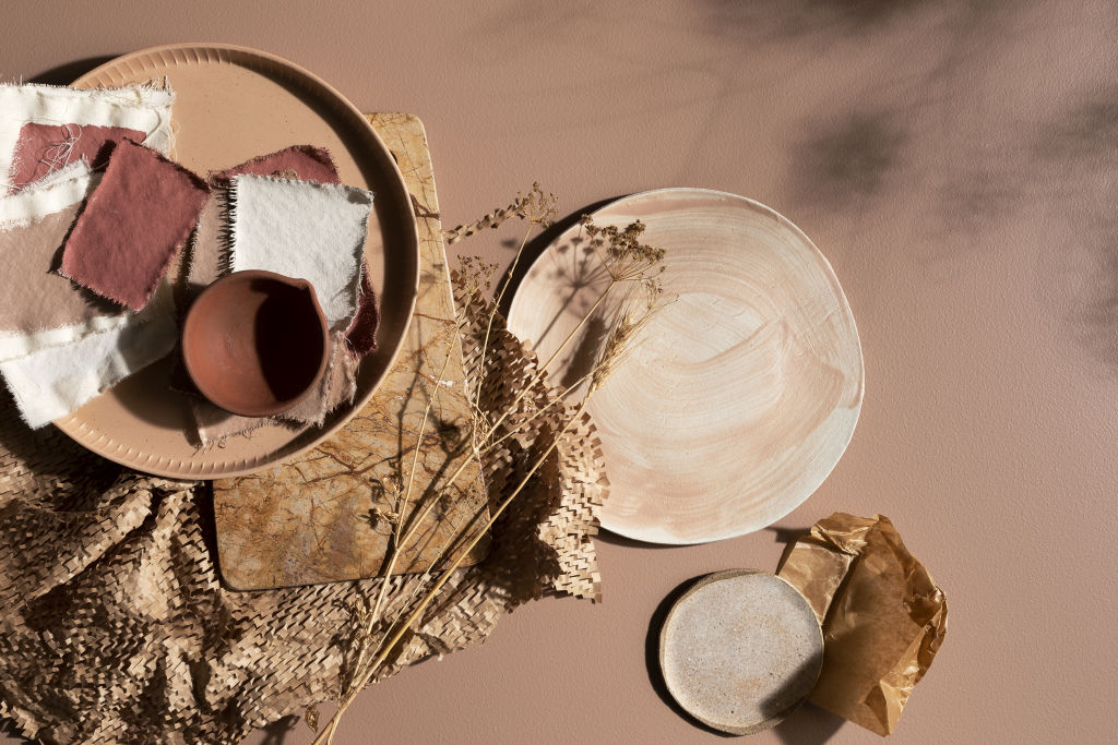
The colour forecasts for 2020 have only just been released by major paint brands in Australia.
The themes, palettes and specific shades identified as on-trend for the coming year are likely to be seen not only in paints, but across furnishings, accessories, homewares and fashion.
The themes of connection with nature, concern for the oceans, trans-seasonal colours and a sense of connection have all translated to the palettes chosen by Dulux, Taubmans, Haymes and Wattyl.
Listen to episode five of Domain’s podcast Somewhere Else:
Dulux
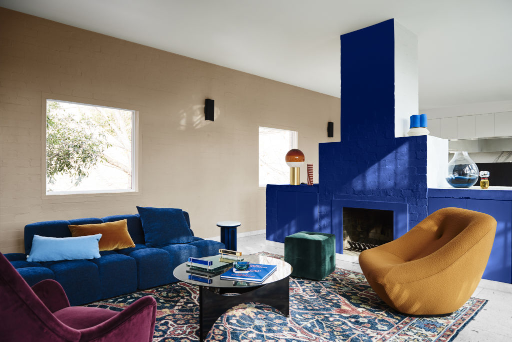
The Dulux Colour Forecast 2020 focuses on reflection and re-energising. The brand has identified four tonal palettes that are inspired by nature. Soft neutrals combined with bold, invigorating accent hues across Comeback, Grounded, Cultivate and Indulge.
Comeback is focused on bringing the past into a modern palette to reflect individuality with a timeless nod to the classics. Various blues (shell, cameo and marine blues), warm neutrals, burgundy and rust shades with a deep grey-green (Amphitrite) define this theme.
Cultivate speaks to those who want to harmonise their internal life with nature and the living world outside. This palette is gentle and focuses on organically grown produce as inspiration, with mustard, deep herby green, duck-egg blue and clay colours evoking warmth.
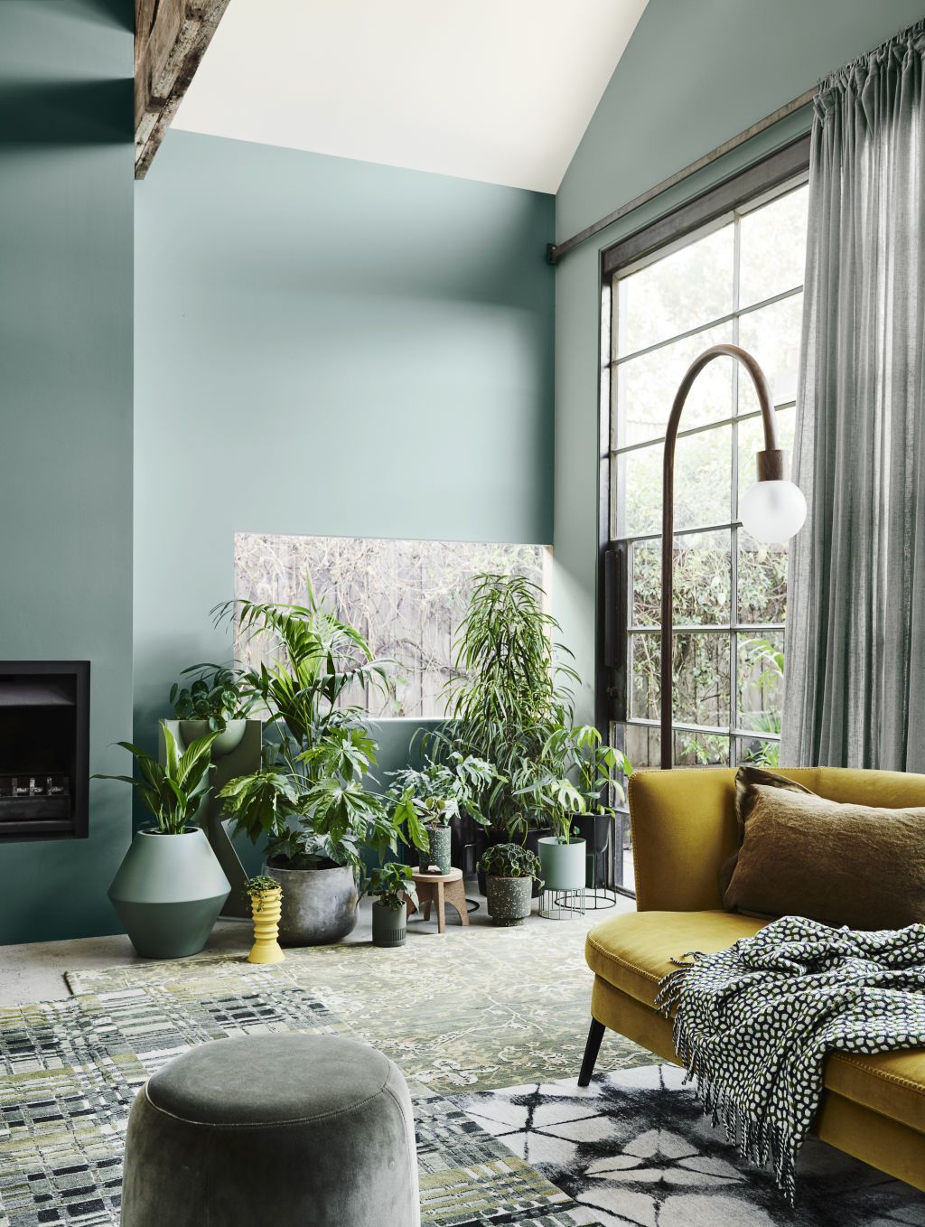
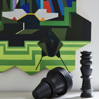
Grounded sticks to earthy neutrals, from the very pale off-white of “White Dune” to the soft sandy shade of “Sandrock Bluff” and the comforting “Pancake Mix”. The boldest shade is a goldy-rust called “Gold Pleasant”.
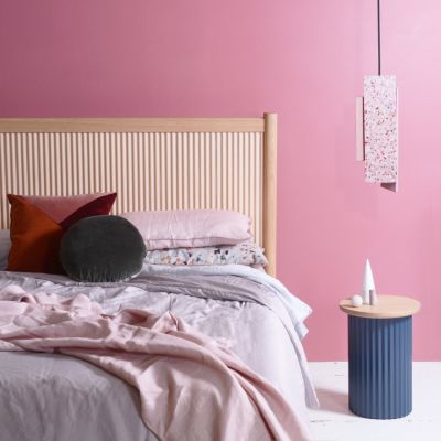
Indulge would work equally well as a lipstick palette as in the home. With pinky, red and mauve-based shades that emanate a subtle power, the romantic pinky-peach of “Yolanda” contrasts with the deep pinky-mauve of “Camellia” and the intensity of “Deep Exquisite” (dark purple) and Red Rebel (a perfect, poppy red).
Taubmans
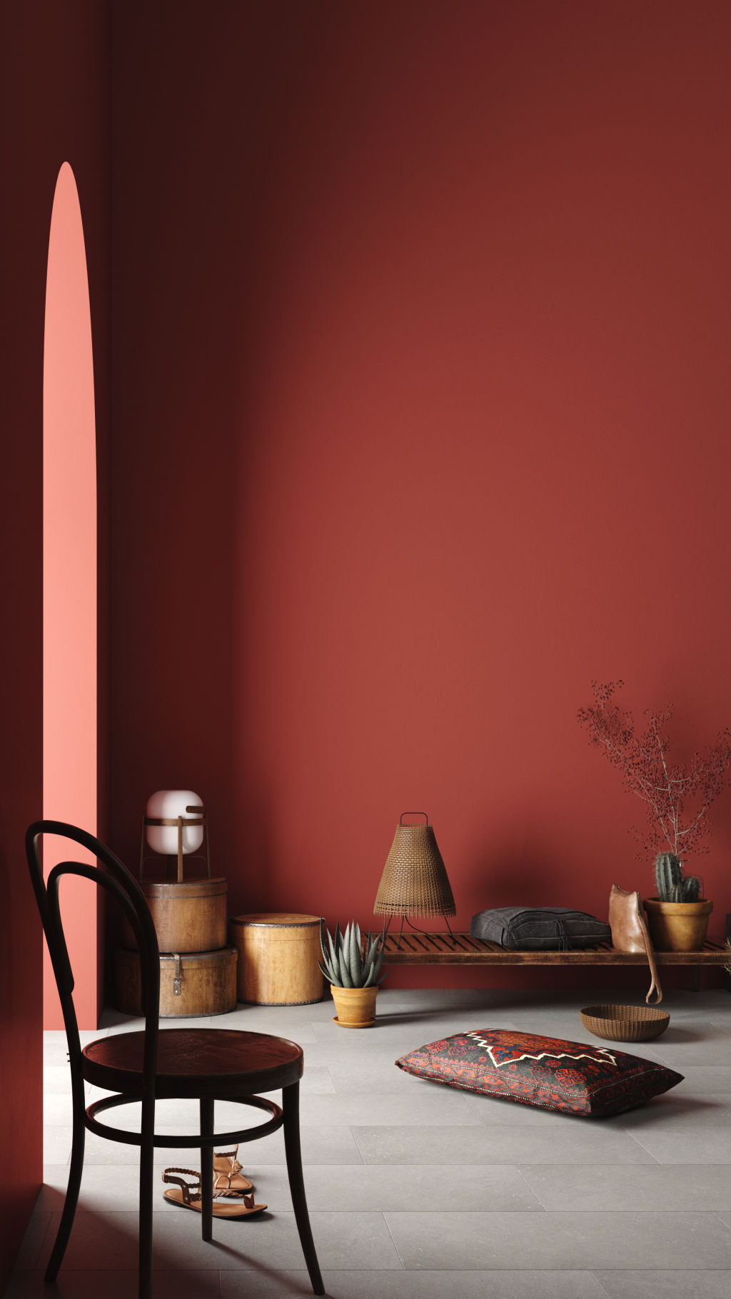
Rachel Lacy, colour category manager at Taubmans Australia, credits the dominant trends on the 2019-20 fashion catwalks for their trend forecast.
“The colour palette ‘Protect’ is our interpretation of the retro futuristic inspired trend for the built environment,” she says. “Current geopolitical and climate concerns, increased polarisation and protest have inspired a sense of being protective of both physical space and resources. We’ve become more mindful, with curated possessions designed to last.”
Protect combines a warm palette inspired by the outback Australian landscape with the retro futuristic fantasies of space travel to Mars. This results in a palette of red and orange-based colours that build in depth and intensity.
Haymes
Concerns relating to environmental damage and the necessity for sustainable, conscientious consumerism have also inspired Haymes’ 2020 palette forecast. Three key themes explore how political and personal concerns inspire the hues we select for our homes.
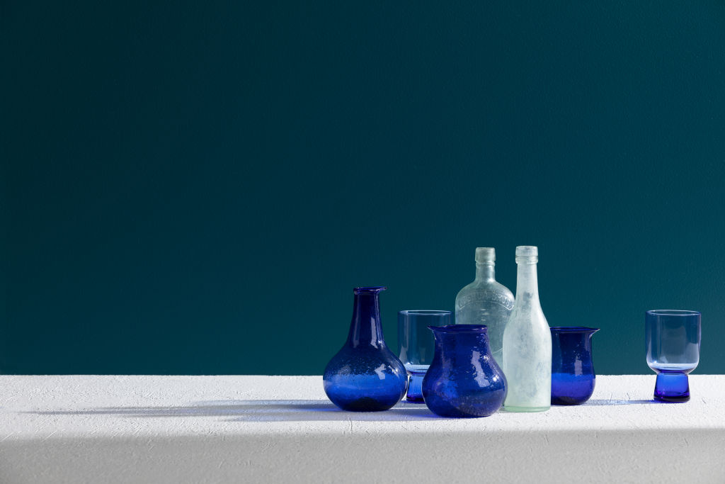
Positive Light is reflective of the beauty and fragility of the ocean. Various shades of blue from powdery light to deep midnight blue, cobalt and indigo define this palette.
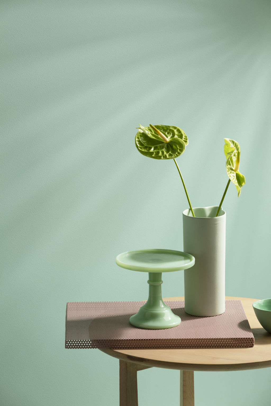
Equilibrium embraces the youthful mindset that we can transcend age and gender to find connection and fresh ways to communicate and coexist. A contemporary alternative to neutrals ensures the versatile tones of icy blue, minty greens, sage, olive and moss are both invigorating and refreshing.
Home Grown has curated rust tones and earth hues interspersed with neutrals that have a red undertone to harmonise the varying shades. The inspiration is natural dyes that honour the wider landscape and the power of nature to heal and nurture.
Colour and concept manager Wendy Rennie says, “Chocolate, champagne, whisky, cinnamon, rust, and everything in between define this palette. Browns are everywhere. Their soft shades are infused into everyday living, so that it feels natural and evokes a soothing overall effect.”
Wattyl
“The duality of life has never been more apparent,” says Sarah Stephenson, Wattyl colour and design expert. The contrast between being highly digitally connected but yearning for simpler times and the tactile, organic textures of the natural environment have resulted in the three themes forecast as key for 2020.
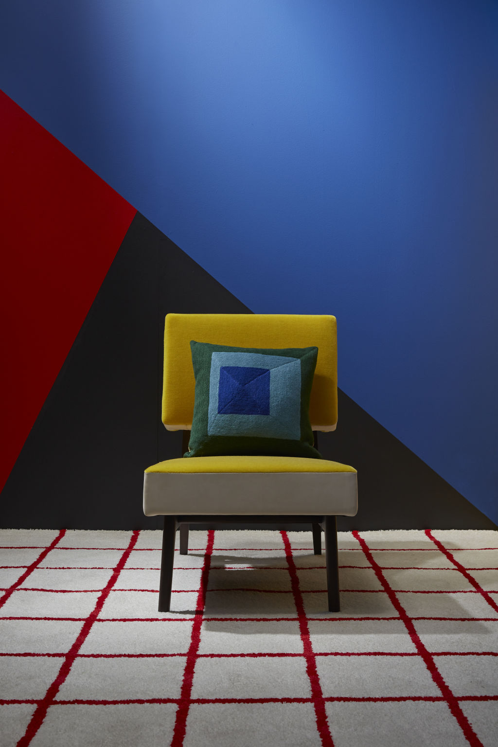
Bright Future takes bold blue “Space Odyssey”, daffodil yellow “Secret Shrine”, lipstick red “Firefly” and paler blue and peach to evoke a futuristic idyll.
Natural Connection combines warm hues of blush, golden yellow and terracotta tones for a comforting embrace, tempered by shades from a more raw palette.
We recommend
We thought you might like
States
Capital Cities
Capital Cities - Rentals
Popular Areas
Allhomes
More
