The Design Files: Inside an apartment with the perfect mix of design and comfort
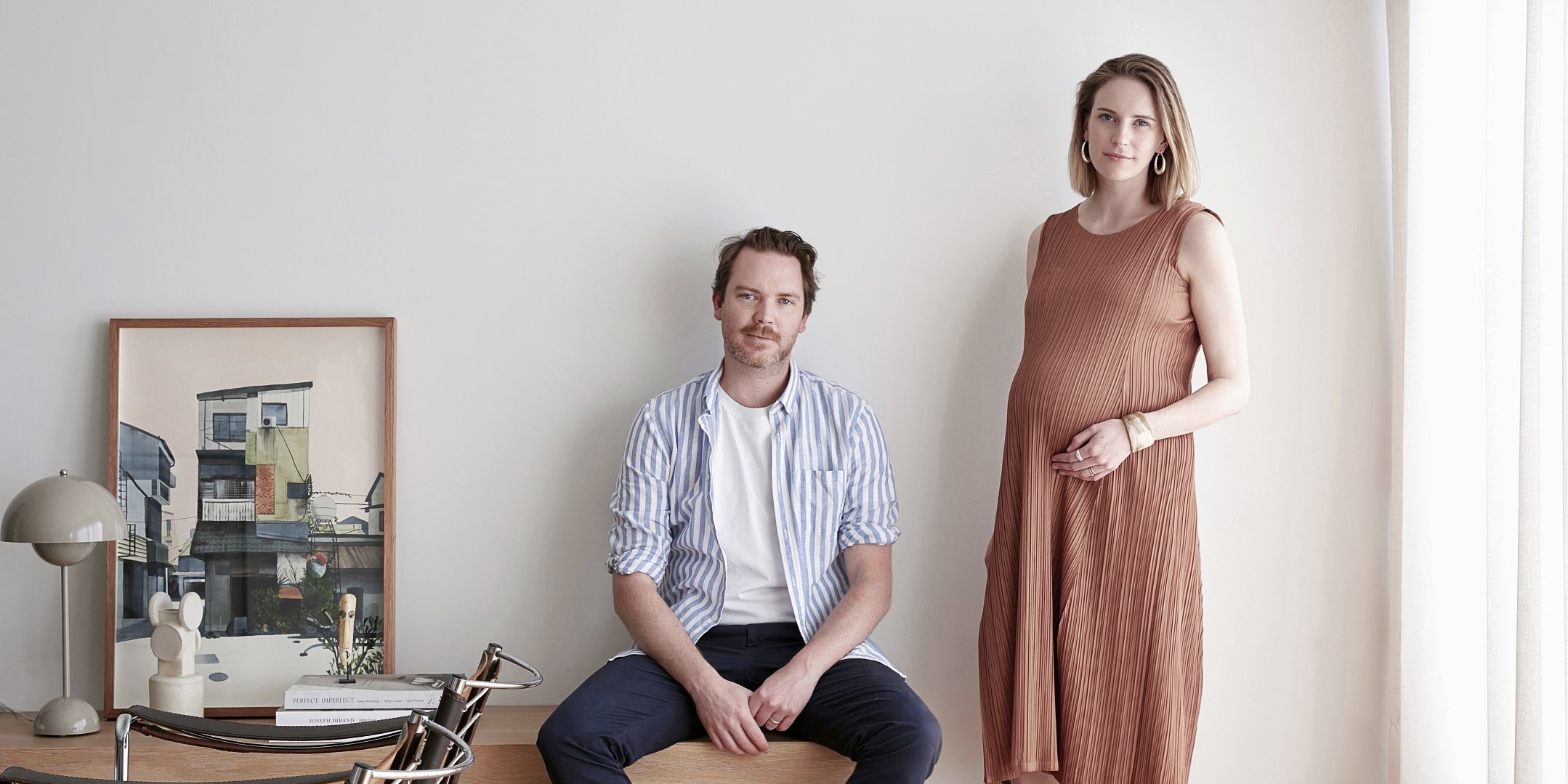
Who: Sean Fennessy (photographer), wife Jess Lillico (stylist and graphic designer) and baby Matilda
What: Renovated 1960s apartment
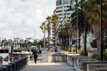
Where: Brunswick West
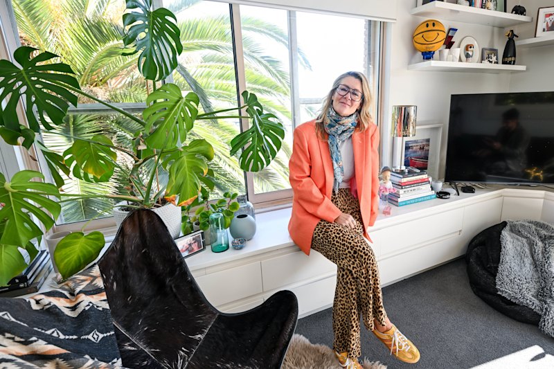
The apartment of photographer Sean Fennessy and his wife, stylist and graphic designer Jess Lillico, is enviably sleek, while somehow remaining entirely down-to-earth and liveable. Between Lillico’s styling credentials and Fennessy’s exacting eye, this apartment is the ideal blend of design and comfort.
Over the past five years, the couple have transformed the “bad faux-Tuscan ’90s” vibes they inherited when purchasing the home, through intensive renovation in the kitchen and bathroom, and repainting the space. While the pair “never planned to live in an apartment”, Fennessy explains that the late ’60s red-brick place suits their lifestyle: where there is no need mow the lawn, but ample opportunity to make the space feel like home.
The couple removed walls, and introduced new lighting to bring the apartment to life. Fennessy says, “We both work in the interiors world, and have seen our fair share of beautiful homes”. While this was initially overwhelming, the couple have consolidated their extensive know-how to reach a point that he describes as “finally living in a space that reflects us”.
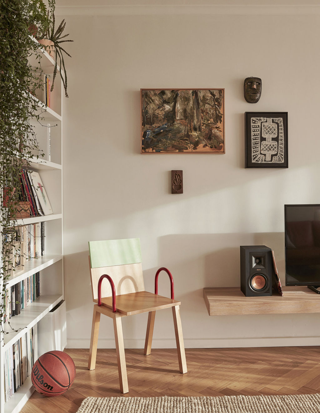
The apartment is filled with furniture and artwork inspired by shoots the creative couple have worked on, and friends they have worked with. Fennessy highlights, “the Daniel Emma chair is always a talking point, and was part of a trade for some photography we did for them many years ago”.
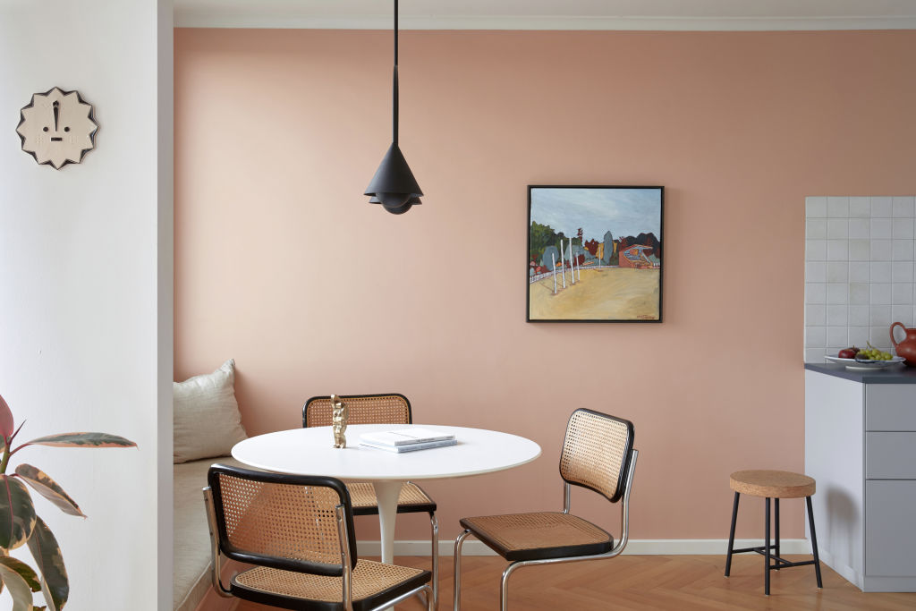
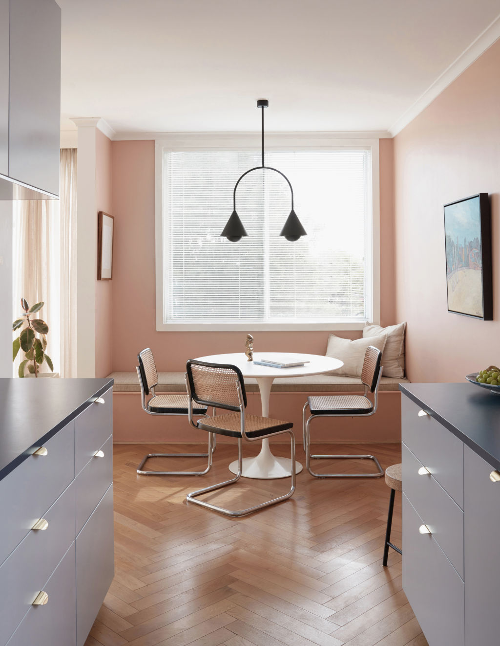
Other trades include herringbone floors from Storey, the long floating bench from Melbourne Table Company, and stunning artworks by Sanne Mestrom and Emily Ferretti. Other cherished items include the dining chairs, which Lillico spotted on the side of the road and lovingly restored.
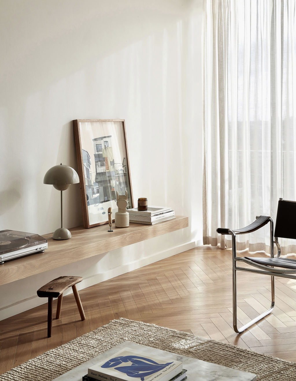
Fennessy nominates the “afternoon light and warmth” as a favourite element of their home. Soft shards of sunlight flood the bench seat beneath the window – a perfect breakfast spot. He says, ‘It’s so simple, but in an apartment every extra bit of seating and storage makes a difference”.
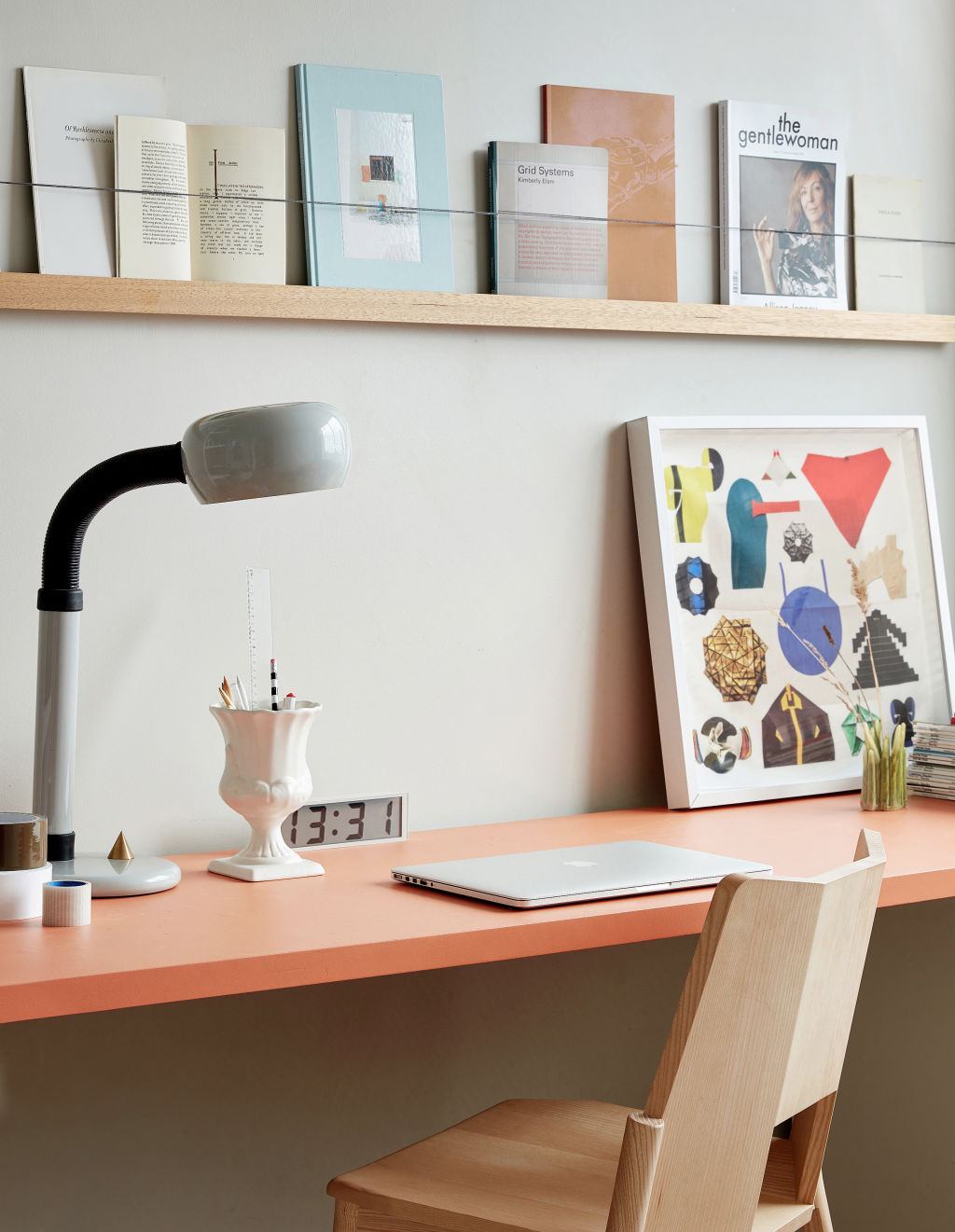
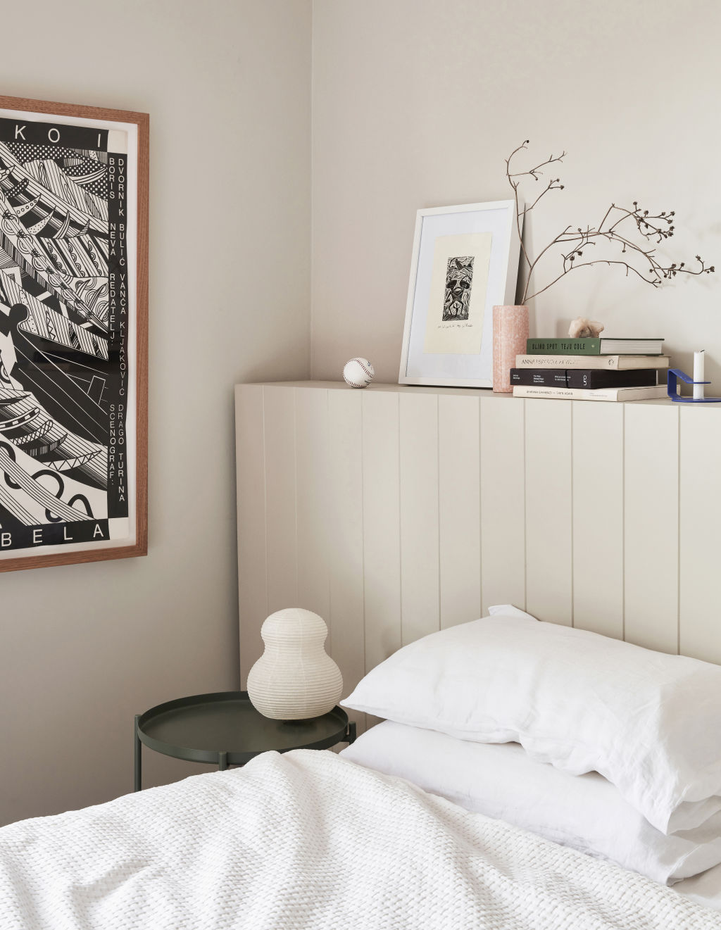
If you peer closely in one of the photos, there is a copy of Teju Cole’s book Blind Spot sitting on this shelf. In this text, the photographer and writer explains, “I am intrigued by the continuity of places, by the singing line that connects them all”. A fitting sentiment, too, for a home that mirrors the precise aesthetic of two of Australia’s most talented image makers.
The New Pastel Palette
One of the easiest ways to make a big impact at home is by introducing colour, and right now, we’re seeing a renewed focus on pastel hues in Australian contemporary interiors.
Still need convincing to break out the paintbrushes? Consider the following:
- Muted and neutral tones with a little warmth, such as blush, peach, and dusty pinks are a great alternative to white, injecting a subtle sense of warmth and personality, without commanding attention.
- Pastels can appear a little insipid if they’re too clean and bright (ie princess pink, or baby blue). For a more grown-up look, opt for slightly murkier, dustier version of your favourite pastel shades.
- Blush is having a moment. This edgy take on “millennial pink” simultaneously channels both a nostalgic, retro feel and a crisp, contemporary aesthetic, making it very adaptable to both old and new homes.
- As a general rule, paint colour always looks two to three shades lighter when painted on the wall than it does as a small colour swatch. Select one shade darker than the printed sample, and always paint a large test patch on the wall before committing to your final colour selection!


We thought you might like


States
Capital Cities
Capital Cities - Rentals
Popular Areas
Allhomes
More
