The Design Files: The perfectly imperfect home of stylist Amanda Henderson-Marks
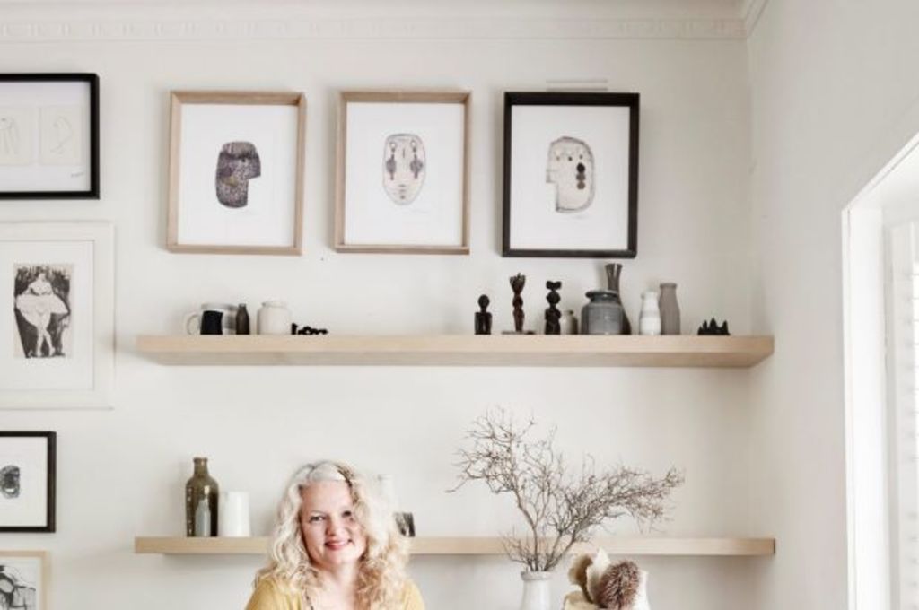
WHO: Amanda Henderson-Marks and Michael Marks and their children Gwennyth and Isaac.
WHERE: Northcote, VIC
WHAT: Renovated double-fronted Edwardian family home.
The Northcote home of stylist, interior designer and retailer Amanda Henderson-Marks and her family is perfectly imperfect. Unfinished and ever-changing, this family home is a serene, pared back space, layered with second-hand furniture and vintage finds.
When Amanda and her husband Michael (a landscape gardener) originally spotted this rambling double-fronted Edwardian house for sale online more than seven years ago, they were instantly drawn to it. With their combined creative skills, they knew they would be able to create something special here.
As soon as they took possession of their home, the pair set to work. Carpets were removed, old doors replaced and interior walls painted. Amanda designed a new kitchen, and Michael poured the dark charcoal concrete benches himself.
Floating shelves were selected in favour of overhead kitchen cupboards, to display Amanda’s ever-changing collection of ceramics, chopping boards and kitchenware, and an array of vintage lighting was sourced to complete the look.
More recently, the pair have focused on their sleeping quarters. The master bedroom has been extended and updated, and an en suite added, in what was previously an old laundry.
With its deep blue walls, the bedroom is moody and dramatic, though west-facing windows ensure the room never feels dark or cold. “The main bedroom has a large set of French doors which takes in the afternoon sun, so we painted this room in Dulux Companion, a beautiful inky blue which balances perfectly,” explains Amanda.
Though carefully considered, Amanda’s decorating aesthetic is intuitive rather than strategic. “Our home is very relaxed and easy to live in, it’s not precious,” she says.
Employing a neutral palette, Amanda has created a cosy space, filled with second-hand furniture, collections of vintage ceramics, stacks of books and magazines, artworks, prints, textured cushions and throws.
A consistent colour and materials palette ensures the place feels calm rather than cluttered. “Our home is ‘chalky neat rustic’, if that makes sense?,” Amanda says. It does, perfectly.
The Design Files guide to using neutrals
To get the most out of a neutral palette, look beyond white walls and timber floors.
First, choose a white-ish base colour with a warm undertone – Dulux Whisper White is a great creamy white base. Next, layer it up. Introduce various shades of oatmeal / grey / beige – try a soft cream rug or seagrass matting underfoot, raw linen upholstery, and accents in grey, mushroom or even black and white.
Where colour recedes, texture is front and centre. Rustic textures work particularly well in neutral spaces – try distressed, unfinished timber furniture, and tactile handcrafted ceramics.
Soft furnishings should be super soft and inviting – try loose linen covers and an abundance of squishy, well-loved cushions.
An absence of bold colour leaves room for braver choices when it comes to artwork, lighting and collectibles. Frame works on paper in timber, white or black frames, and cluster together for maximum effect.
A consistent colour palette requires discipline. Be strategic when buying or collecting for your home.
We recommend
We thought you might like
States
Capital Cities
Capital Cities - Rentals
Popular Areas
Allhomes
More
