The Design Files: Thornbury shopfront transformed into charming home

Who: Neighbourhood Studio owner and artist Lucas Wearne and social worker Lucy Hyslop
What: A converted shopfront home
Where: Thornbury
Neighbourhood Studio owner and artist Lucas Wearne and social worker Lucy Hyslop first came across this Thornbury shopfront when it was listed as a commercial building for sale.
“At the time, it was way out of our price range, however, we were just trying to get a gauge on the market, so we were looking at everything,” says Wearne.
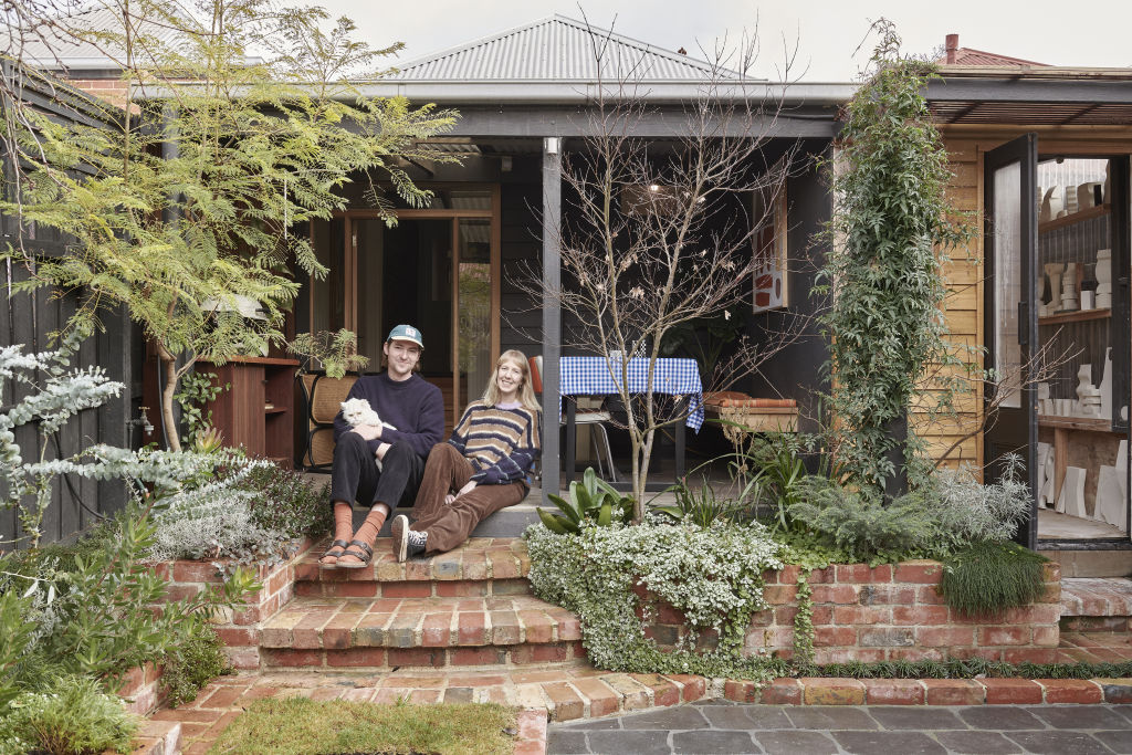
Wearne and Hyslop initially missed out on the place, but a few months later, they noticed it was back on the market. The original sale had fallen through due to complications caused by the pandemic.
This time, the property had been gutted, and it was listed at a reduced price. “It was really just the right time, right place sort of moment,” says Wearne. “The other options in our range for the area would have been limited to units or apartments. We feel extremely fortunate to be able to own a house (albeit unconventional) in Thornbury!”
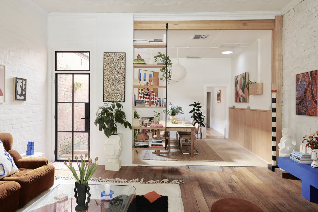
COVID lockdowns meant Wearne and Hyslop could only briefly inspect the property prior to purchasing. They initially planned to move in within two weeks of taking possession before realising a much bigger job was required.
“Every wall was crumbling, large sections of the floor were missing, the old commercial kitchen had been ripped out, there were no doors, and there were exposed wires,” says Wearne. “We ended up spending just over six weeks (working non-stop) before it was at a point that we could move in.”
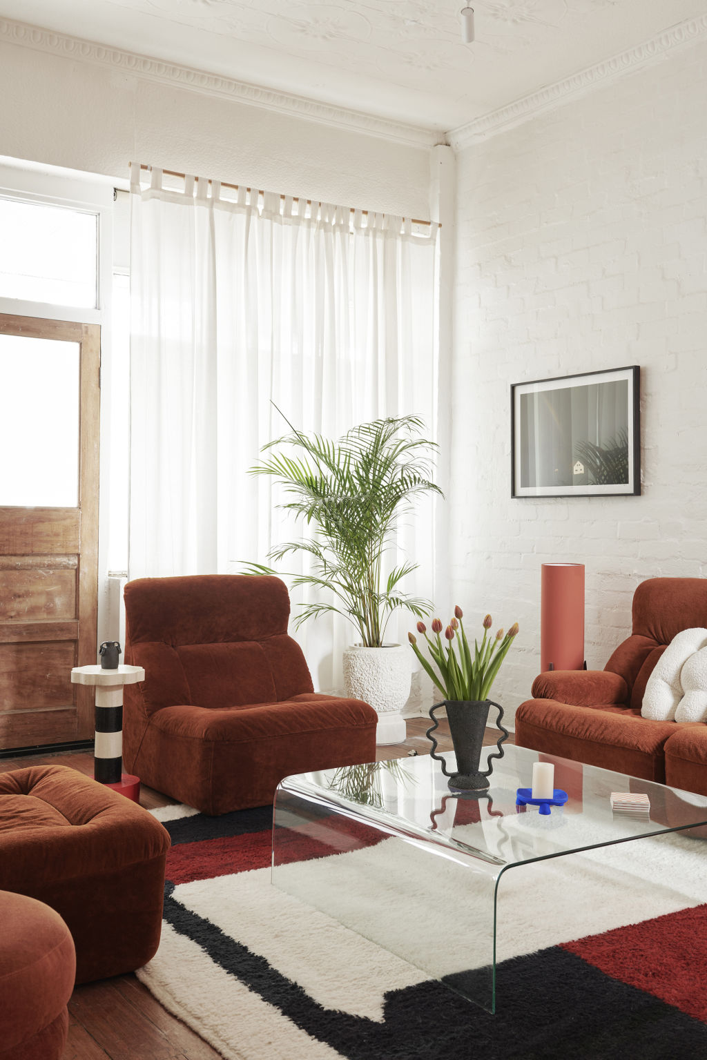
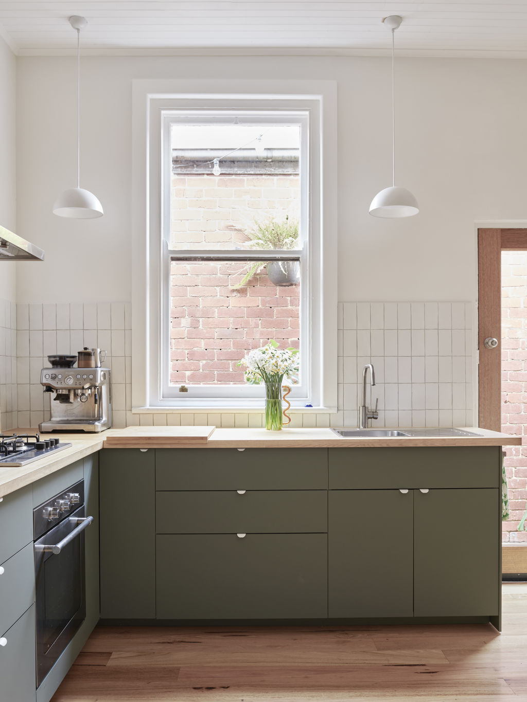
The main feature of the DIY renovation is the kitchen, which features new floors, walls, ceilings, and IKEA cabinets. The remainder of the home has been patched up and painted, with Dulux Natural White walls highlighting the original exposed brick walls and pressed metal ceilings.
Wearne and Hyslop also updated the garden, including a tiny backyard studio where Wearne creates his functional limestone objects and sculptures for Neighbourhood Studio.
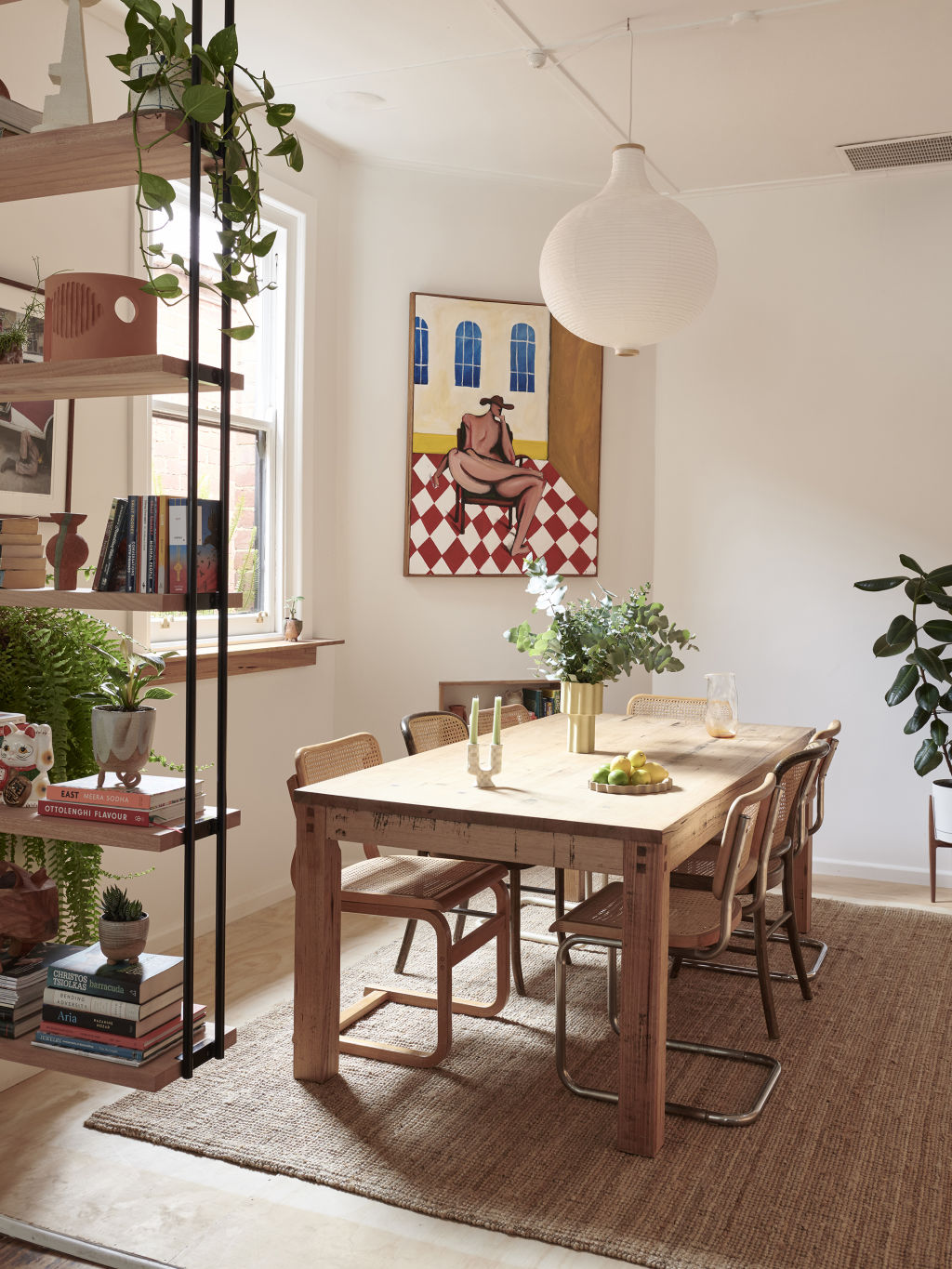
The personality of Wearne and Hyslop’s home interiors lies in the combination of contrasting styles and the display of artworks by clever friends.
“We try to only bring things in that we really love and are sure we want to hang on to for a long time,” says Wearne. “There’s definitely no grand vision or plan; it’s just what feels good, what makes us feel happy and comfortable in the space.”
The charming outcome is just version one of Wearne and Hyslop’s home. The pair are currently in talks with an architect to undergo a more extensive renovation.
How to tackle a DIY renovation
It’s getting more and more expensive to build and renovate. If the DIY approach is your only option, here are some handy pointers.
- Start with an exhaustive wishlist, then create a to-do list in priority order.
- Kitchens and bathrooms are always the most complex and expensive rooms to renovate. Try to minimise moving plumbing and electrical appliances if you can, and look for off-the-shelf solutions for these rooms, such as flat-packed cabinetry or an IKEA kitchen that integrates easily with existing appliances.
- Make good. Be wary of ripping out doors, windows, walls and floors too enthusiastically. It’s always cheaper and easier to make cosmetic updates to existing features than to demolish and replace them.
- Prioritise function over form. Aim to have the functional parts of your home in working order before you worry about decoration. Aesthetic details such as paint, door handles, light fittings etc., can come with time.
We recommend
States
Capital Cities
Capital Cities - Rentals
Popular Areas
Allhomes
More
- © 2025, CoStar Group Inc.
