The interior designer whose work is anything but beige
It’s a testament to how masterly is her use of interior and furnishing colour that even when Chelsea Hing’s studio doesn’t enter specific paint and interior design competitions, her practice’s name will sometimes appear on the shortlists.
In this long age of generic white-outs, or tonal grey-scales – where black becomes simultaneously a feature trim and a neutral – the Melbourne designer’s record of doing lush and gorgeous colour schemes that are so suitable to both room situations and client personalities has earned many admirers, among them name experts and critics.
Neale Whittaker credits Hing as being “one of the most original designers working in Australia today”, specifically citing her “confident command of colour, scale, symmetry – and surprise”.
Listen to episode seven of Domain’s podcast Somewhere Else:
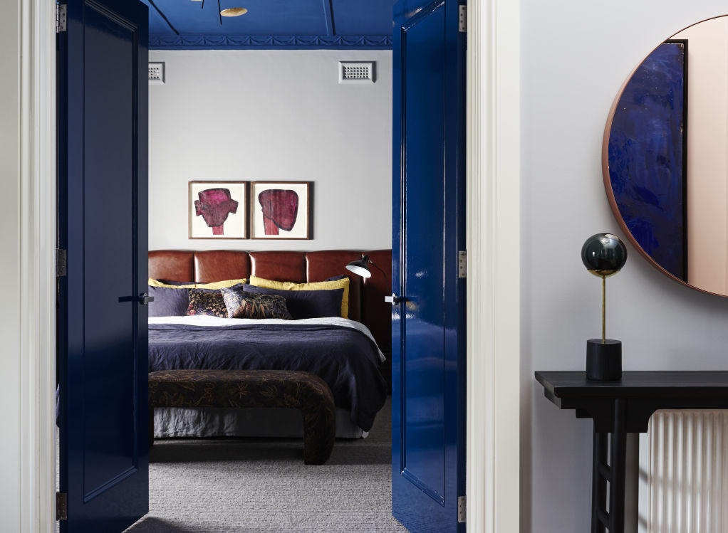
Indeed, how much of a surprise is it to see a Californian bungalow that Hing refreshed in Camberwell sporting quite so much French blue?
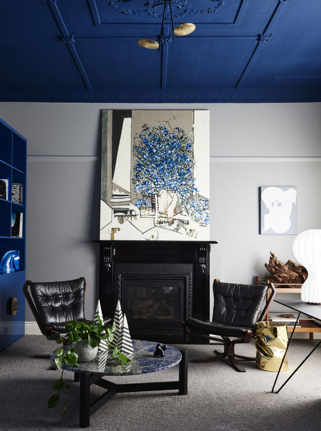
It’s used in high gloss on doors and new cabinetry, and more matt on the decorative plaster ceilings, in paintings and even reappears in flecks in the sitting room’s circular coffee table.
This scheme that in 2016 scored the Best Use of Colour in the House & Garden Top 50 Rooms contest happened, she says, due to a “tech savvy client who was used to bold ideas which meant we could push the envelope. It was also a way of dealing with less-than-perfect ceilings.”
Hing describes the ceiling paint job as “a minor cosmetic change”. And with her decades of experience that might be so. But the question begs of how a domestic amateur might risk doing pigmented gusto without going overboard?

“It’s experience. It comes from trial and error. But you have to back yourself with taking a risk that it will work out. You need to find the sweet spot of having just enough,” she says.
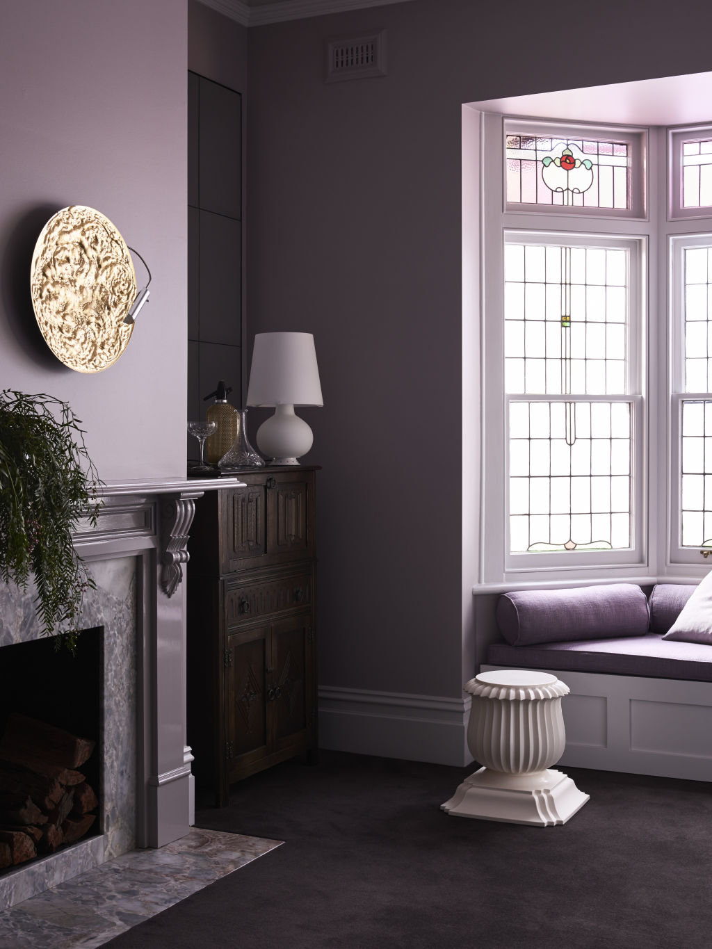
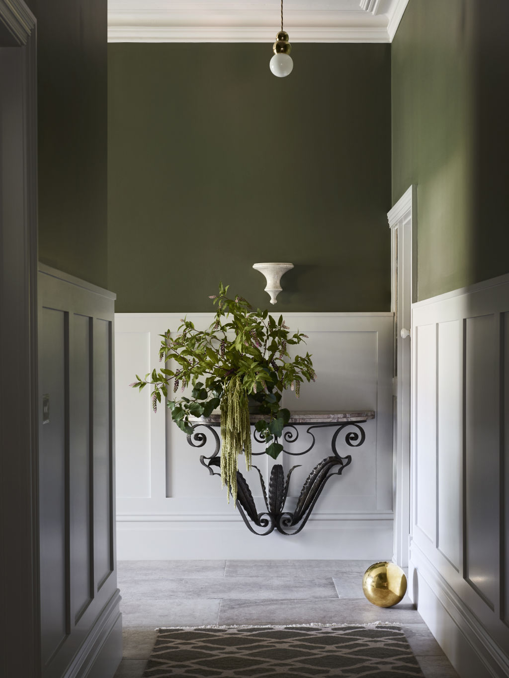
In an Edwardian house in Glen Iris, too much would have been doing the whole of the entry hallway in “a mossy green” inspired by the detail in the original stained-glass windows beside the front door. “In a light-starved space, the whole wall would have been too overbearing.”
To mitigate that, Hing installed some low-level panelling that was painted white. “It’s about knowing how much colour to use without it being too much.”
In the same house, she went boldly on into the dining room and did mauve, not just on the walls, ceilings and wooden mantle but in the soft furnishings of the window seat.
“Lilac is a beautiful foil to the mossy green. And for a space that’s moody, we selected a colour that’s not pink,” Hing says.
A statement sofa in a sitting room of the home continues the pale shade of purple story.
In her schemes, even in period homes, Hing will often select manifestly contemporary and high key colour pieces that bring in extra moments of … “I don’t want to say ‘pops of colour’. But it’s about selecting colours that talk to each other in the rooms. Colours that aren’t too matchy-matchy.”
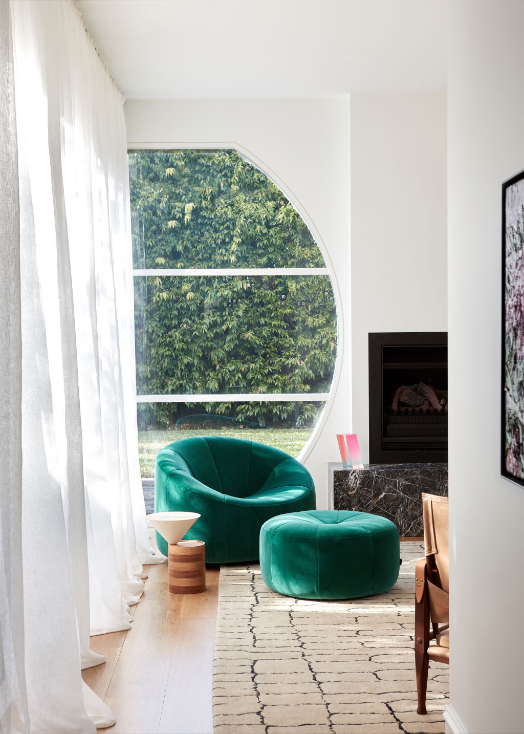
In a reasonably bright Elsternwick home “where the client wanted an exploration of colour”, the attention-grabbing elements are in jewel colourations; a purple velvet couch; an emerald green extreme modern arm chair and ottoman.
Art works and paintings were also part of the selection service. The designer initially matches the artist to the personality of the client. “Once you get that right, it’s then about figuring out what works in the space,” Hing says.
Figuring out the furniture is just as much fun. “You can do stronger showstoppers within the spaces. In choosing attention-grabbing furniture, ‘the selection’ is all about the silhouette and sculptural shape from the front to the back to the sides because you read a space in three dimensions,” she says.
“You take pictures with your eyes but the furniture needs to feel like you can just flop down in it.”
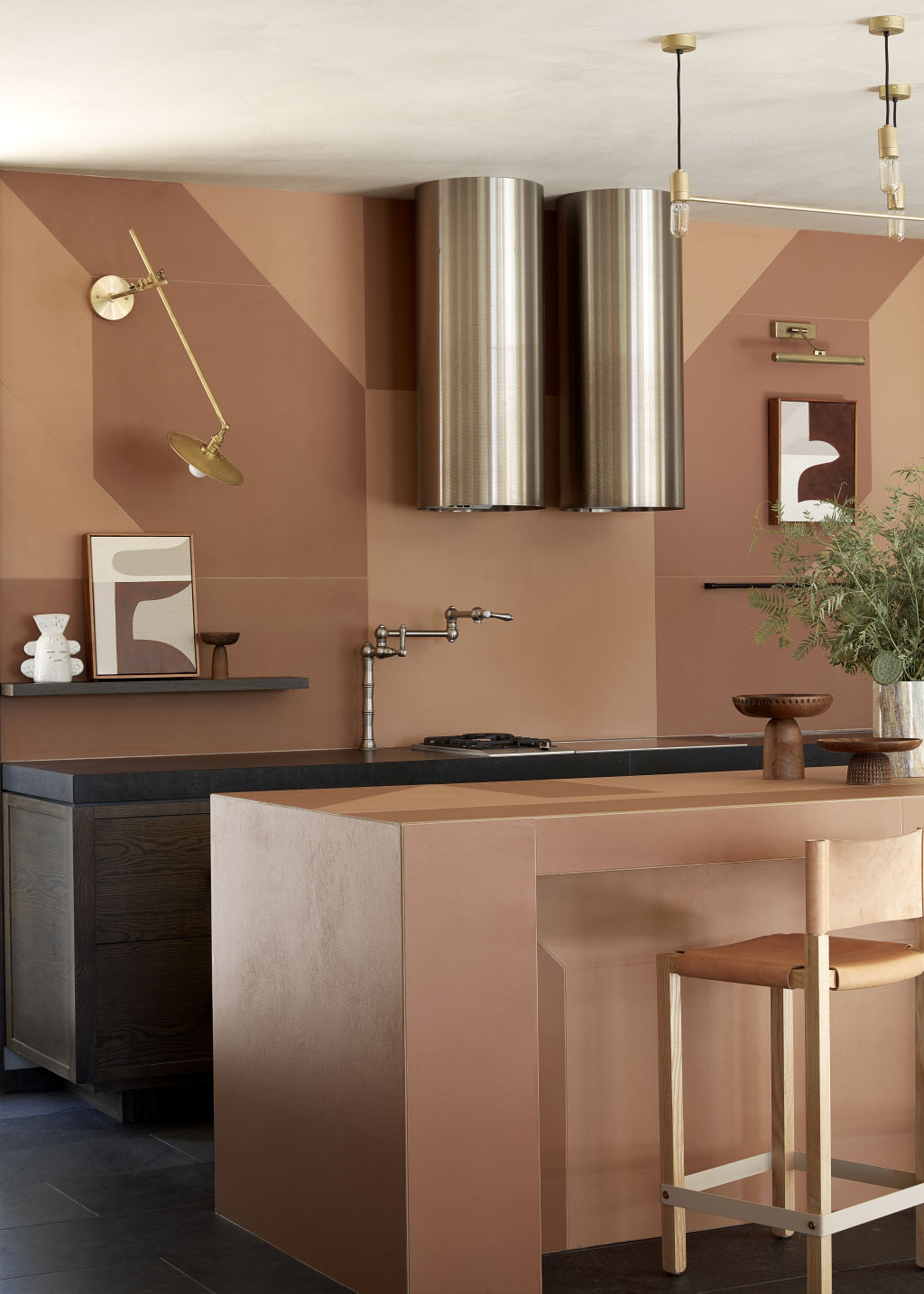
Out in the rustic Yarra Valley in a 10-year-old home that looked at hills and vineyards, the muted greens and terracotta tonings became “the earthbound palette of the house: The greys of the gums, the olive greens of the vine leaves, the blush of the distant soil were all taken from the landscape”.
“The kitchen and bathroom presented the best opportunity for a good play. In the bathrooms we used incredibly beautiful and textured terracotta tiles, brass fittings, sand-blasted oak timbers and a concrete bath.”
For Hing, colour is such an essential decorating tool because “it is so uplifting. It is also a reminder not to take ourselves too seriously.”
We recommend


We thought you might like
States
Capital Cities
Capital Cities - Rentals
Popular Areas
Allhomes
More
