The Lighthouse by Shona McElroy is a beacon of style perched on the Vaucluse cliffs
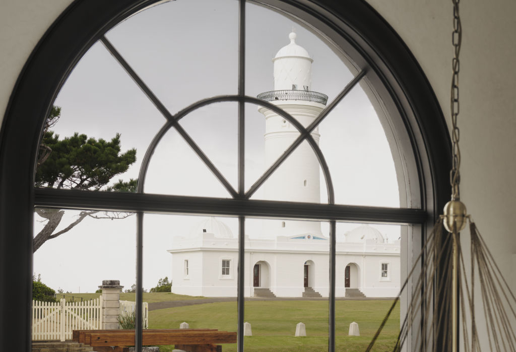
A reimagined Tuscan-style home perches on the side of a cliff in Vaucluse just steps away from one of Australia’s oldest lighthouses. Beautifully elevated, it breathes in pristine views of the harbour, bridge and the Blue Mountains.
Designer Shona McElroy from Smac Studio’s first reaction when she visited the property was “pure love”. “The previous owner was an architect who built it for his family in the ’70s after a trip to Tuscany,” she says. “It felt important to honour his vision and preserve the Italian spirit of the house.”
The new owners wanted large, melded spaces filled with natural light and elegance. Fortunately, the front of the house presented the designer with graceful architectural elements to find her inspiration.
“The formal entry, sweeping staircase, double void and arched windows looking out to the lighthouse were all there,” she recalls. “The layout at the rear, however, needed to be opened right up.”
The extensive renovation saw three small rooms rejigged into an expansive kitchen, living and dining area. The rear wall was moved to carve out more internal space.
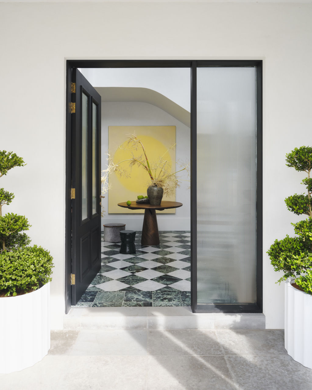
The foyer’s original verdi alpi stone floor was modernised with a chequerboard pattern comprising the same stone alternated with Carrara marble. The original arched windows alongside new sleek black steel balustrades provide graphic definition to the space. The lime-washed orange walls and angular staircase have been smoothed with Venetian plaster, and the staircases’ curves create an architectural hug on arrival.
“The light-filled space full of soft white curves draws the eye up to a floating cloud-like chandelier,” says McElroy. “It’s a heavenly sense of arrival.”
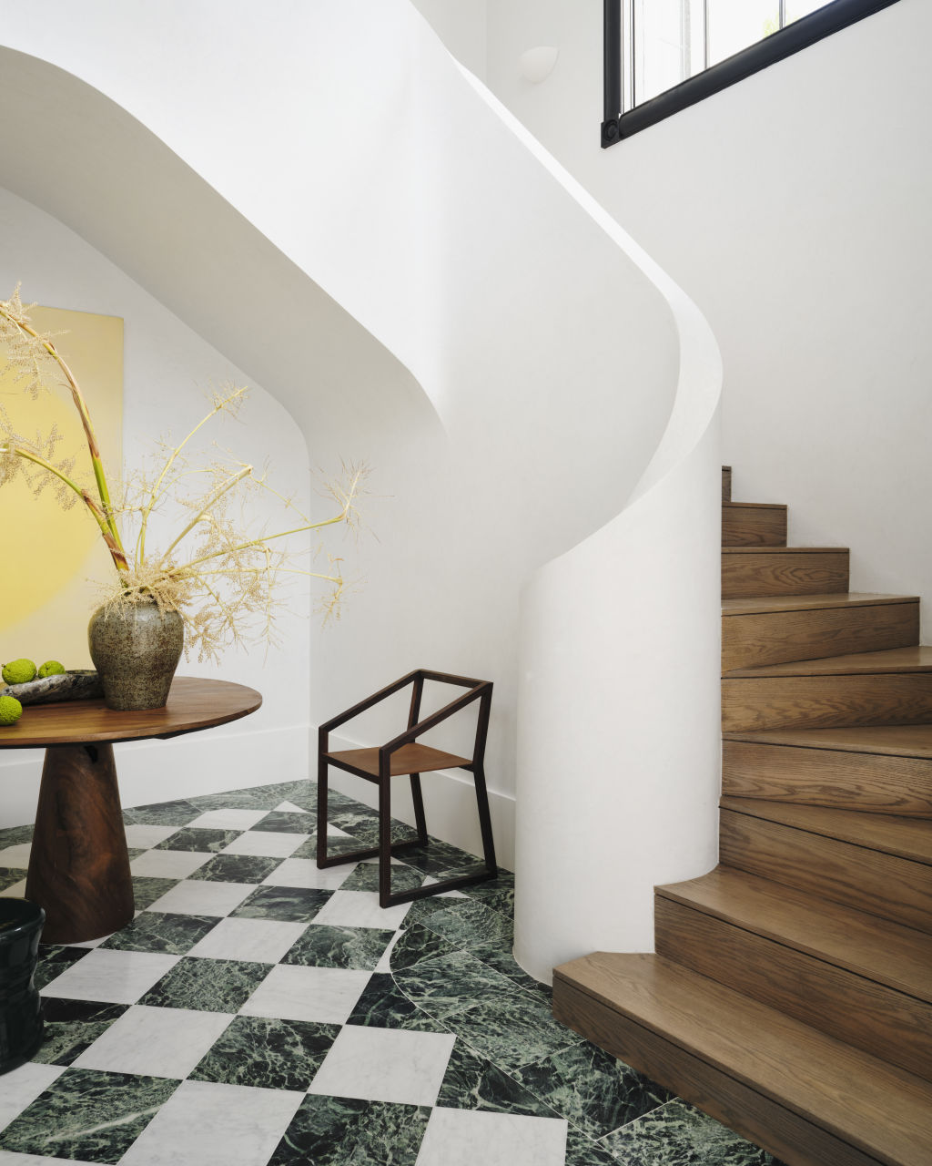
Each space is calm and luminous, allowing the intrinsic beauty of carefully crafted surfaces, materials and finishes to stand out. Combining elements into a seamless whole sums up McElroy’s technique of blending materials and design features into something new and exciting. “I love different layers, materials and the shifts of light you experience as you move through the spaces,” she says.
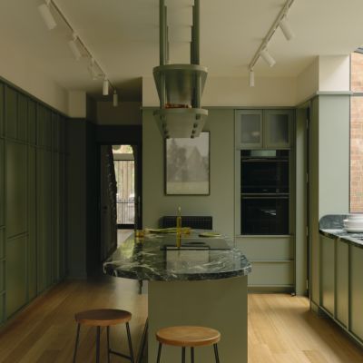
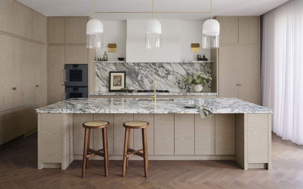
The kitchen’s original U-shape configuration in dark mahogany was enlarged and reorientated towards the living spaces. Its fresh, mid-tone timber veneer cabinetry with datum lines meshes the nostalgic and the contemporary, similar to the other joinery throughout the home. Arabescato stone and a curved plaster range hood add luxury, while open shelves imbue personality into the space. “We ummed and ahhed over including a butler’s pantry, but spatially, it didn’t work,” says McElroy. “Instead, we included lots of storage beneath the island bench and an appliance cabinet that opens up and slides into pocket doors.”
Beautiful lighting features in every space. Here, simple brass folded wall sconces by Kelly Wearstler flank the range hood, and a trio of glass Articolo pendants float above the island, catching the eye without overwhelming the space. “Each light is an art object during the day, and at night, creates a soft, ambient, romantic glow,” the designer says.
The formal spaces’ once dark timber symmetrical portals are now wrapped in arabescato marble, creating an elegant entrance into the dining and cigar room. In the latter, a traditional grey-green tone lines the walls, and the bar’s bronze veneer and marble splashback add layers of decadence.
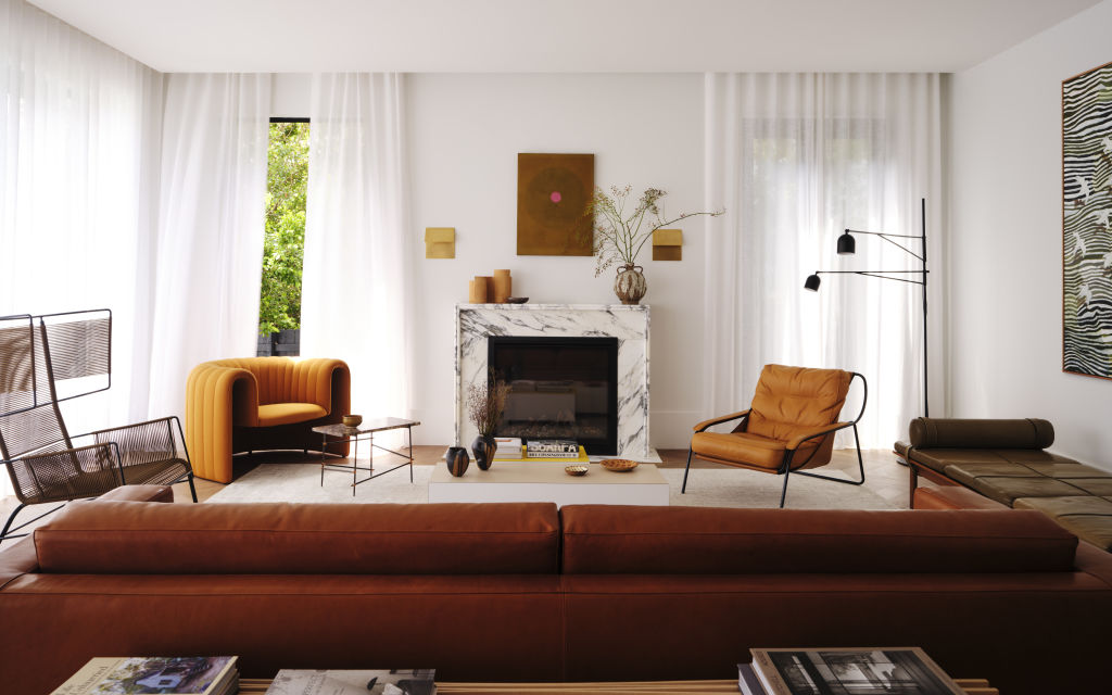
The living room revolves around its original fireplace and leans on mid-century style with caramel tones, leather sofas, and sculptural forms. “It feels earthy, rich and warm and is a little unexpected for a classic house,” she says.
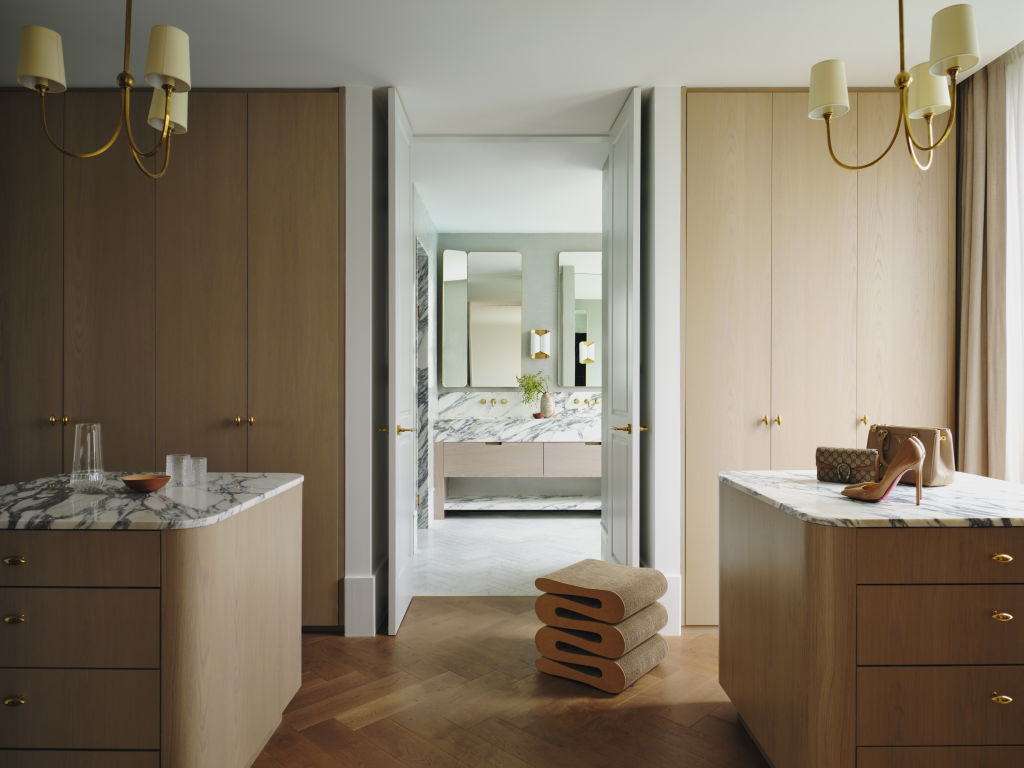
One of the designer’s favourite spaces is the walk-in wardrobe with double doors leading into the ensuite. Complete with twin marble-topped islands, seamless cabinetry and automatic lighting in the cabinetry, McElroy says it feels like a high-end fashion boutique. “It’s incredibly atmospheric and fun!” she says.
McElroy is known for her glamorous powder rooms, and this one does not disappoint. “It’s a beautiful space but also represents the most dramatic version of the home’s theme,” she says of the room swathed in marble and golden grasscloth wallpaper.
“Of all the homes I have designed, this is the one that epitomises the way I love to live,” she says. “It will still look great in 30 years, yet its formal spaces, symmetry and palette allow it the flexibility to change its style over time.”
We recommend
We thought you might like
States
Capital Cities
Capital Cities - Rentals
Popular Areas
Allhomes
More
