The most important decision to make when redesigning the facade of your home
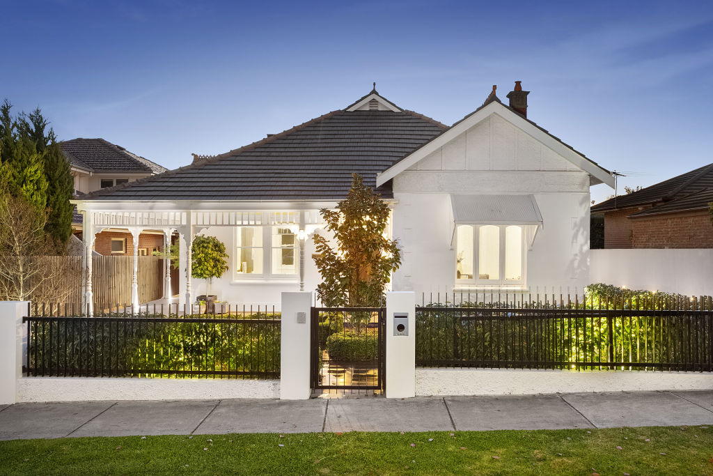
If you know anything about design, you’d know that there is more to a beautiful facade than just choosing the right colours. Creating a strong focal point and achieving cohesion and balance through your entire design is central to the overall look of your home.
But there’s another step in the design process that all designers understand and use, and that is the notion of balancing hard features with those that are softer in appearance. Although it’s not as widely known in the general population, it’s something that creates a much more aesthetically pleasing look for your facade.
Hard features include those with darker colours, stronger lines, more structured landscaping and often a squarer, more angular or chunky effect. Soft features are those with lighter colours, more curves, softer landscaping and usually a more fluid appearance.
Find out what it’s like to live in a tiny house on Somewhere Else:
Of course, some houses have a mixture of both, but overall most tend to be either on the hard and structured side or soft and ornate side. Deciding which overall look you want for your facade is important to do early on. This decision will have a bearing on paint colour, materials used and the type of landscaping you do.
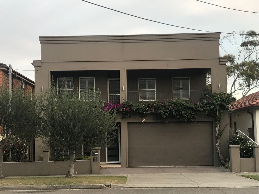
A beautiful facade has depth, contrast, and visual interest. Identifying whether your house is more hard or soft in appearance will help you work out how to balance it and use contrast to achieve a more visually interesting facade.
If what you’ve got on your facade is not working, think of the opposite (in terms of hard or soft) and consider adding in those features to balance it out. If it’s too hard, add in the soft and vice versa.
For example, if your house is a big brick 1980s house, it’s probably quite hard-looking. It’s likely to be angular, chunky, very structured and could be lacking personality because it’s one big solid mass with not much to visually break it up. To balance that, you could add softness.
You might render it to add contrast through colour, but more importantly, you could look at the shapes and give it some softness through landscaping, more fluid lines and using more natural materials.
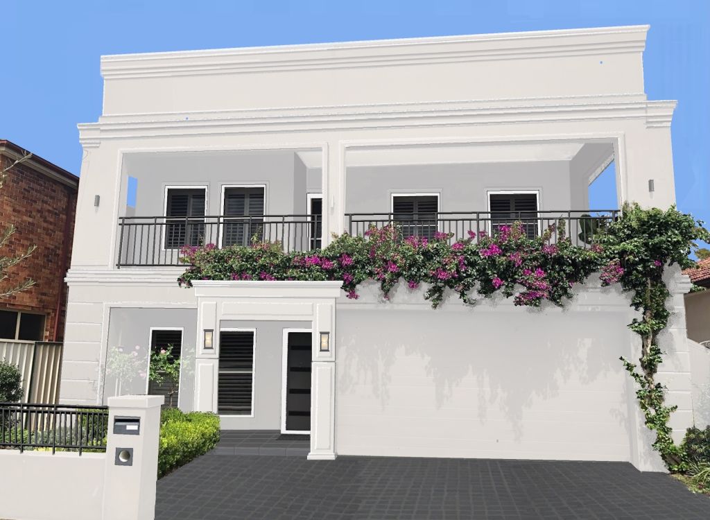
If your house is too soft and ornate, you could add more structure and depth through darker colours, stronger lines and landscaping. You would aim to make it less fluid and more entrenched or solid in appearance.
If you have trouble identifying where your house lies on the spectrum, or you need a bit of help in achieving a balanced design for the facade, consider hiring an exterior designer. A good one is worth their weight in gold, and usually far less expensive than you think.
Jane Eyles-Bennett is one of Australia’s top interior-exterior designers and owner of design firm Hotspace Consultants. Join Jane in her Facebook group Home Renovators Network Australia for design and renovation inspiration and insider tips for your home improvement projects.
We recommend
We thought you might like
States
Capital Cities
Capital Cities - Rentals
Popular Areas
Allhomes
More

