The nine decorating rules you need to know

Author: Laura Downie on Houzz
Those before-and-after shots make decorating look so easy, don’t they? As if someone just came along, waved a magic wand and every room turned out perfectly. Sadly I can’t give you the magic wand, but I can share some basic decorating principles that will help you create your own piece of magic at home. Here’s what you need to know.
1. Choose a hero
Every room needs one hero piece – something that will surprise, delight and make an impact. It might be an oversized piece of furniture in a bold colour, a fabulous rug, a work of art, or a feature wall.
Your hero piece is designed to steal the limelight. It should be the thing you fell in love with the moment you saw it, and that you might be prepared to splurge a little more on. Remember, however, to make sure it has space to breathe.
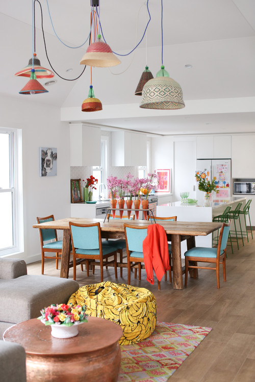
Tip: If your stage-stealing piece is a bold colour, try using hints of it elsewhere for a cohesive look, such as the pink flowers in the vase on top of the candy-coloured sideboard in this dining room.
2. Mix up shapes
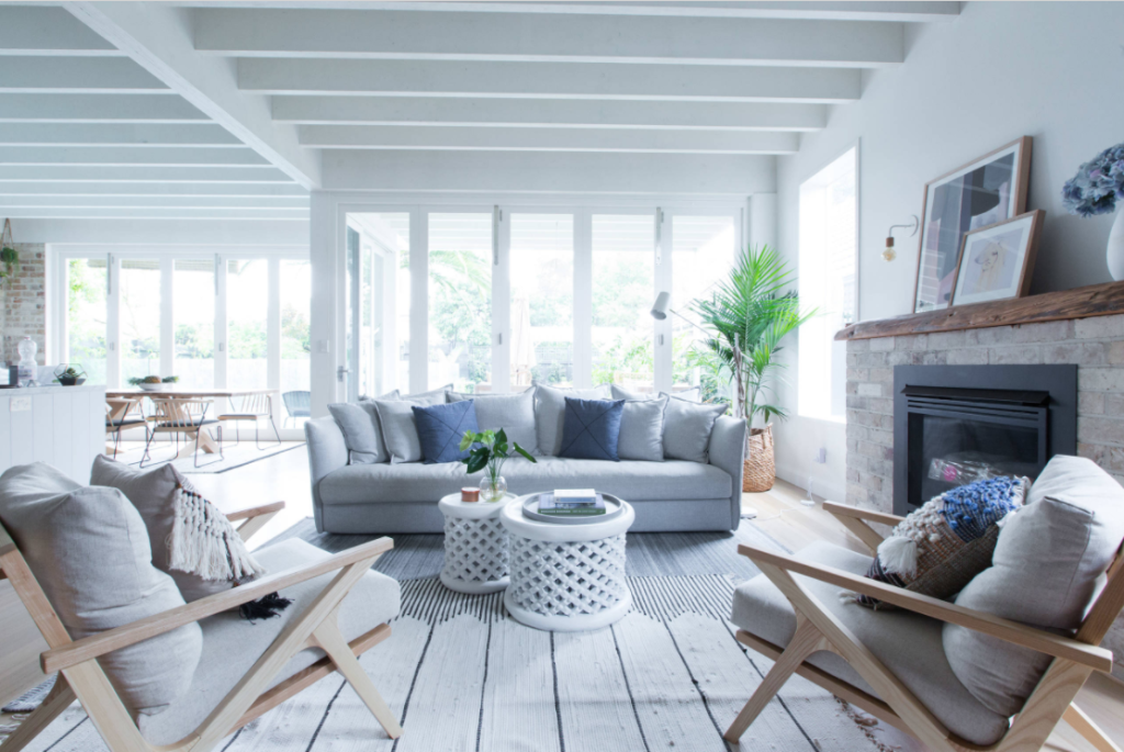
Most living rooms will have a lot of rectangles and squares – it’s simply the nature of those bigger furniture items such as sofas, sideboards and shelving units. If you notice your space has lots of lines and right angles, think about adding some circles. A round coffee table, a pair of round side tables, a round rug, a round wall hanging – the options are endless.
Tip: A round mirror is a great way to break up all those straight tile lines in a bathroom. Go as big as you can. Large-scale mirrors make a real statement and can visually enhance the sense of space in a small bathroom too.
3. Hang it right
A beautiful painting or artwork will look far better when hung at the right height. Also, having a consistent centre line throughout your home helps create a sense of harmony.
As a general rule, the centre of the artwork should be at eye level, which for the average person is 145 centimetres from the floor. Remember, that’s 145 centimetres to the centre of the art, not to the hook. Yep, I’ve made that mistake before.
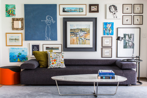
Of course all rules are made to be broken, so when it comes to a feature picture wall, well, anything goes. But a top tip is to centre the first piece – your statement artwork – at eye level and spread smaller pieces outwards from there.
4. Fake height
Do you have low ceilings? Choose low-profile furniture such as sofas and coffee tables to create the illusion of room height. Boost this with tall, slim bookshelves that draw the eye upwards and make walls and windows appear taller.
Mixing different heights in this way will also help create a relaxed vibe in your home.
Tip: To create an illusion of more space, paint the walls, skirting boards and ceiling in the same colour. This will blur the lines of where the walls end and the ceiling begins.
5. Anchor your room
A rug is the one thing I frequently note is missing from my clients’ homes, which means they’re usually high on my list of items to purchase as part of a restyle. Why? Because rugs help anchor a room, plus they’re a great way to add colour, texture and softness. Need to carve up a large, open-plan space into separate zones? A rug is your number-one tool.
Rugs are also relatively inexpensive for the impact they create.
Size matters! Be generous with the size of your rug. Remember the on-the-rug rule for your living room: go bigger to ensure that at least two legs of every furniture piece in the living area are sitting on the rug.
Make sure the rug extends at least 15 to 25 centimetres from either side of the sofa to create a balanced look. And remember, a rug is not wall-to-wall carpet – never lay a rug right up against the wall or window. Aim to leave at least 25 centimetres of visible floor around a rug.
Tip: Don’t forget about your dining table. It’s a great place for a rug too. And if you’re worried about little-people spills, go for a reversible rug for double the lifespan.
6. Love it or lose it
I’m surprised by how many times a client points to an item in their home and says “Hate that!” We so desperately want our homes to feel finished that we often rush decisions and give in to impulse buys (or sales) that weren’t really right.
But you can and must love your home and every room in it. That means filling it with things that have meaning and memories attached to them, and replacing those things that frustrate you.
7. Off the wall
A sofa need not be right up against your wall. If you have the space, pull it out a metre or two and put a shelving unit or console on the wall instead. This not only offers up styling opportunities behind the sofa, but it breaks up the room and can make it feel cosier and more inviting.
8. Include negative space
If you’re big on colour, make sure you include some spots to rest the eye. Aim to include some empty space in a room, or balance your brights out with plenty of neutrals. Here, the owners have used white-washed walls to balance out all the brights.
9. Mirrors are actually magical
You don’t need a wand, you need a mirror! Not only do they add light and depth to a room, but they can reflect views, visually expand a space, be the hero piece of a room… plus, of course, they’re practical too.
A mirror is a great investment and one that will make a huge difference to the look and feel of your space. Now, go create some magic…
We recommend
We thought you might like
States
Capital Cities
Capital Cities - Rentals
Popular Areas
Allhomes
More


