The power of negative space: Why it's an interior designer's secret weapon

Author: Janet Dunn for Houzz
The hole in a doughnut, the interval between lightning and thunder, an eloquent pause in a conversation – an absence can make a profound impression. The concept of negative space pervades all aspects of design, from art and architecture to interiors. Give it a try when decorating your own home – you may just find that resisting the urge to fill every space can become your most powerful design tool.
What is it?
We’re all familiar with the term “breathing space” – that moment when activity and stimulation stop and we have a chance to take stock and regain balance. In interiors, the area around objects – the negative space – performs the same functions. It rests our eyes and brings positive elements into clear focus, creating a subconscious sense of visual comfort and harmony.

The long view
One of the main advantages of negative space is its ability to eliminate distractions from an outstanding feature and enhance its impact. Standing back and viewing a room from where it’s most frequently seen can often reveal how an empty space could be used to highlight something you’d like to show off.
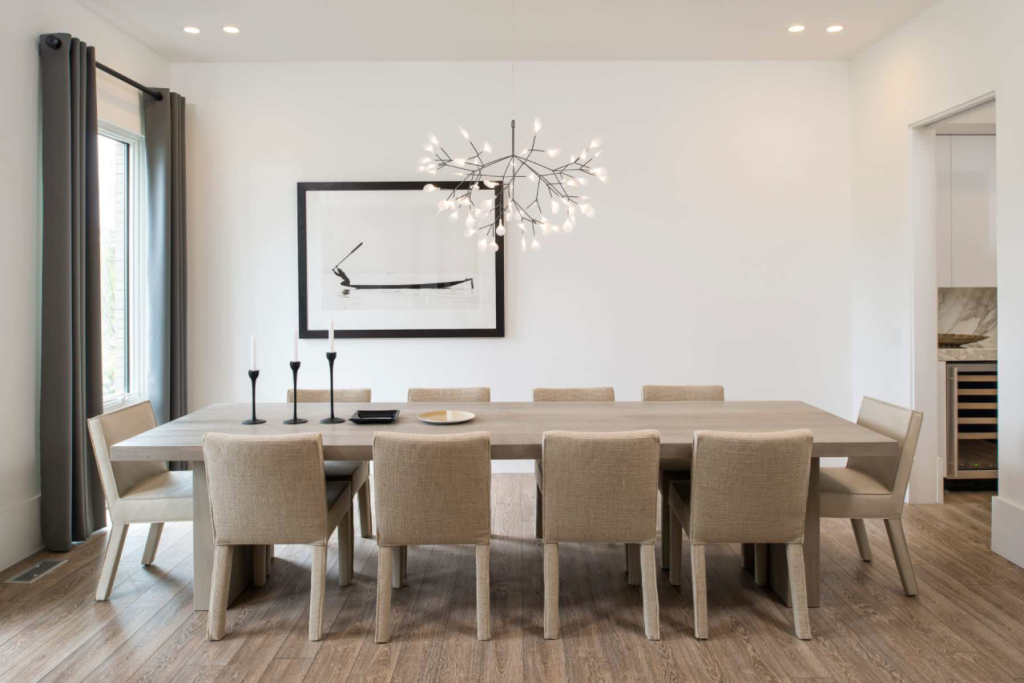
In this room, an area of negative space ensures that two striking furniture pieces and a pendant light take centre stage, without being interrupted by any objects around them.

The power of asymmetry
Our brains derive emotional pleasure from symmetry, according to physicist Alan Lightman, author of The Symmetrical Universe. In design, objects mirrored along a central axis represent order, stability and calm. But disrupting the formality of a symmetrical room, as the homeowners have done here, can add energy to an otherwise static space.

Windows with less
With a dominant wall feature such as this one, a window treatment would be superfluous. Leaving the windows bare allows the fabulous decorated wall to do the talking.

Elimination exercise
When designing a room, what we put in tends to take precedence over what we leave out. Placing a coffee table between or in front of sofas is a firmly entrenched habit. But ask yourself whether it is actually essential to your living room. Would a pair of side tables work better instead? Here, the negative space created by the absence of a central table not only gives clear air to the sculptural lines of this hanging fireplace, but opens a traffic path to the floor-to-ceiling windows.

Space-filled furniture
To see the perfect meshing of positive and negative spaces, look to mid-century chair design. Negative space is the defining element of the Wassily Chair from Knoll, designed by Marcel Breuer in 1925. The balance of precisely placed spaces with substantial leather straps and the strength of curved tubular steel give it a surprising lightness for a chair of such scale.

Perfect patterns
A pattern is a micro-example of how negative space works. A dynamic and effective design results from the interaction of negative and positive areas. Study a pattern on a fabric, tile or rug to see how they combine to draw out the essential aspects of a pattern.
Depending on perspective, negative and positive areas may swap places. Viewed one way, the four-petalled floral shape on these tiles is positive and the white becomes negative space. The illusion is reversible, revealing a pointed white diamond in a black circle.

Small tweaks can have a big impact
Working negative space into your home doesn’t mean you have to rearrange all your furniture. Small steps can be surprisingly effective.
Including some breathing space in a display cabinet, such as leaving an occasional compartment or shelf empty, will direct attention to the pieces you want to be noticed.
We recommend
States
Capital Cities
Capital Cities - Rentals
Popular Areas
Allhomes
More


