The powerful role of colour in the home
Colour is one of the most important of the myriad factors that go into creating a home’s decor and styling.
Far from just adding to a home’s character, colour can influence moods, indicate a clear purpose, increase productivity and even evoke fond memories.
Despite these known benefits, many feel daunted or overwhelmed by the prospect of introducing bold colour into their homes.
From creating a focal point to selecting mood-enhancing shades, learn how to effectively apply colour in your own home with the following expert advice.
Set the mood
One of colour’s most powerful, yet often underestimated, qualities is the ability to influence moods.
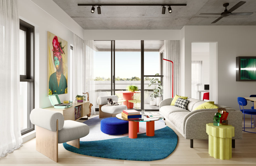
3 Bluestone Way – the latest address in the sustainability-focused East Brunswick Village (EBV) community by Banco Group – recognises this, featuring interiors specifically curated to enhance the mood of visitors.
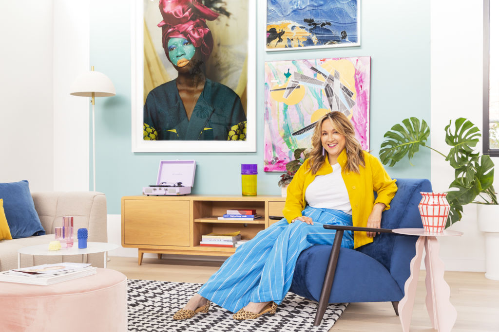
In line with the ethos of the building – which features colour-driven architecture, interiors and public art designed to uplift and calm – interior designer, trend forecaster and stylist Bree Leech designed the colour-rich display suite that uses bold furniture pieces, a hero artwork by Atong Atem and a turquoise feature wall to inspire future residents.
“We were very much going for an uplifting, happy space. There’s a casualness to the colours – it’s not taking itself too seriously,” Leech says.
Rachel Rimmer, colour designer at Hello Colour, is a fellow advocate for the meaningful role colour plays in facilitating spaces that reflect and reward their inhabitants. Specific colours she recommends include muted greens for restorative bedrooms and earthy-toned shades of terracotta for relaxed communal areas.
Interior decorator Katie Riddell’s favourite mood-enhancing colours are violet – “Generally associated with spirituality and can be a calm colour,” she says – soothing and nurturing shades of soft pink, and happy and friendly yellow.
Boost productivity
With more people working and learning from home than ever before, utilising saturated colour can be a valuable means to bolster productivity.
If you have a designated study, office or work zone, try incorporating shades of vibrant yellow or rich blue into the space to signify its purpose.
“Associated with calm and confidence, rich blue tones encourage deep thought and limitless ideas,” Rimmer says.
Riddell has similarly observed the power of deep blues for promoting an engaging work environment. “Recently, I’ve used blue on the background walls for my husband’s Zoom calls,” she says. “He said that his clients and colleagues have commented that the colour blue is calming, and it has drawn them in to engage with the conversation.”
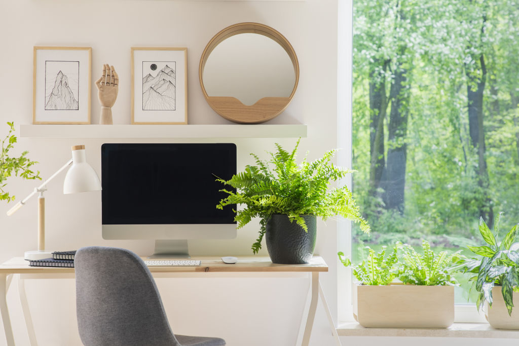
Inviting elements of the outdoors into your workspace can also encourage focus and alertness in home work environments, as interior designer and decorator Becc Burgmann explains.
“Too much white in an office can look and feel clinical, making you counterproductive,” Burgmann says. “There is nothing more reinvigorating than getting outside for fresh air and a walk, especially for clarity, so bringing some of that greenery from outdoors in can create a more productive space.”
Add unique character
Styling with colour is the simplest way to add character that is reflective of your personality and taste.
This doesn’t have to be a major commitment, as showcased in the 3 Bluestone Way display suite that features pops of colour for maximum impact.
“We selected one section of the display suite and created a block of colour on the wall,” Leech says. “It’s a really great example that you don’t need to paint every wall in the house; you can actually create a focal point with colour.”
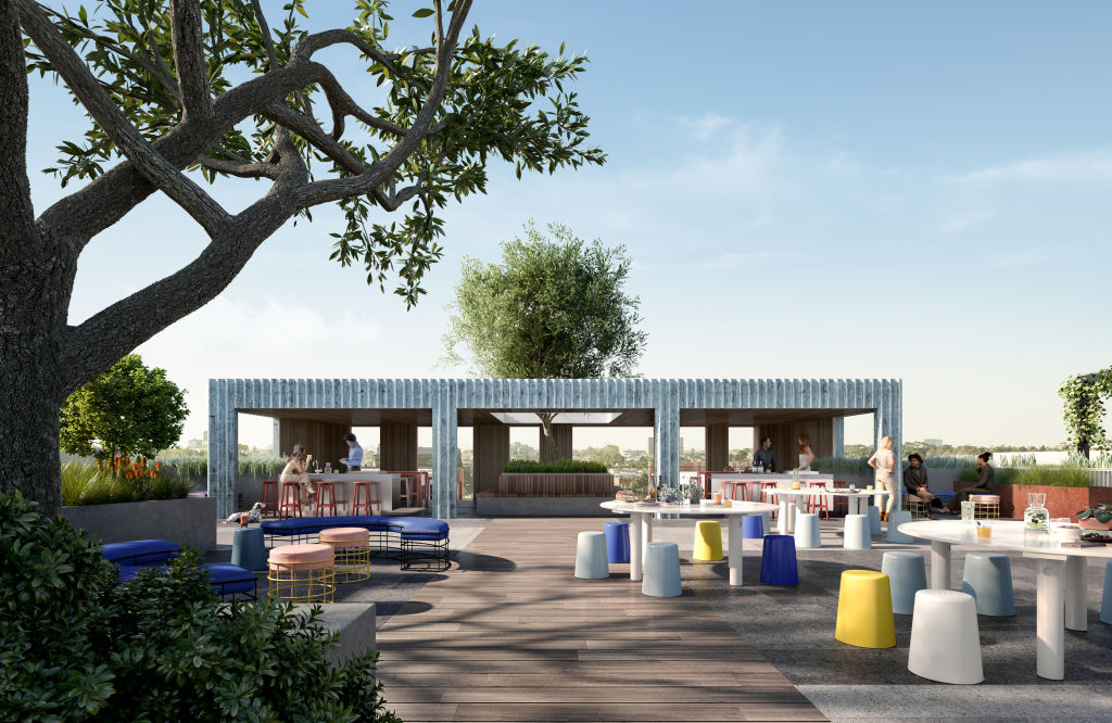
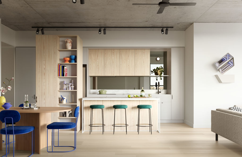
3 Bluestone Way, which has been designed for the apartments to be operationally carbon-neutral, also features pops of colour on the front of the building, with three maroon-hued panels providing an earthy aesthetic. On the rooftop, residents will be able to take in 360-degree views among a maze of colourful, LED-lit garden beds, portable seating, art displays, pergolas and barbecue spaces.
To ensure the longevity of your colour palette, Burgmann recommends choosing neutral shades for investment pieces such as sofas, while being more playful with accessories and smaller furniture pieces.
Still can’t decide on an appropriate colour palette? Throw the rulebook out the window and reflect on the colours that truly speak to you.
“You don’t need to think about what everyone else says,” Leech says. “What would actually make you feel good in the space?”
We recommend


States
Capital Cities
Capital Cities - Rentals
Popular Areas
Allhomes
More
