The remodelling of an elegant century-old home in Carlton North
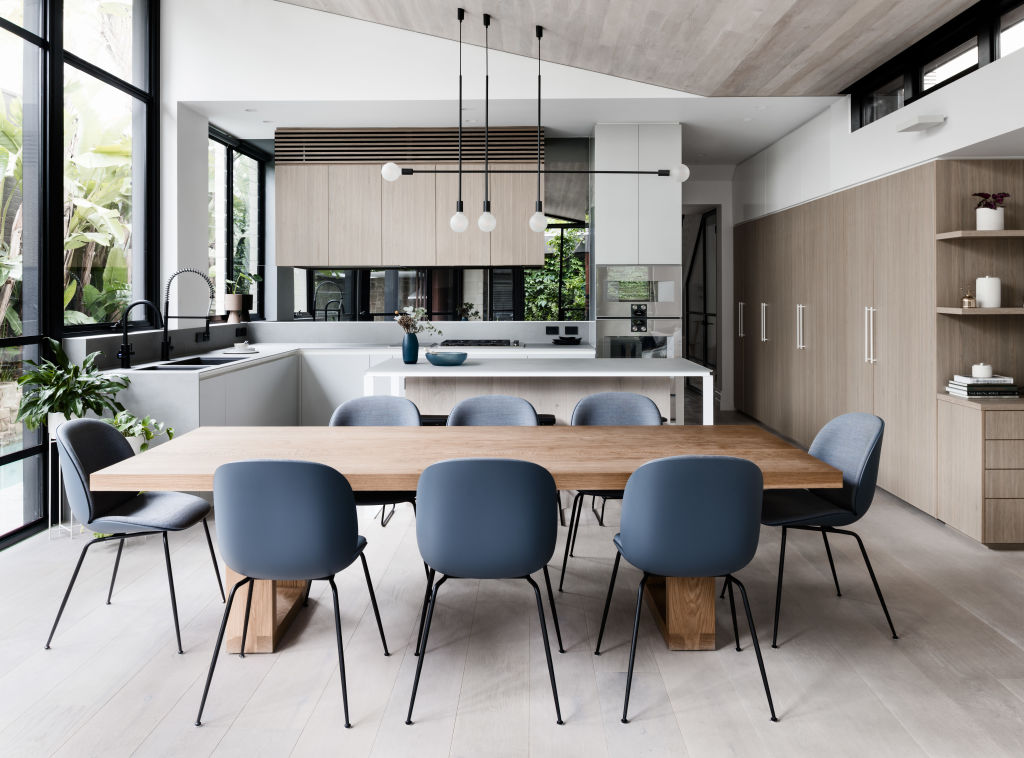
The remodelling of an elegant century-old home in Carlton North was inspired by its heritage and owner’s desire for functional modern-day family living.
“Right from the very start we were compelled by this two-storey Victorian terrace with its generous proportions and deep block,” says Nick Travers, director at Techne Architecture and Interior Design.
Love tiny houses? Find out more on Somewhere Else:
“While it was already a nice house, we identified elements we could improve for its owners,” he says. “The renovation is contemporary yet sympathetic to the Victorian-era.”
Briefed to modernise the interior for improved functionality, the work quickly expanded to include a refreshed layout and new wing.
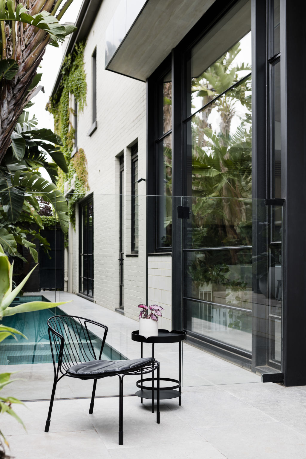
Encased in glass, it features full-height glazing framed in black steel that offers views of the gardens.
“By removing the back half of the house, we created a beautiful architectural pavilion structure with a true connection to the outdoors,” Travers says. “The main living and dining space is a highlight and connects to the existing landscape while the architectural skillion roof maximises views and sunlight into the space, creating a transparent connection with the garden.”
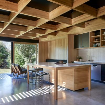
Other revisions included relocating the powder room, transforming a cupboard laundry into a serviceable space, additional storage, and a generous kitchen that drinks in views from the lush tropical garden.
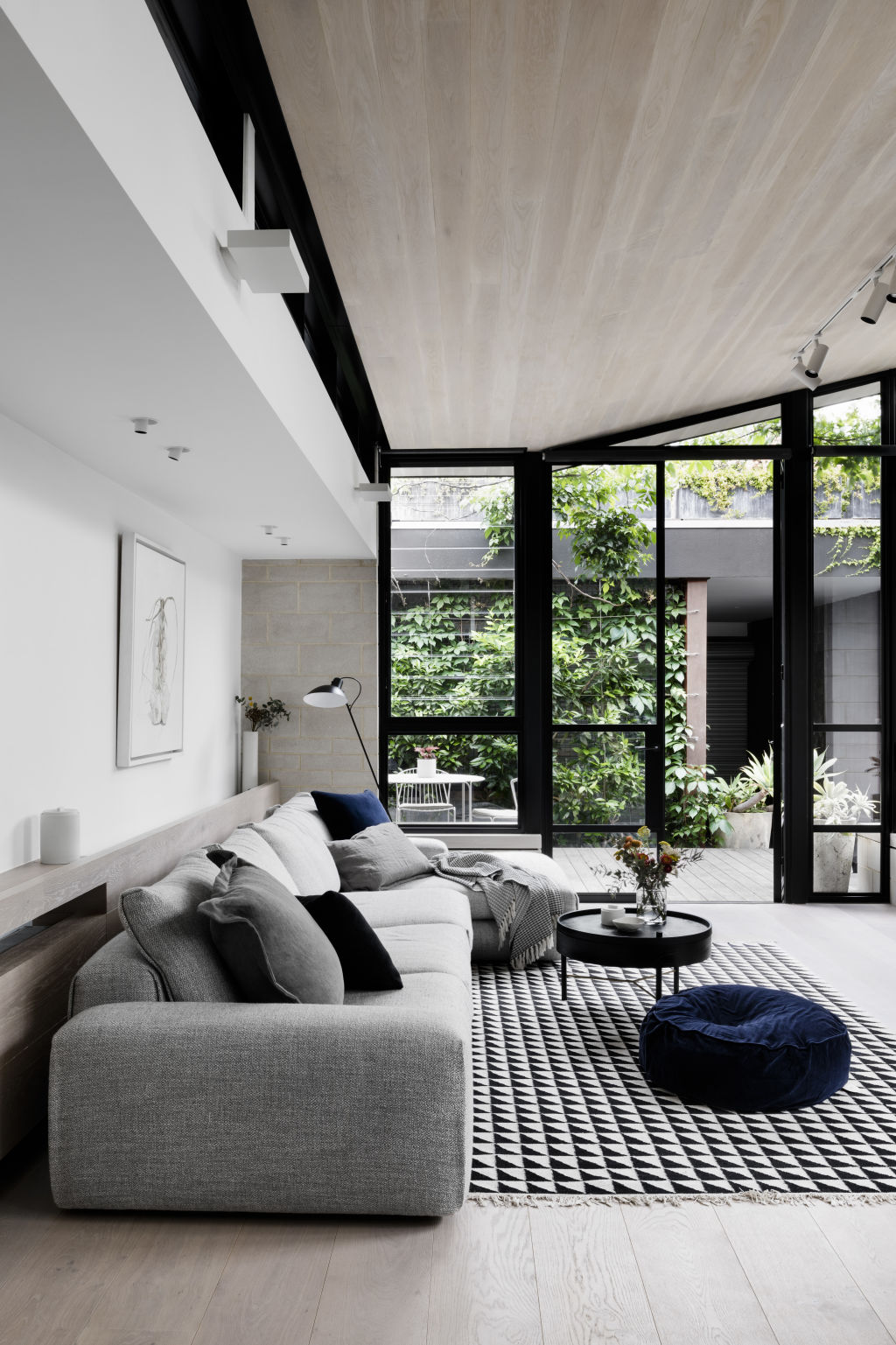
Well-considered sustainability is found in the double-glazed windows and doors throughout, louvre windows that fine tune airflow for natural cross-ventilation, and clever shading structures designed to block direct sunlight in summer and bring warmth inside during winter.
Taking design inspiration from garden houses and conservatories, each living space is sumptuous, warm and functional, providing the home with an airy spaciousness.
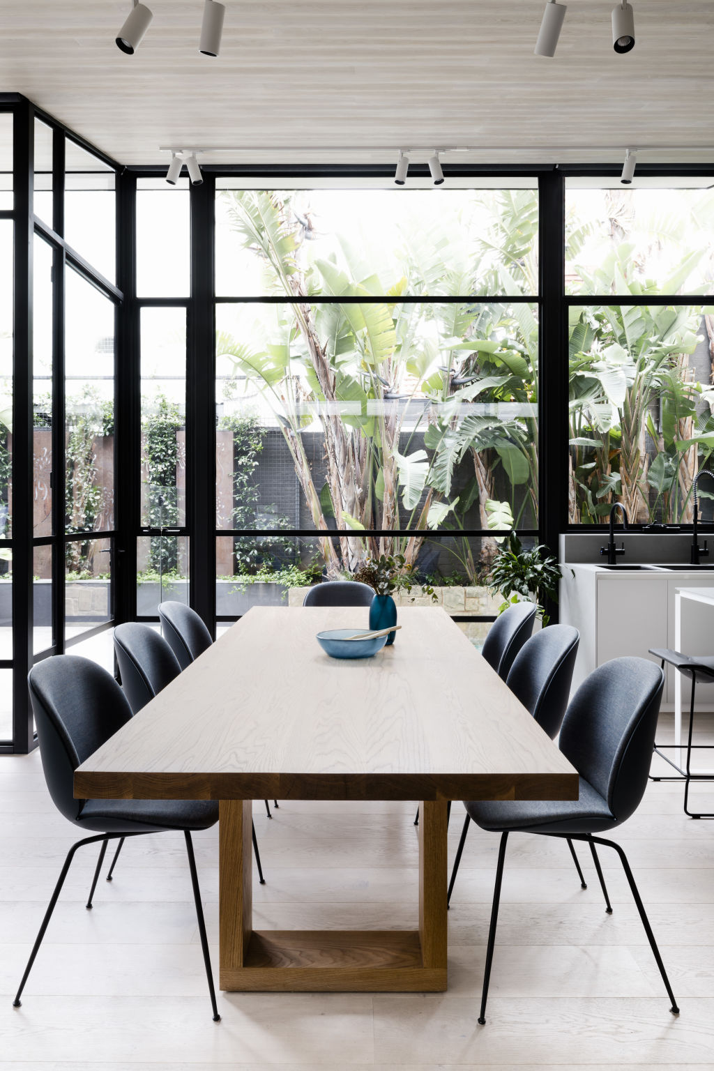
“Our aim was for a timeless aesthetic and design that will grow and evolve with the family, with spaces that are continuously adaptable,” interior designer Bianca Baldi says.
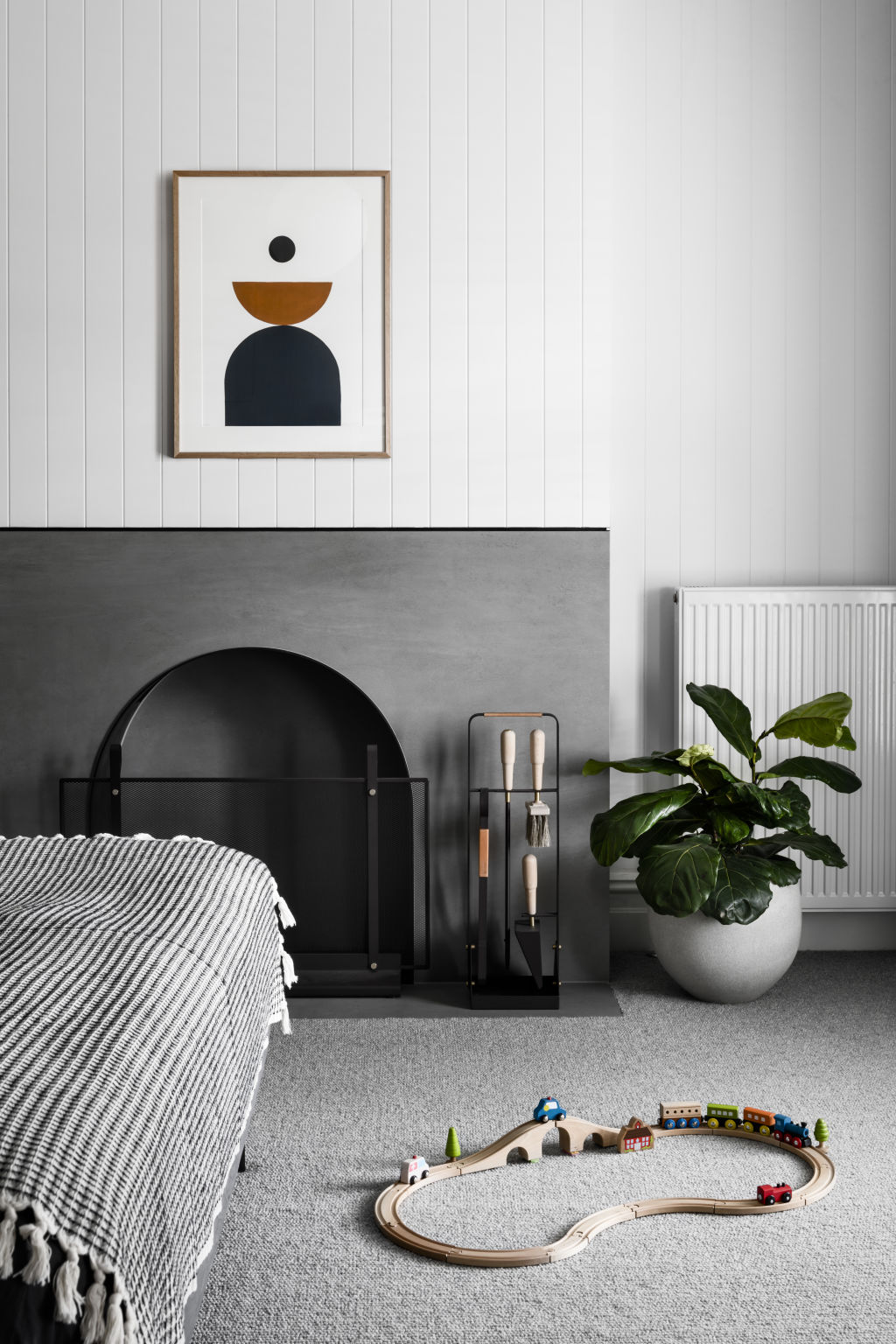
The interior is a clever mix of refined natural materials and original period features, including heritage plaster cornices, ceiling roses, and multiple fireplaces and chimneys upstairs and down that are complemented by V-groove panelling.
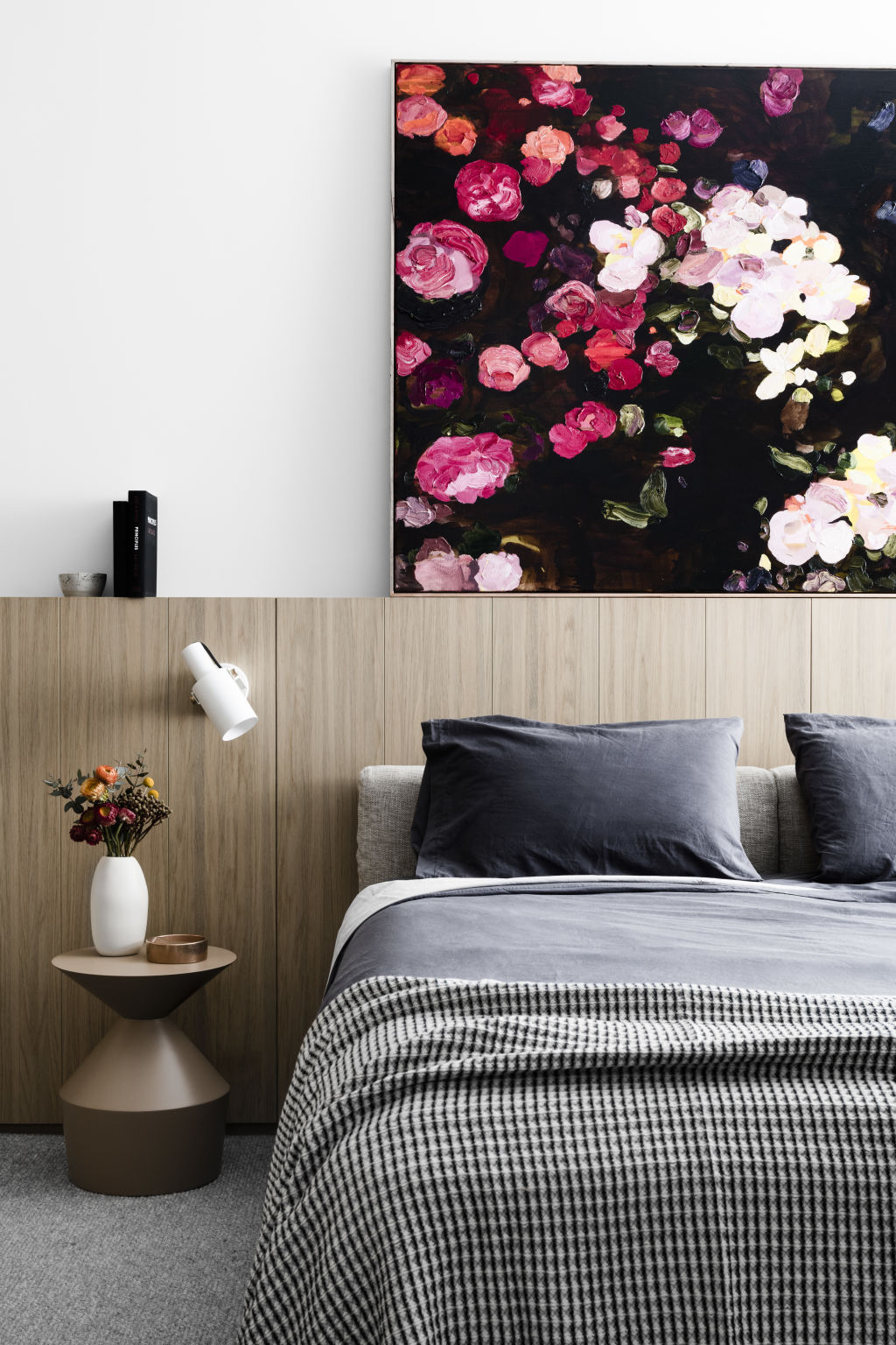
“Tranquillity was the key concept,” she says. “We used a palette of soft tones, light timbers and black and white accents, alongside fine
black detailing in the fireplace design, curtain rails, steel windows and door framing.”
The colour and material palettes provide a clean canvas for statement finishes, artwork and furnishings.
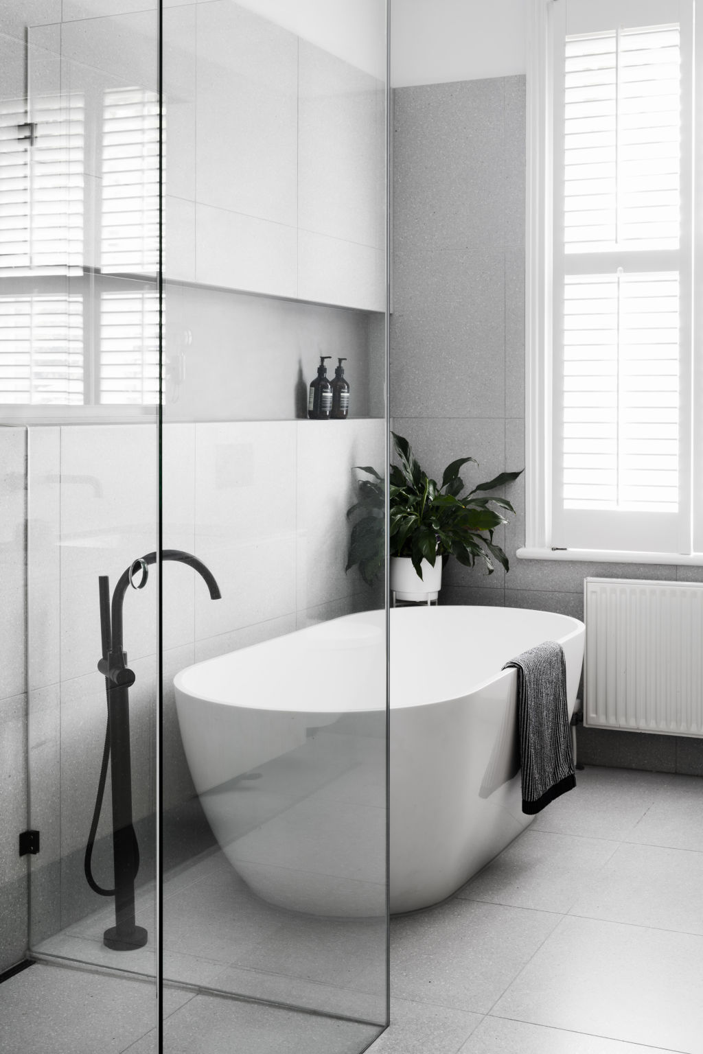
“Our selections were driven by a combination of the contemporary and timeless, with an added injection of colour,” says Baldi.
Charcoal and light-coloured porcelain features on mantelpieces and benchtops, while supple caramel leathers, richly coloured textiles, and plush textures, are peppered throughout for a feeling of comfort and equilibrium. “We are proud of the mix of raw and refined materiality throughout,” adds Travers.
Style notes
Dining chair
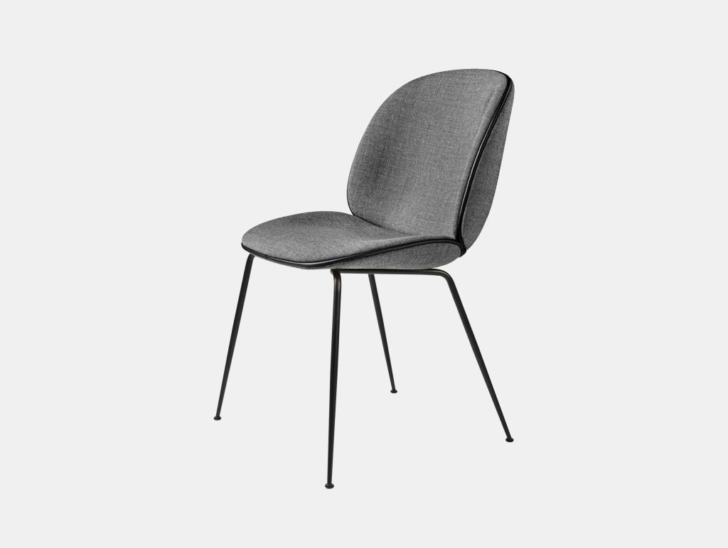
Design-duo Gam Fratesi found inspiration in the four-legged beetle’s form for a dining chair that is understated yet comfortable.
Wall clock

Herman Miller’s Nelson Sunburst Clock is a classic timepiece designed in 1949 by iconic architect George Nelson.
Pendant lamp
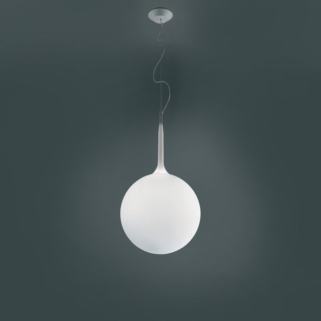
The Castore Sospensione pendant lamp in the living room features a hand-blown glass globe for a soft luminous effect.
We recommend
We thought you might like
States
Capital Cities
Capital Cities - Rentals
Popular Areas
Allhomes
More
