The top colour trends for 2021 are surprisingly serene
With the pandemic swiftly changing our relationship with the four walls in which we reside and many of us now working from home, the lines between our work lives and our home lives have been substantially blurred.
While your budget might not stretch to a full-blown renovation involving an extension to accommodate a home office, there are some subtle updates you can put into play that will make a big difference.
Sure, a brand new coffee machine might increase your productivity, but switching up the colours of a room can certainly affect it too.
It was this sentiment that informed Dulux’s Colour Forecast for 2021, an annual report in which the brand’s colour team research trends throughout the year, connecting with colour trend professionals from around the world to predict global trends and how they will affect Australians.
“Spending more time at home has meant we are wanting our homes to really reflect our personalities and to be a sanctuary that works with the blur of working or studying from home as well as relaxing,” Dulux colour and communications manager Andrea Lucena-Orr tells Domain.
While previous years have been largely dictated by European design and architecture shows, most of these were cancelled this year, leading to the trends being led by the adaption of our homes towards new ways of living and working in the same space.
“Colour is so emotive and really helps you feel connected to your space. At present, we all would like to feel happy and safe in our homes and colour can certainly help you feel settled, relaxed and happy in your environment,” Lucena-Orr says.
“Spending more time in our homes has led us to finally tick off some key items on our to-do list, as well as bringing attention to the areas that need some work.”
The 2021 forecast comprises of three soothing palettes, inspired by nature along with moments of stronger colour to lighten the mood and brighten our outlook.
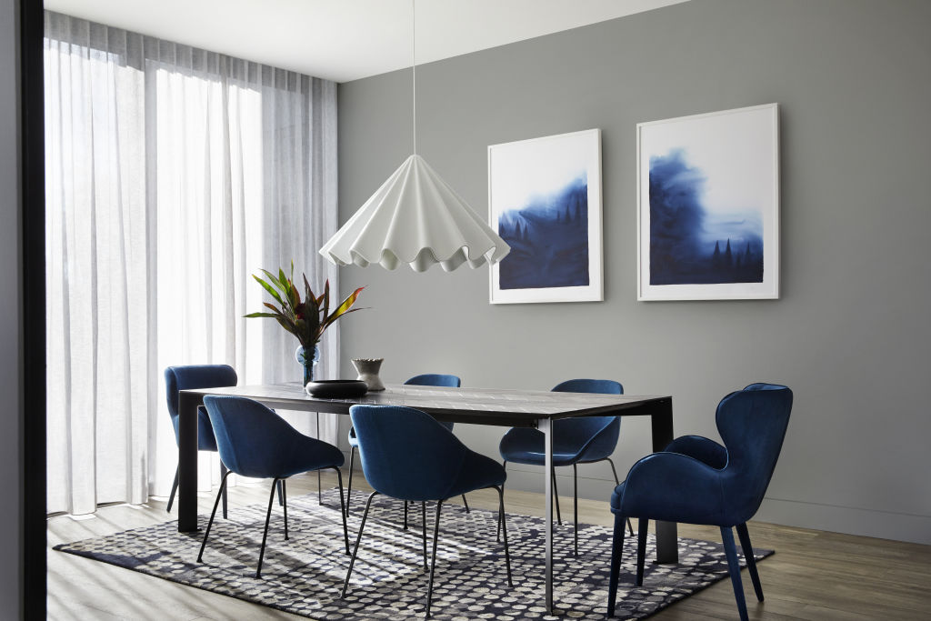
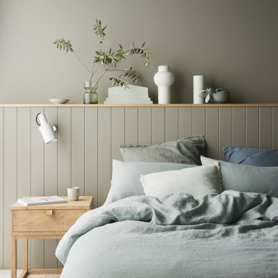
The Retreat palette is made up of warm whites, brown-based neutrals and dusty blues that convey a sense of soft luxury, alongside vintage-inspired tones of burgundy and deep ocean blue.
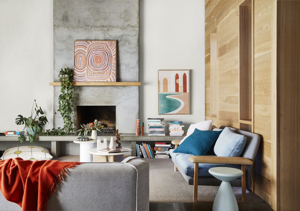
In a similar vein, the Nourish palette captures our renewed appreciation for natural beauty, with gentle, buff neutrals and touches of tan, soft olive and muted ochre.
“Natural colours are soothing and can help us feel more grounded and secure. These muted colours, with an earthy undertone, are very comforting and remind us of our natural environment and can create a sense of harmony and calmness,” Lucena-Orr says.
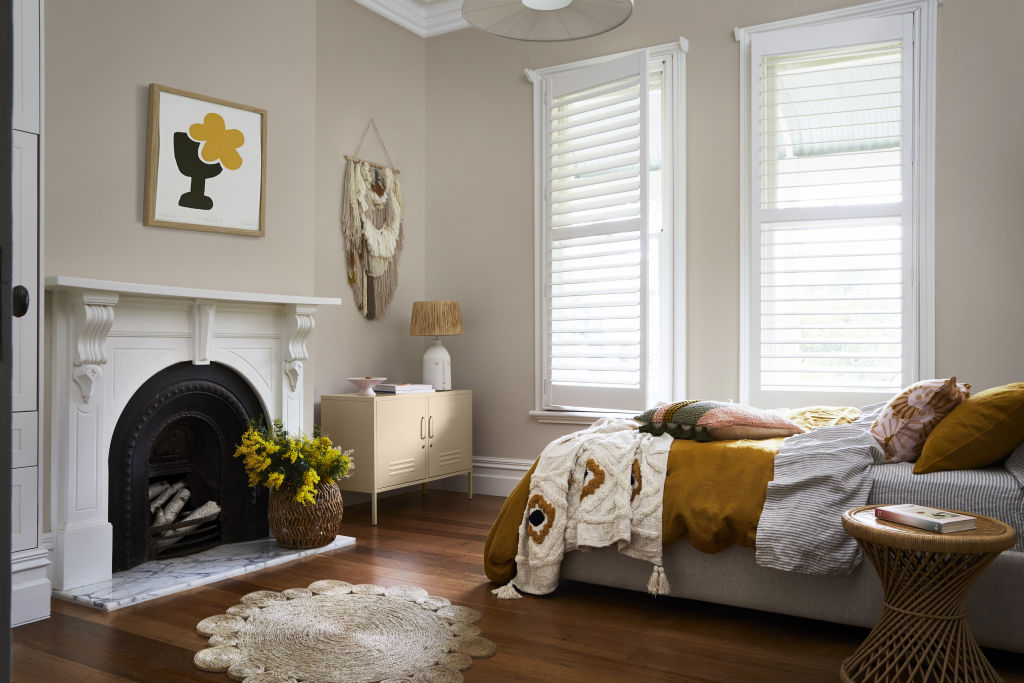
On the other end of the spectrum, the Reset palette is an uplifting and optimistic range of enriching and brighter hues; rich blue and coral, warm rust and playful mash-ups of pink and terracotta hint at 1970s nostalgia and evoke memories of travel and fun.
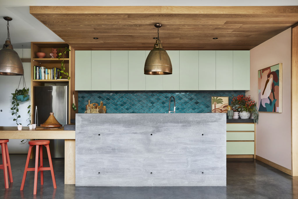
And if you’re struggling to wind down after a big day, colour can be harnessed to help distinguish spaces, especially if you are working from home and want to have a separate feel between your workspace and relaxing areas.
“An easy way is to begin your colour journey in the master bedroom and create a feature behind your bed. You can create a beautiful moody feel in the bedroom using a deeper or darker colour and complement this with lighter bedlinen and accessories,” Lucena-Orr says.
“A home office or study area is another great way to introduce colour that helps you feel inspired and is another reminder that this is a working space. Using a mid-tone hue or deeper tone is a great start.”
For a real mood-lifter, however, consider painting your front door in a bold or dark colour.
“This is such an easy way to inject colour and a personality into your home and differentiate your home from your neighbours. Colour is a reflection of you and the people in your home, so have some fun and remember it’s only paint and such an easy thing to change.”
We recommend
We thought you might like
States
Capital Cities
Capital Cities - Rentals
Popular Areas
Allhomes
More

