'This is so daggy': Interior experts on terrace, garden and garage week
Could there be any DIY task more stressful than trying to complete four important spaces in time and on budget?
This week on The Block, the couples were challenged to do just that with the opportunity to redo a room, as well as the rooftop terrace, garden and garage.
The judges described their efforts as “crackers” and “off the charts”.
Here’s what our experts thought.
Mitch and Mark
Terrace: Amy Chamberlain-Primrose from The Real Estate Stylist says the boys missed the mark this week. “This is so daggy,” she says. “It looks like a share house not a multimillion-dollar rooftop terrace. Budget doesn’t have to equal ugly.”
Re-do Room: “It’s an improvement,” says designer Nickolas Gurtler. “The bed is sophisticated but the white wall around it makes it look like a rental property.”
Garage: “A Tesla power wall is a wise investment and I love the mural,” Gurtler says. “Where’s the storage for larger items, though?”
Garden: “I can’t see ‘mid-century’ here but overall it’s pleasant,” he says. “More magnificent cacti might have given a more Palm Springs vibe.”
El’ise and Matt (Winners)
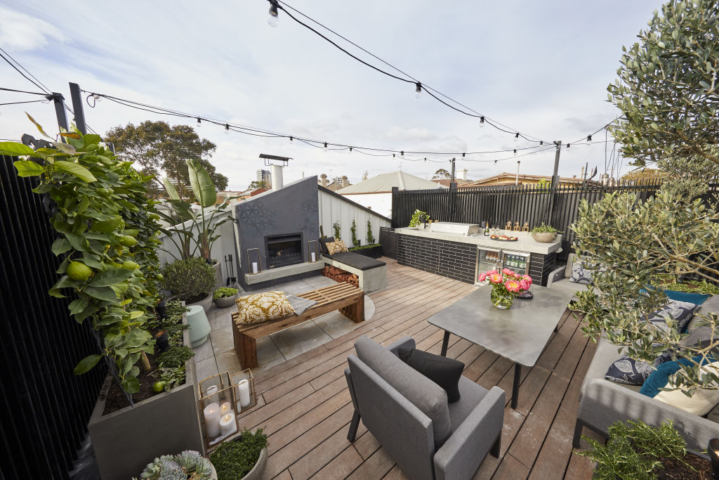
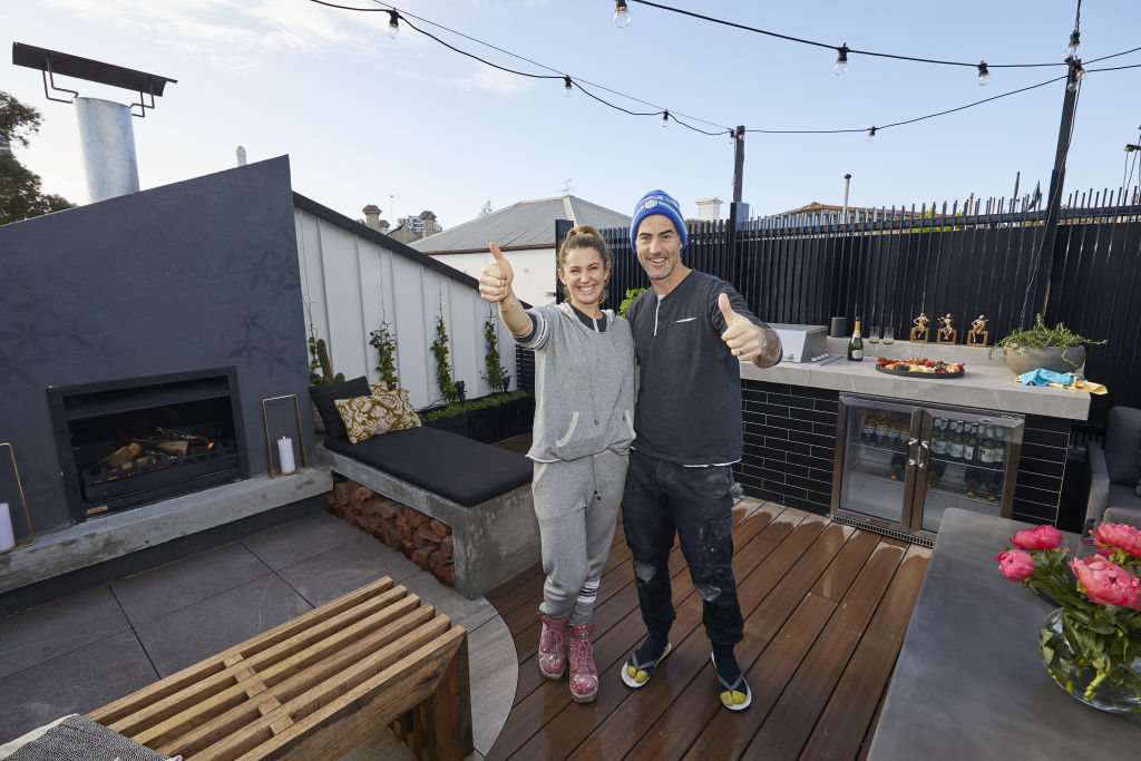
Terrace: Chamberlain-Primrose says a terrace is a notoriously hard space to get right. “It’s difficult, so points for giving it go,” she says. “I like the bar fridge, barbecue, seating and fireplace, but there are too many materials. The curved tiled feature is nice but not with the bench seat.”
Re-do Room: “They have rescued their kitchen!” says Gurtler. “The pendant lights feel sophisticated but the styling looks rushed. A vase with olive branches was all it needed.”
Garage: “Finally, storage!” he says. “I like the mural but perhaps that money could have been better invested into other areas of the home that really need it.”
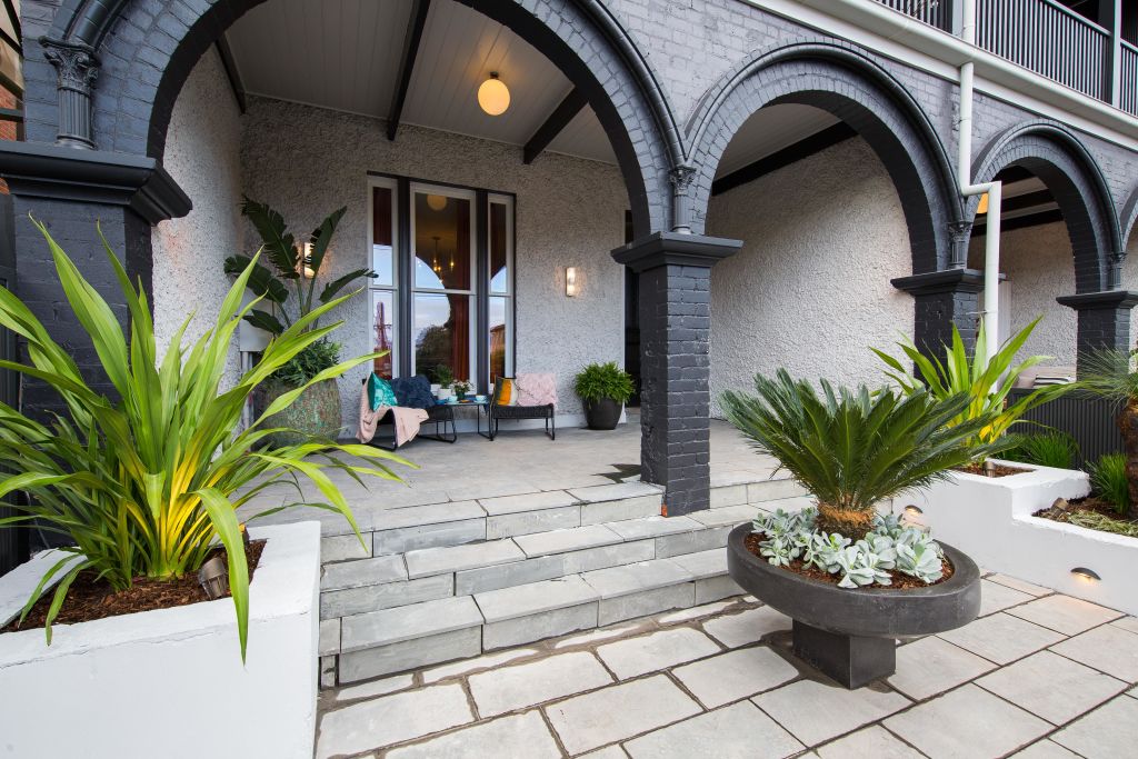
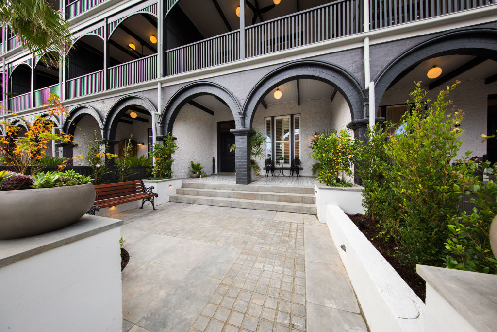
Garden: “The cobblestone pavers are a great way to provide texture, but the patterned tiles are too busy,” says Lauren Li from Sisalla. “These tiles are used in bathrooms, so they’re out of context on the porch of a Victorian building.”
Jesse and Mel
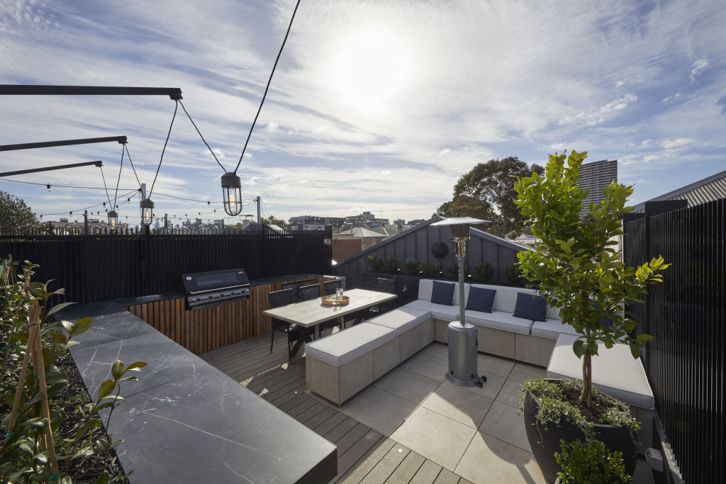
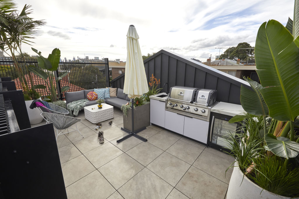
Terrace: “Contemporary and well-designed,” says Chamberlain-Primrose. “It’s a clever use of space with the sofa doubling as table seating. Plus I spy a tap – win! Many forget about this when putting greenery on a terrace.”
Re-do Room: “I love upholstered walls but this fabric is offensive and the execution is a fail,” says Gurtler. “The bedside tables look cheap and a solid lamp that hides the light switches on either side of the bed would be better too.”
Garage: “Again, no storage!” he says. “It makes it completely impractical. All that’s needed is something simple, like a single line of slim shelving – that’s it!”
Garden: “This outdoor furniture screams ‘cheap and easy’,” he says. “The garden bed of gardenias are genius, though, and I hope by auction they’re in bloom!”
Tess and Luke
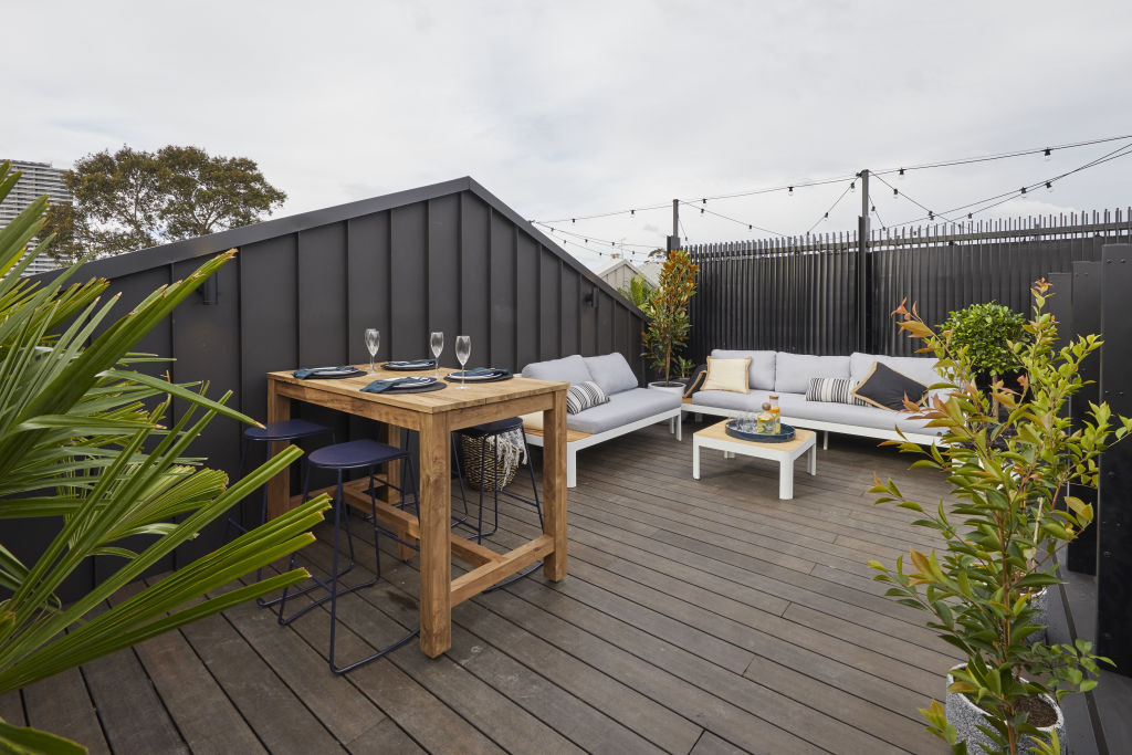
Terrace: “The layout is practical and the high table is perfect for entertaining,” says Suzanne Gorman from Studio Gorman. “The timber flooring makes the space feel warm and the styling isn’t too complicated. Once the palms grow taller, the space is going to feel even better.”
Re-do Room: “Tess and Luke did a fantastic job of converting their formal living into formal dining,” Gorman says. “The size of the table is perfect and the finishes suit the new dining room, however the chandelier could have been lower to add more drama.”
Garage: “These guys were smart in their simple approach,” says Gurtler. “A fancy garage isn’t something that a lot of people have a need for. Some storage though would have made it more practical.”
Garden: “This area has been designed as a space to be used,” says Li. “The bench seat and outdoors sofas make it feel inviting. The styling could be stripped down, though – there are too many patterned cushions and planters.”
Andy and Deb
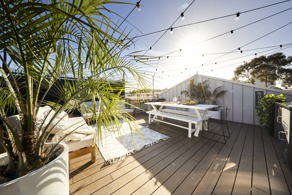
Terrace: “A generous dining and lounge area adds to the appeal,” says Gorman. “This is a great space for entertaining. I love that they have used ivy hanging to camouflage the airconditioning too.”
Re-do Room: Gorman says the artwork lacks scale. “I like its tones though because they complement the space,” she says. “The bed end is a nice addition, but it’s too small for the size of the bed.”
Garage: Gurtler says despite the lack of storage, the couple did a good job in this space. “I love the Tesla power wall,” he says. “It’s a sexy object and will attract buyers.”
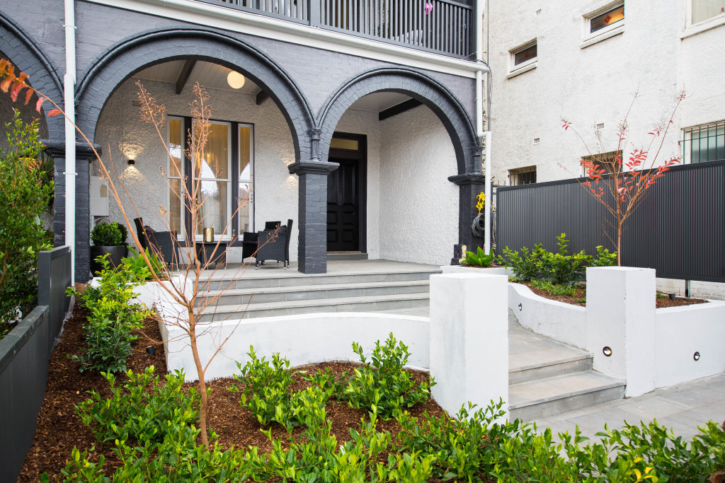
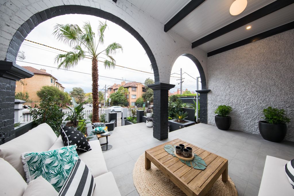
Garden: “The bluestone pavers look substantial,” says Li. “The materials are limited but impactful. The white render contrasts beautifully with the pavers and planting.”
We recommend
We thought you might like
States
Capital Cities
Capital Cities - Rentals
Popular Areas
Allhomes
More


