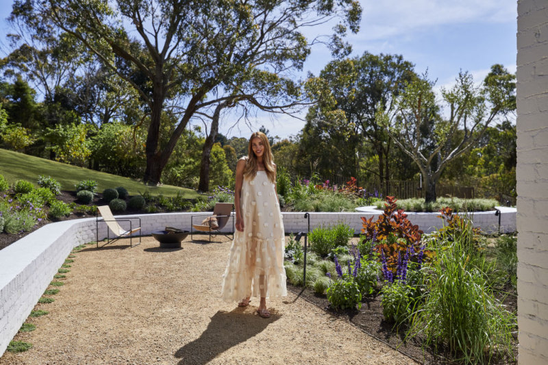
Three design principles that will help create a beautiful facade
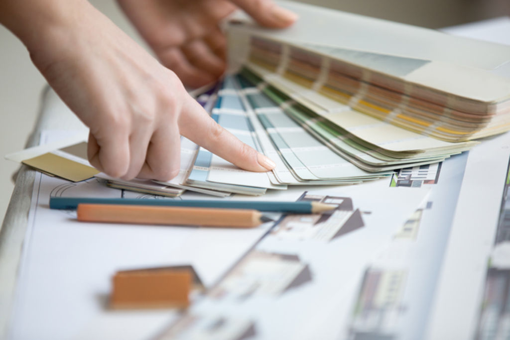
“What colours did you use?”
This is the question I get asked most often when I post before and after photos. It’s a question I rarely answer, not because I want to keep the colours a secret at all, but because a paint colour that looks good on one house may look atrocious on another.
To create a fabulous facade, you need to choose colours that suit the style of your house. More importantly, though, it’s realising that colour alone is not what will turn your house around.
Listen to episode five of Somewhere Else:
The truth is, colours are only about 20 per cent of the total effect. A whopping 80 per cent of the effect comes from how you combine and use other elements like structures, features, materials, fittings, landscaping and so on. To do this well you need to adhere to a few certain design principles.

Focal point
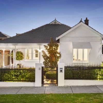
Create a strong focal point. Usually, this is the entryway. It doesn’t have to be front and centre; some houses have a side entrance which works just as well. The trick is to use elements that help naturally draw the eye toward the entrance.
You might have a contrasting colour to emphasise your entry or maybe a different material (say, some timber/timber-look feature panelling). Maybe it’s a slightly modified roofline to make the entrance more prominent. You can enhance your entrance (or other focal point) in many ways.

Visual balance
Don’t confuse symmetry with visual balance. You don’t need to have everything matching and perfectly symmetrical (although this works for some houses), but you do need to make sure the visual weight is balanced. This might mean that you balance a double garage door on one side of the house with something of visual interest on the other side.
This doesn’t necessarily require a large structure on the opposite side, just adding something with a bit more interest and visual weight will help balance things out.
One thing you can do is add some dense planting around the base on that side of the house so that it appears to anchor the property in place. This is one technique I use in my design work every day. It’s subtle, but makes all the difference to the aesthetic of your facade.
Cohesion
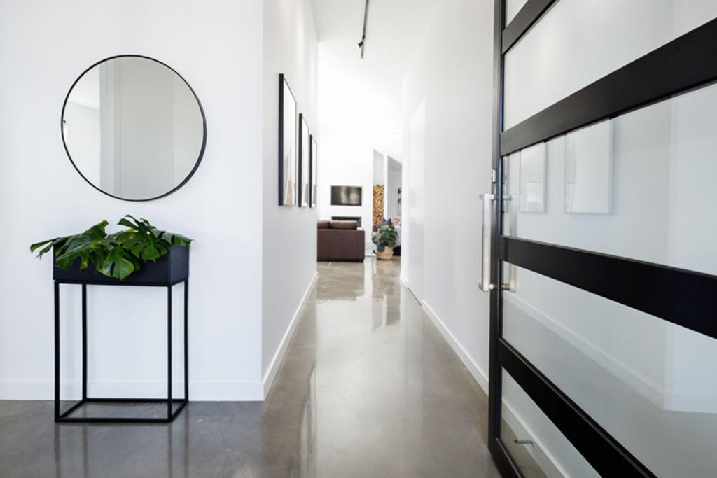
How are you going to tie everything together? You might choose a particular material and/or a colour as an accent and take that through to several different areas of the property so that it forms a cohesive whole.
When making over your facade, the idea is to make it look interesting without having too much going on. Similarly, you want to make sure you have enough going on so that it doesn’t fall flat. There is a fine line between minimalism and boring.
It doesn’t matter whether you’re doing up a big blocky, brick 1980s house or a small fibro cottage, if you apply these principles, you will create a much better facade than if you focus solely on choosing a nice colour.
Jane Eyles-Bennett is one of Australia’s top exterior designers and owner of design firm Hotspace Consultants. Join Jane in her Facebook group Home Renovators Network Australia for design and renovation inspiration and insider tips for your home improvement projects.
We recommend
We thought you might like
States
Capital Cities
Capital Cities - Rentals
Popular Areas
Allhomes
More
- © 2025, CoStar Group Inc.

