Three intriguing and recently completed Australian architectural projects
Some of the most promising house projects have a sort of come-on attractiveness that has you wondering what else might be happening behind that already interesting street frontage. What’s the story in form, appointment and decor beyond the front door?
Here, we look at three recent completions that all have that particular quality of intrigue. Each is engaging to a marked degree, but for very different reasons.
Project 1: Bondi House
James Garvan, whose first solo project is this inscrutable house screened from the street in finely milled, 30mm-wide red cedar battens, sees it as a built representation of Bondi’s culture.
“It’s vibrant, socially active, connected to its landscape and incredibly sustainably responsible,” Garvan says. Depending on the viewing angle and time of day, the screen can be opaque, transparent or translucent. At night, with lights on, the house becomes lantern-like.
The lineal unfussiness in the 25-metre-long south-facing facade relies on the refinement of the overall composition and the contrast between that progressively greying cedar and the solidity of concrete that’s been treated as a plastic material so successfully it becomes the stuff of the fine detailing.
Check out the bevelled edges to the garage portal and the tapering ends where the eaves extend. “We didn’t want a blunt edge,” the architect says. “In its geometry that eave form reinforces the horizontal lines and resolves the interface between the concrete and the timber infill.”
Its three bedrooms are upstairs and all-in living space downstairs, and the main public room that puts a high-shouldered, form-poured concrete wall to the street side can become so open to the garden on the other face that when the 3.3-metre-high, 10-metre-long sequence of glass doorways roll aside, it presents itself as an air-washed under-croft as relaxed as a barefoot Bondi weekend.
- Related: The room everyone wishes they had
- Related: Inside a sustainably designed home
- Related: Why it pays to hire an architect
Project 2: Collingwood House
Very surprising is the casually tailored but thoroughly modern amenity that opens up behind the 10-metre-wide frontage of one of Melbourne’s longest-surviving wooden houses. The gold rush cottage was imported as a prefab by colonial brewer Edward Crisp when accommodation of any kind was difficult to find in a Melbourne inundated by diggers.
Architect Brett Robertson, of Robert Nichol & Sons, bought the “rotting, single-storey building with a really scuzzy backyard” on the Collingwood Slope in 2010 when “Collingwood cost nothing”. While wrestling planning restrictions, he and practice partner David Nicholson came up with a simple double-level extension design.
“We kept the house to the first ridge and, replicating the same angle of the original house’s (roof) volumes, built the addition in one material. Grey ironbark makes it recessive.”
Stepping inside, the low wooden dado and immediate intimate proportions feel colonial. But a bold black-grounded floral wallpaper promises otherness and this house doesn’t disappoint. With two bedrooms, bathroom, a study and central living area on the ground level, a stairwell leads up.
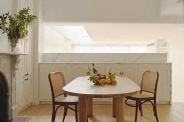
Suddenly, you’re in a comfortably contemporary 60-square-metre great room. “A big, simple space” with the living/dining and kitchen combined but defined beneath an interesting roof with two skylights feeding in extra daylight.
Wherever he can, Robertson has exposed the ceiling structure. “I love structure; I love steelwork”, he says. “Why cover it up with plaster?”
As if the four-metre-wide above-kitchen-bench window looking down across Collingwood, and the glass doors to the rear barbecue deck looking up a laneway to old brick Victoriana isn’t enough outlook, an outdoor stair leads up to a secretive, third-level deck with a parapet. “I come up here all the time in winter.”
The country-raised architect has a sense of humour: across the fake grass on the deck is a rusty corrugated iron structure. “A dunny. An outhouse,” he says.
Project 3: Geebung House
The intriguing question about the Geebung house Brisbane architect Paul Butterworth designed for clients who’d originally planned to renovate their old house on the block: is it old – as in a 1960s Australian version of a modernist home – or, is it new?
With two bedrooms, small-scale (115 square metres) Honeyworks House is neat and petite.
The familiarity of forms and materials, including new dry-pressed red bricks made in an old way by Claypave, has to do with Butterworth’s conviction of making architecture “that is a response to context and not too shouty.”
While Butterworth pursues modernist principals of the mid-century California type, he explains there is nothing cut and paste about this house. “It draws more on the local context. It looks like nothing else we’ve designed before.”
We recommend
States
Capital Cities
Capital Cities - Rentals
Popular Areas
Allhomes
More
