Three stunning bathrooms to inspire your next renovation
There’s more to a bathroom beyond maintaining good dental hygiene and inspecting one’s pores in the mirror. It’s one of the only spaces in the home that offers true privacy, where you can unwind, relax and ponder.
These three bathrooms prove that with good design a bathroom is as worthy as any other room in the house, and can be more than white on white.
Caulfield North bathroom by Flack Studio
Art need not just hang on walls or balance on plinths but can be a room in itself, especially if David Flack of Flack Studio is at the helm.
This new-build bathroom was part of a larger design overhaul of a 1960s home in Melbourne’s Caulfield North, where the owners gave permission for Flack to be “anything but polite”.
While Flack was sympathetic to the original geometry of the home, he was wary of creating a time capsule of the past.
“It was about finding materiality that feels quintessential of its time in the 1960s, but at the same time I don’t really believe in recreating the past, the work has to be contemporary,” Flack says.
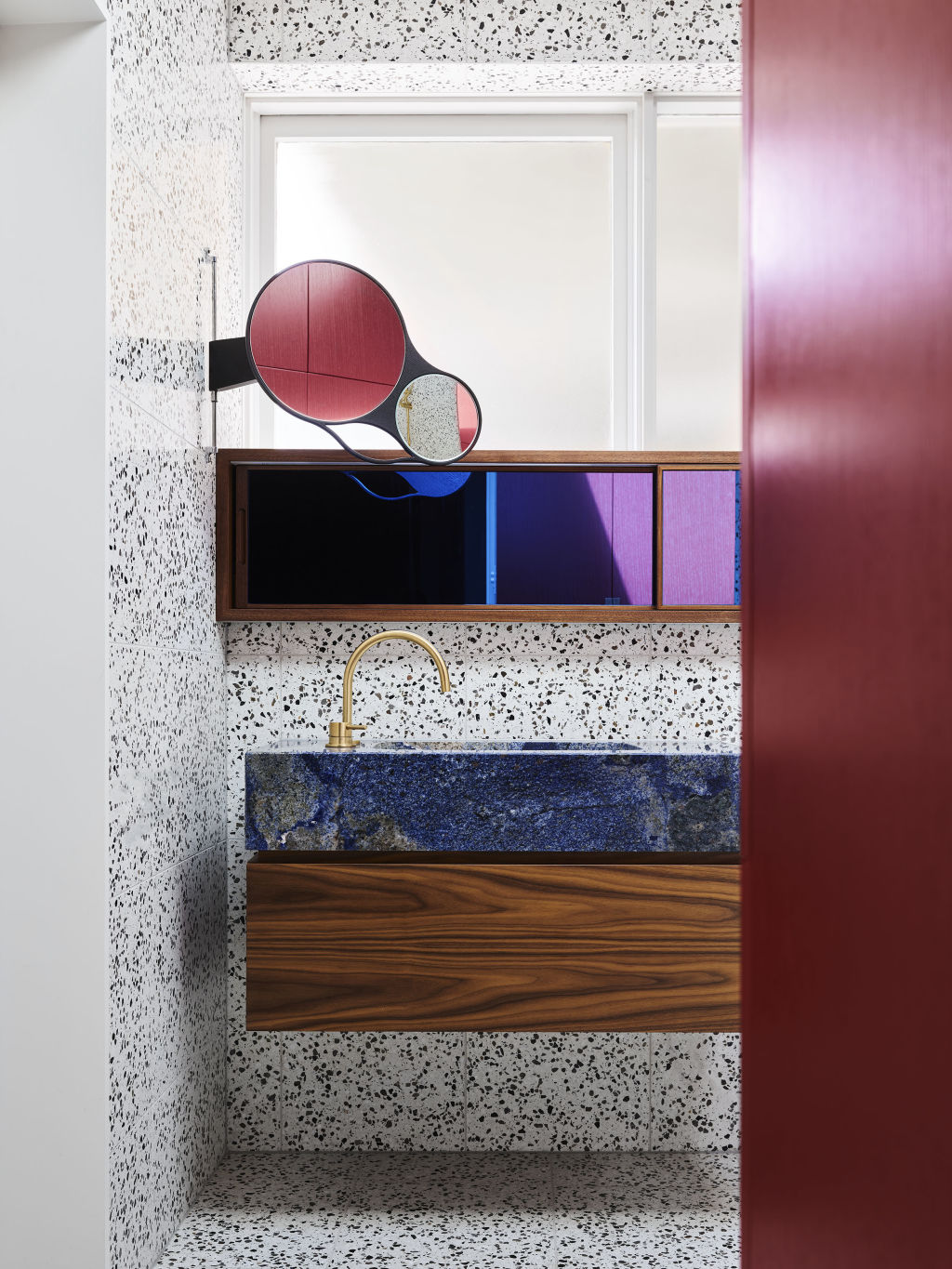
The resulting design brings together sophistication with elements of pop, integrating graphic finishes with streamlined joinery.
“There’s only a few finishes in there but it’s about the interplay and how they mould together.”
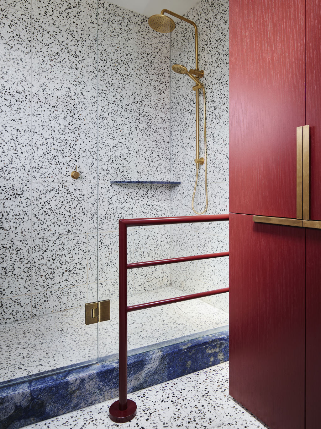
The floor-to-ceiling terrazzo is a custom mix with blue-mirrored cabinetry and a celestial lapis stone wash basin atop an American walnut vanity.
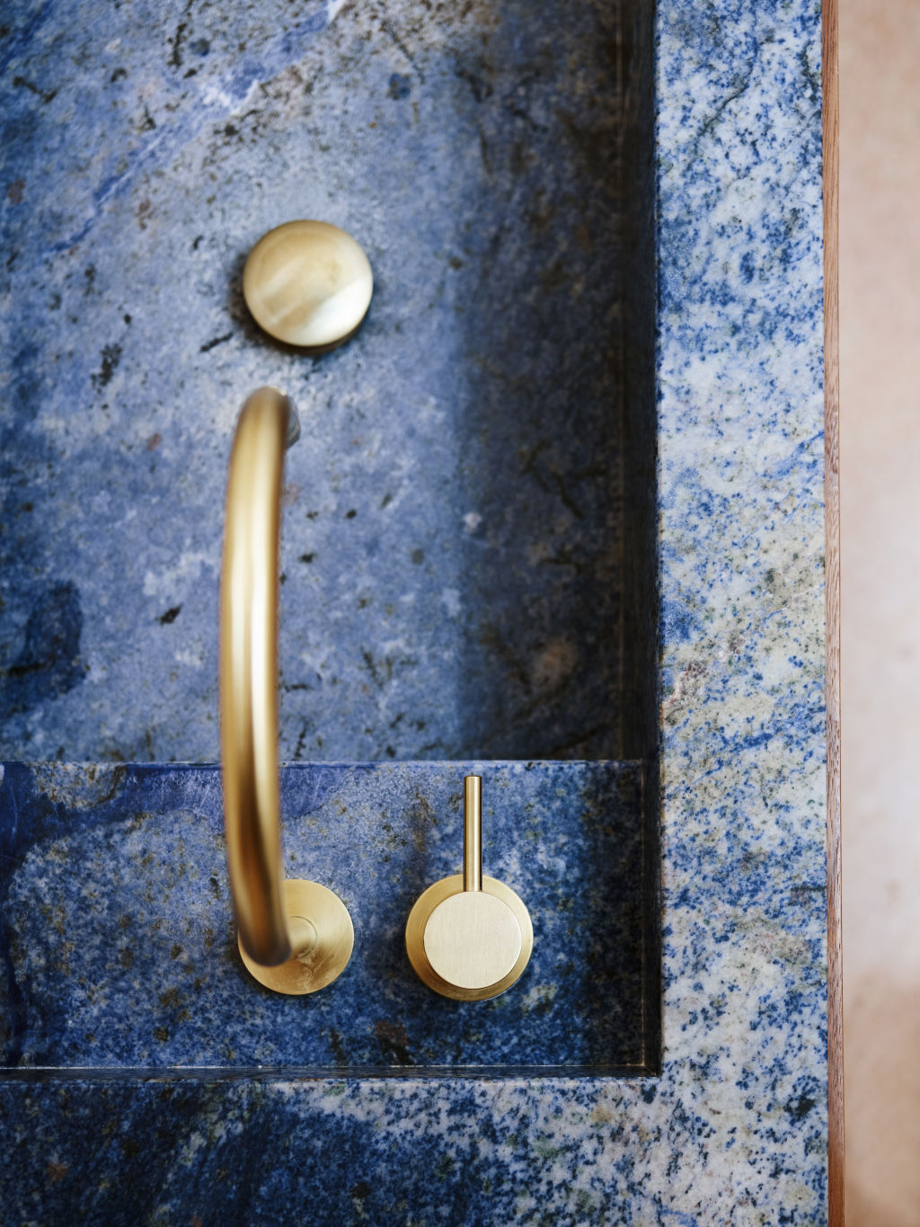
Nothing is spared the Flack touch, even “the burgundy you see is American oak with a sprayed finish over the top so you can see the grain coming through”.
Sure it’s a bathroom, but it’s also a case study for interiors as art.
South Yarra bathroom by Full of Grace Interiors
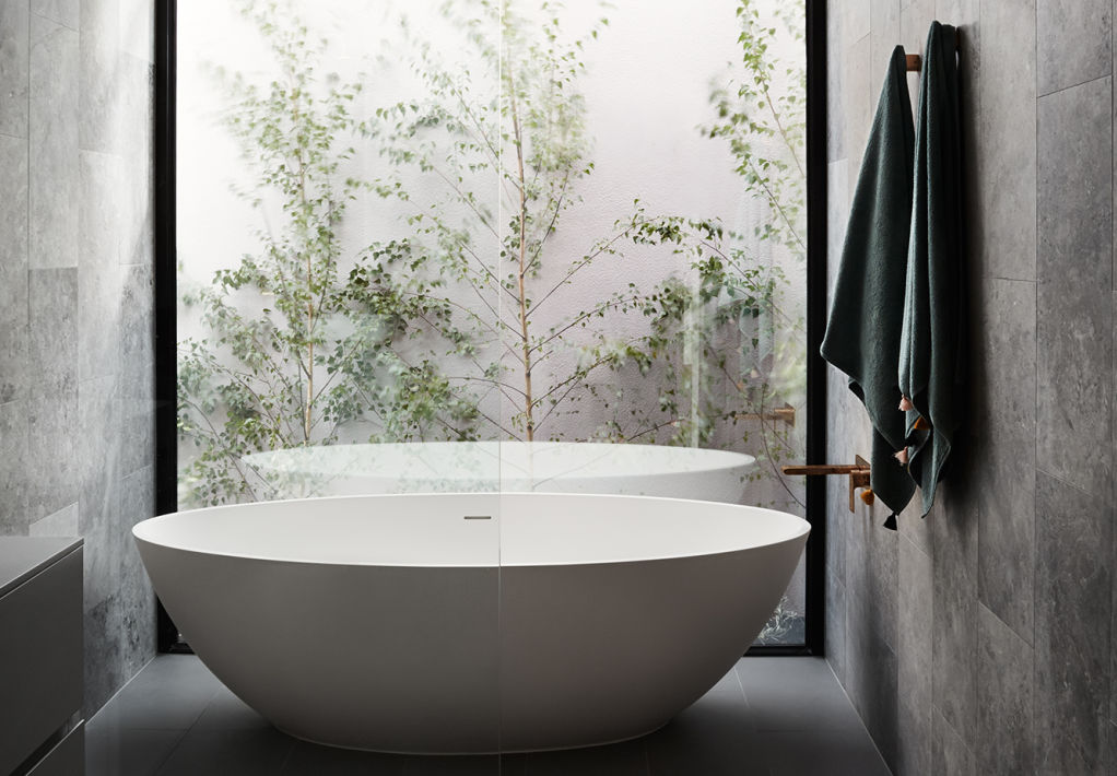
Watching James Bond movies paid off for interior architect Therese Carrodus of Full of Grace Interiors when she was approached by clients to design a bathroom that was full of elegant masculinity.
Carrodus says she drew inspiration from the “early James Bond movies to create a cool but classic aesthetic” that informed the bathroom’s “rich, moody colour palette for the finishes and fittings”.
The bathroom redesign was part of a wider renovation completed by Carrodus, which involved the complete overhaul of the 1940s art deco property.
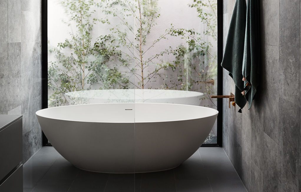
“The material palette is a mixture of calming tones of grey, balanced by the warmth of aged brass fittings and simple forms,” she says, referencing the brass tapware paired with the soft curves of the wash amenities with floor-to-ceiling grey tiling.
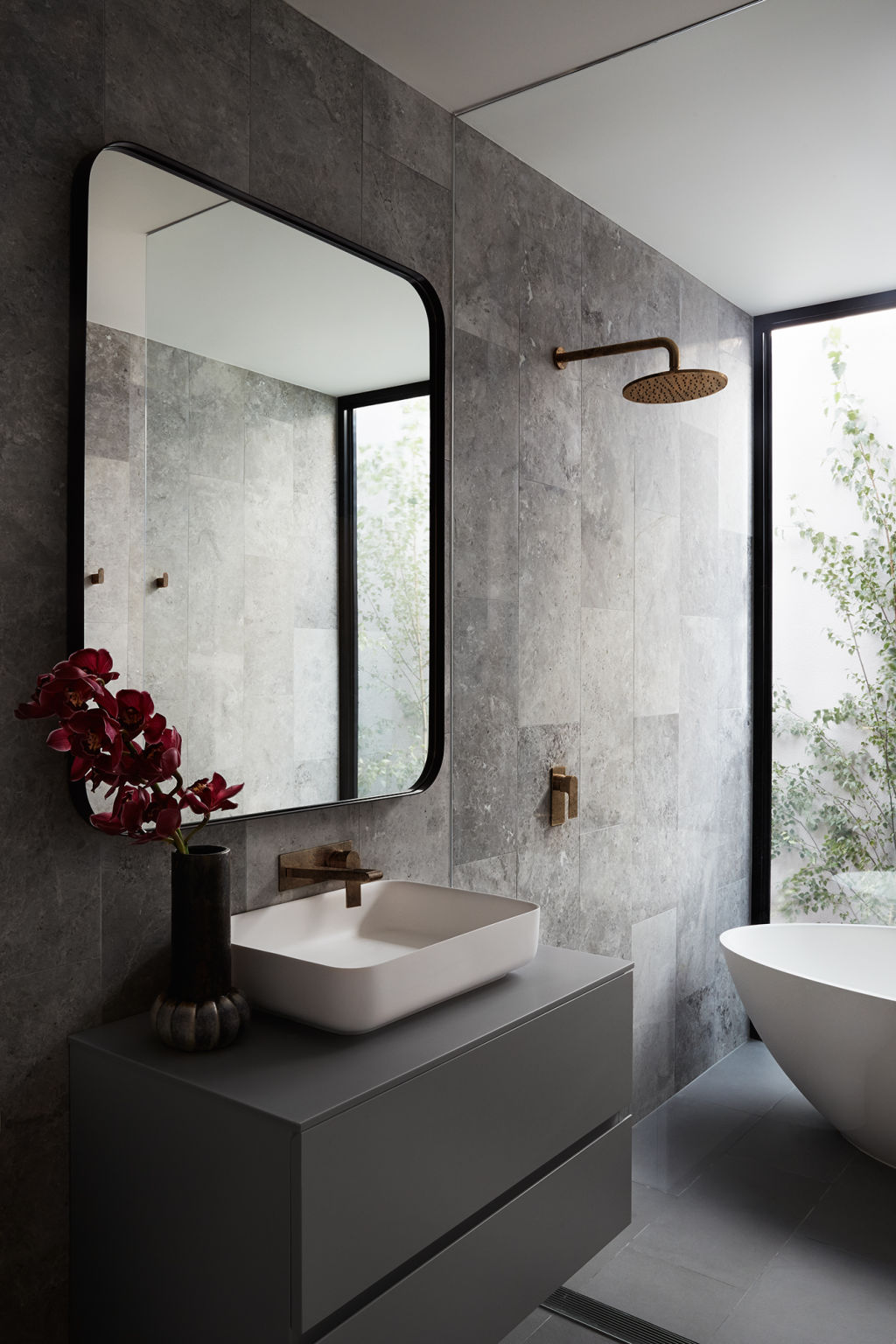
Integrating natural light into the space was realised with a dramatic full-height window positioned behind the free-standing curved bath and grey tundra natural stone walls.
“These elements combined really give the feeling of an oasis in this inner-city suburb of Melbourne.”
And at night? Carrodus keeps the atmosphere equally as moody and relaxing with dimmable sconces.
“The aim was to create a real sanctuary where the client could escape to after a long day.”
Bentleigh East bathroom by Studio Ezra
Often the best way to solve a problem is to create the solution yourself – a philosophy that’s been embraced by interior architect Georgia Ezra of Studio Ezra.
When she was unable to source tiles that suited her interiors projects, she started designing them herself under Tiles of Ezra.
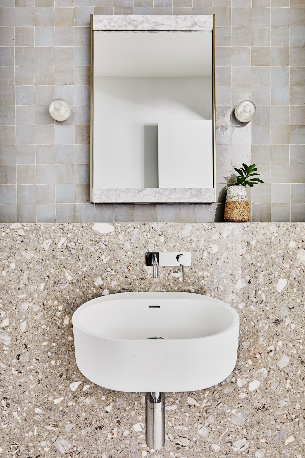
The magic of textural and tactile tiling leaves a lasting impression in this Bentleigh East bathroom, where Ezra’s handmade Zellige tiles cover the wall from floor to ceiling.
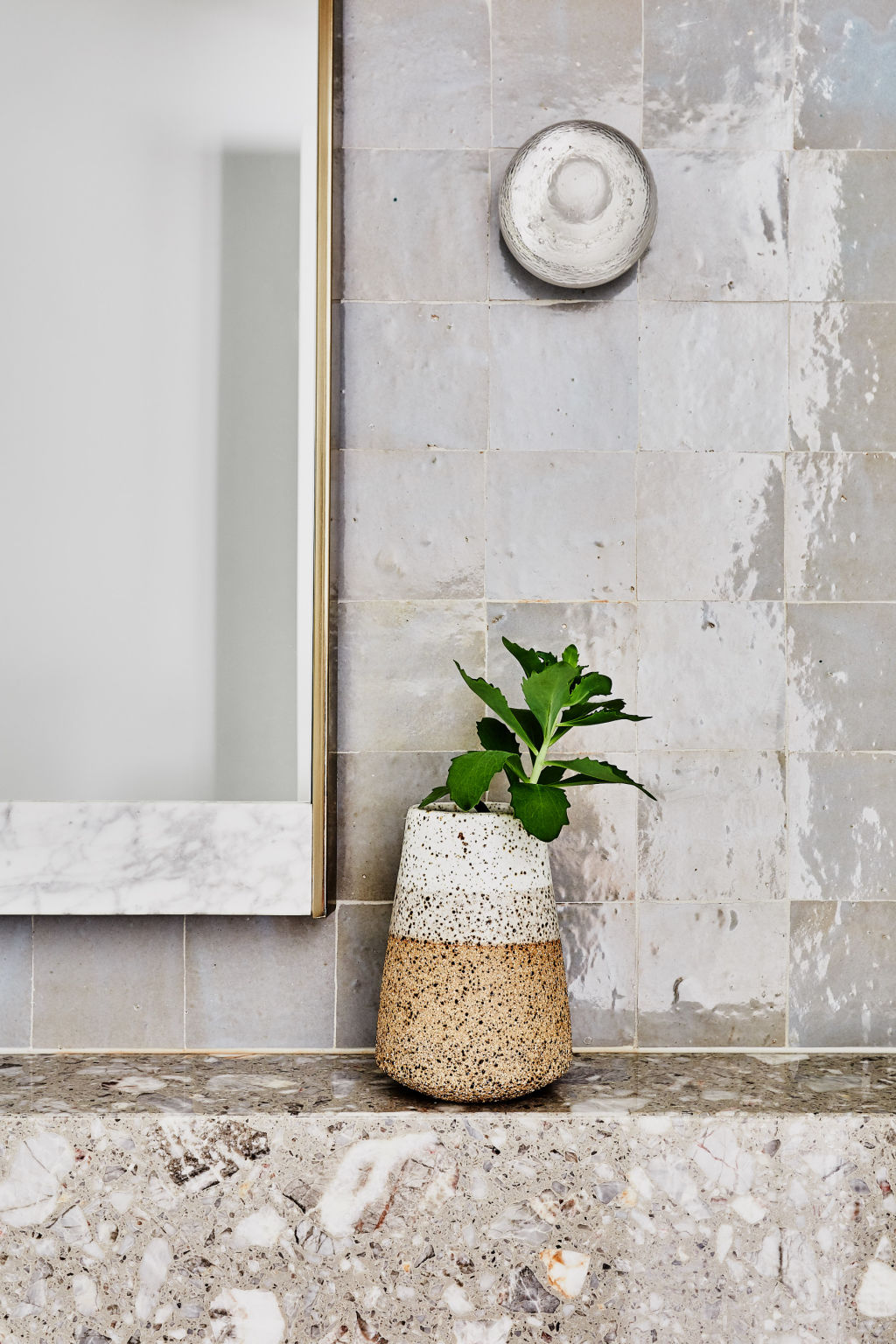
“Cladding the wall all the way to the ceiling in the powder room allows the space to feel larger than reality,” she says.
“We love how the stone meets the tile and how beautifully the tile and stone work together.”
Diffused light is projected from blown glass wall sconces by Lucretia, a favourite of Ezra, who worked alongside AG Construct to bring the bathroom to life.
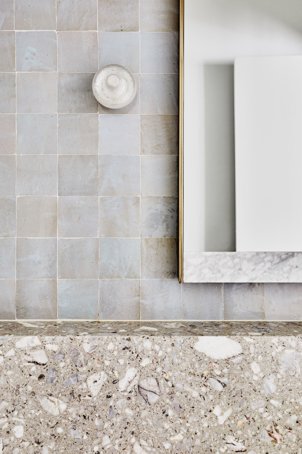
“When you turn the wall sconces on, the light makes it seem as though the tiles are glowing.”
If you’re considering your own bathroom palette, Ezra suggests the modesty of “non-obtrusive neutrals” that will allow you to introduce colour and intrigue without dominating the rest of the home.
For this project, the answer was clear to Ezra from the get-go with soft tones of blue and grey.
We recommend
States
Capital Cities
Capital Cities - Rentals
Popular Areas
Allhomes
More
