Trends versus classics: Which kitchen features will go the distance
If you’re renovating your kitchen or building one from scratch, your head might be turned by what’s fashionable – then again, you might want a more timeless look.
Over the past decade, trends have come and gone, and we’ve liked a fair few, but how do you identify which ones will stay the distance? When you’re considering your choices, it pays to go for the slow-cook, rather than fast and flash.
Tables turned

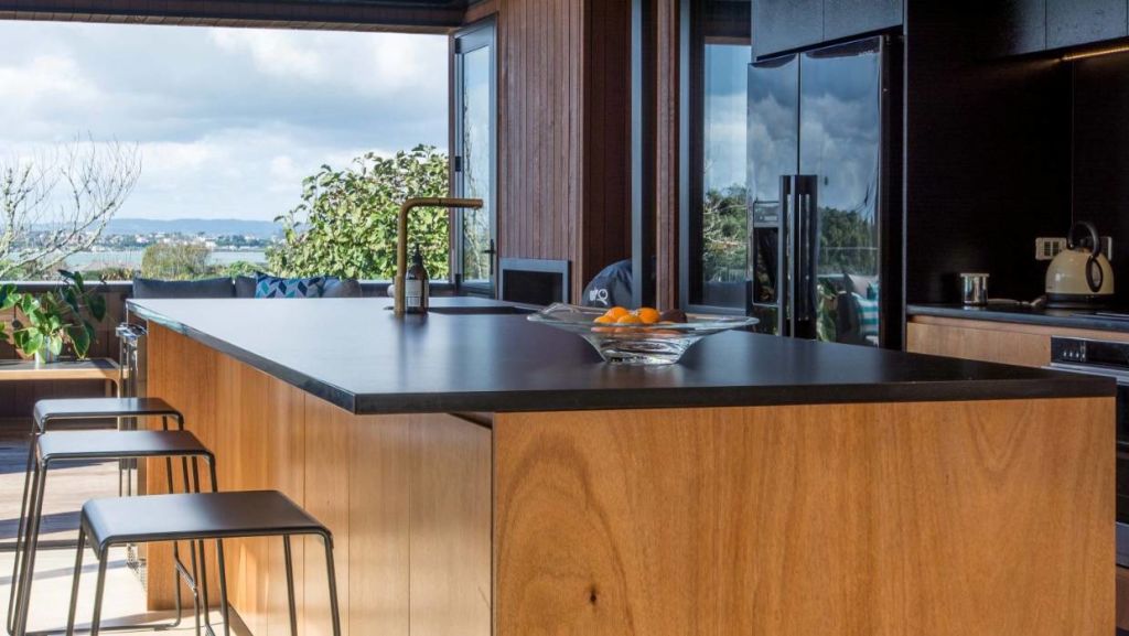
Island benches have been the fulcrum of kitchens since their gentle introduction in the 1970s. But what if your kitchen didn’t have one? Would the sky fall around your ears? Would the design gods zap you from on high for such insubordination?
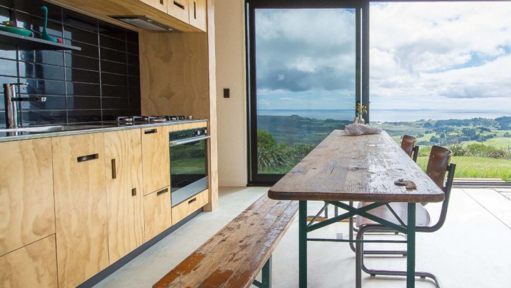
A quick look further back in history saw kitchens with benches along the walls and, while we’re not advocating design turns back the clock completely, the idea that a dining table doubled as an extra bench is not a silly one.
Fast forward to today when there’s an urgent interest in smaller homes that are precisely planned: the island is out and the good old kitchen table is back in.
Save space and expense by ditching the island in favour of a table that is both an inexpensive surface for food prep and a place to congregate and play The Game of Life.
The concrete facts
Concrete benchtops with exposed aggregate – those large flecks of industrial stone – became prominent around 10 years ago. While the benefits of properly sealed concrete – it’s heat and stain resistant – only increase with age, the full aggregated and even speckled salt and pepper finish has done its dash.
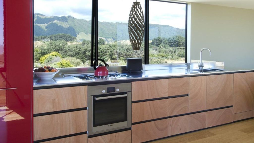
Now homeowners who want concrete tend to choose a “cream” finish where the concrete has no aggregate exposed but is lightly polished for contemporary elegance. If concrete is too heavy for your space, a stainless-steel top achieves a similar industrial aesthetic with a sense of agelessness.
Can you handle it?

Once bar handles, instead of individual knobs, were the latest of the greatest, giving a sleek, stylish look. Whether you opted for the square-ish D-shaped ones or the cylindrical pulls, they were ergonomically functional.
That was before today’s obsession with an “everything integrated” approach that leaves visitors to the kitchen confused and doors and drawers with no handles at all.
Will this last? Hopefully not; handles can be objects of beauty. The knurling-pattern handles now in vogue are exquisite but, if you’re not keen on the expense, a simple routed cut-out or negative detail has the simplicity and a nostalgia no-one can object to.
Brass is the new black

Black tapware: you might swoon because it makes such a smart, emphatic statement. And, yes, the taps do look a million bucks when contrasted against a pristine-white engineered stone bench.
But will they age well and will your treasured black sink mixer date? Did mushroom-toned cabinetry? Our prediction is it will.
If you love it and must have it, go for it but, if you want lustre and longevity and taps that get better with age, best to stick to the classic metallics such as brass, copper or stainless-steel which keeps its appearance for decades.
Opt for custom finishes – burnished, brushed, aged or polished – to add a bespoke touch. There is even double-dose tapware where part of the tap is one metal, and another element of the same tap is in a different metal.
Cut the colour

Remember the craze for coloured-glass splashbacks: glossy red or vibrant green? If you loved it then, you may love it still. Then again, you may not.
One plus factor is that glass is superbly easy to clean, far easier than grout, so a way to use it is to employ it as a ‘covering’ for, say, a plywood sheet, which gives you the warmth of timber but is effortlessly wiped down. Or stick to glass over a black or white background.
At the high end of the market, marble is still making moves but, for those in the premium-economy category, classic white tiles are in favour with interest being created by 3D texture, shape – think subway, hexagonal or the charming penny round – or pattern in the layout – think herringbone or basket-style. Stainless splashbacks are also back in the spotlight, often just as an upstand.
Closing argument
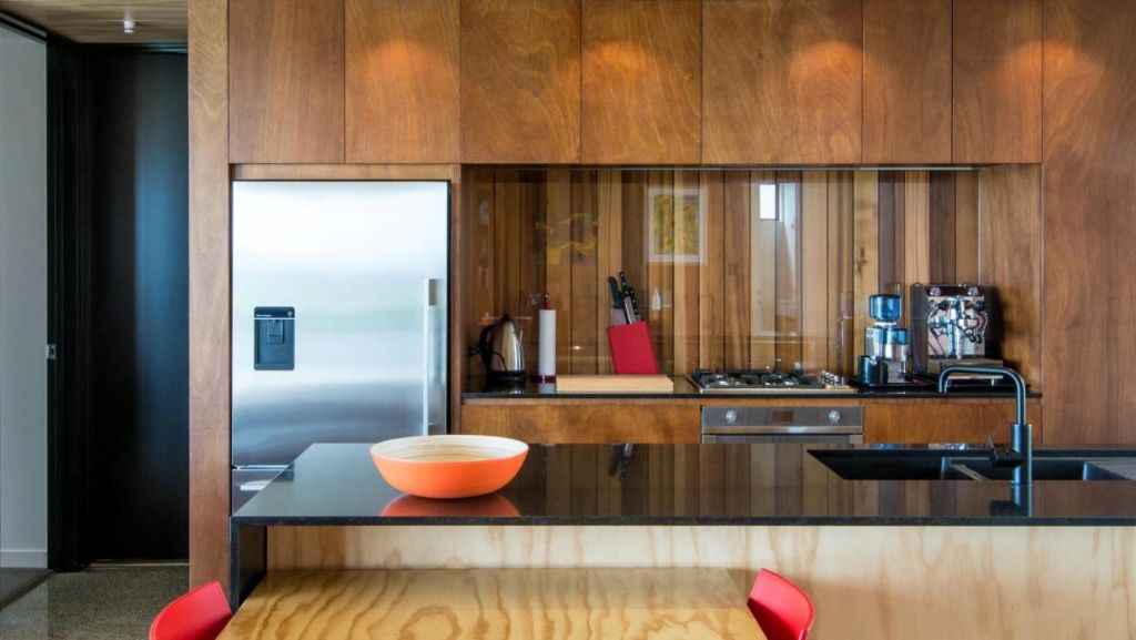
A final note on cabinetry. Timber is timeless whether it’s in solid form, a veneer or plywood. Teamed with black and/or white benchtops/splashbacks and wall colour, and metal tapware that will weather to a beautiful patina, it will never date.
Then again, dateless isn’t always as much fun as a life lived with expression. Just saying.
Caitlin Barrett is an architectural graduate at Box.
- This story originally appeared on stuff.co.nz
We recommend
States
Capital Cities
Capital Cities - Rentals
Popular Areas
Allhomes
More


