The two must-haves when renovating your front facade
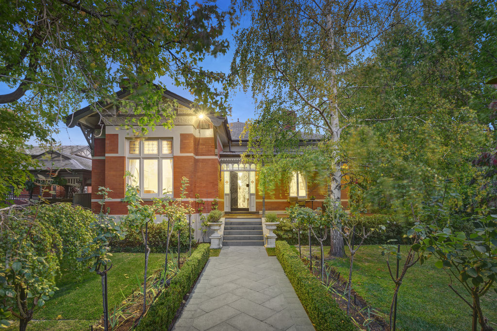
It’s a nice feeling arriving home to a house with a beautiful facade, so if you’re thinking of updating yours you’ll want to get it right.
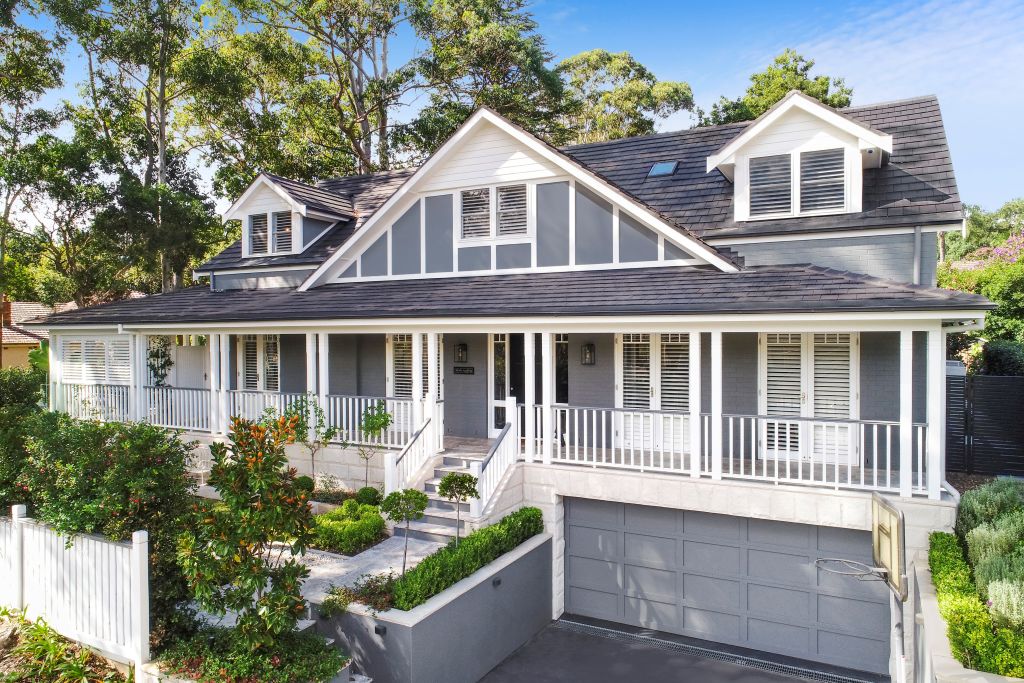
A common misconception is that the main way to improve your home’s facade is by choosing the right colours. This is important, but there are two other things that are far more important to get right – “visual balance” and “focus”.
Don’t fall into the trap of thinking these concepts don’t apply to your home – they apply to every home (if you want it to look great).
Listen to Karina’s renovation story on Somewhere Else:
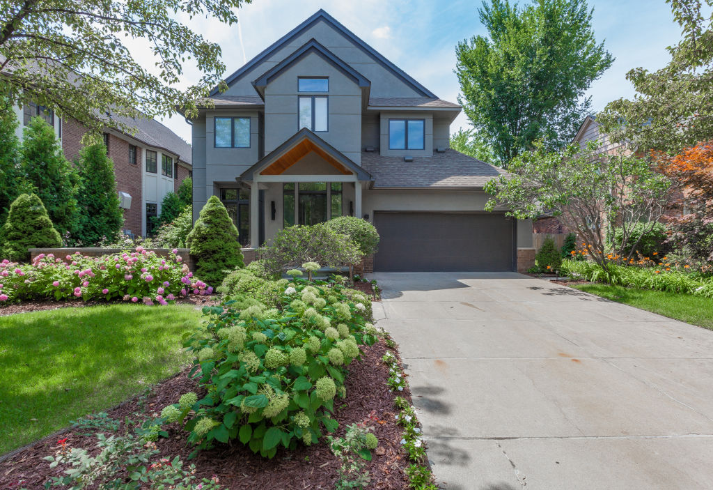
Visual balance
It doesn’t mean that everything has to be symmetrical and matching (although in some houses it is), but there has to be a sense of things being even and balanced.
Imagine the difference in visual weight between a small white box and a large black box. The black box is visually heavier because the box is bigger and weightier, and the dark colour is visually heavier. The white box is smaller, lighter in weight and colour, and so is a lighter visual weight.
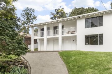
With that in mind, if you now take a look at your house front on and note everything you see, you should be able to tell if your house is visually balanced. If it is, there will be some sense of an evenness or balance to all the features. However, if you’ve got something like a big garage door, a tree, and/or a lot of detail on one side and then absolutely nothing on the other side, then the house is not visually balanced. Similarly, if you have a double-storey with steps leading up on one side but just a single level on the other side, there is a visual weight difference.
To improve the facade of a house that does not have visual balance, you need to even things out. You can use colour, texture, landscaping or other interesting elements to alter the visual weight of the different components.
Focus
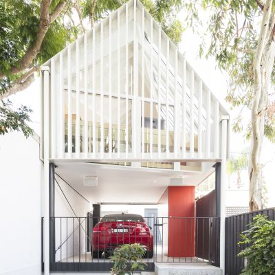
A great facade design aims to have one strong focal point and that’s often your front entrance. If you have too many things drawing attention at the front, you lose focus, so choosing just one strong focal point is critical. The trick here is to make sure the other elements are not competing with the focal point but complementing it in some way.
For example, if your garage door is overly detailed or if there are too many different colours and materials going, this can complicate the scene and detract from the one focal point you want to be your hero.
If you’re lucky, your house might already be visually balanced and have a good focal point. If that’s the case, you can strengthen the focal point or downplay elements that detract from its visual balance.
If not and you’re planning on a considerable update to the facade of your home, then an exterior designer will help you ensure you have these foundational components for your renovation, correctly in place.
Designing an appealing facade means getting the fundamentals of the design right. If the fundamentals (in this case, visual balance and a strong focal point) aren’t there, no matter what colours you choose, your facade will lack that special something that could otherwise have been fabulous.
Jane Eyles-Bennett is one of Australia’s top interior-exterior designers and owner of design firm Hotspace Consultants. Join Jane in her Facebook group Home Renovators Network Australia for design and renovation inspiration and insider tips for your home improvement projects.
We recommend
States
Capital Cities
Capital Cities - Rentals
Popular Areas
Allhomes
More
- © 2025, CoStar Group Inc.
