Wallpapered ceilings and mismatched prints: 5 design trends we're most excited for in 2022
Emerging design trends provide a fascinating insight into how we will decorate and live in our homes in the future. With a new year almost here, we asked experts to forecast the colours, spaces and styles set to make waves in 2022.
Statement ceilings
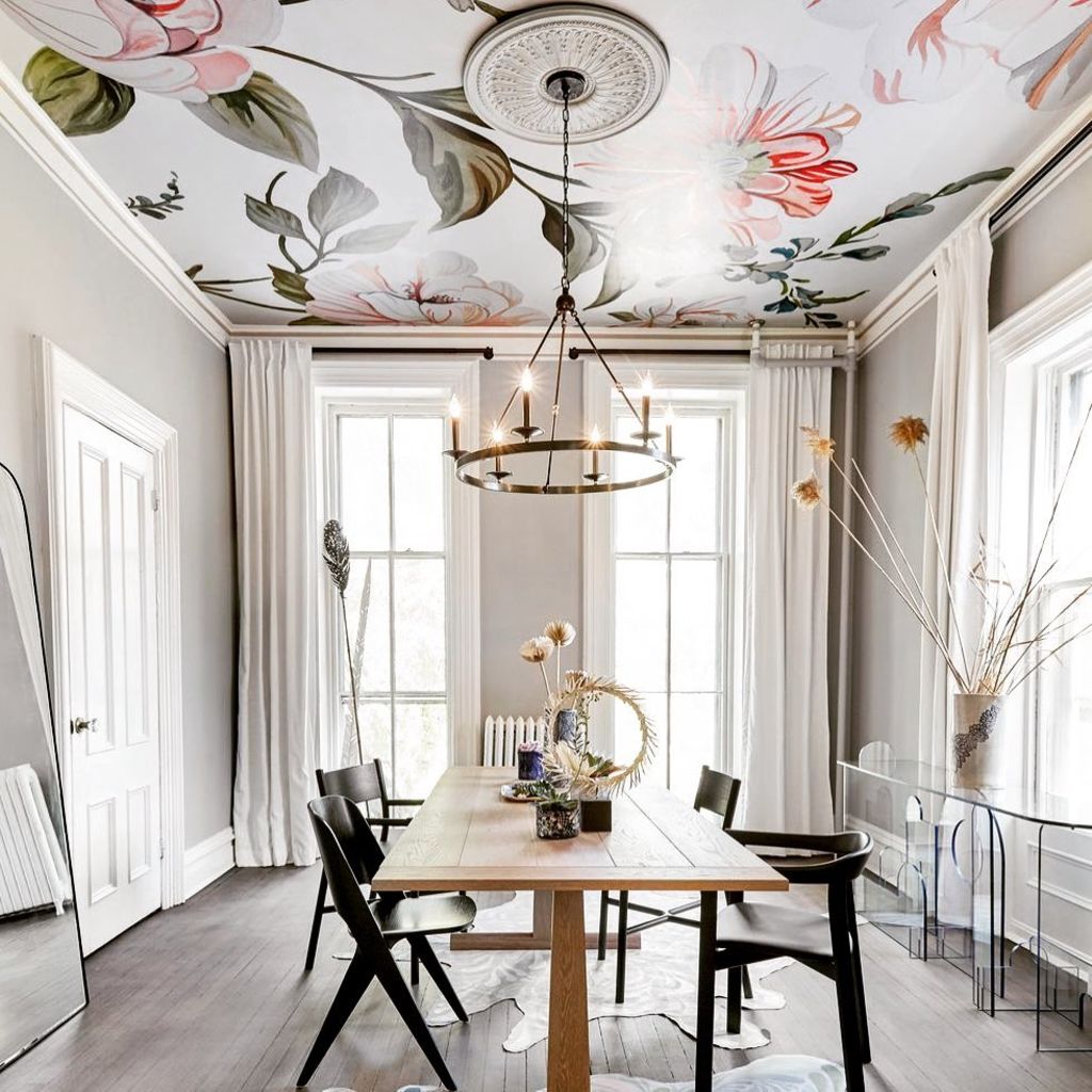
Look up. Right above you is the most underused real estate in your home – until now. Expect an influx of cricked necks in 2022, with wallpapered ceilings back and adding a magical touch to our homes.
“Consider bold geometric patterns, florals, murals or quieter textural papers like seagrass and rattan,” suggests designer Angie Rogers from Interior Tailor Company. “If there are elements you don’t like in a room, a wallpapered ceiling is great for distracting the eye, drawing it upwards.”
Add instant glamour to a bedroom or bathroom or transitional spaces like hallways and foyers. Match walls to ceiling, use a bold ceiling to contrast neutral walls, a patterned ceiling with colourful walls, or balance your print with elegant wall panelling detail.
Feel free to splash out and have fun. Just like paint, wallpaper can be changed on a whim. “It isn’t a permanent fixing and generally, there’s little or no structural work required to wallpaper ceilings, and it makes it simple to do,” Rogers says.
Rock star powder rooms

Small and scaled-down, the powder room is the space for living out our wildest design dreams. From discreet elegance to disco glamour, a touch of playfulness can pack a punch in this sliver of a space.
“It’s a room that provides real surprise,” agrees designer Cassandra Walker. “It holds so much possibility and carries that element of amazement.”
Look for dreamy wallpapers, artisanal tiles, characterful terrazzos, statement lighting and glamorous mirrors and fixtures.
“Colourful marble vanities and basins are a big feature next year,” predicts Walker. “Marble can be carved and shaped into almost anything.”
While a powder room is a dazzling space, it should be practical, too. “It’s still a bathroom and needs storage for toilet paper, hand towels and cleaners,” Walker says. “No matter how beautiful, functionality is always key for success.”
Green front and centre
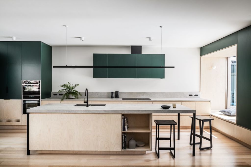
“Don’t write off the power of adding green to your home,” says designer Bea Lambos. “We’re yearning for fresh new things that make us feel good – green is the answer.”
Look to nature’s palette for inspiration, from deep forest greens, eucalypt and sage, to crisp greens that perk up sombre shades like greys and warm whites.
Not only is it mood-boosting, but green can have a profound effect on the feel of a small space. Shades like sage provide a tranquil vibe while others, like invigorating citrus shades, can energise.
“The perfect shade of green is your golden ticket out of neutral boredom,” says Lambos. “Research your greens to find your perfect shade, and if you’re not 100 per cent certain, start adding it to your space very gently.”
Mismatched prints

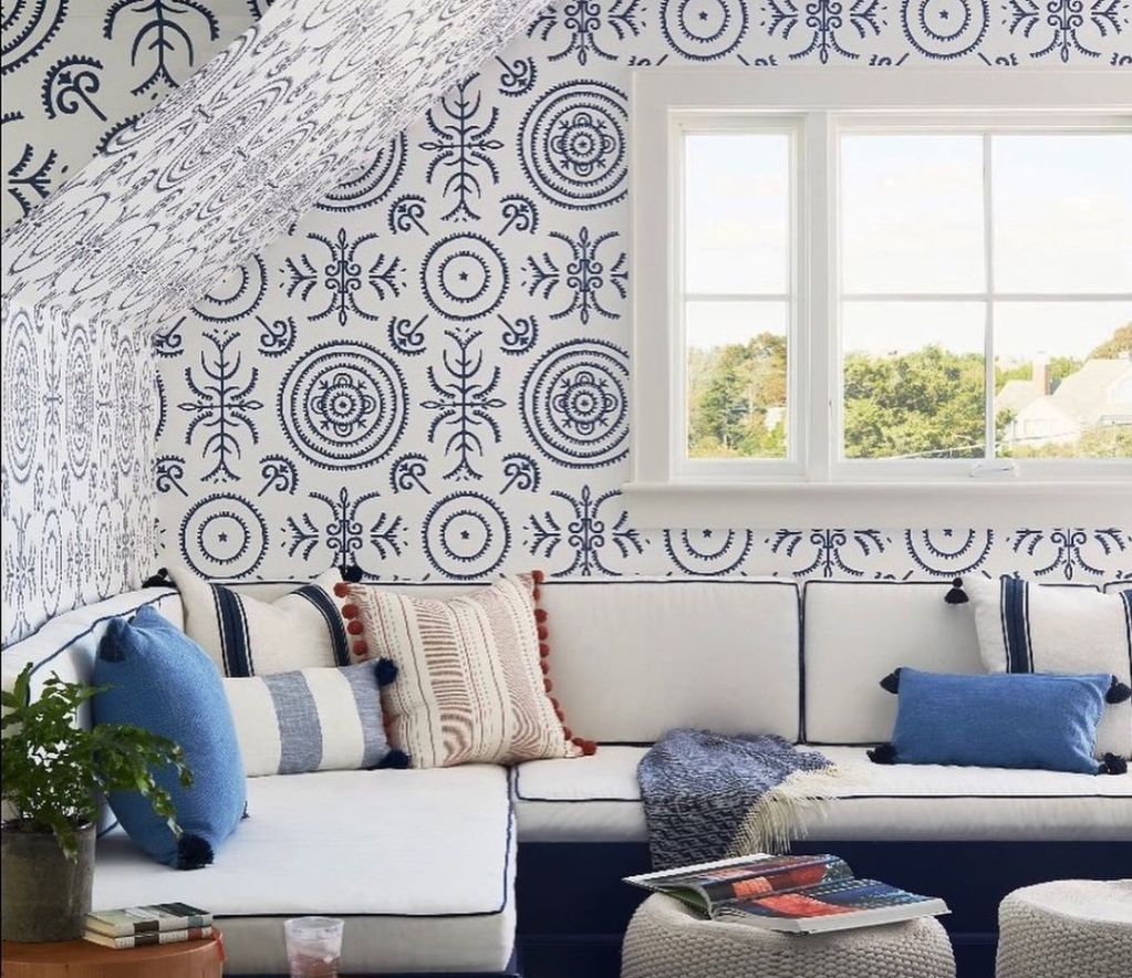
With their ability to add character and cosiness, it’s no surprise prints are enjoying a renaissance.
“Patterns often reference a place, culture or point in time,” says Rochelle Morris from Nudge Interiors. “With our lust for culture, travel and love for handcrafted, we’ll be seeing organic shapes, gentle curves and imperfect patterns in the new year.”
Artfully layering prints elevates a space, instantly bringing it to life. Strong, symmetrical patterns with vibrant, contrasting colours feel energising, while soft, subtle and low-contrast prints imbue a sense of calm.
Mixing prints can feel intimidating, so simplify by selecting a ‘hero’ pattern, generally the boldest and most colourful – and then a second and third print that share a common colour, ensuring they complement, not compete with, the scheme. “Print proportion is important,” says Morris. “Aim for 60 per cent for the hero colour, 30 per cent for the feature colour, and 10 per cent as an accent.”
Play with scale, like a large floral paired with a fine pinstripe, and keep your colour palette tight. “Work with three to five key colours in various shades and don’t match everything too perfectly; it can look like you are trying too hard,” warns Morris. “Buying prints from different stores, rather than from one designer, helps avoid this.”
Luxurious linen
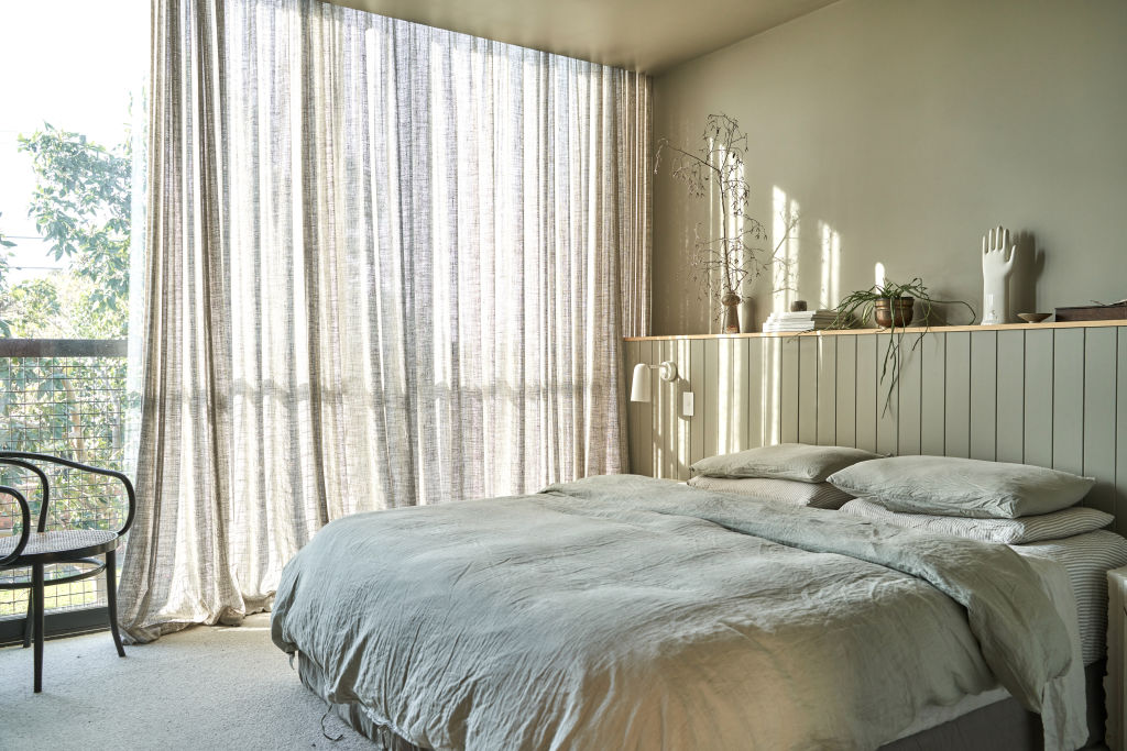
Finesse your interior spaces with sheer billowing linen curtains. This cherry on the cake finishes a room, providing it with subtle elegance, movement and ambience.
“They’re so classic and timeless,” says designer Adele Fudlovski from Window Studio. “Linen curtains work in any room, especially bedrooms for their superior block-out capabilities and in the living room for a cosy and homely feel.”
Look for soft ice-cream shades, crisp white, or neutral shades and team with brass rods, ensuring they are wide and high enough for your room. “Aim for just under the cornice or 3/4 above the architraves to maximise a feeling of height in the room,” she says. “It’s key for creating a feeling of spaciousness.”
Make sure curtains are lovely and long with a slight 20-millimetre puddle. Ensuring their proportions are right instantly makes ceilings feel higher and the smallest space roomier.
If your budget doesn’t allow for pure linen, opt for a linen-mix fabric that offers a similar aesthetic and movement. “Keep curtain tracks to a slim profile rather than a larger profile too, and it will ensure your curtains are the star of your space,” Fudlovski says.
We recommend
We thought you might like
States
Capital Cities
Capital Cities - Rentals
Popular Areas
Allhomes
More
