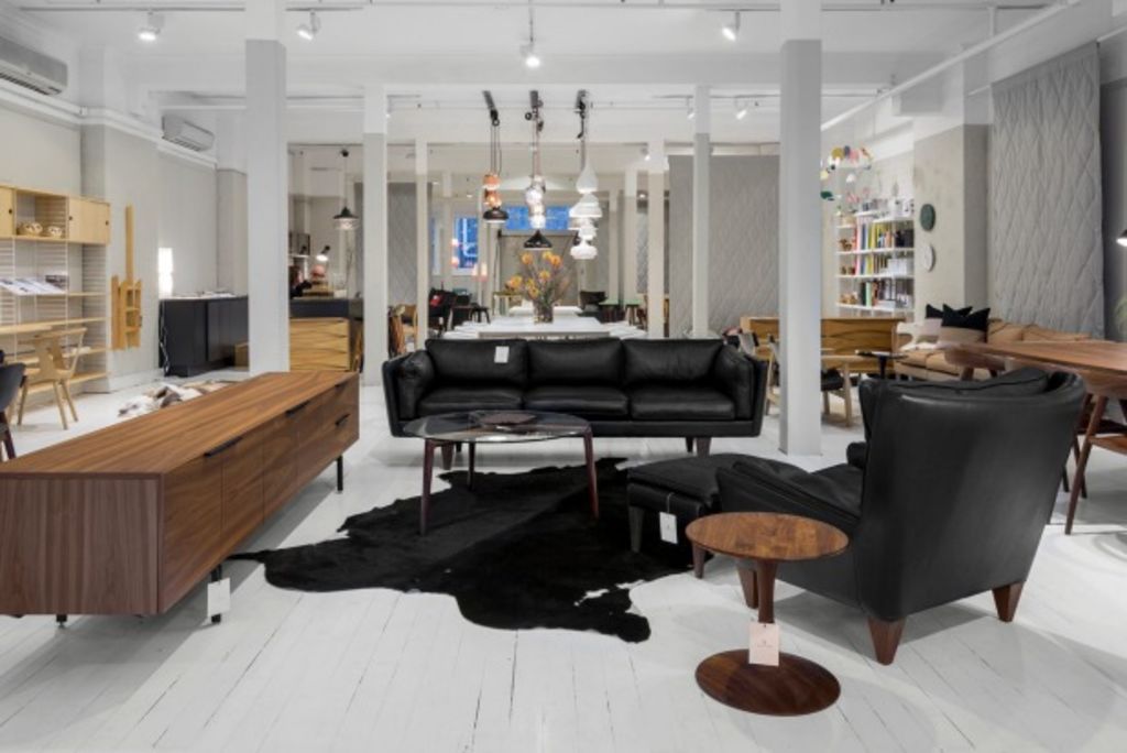
What exactly is Scandinavian design?

Kivik. Hemnes. Ektorp. Even if you aren’t sure what these funny-sounding words mean, they’re probably familiar to you. That’s because they’re the names of sofas and bookshelves from IKEA. But did you know that the Swedish company names its products after towns in Northern Europe as a nod to its Nordic heritage? And that the blue and yellow logo was inspired by the Swedish flag?
It’s easy to forget how much Scandinavian design has influenced our furniture market. Thanks to modern mass retailers, including Ikea, clean lines and starkly simple silhouettes are so popular that they’ve become mainstream. But what is Scandinavian design, and why did it become one of the go-to design styles in the developed world? And are we doing it right?
Let’s start with the basics. The style emerged in the 1950s as part of a modern movement in Nordic design (i.e. Sweden, Denmark, Finland, Iceland and Norway) that prioritised function and affordability over preciousness and luxury. Marked by pale colours, natural materials and lean, leggy furniture, the aesthetic was largely a response to the region’s short days and long winters, which called for bright, practical interiors.
These days, it’s a favourite among minimalists who tout its influence on the mid-century modern movement and praise its lack of fuss. As such, the aesthetic seems particularly trendy around the new year, when resolutions to declutter are top of the mind.
While there’s a great deal of overlap between Scandinavian and mid-century modern design, the biggest differences can be found in the lighting and colour palette. Mid-century modern interiors tend to explore darker hues and work just fine in low light, whereas Scandinavian interiors aim to maximise lightness in a room.
“It’s as much a lifestyle as it is a look,” says interior designer Rachel Dougan, who owns ViVi Interiors in Washington, USA. “It’s disciplined. Swedish benches, for example, have longer legs. And I think to myself, how easy would it be to store stuff underneath there? But Swedish design has no place for clutter because clutter ruins the lines. It begs to be left alone so that air and light can circulate through it. It’s aspirational.”
Don’t be intimidated, though. The style doesn’t have to be adapted in full – it works well with industrial and farmhouse pieces – and for the most part, the furniture isn’t as delicate as it looks. Loi Thai, who owns a Swedish antiques shop says most Scandinavian furniture is quite rugged and will stand the test of time.
The appetite for modern, minimalist design can be felt even in more traditional places, Mr Thai says, where people shy away from big, heavy sets of furniture. “The thing about Swedish furniture is that it has a lot of classic elements, there’s so much history there,” he says, “but it lends itself easily to a modern interior because it’s very edited.”
Magazines and design blogs tend to make Scandinavian design look impossibly neat and expensive. Pictures show whitewashed walls, natural wood floors, dramatic pendant chandeliers and rooms flooded with light. These interpretations aren’t always realistic, so if you’re looking to work the aesthetic in your own home, just remember that it’s high on function, low on fuss.
“The dining room is a great place to start,” Mr Thai says. “One by one, swap out heavy dining chairs for light ones and mix a variety of colours and materials. It will feel inviting and personal.”
To fill in the gaps of a mix-and-match look, try IKEA’s birch-legged Leifarne chairs ($US55 ($77.70) each) or World Market’s Paige square-back dining chairs ($US400 for a set of two), which Ms Dougan likes.
As for tables, IKEA makes a basic, extendable wood table called the Norden ($US299) that can be paired with just about any chair from around the house.
In living spaces, avoid large, dark rugs and wall-to-wall bookshelves, and instead spring for a pale handwoven mat, such as one from Safavieh’s Rag collection ($US30 for a 2-by-4-foot rug), and a few large potted fig trees. Accessories should be few and purposeful: copper light fixtures and large mirrors to bounce light around the room, rainbow-coloured candle-holders for a small, bold accent, and clusters of pop art on the wall.
Consider introducing some high-contrast masculine elements to keep the room from looking overly feminine, Ms Dougan advises.
“This look has a lot of pastels,” she says, so add some contrasting elements, such as a raw wood coffee table or industrial metal pendant lamp, or even a metallic piece, such as a heavy gold clock. And of course, restraint and balance are crucial. One of the most common mistakes newbies make when decorating with a Scandinavian look in mind is going overboard.
“Swedish furniture is very leggy,” Ms Dougan says. “If you aren’t careful, your whole living room will look like it’s full of twigs.”
– The Washington Post
We recommend
We thought you might like
States
Capital Cities
Capital Cities - Rentals
Popular Areas
Allhomes
More


