What is 'colour drenching' and how can I do it at home?
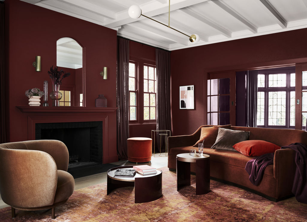
How we decorate our homes impacts us every day, and what better way to make your walls talk than with colour? From vibrant lipstick red to dusty grey, colour’s saturation, vibrance and hue have the magical ability to elevate and celebrate your favourite space.
“After spending so much time at home recently, there is a genuine desire to express individuality in our homes,” says interior designer Angie Rogers. “Utilising every inch is important, and turning a pokey, unloved space into a cosy corner filled with personality is appealing.”
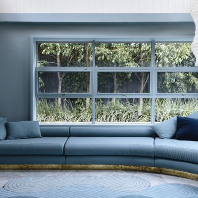
Enter “colour drenching”, the paint-every-surface-in-sight trend that sees colours break free in every direction, pepping up even the smallest or drabbest spaces.
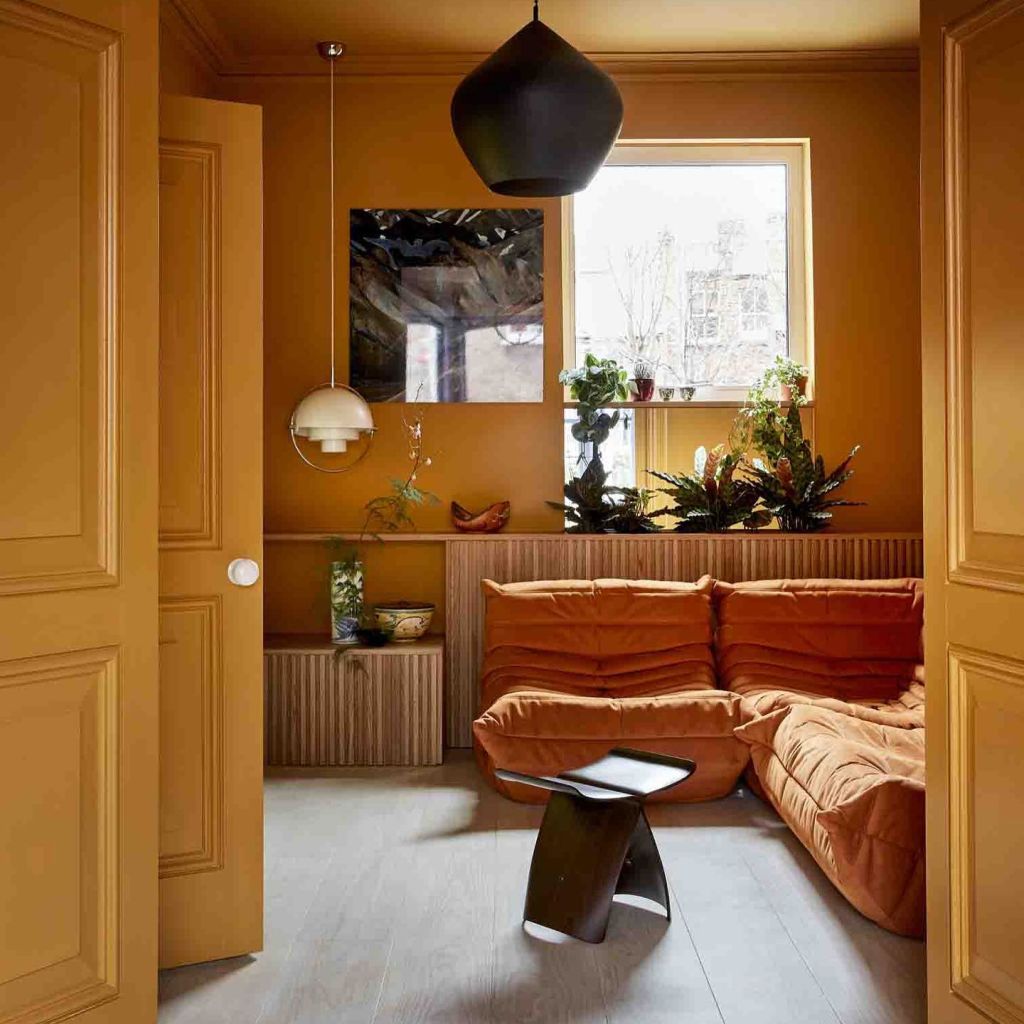
“It’s a really exciting trend,” says colour expert Annie Sloane. “Paint walls, furnishings, lamp fittings and even picture frames in similar shades, then sit back and bask in compliments.”
Designer Shona McElroy agrees and says it’s not only an impactful trend but an easy way to pull your home together. “Colour drenching is also a popular fashion trend because we love to co-ordinate, rather than use a pop of colour,” she explains. “Contrary to what it might feel like, it’s a way to keep everything cohesive and design intentional.”
Choose your space
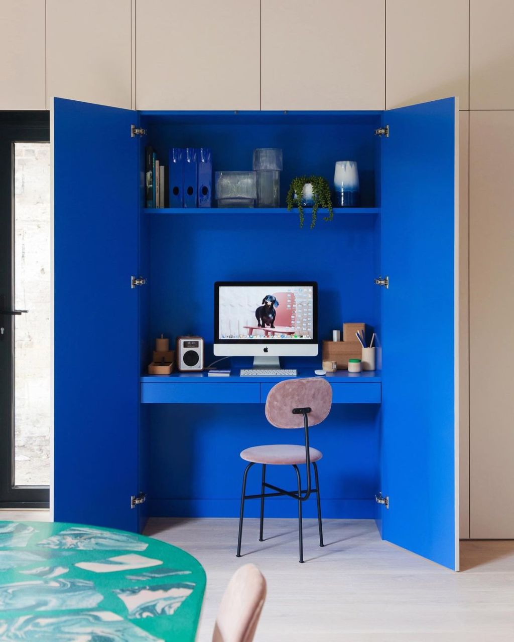
Avoid the passé feature wall or large rooms where too much colour can overwhelm. Look for smaller nooks and spaces like the study, bedroom or powder room to experiment. “Colour drenching can make a small room feel bigger,” says Rogers. “It has the effect of pushing the walls, doors, windows and trim into the background, allowing furniture, lighting and accessories to star.”
Consider mood, space and impact
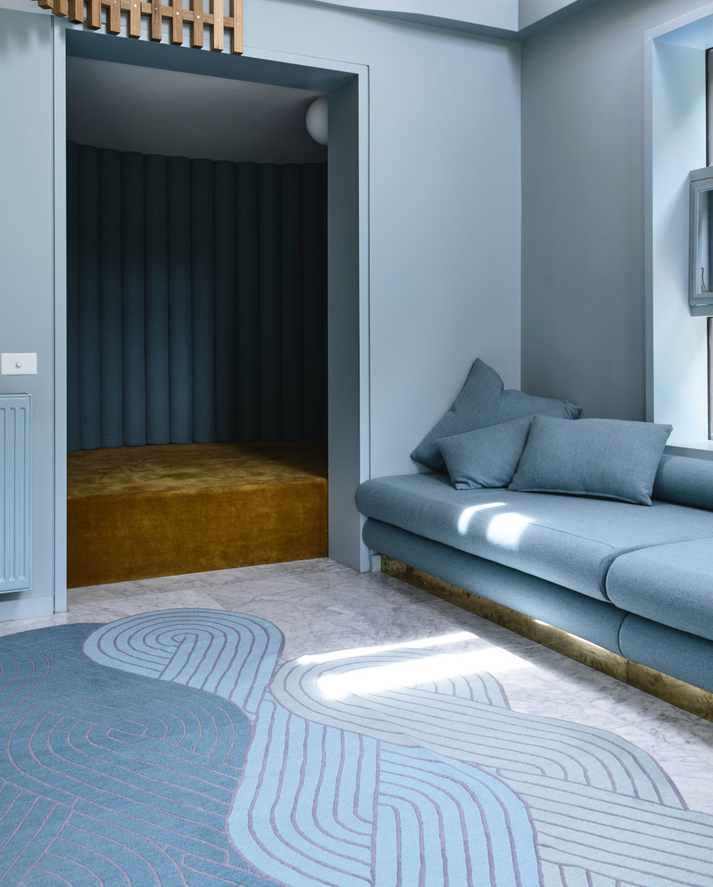
Certain colours capture our moods. Some are subjective, and research shows others have mood-altering effects depending on their brightness, shade, tint or tone. Bright and light colours evoke feelings of joy, green is linked with nature and growth, and grey and blue feel calm and soothing.
“Consider the mood you want to achieve and the level of natural light available in your space,” suggests Rogers. “Deep greens and blues create rich, luxurious spaces; pinks, rose and berry are soft and feminine; and bright yellow is super fun and vibrant for an inviting space.”
Select a colour
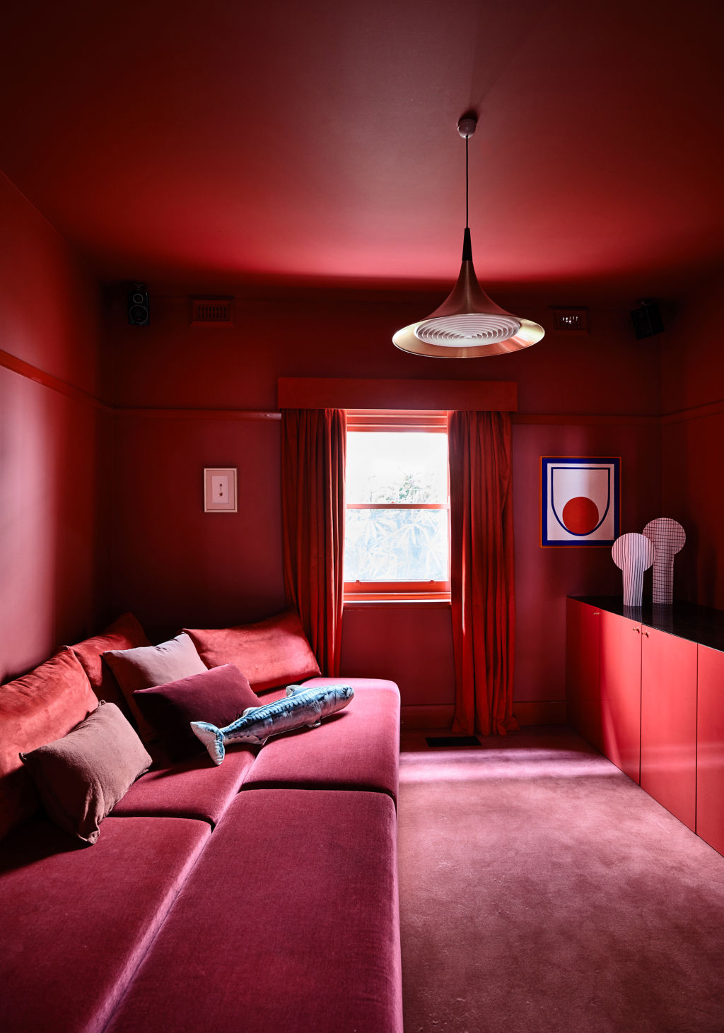
You can go top-to-toe in bold, dark, hushed or bright hues, or envelop an entire room in shades from the same section of the colour wheel, like pink and red or green and blue. Test patch a wall first to check your colour choice works with the light in your space and is sympathetic to its architectural detailing. Most importantly, see if it inspires and makes you feel at home.
“If you are afraid to pick a really bold colour and go crazy painting it on every surface, select one colour and use different tones and levels of saturation,” suggests Rogers. “You’ll achieve a contemporary monochromatic colour-drenched effect but in a much softer application.”
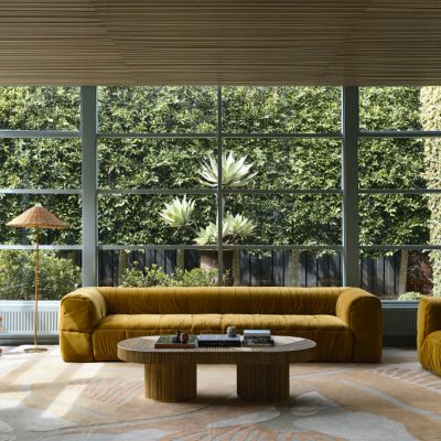
Think about your space in terms of layout and furnishings and how each will relate to your selected colour. Bold primary tones work perfectly on all types of furniture, and the right shade even breathes new life into old pieces.
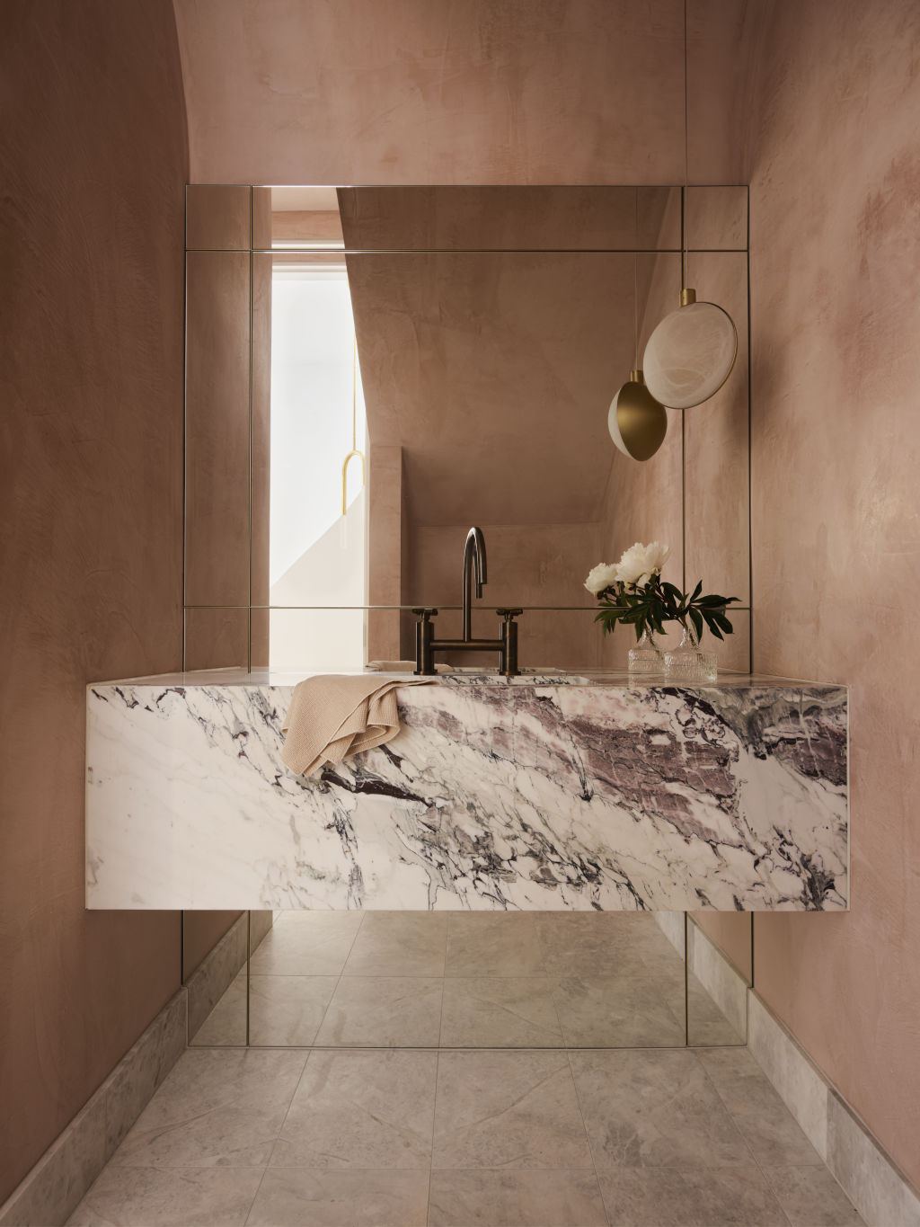
McElroy is drawn to heavily pigmented colours in a melee of tones and materials. “Play with material with different effects like translucency, softness and reflectivity,” she suggests. “Think hard polished plaster with leathered stone, marble, aged metals and different types of upholstery.”
“The powder room is an easy space to experiment,” says Sloane. “Pick a surprising shade; something statement worthy and joyful such as Capri Pink [from Sloane’s chalk paint range] to empower and suggest the fun glamour of a restaurant or hotel bathroom.”
Now, paint
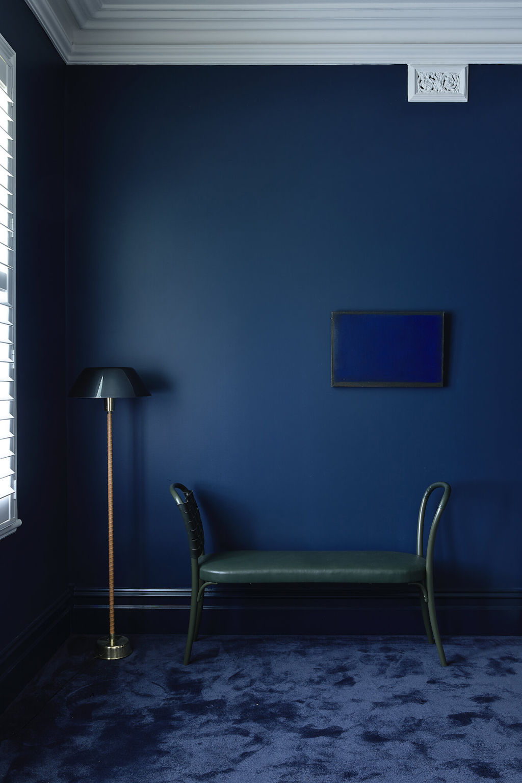
When you have chosen your star colour, splash with abandon. Commit to the cause and envelop your space, celebrating even the most subtle of details. “Shut the door and start painting every wall, the ceiling, power points, architraves and furniture; even match the hand towel and fresh flowers,” says McElroy. “Really go for it, and don’t worry – you can always start over.”
We thought you might like
States
Capital Cities
Capital Cities - Rentals
Popular Areas
Allhomes
More
