'Where's that?': A distinctive home designed by an architect to the bridesmaid suburbs
Michael Ong is making a habit of introducing idiosyncratic architecture to some of the Melbourne’s bridesmaid suburbs that haven’t yet seen much gentrification.
“I often feel like I’m the first architect to enter the not-so common suburbs,” he says. Indeed, when talking about recent design ventures he’s often asked, “Where’s that?”
In most of his architecture, the principal of MODO (Michael Ong Design Office) does anything but the orthodox. But that’s what makes his projects distinctive.
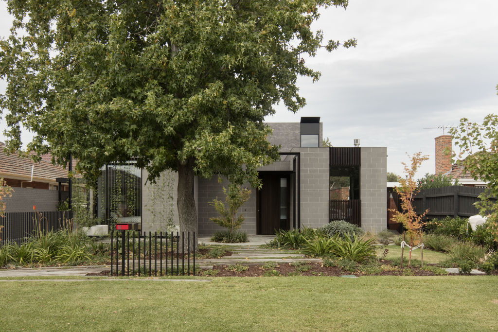
In his latest outing, a four-bedroom, two-level, grey brick family home in Strathmore near Essendon in the metropolitan north-west, Ong has, however, employed some strategies characteristic enough to be recognisable as his insignia.
Even on an economic 520-square-metre block, he hasn’t built to the boundary. “We wanted to give space around the house to allow light to pass over and into it,” he says.
He hasn’t given the home one big backyard, using multiple smaller outdoor spaces instead. The most important to the foodie dad is the outdoor barbecue area with pizza oven that extends the “simple [indoor] kitchen with a butler’s pantry”.
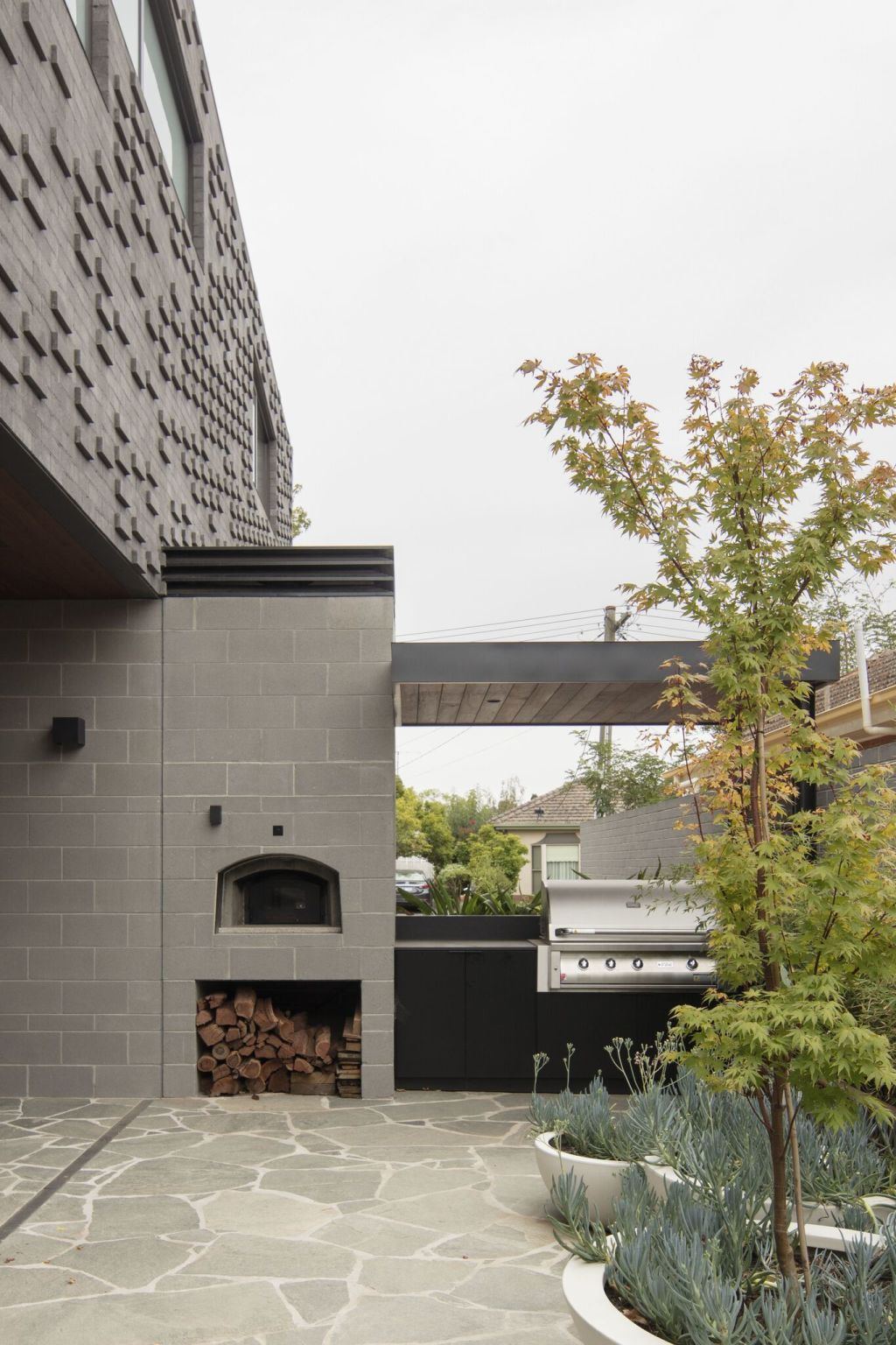
He hasn’t barricaded the place behind a high wall. As the house is made so robustly of concrete blockwork plus smaller-scale but same-shade bricks above, “and being such a solid object, a fence would have felt like an extra physical barrier”.
“We decided to leave the front as public as we could,” he says.
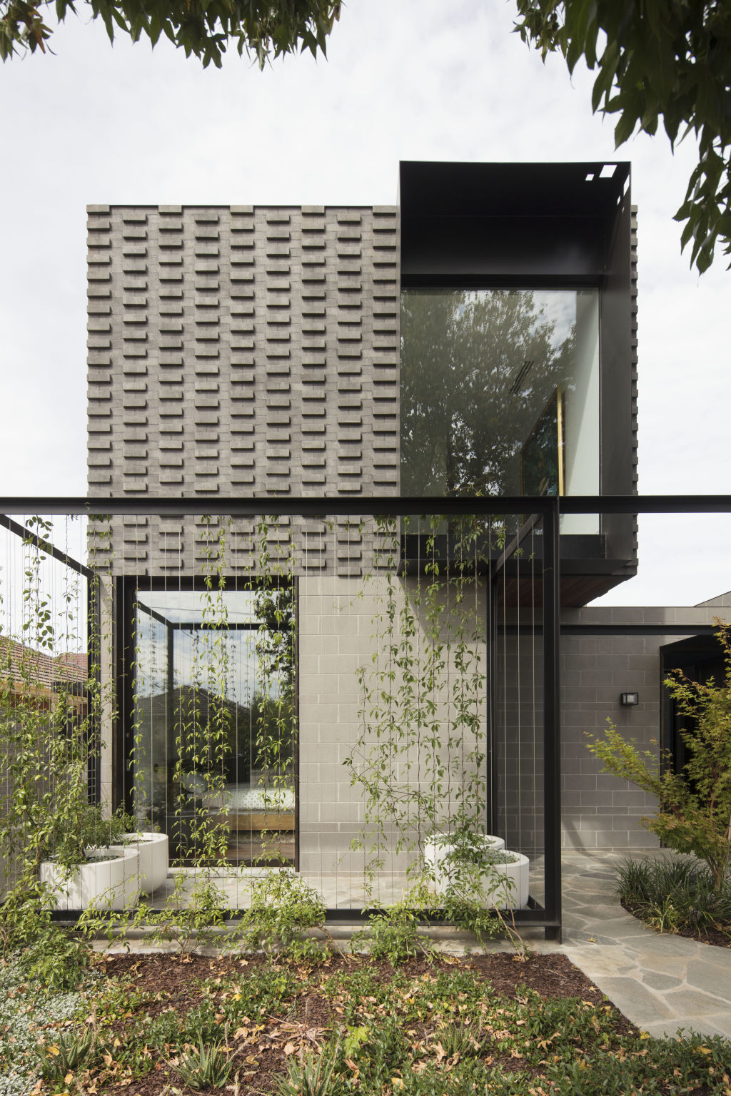
When vines grow up to veil the street-side guest room’s courtyard in verdant privacy, there won’t be any sense of exposure. And besides, the established liquid amber is so well-leafed for three quarters of the year that the family’s life is not the main presentation to the pavement.
The tree, a remnant of the former home that occupied a block in a precinct where the use of brick is a mandatory covenant – “Strathmore has brick everywhere” – was the element that determined the scale and situation of the new home.
“We wanted the house to be behind the tree and [on the upper storey] we wanted to align the outlook toward the tree,” Ong says.
In the pleasing front-of-house composition of stretched rectangles which ultimately feature that large forward-projecting, steel-encased picture window in the upper cantilever, the tree’s presence is so strong that Ong says “its beautiful volumes set the tone of the [main] bedroom”.
“It brings so much privacy and softness, and such a sense of the transition of the seasons that you really don’t feel like you’re in the suburbs,” he says.
But those elements are the mere entree to a home that also fulfilled the owner’s request for something with mid-century references and a lap pool for two teenage children who take their athletic fitness very seriously.
Having done away with a big backyard where a pool might conventionally go, the architect suggested it be set in the house’s heart.
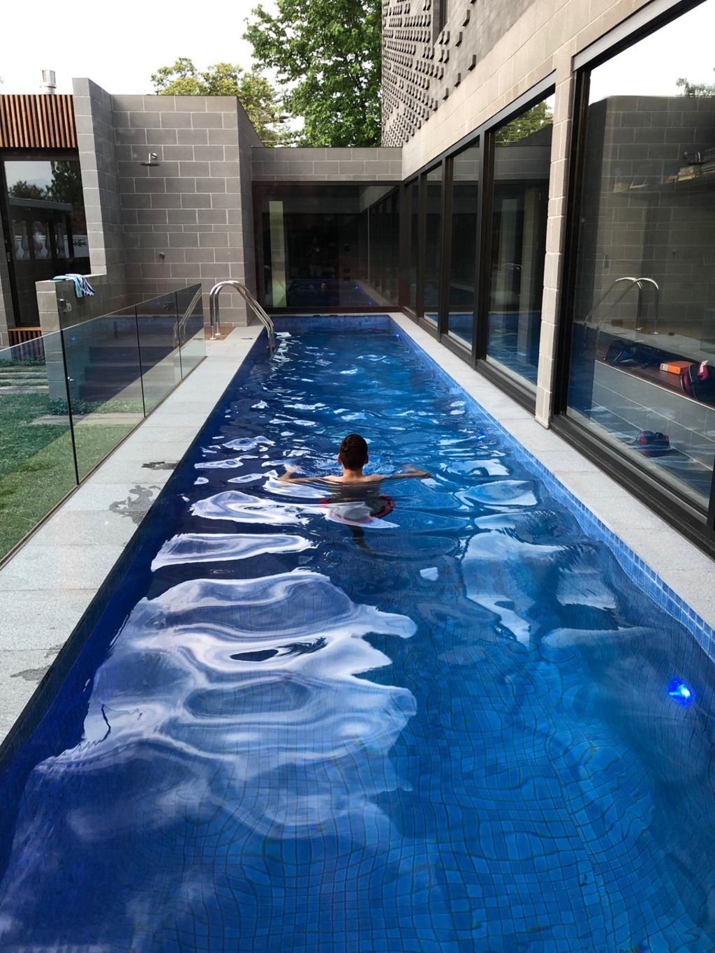
“I said, ‘Why don’t we bring it into the centre of the house and align it to the corridor so that bang! You would see it when you walked in the front door, and follow it along to the living room?’”
By having water in the middle of the house, and lifting it up from the ground plane by half a metre, “the change of light on the water can be appreciated all through the day and all through the year”.
The other main refrain that Ong knows makes this place “not a bland house … not a normal house” is the application of two major materials in such a masterly way.
Brick used in different sizes and patterns – straight blockwork below and fascinating smaller profiles with changing configurations on the upper level – resulted from decisions made as the building was emerging.
“The texture happened on site, organically,” the architect says. “As it was going up, I was thinking there just wasn’t enough contrast between the small brick and the blockwork. We decided we needed to add more interest so that the building didn’t look too heavy.
“So, we developed a few patterns.”
There’s a regular pattern on the front and irregular patterns on the upper side facade.
“Now when the light hits it, it really pulls the above volume into a totally different character.”
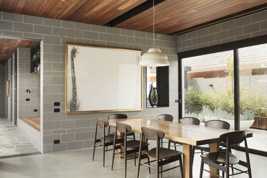
Internally, the lower and upper volumes are similarly demarcated with different materials. On the ground level the blockwork is the honestly exposed background of a cherished modern art collection.
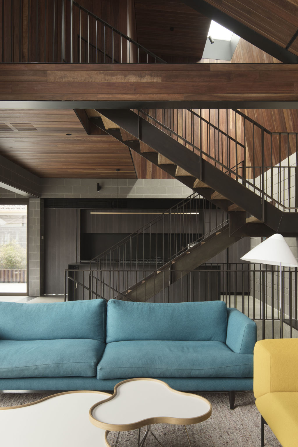
Upstairs and in constantly changing above-head volumes – “three metres at the entry, double height to six metres to the skylight above the kitchen, and five metres above the living room” – the many different planes and rakes are clad in boards of Spotted gum, “a textured material that will patina with age and that even now gives the upper storey a lot of softness and warmth”.
An outpost in the suburbs it may be but this new MODO completion is so richly considered it’s the absolute antithesis of bland, blah architecture.
We recommend
We thought you might like
States
Capital Cities
Capital Cities - Rentals
Popular Areas
Allhomes
More
