'Clever layouts, meatballs and Malm': The psychology behind IKEA stores

It’s funny how a trip to IKEA sounds better than a trip to most other furniture stores. The question is: why?
Dr Jan Golembiewski, director of Psychological Design, has an inkling. “For most of us, going to IKEA feels good mentally,” Golembiewski says. “Whether or not they planned it, the design of the showrooms manipulates the dopaminergic system in our brain.”
Dopamine is the chemical that signals to the brain that something is rewarding and worth pursuing again. It can help us focus our attention on certain things. IKEA’s showroom design, Golembiewski says, sets the stage for the brain to use dopamine to stimulate aesthetic, three-dimensional thinking, which is not something we do very often in urban life.
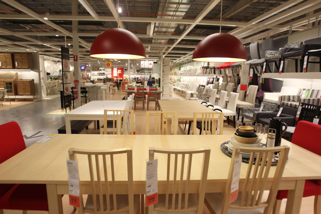
“When you go into IKEA, there’s a grey path ahead of you with arrows illuminated by spotlights to show which direction you will take,” notes Golembiewski. “We’re resistant to that so it feels uncomfortable, but we have to accept it. And in doing so, we accept we engage with IKEA on their terms, not our own.” The maze-like floor plan essentially forces you to travel through every section of the store, says Adam Burns, director of Design Portfolio, so you are faced with the showrooms and items for the kitchen, living, and bedrooms, even if you were originally only there for a fake plant.
We are presented with myriad choices throughout our time at IKEA, and are lured into making “conscious aesthetic decisions that please us and are about improving our own lives,” explains Golembiewski. Having to make these choices draws dopamine to the part of the brain used for making aesthetic judgements and recalling size and formation of rooms.
This makes us more aware, wakes us up momentarily from our humdrum, autopilot existence. And it feels rewarding, Golembiewski says, “It’s like using muscles we’re not used to using, they get sore but feel good.”
Less effort is required to imagine how a product fits in our home
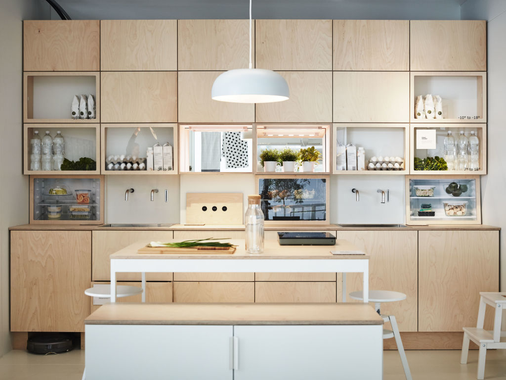
If we lack an eye for interior design, IKEA has set out scenes of a home environment along our journey through the store. There is often more than one kind of layout of each room type to appeal to varying interior design styles, says Burns, so it’s easy for different customers to imagine the product in their own home. And even if we don’t end up purchasing anything, we leave with home decor inspiration, and the trip does not feel wasted.
We feel included and looked after
IKEA’s furniture doesn’t have particularly showy or high-end designs, says Burns. “You’re going there for everyday products, you can use their products as a base and have your own current products to go with them. So, it’s very democratic in that way.”
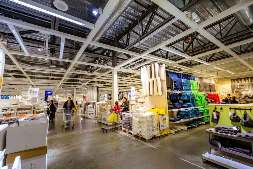
Besides their furniture, the store design itself exudes a homely and inviting vibe, so we are quite happy to spend time here. “When you go into IKEA, they normally have a high open ceiling,” says Peter Wang, director of 0813 Studio. “Majority of people feel relaxed going into a high ceiling space, if it was a confined space, they would just want to leave.” Wang observes that their lighting is predominantly warm white, which has a welcoming effect, with only spotlights to highlight products here and there.
Finally, let’s not forget the IKEA restaurant, which has us lingering in the store in comfort. Since you’re spending a lot of time there, it provides customers a convenient halfway point to take a break without leaving the store, and spend more time browsing after eating, says Burns.
We recommend
States
Capital Cities
Capital Cities - Rentals
Popular Areas
Allhomes
More

