Why you shouldn't follow The Block design trends
Whether you love it or hate it, there’s no denying the popularity and influence of Chanel 9’s The Block. Even in its twelfth season, the series continues to pull more than a million viewers for many episodes.
The Block has opened people’s eyes to the possibilities and potential of beautifying their own homes. It has been a channel through which design trends have become very popular, very quickly. These trends are often explored and implemented in a number of ways because four or five couples are renovating multiple areas. This means viewers get a broad range of inspiration for updating their own homes.
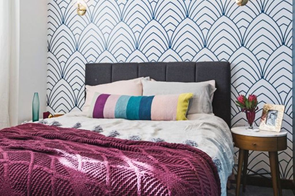
But the problem with up-to-the-minute trendy design is that it dates. Really fast. Much like we can now pin-point a ’70s kitchen by its orange laminate bench-tops, people will one day look back and say, “That hexagon splash-back is so 2014!”
Everything dates with time, but the trick to design longevity is to pick your design details carefully. If you chose black taps, a rhombus splashback tile and cage-style pendant lights back in 2013, you could fairly easily update them because they are easily replaceable. But if you went for matte-finish concrete-effect porcelain sheeting for all your bathroom floors and walls, you might be regretting that in a few years’ time.
My style is generally up-to-date, but not trend-specific to a particular year. For instance, from 2000 to 2016 we’ve had a very neutral palette, blending in with some micro-trends that have come and gone (including matte finish taps, penny-round/hexagon and rhombus tiles, exposed globe pendant fittings, chevron or herringbone designs … the list goes on).
To give longevity to my clients’ home designs, I try to choose “broad” for the fixed items, and leave the trendy designing for easily changed accents and soft furnishings: lighting and splashbacks but also cushions, rugs and artworks. Whether for a renovation or a new-build project, I’ll almost always recommend a neutral kitchen/bathroom/exterior. Within the space we can play with layering different textures and neutral colours, meaning the room will stay current for longer but not be boring.
Regardless of whether your interior design style is specific to 2016/17 or broad, the principles of good design will never change: focus, repetition, balance and cohesion.
There’s a big misconception that good design equals trendy design. This is untrue. Good design is about pulling different elements together in a way that gives the viewer visual comfort, regardless of whether the space is trendy or otherwise. Typically this means there is one focal point in each area, elements (shapes and colours) are repeated through the property to give a sense of flow and cohesion, and the spaces look and feel balanced.
So before you head off and buy the fixtures and fittings for your next renovation, recalibrate and really think about how long your design is going to last. Are you happy with a three-to-five-year window, or do you need to rethink your design?
Jane Eyles-Bennett is renovation mad and has been a professional designer for 23 years. She was a renovation designer on the TV series Property Climbers, winner of several interior design awards and design consultant to more than 600 property owners in the past nine years.
Have a renovation or design topic idea? Contact Jane at jane@hotspaceconsultants.com or via her website.
We recommend
We thought you might like
States
Capital Cities
Capital Cities - Rentals
Popular Areas
Allhomes
More
