A high benchmark of adaptive reuse
One of the classic tenets of design holds that proportion and relationship are two attributes that make objects and buildings aesthetically pleasing over the long term.
Invention is another, but not when it is affected for its own sake.
Short-term, stuck-on novelty is the precise quality that guarantees a short life cycle and real fast relegation to the bin of laughable fashion fripperies.
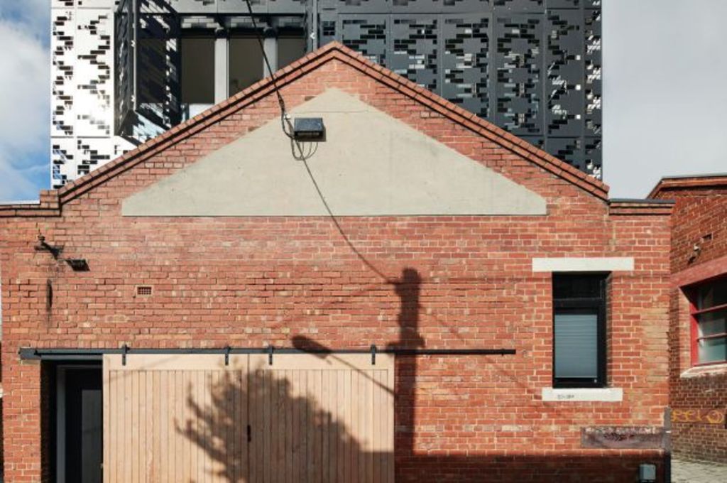
In the remaking of a small and old brick warehouse in Carlton into five separate dwellings, Melbourne architectural firm DKO has created a really admirable exemplar of all that is worth doing when adapting an old building for a new use.
The distinct old and new form proportionally relate to each other and to their neighbourhood. The invention – that fantastic upper-level facade of black perforated steel that screens for sun and privacy and that design director Jesse Linardi says during the daytime “makes the space inside really ambient and unusual” – is a brilliant piece of work. “Really simple and strong,” he says.
And this, says the description of the development into four two-bedroom dwellings with roof decks, and a single bedroom apartment at the rear, is how to create an interesting structure that so very successfully “occupies the present but talks to us about the past”.
The Victorian-era brick building “on the compact site between two lanes”, Linardi says, “had gone through a number of different lives”.
“It had been a metalworking factory, a textile factory and when we got to it, was near derelict but there was a student living in it.”
After taking out the asbestos and gutting it to front and side brick boundary walls, the new vertical apartments of three levels each; two of which share the front, north-facing boundary and the peaked front parapet wall; two that occupy the waist of the building, and the one small dwelling at the back boundary, are modern and have their upper edge walls made out of glass, “So they are double facaded,” the architect says.
“Behind the black screen, which is openable on the front with bi-fold doors, it’s a glass building. And all the individual 16-square-metre roof decks have inbuilt metal shelving that can be planted with greenery that is spilling to the outside already.”
The glass is recessed back from the screen which is patterned, apparently with quite random rectangular spaces, but that, Linardi explains, references the patterns in the bricks down below and in a nearby church.
“We wanted the building to be contextual so that it felt like an appropriate response to the wider environment. That was the seed of the design for the screen”.
The choice of black for the upper level box and the bulk of the “pared back” internal joinery, was, he says, because he sees it as a neutral.
“But also, to try and let the historical brick building be ‘the moment’ of the piece and allow the new insertion to fall into the background of that beautiful base,” Linardi says.
“We were trying to be a good neighbour and to be a good building as well. We’ve had no negative feedback about it at all, which is very unusual”.
We recommend
We thought you might like
States
Capital Cities
Capital Cities - Rentals
Popular Areas
Allhomes
More

