Achieving a tonal quality in Hobsons Bay waterfront home
There is so little absolute waterfront property in Melbourne that it always ranks as top-shelf realty.
Add in the around-the-clock activities of Hobson’s Bay; Station Pier with the comings and goings of the Tassie ferries, the varying weather-over-water phenomenon, and sunset somewhere over the You Yangs, and you have guaranteed “always dramatic views”, says architect Anja de Spa.
In making over a two level, two bedroom penthouse exposed via a curved glazed frontage to this living spectacle, de Spa’s practice, Molecule Architects, sought to make their changes “a counterpoint to the outlook”.
In a Port Melbourne high-rise built only 10 years ago, one of the most obvious tasks was to quiet down the glare of “the very high gloss white tiling”, and mute its hard contrast of “dark brown joinery and two types of reconstituted stone – dark charcoal and cream”.
Gutting a house to contemporise a scheme is relatively straightforward compared to renovating an apartment because, apart from annoying the underfloor and next door neighbours, “the central challenge is that all the building services, particularly the plumbing points are fixed”.
So in this case was the lift shaft that protrudes into the apartment like a square peninsula.
Adding yet another level of complexity was that fact that the apartment’s footprint is an ungainly shape; a lemon wedge with a long front crescent of floor-to-ceiling windows.
“The existing spaces were quite awkward in relation to the facade, especially the kitchen,” de Spa says.
Not able to move walls or the location of rooms, what Molecule did was very astute and is best summarised in the kitchen of multiple angles. First they inserted a new non-structural wall behind which is what de Spa says is “the back of house scullery”; a narrow area with fridges, dishwasher, big sink and big storage.
Liberating the kitchen from clutter, a great thick slap of grey granite with bevelled edges now sits at a 90-degree angle to a bench-height dining table extension made of the waxy hardwood, Tallowwood.
“The stone and timber become a yin/yang element, and they follow the angles that are already present in the room,” de Spa says. “The Tallowwood table, warm to the eye and to the touch, is the only table in the apartment and it is set at bench height which means that you dine on stools.”
To connect and make more logical the oddly relating spaces in the linear geometry of the apartment’s lower level, the architect introduced some repeating, visually linking decor themes.
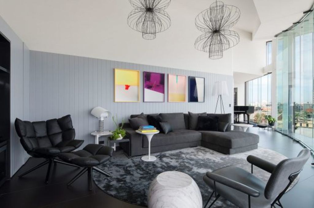
One is the pale grey painted vertical timbering that runs from the kitchen, into and out of the entry foyer and around the corner into the sitting room, where it becomes the lower stratum in a space that has an extra-half level of head height.
“The timbering is a datum line – like a ribbon – that provides a continuity throughout”, de Spa says.
Another repeating installation is there in the entertaining areas as three, glossy and black and therefore recessive alcoves, with different functions, treated as “a punch” within the soft grey wall linings.
In the kitchen it’s the cooking alcove. Beside the glossy black piano, it’s the bar, and in the living room, it’s the entertainment unit alcove.
The chromatic greyscale colouration that is carried through in the flooring and wet room tiling, the cabinetry, the silk carpet in the sitting area is custom-designed by de Spa, and even in the lovely cloud-patterned wallpaper in the powder room.
It is all about quiet and calm, and creating that counterpoint to the view.
“There’s quite a rigour in the monochrome, and quite a moody re-imagining of the atmosphere of the place,” de Spa says.
We thought you might like
States
Capital Cities
Capital Cities - Rentals
Popular Areas
Allhomes
More
