Architect turns old 'warren' house into striking hybrid of period and contemporary

On the harbour’s north shore – and made using some old bones of a house first planted on the steep block in 1910 that later suffered much modification – is a five-bedroom residence that, following a recent rebuild, morphs through a staged sequence of stylistic expression to stand as an intriguing, visually elegant original.
Architect David Mitchell took on the brief to “sort out an unbelievable warren” and, for a family that entertains often and in numbers, to create a house with an entire third level as parents’ retreat and the entire rear lower level as a second living-dining “and magnificent entertainer’s kitchen”.
Beginning by taking the house back to a central slice of its Edwardian heartwood and keeping the archway and period-style panelling in the entry hallway, Mitchell set up a narrative of curves that has you at hello.
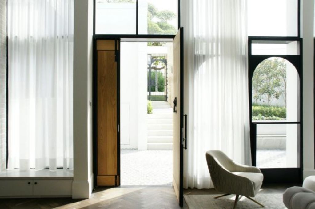
There is, in the stairwell ceiling and in the new, custom-made steel-framed windows in the front rooms made by fabricator Klint Busby, a curvaceousness that almost has a deco feel – or is it Georgian?
Moving through to the rear, the house becomes very square set. And in the off-form concrete structure that faces the lapping shoreline, the windows and glass terrace balustrades become black frames of verticals or horizontals.
“We pushed that part of the house not seen from the street towards the contemporary,” Mitchell says.
“We also kept it to a really simple palette and that’s also very contemporary.”
What Mitchell and his interior designer partner Kat Wilson have done in the harbourside mansion obviously required a big budget. Yet in keeping the many suggested stylistic typologies so cohesive and having them gently mutate from one to another, they’ve done something quite rare in a renovation: they’ve made a genuine one-off house.
- Related: Royal reno for an unashamedly modern pavillion
- Related: The hinterland home made with fallen boulders
- Related: Jacaranda tree inspires epic home renovation
Mitchell also designed the landscape, meaning the composition is taken to completion.
“To achieve this balance was not an easy thing,” he says. “It was being constantly thought through and fought over because we did not want any one element to stand over and above any other.
“It was a 20-month-long project and for a client couple who came from different [design] points of view. But we think it came together as we hoped it would.”

The north shore residence may have old bones but its look is stylishly modern.
Photo: David Mitchell
We recommend
We thought you might like
States
Capital Cities
Capital Cities - Rentals
Popular Areas
Allhomes
More


