Are designers influenced by the Pantone Colour of the Year award?

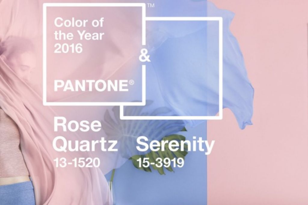
Last week, colour forecasting company Pantone announced its Colour of the Year predictions for 2016, Rose Quartz and Serenity – or, as most would say, baby pink and baby blue.
A self-described “global authority on colour”, Pantone’s annual award supposedly “captures the essence [of] what we see taking place in our culture during a specific moment in time”.
The awards always generate fan-fare – who could forget the colourful discussions of last year’s winning hue Marsala.
But despite the awards intentions to provide us with a colours that can help us find “mindfulness and well-being” as Rose Quartz and Serenity are intended to do, how do they really translate into the field of design?
Interior designer Anya Grant,from Melbourne architecture and design firm Techne, avoids using predicted “trends” in her design.
“We often look for longevity in a project, so we are less likely to be influenced by what a colour forecaster says will be hot next year,” she said.

Chelsea Hing, who runs her own interior design business, also avoids selecting colours simply because they are in vogue.
“My approach is to choose timeless colours and apply them in ways that feel like they were always there,” she said.
This year was the first time Pantone bestowed its highest honour on two colours since the award began in 2000.
The selection of the pink and blue were described as a “harmonious pairing of complementary shades” and were chosen to reference the discussion of gender equality and fluidity which was a hot topic in 2015.

But for interiors, the colour selection is a dated one, according to Grant.
“I think there has probably been quite a lot of use of those colours for quite a long time and it’s quite a surprising choice,” she said.
“Locally, there has been quite a lot of those colours used across that colour pallet.”
For Hing, the colour Rose Quartz “has been and gone” in the recent wave of nude and rose tones that grew popular in interiors. Serenity could be used for soft furnishings but never to colour walls.
“It feels a touch old fashioned on its own,” Hing said.
Sure, gender equality is great but when push comes to shove and you’re standing in the paint aisle of your local hardware store, with thousands of paint swatches at your finger tips, is Pantone’s reference to gender equality going to make you paint your home pink and blue? Probably not.
And it certainly won’t be leading professional designers to change their style designs.
“We aim to be ahead of the curve when it comes to taking risks with colour, so our clients would be led by us rather than trends,” Hing said.
Chelsea Hing’s tips on how to choose the right colour for a space
- If a space is dark, go for personality and generally the darker tones. Go with it, don’t fight it.
- Colour should be used like a thread, run through a space in a way that knits together and gives meaning to both the architecture and the interior.
- When taking the plunge with colour, go for the greyer/murkier tones rather than the clearer tones. Once it’s on the wall, the underlying ‘hue’ will be strong enough.
- Have guts, it’s only paint. You can’t tell how a deep colour will feel by painting a small brushout on the wall, so you really have to just go for it.
- Light is the single major factor when choosing colour, they will all look different in different spaces. Choose individuality rather than copying.
- Risk is equal to the reward.
We thought you might like
States
Capital Cities
Capital Cities - Rentals
Popular Areas
Allhomes
More


