Australia’s best residential architecture in 2020
The most memorable projects we wrote about through 2020 were, of course, all finished before COVID-19 distorted so much about our lives. Yet, in so many ways, they anticipated trends that might emerge in our homes of the post-pandemic future.
More nuanced in design and site-responsive individuality, mostly smaller in scale – apart from those that were made for multiple generations to occupy – and more adaptable for home office use than so much that has gone before, a lot of their features add up to a vital ingredient Australian residential architecture has been missing for too many decades.
Charm: “The power or quality of delighting, attracting or fascinating”. More, please.
Gables in a green valley
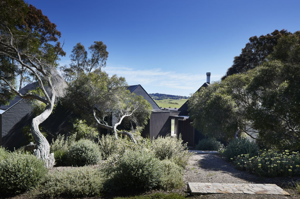
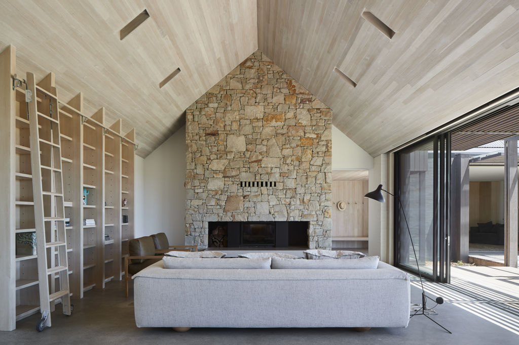
Inspired by an old dairy shed on a rolling green Mornington Peninsula property in Victoria is Sally Draper Architects’ rustic evocation of a picturesque house with multiple pitched roofs. It’s new but looks so apt to its situation it might have been there for generations.
Draper describes the collation of dark gables amid the native moonah trees as “a simplicity of forms”. The five-metre high, rock-built chimney breast and hearth in the main living room defy anyone to resist the urge to sit down, settle in and call for drinks, please.
Hunkered down in NZ’s deep south
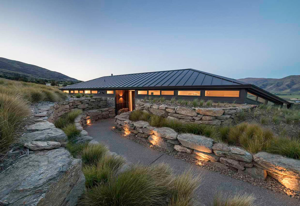
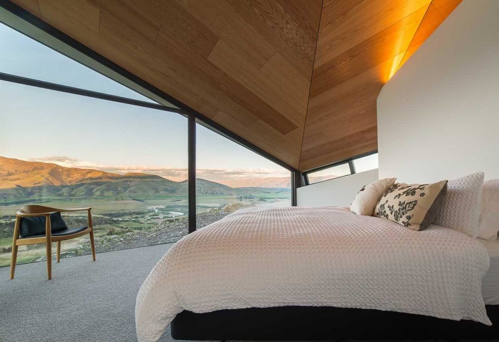
Engaged by an Australian-based Kiwi to design her family’s new holiday house in the wilds of the Otago region of New Zealand’s South Island, the always original Sydney architect James Stockwell created an extraordinary and half-buried “bach” with a roof shape derived from aerospace engineering and even then, with a downward tilt to protect it from often ferocious winds.
The Canadian oak-lined roof of the impressive interior volumes is just one aspect of thoroughgoing and exemplary craftsmanship that saw the three-bedroom Hawk House awarded the Supreme House Build of the Year by the country’s Registered Master Builders’ organisation.
Dimensional distortions
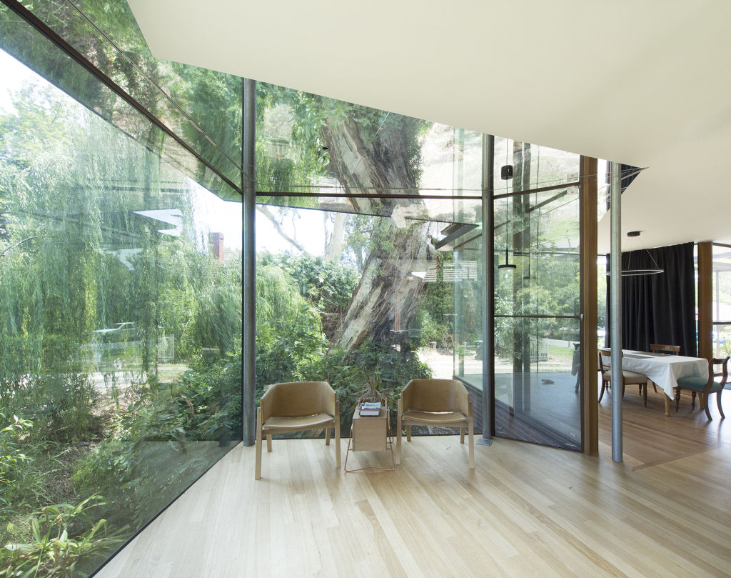
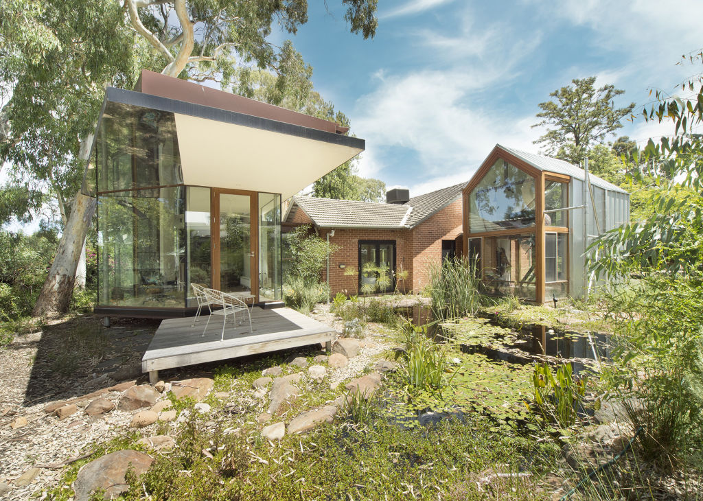
Adelaide Hills architect John Adams added two new wings to take the rear portion of a rather ordinary ’60s brick house closer to the creek that runs through the foothills property overhung with 100-year-old red gums. Also a landscape designer, Adams made a lovely natural pond the centrepiece of two glassy pavilions.
Where the work crosses into intrigue is that he lined the ceilings that break through the windows to become wide mirrored eaves. “So,” he says, “it all becomes a little bit discombobulating (confusing). You can sit inside in a chair, look up and see the creek.”
Shop-top living in style
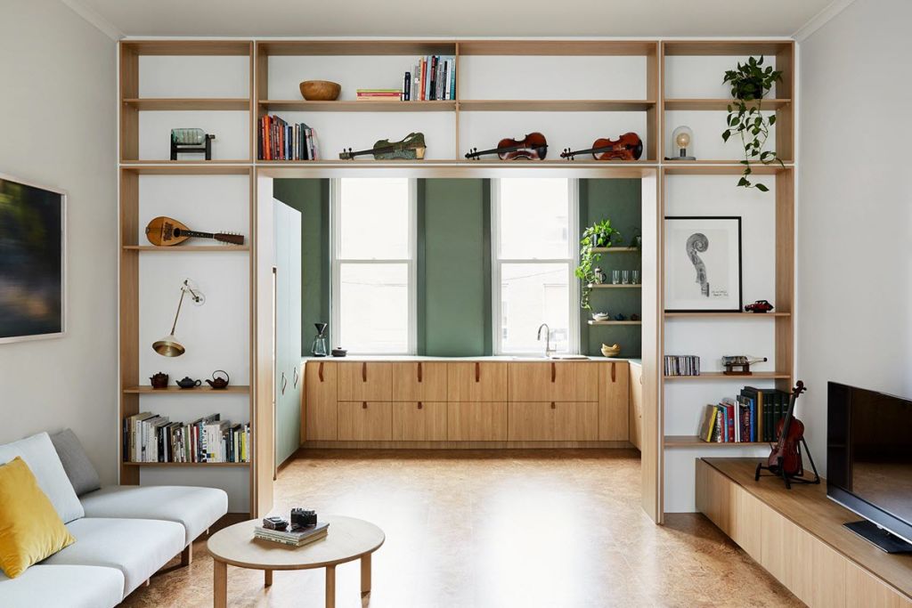
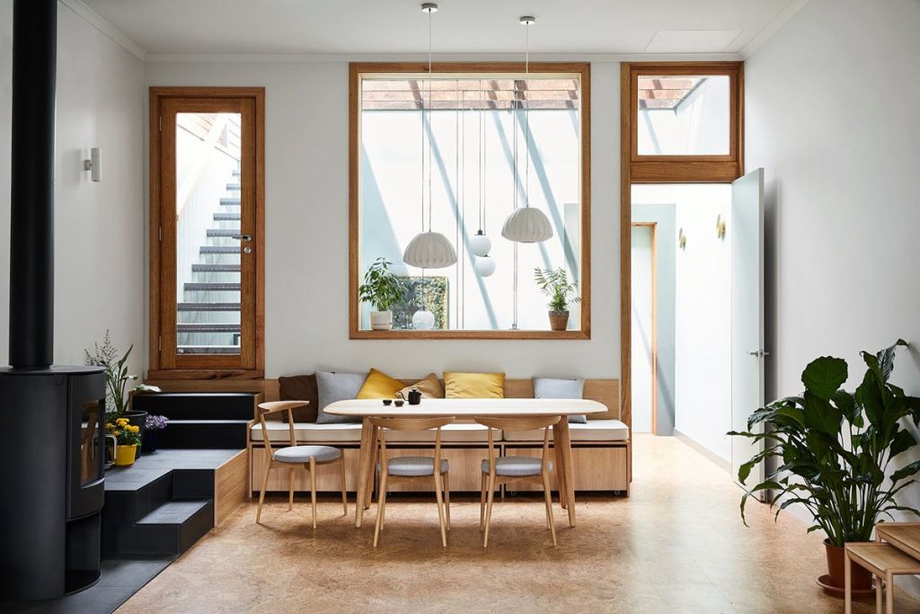
The Collingwood Melbourne shop and its upstairs residence were 4.5 metres narrow and Victorian-era old. But with 3.3 metres high ceilings and a series of deft moves orchestrated by squeezed spatial specialist Jack Chen of tsai Design, it was transformed into a chic little pad with a translucent roof above the staircase bringing light into the refreshed core of the building.
Pushing the cabinetry back to the walls, making a dining table banquette seat morph into the stairs up to the roof deck set above the new rear extension, Chen hopes the “dynamic” outcome of the project might encourage more interesting shop and dwelling renewals that he sees as “underutilized prime real estate”.
Multiple uses on a suburban block
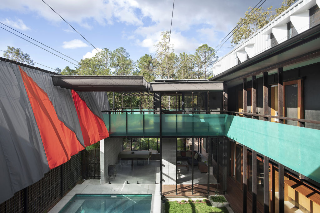
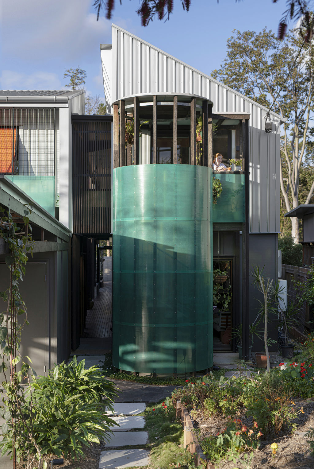
On an outer suburban Brisbane house block, architectural couple Sonia Graham and Chris Bligh of Bligh Graham used their own home as a laboratory to test their theory that the house of the future can be functional and marvellously adaptable to all sorts of evolving living and working situations.
At present their tropically airy compound accommodates their family, that of a single mother in a separate upstairs tenancy, and their practice office in an arrangement that uses two street frontages and three courtyards to ensure everyone has privacy. Sonia Graham calls it “a village within a village”.
Respectful readaptation of a master’s innovation
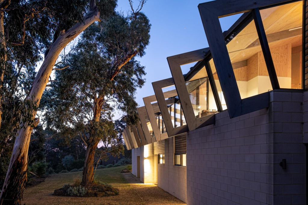
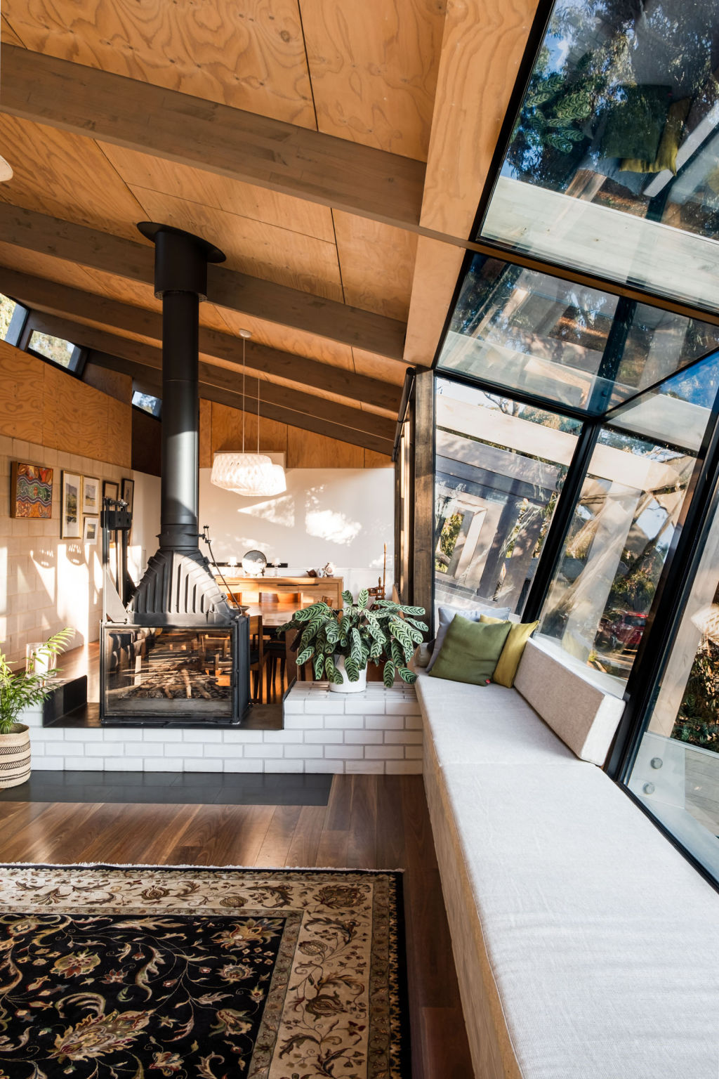
Winds ripping off Lake Connewarre on Victoria’s Bellarine Peninsula can be so fierce that when Michael Bell and wife and practise partner Tamara Bell of Freehand Projects designed a two-level house for her parents, to moderate those forces – and to artfully marry the structure to the twisting Yellow gums on the block – they adapted an idea first applied by Frank Lloyd Wright in the 1930s.
Using a grand order style expressed structure of big, downward-tilting Glulam beams, Tamara says “it was a gesture that gave a lot of opportunities to do a lot of other things”. This included inserting a long window seat to project out into the canopy that is the most claimed possie in the living room.
A home to overload the senses
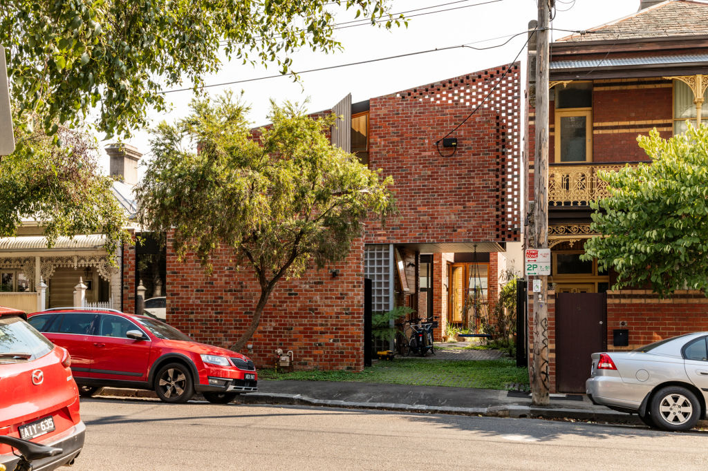
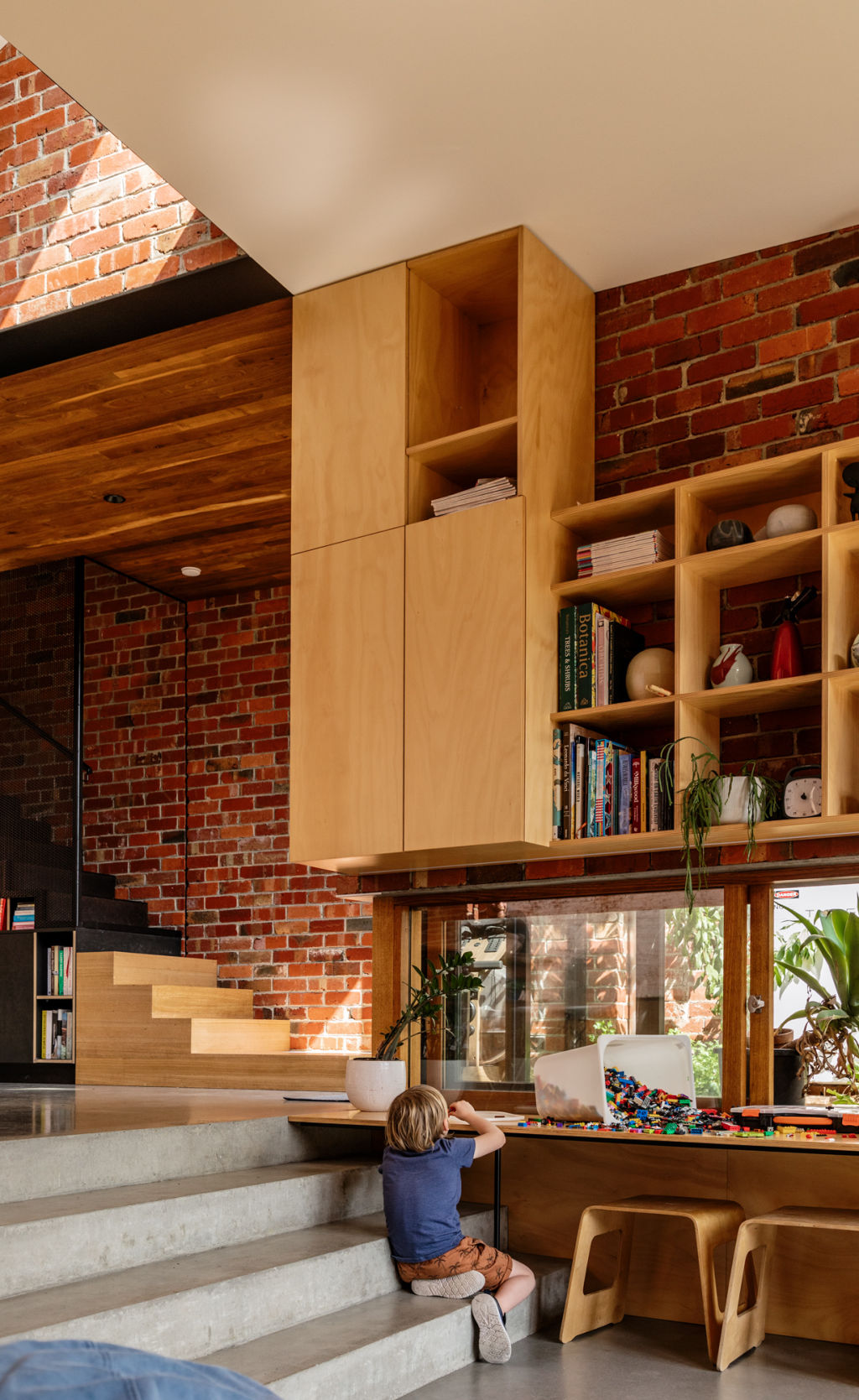
Even if it didn’t have such a specific rationale, Anthony Clarke’s inner-city Melbourne project Hungry Hands is an interesting building that beyond using 27,000 recycled bricks to fit it into its tight Richmond context, saw his practice Bloxas awarded for its multiple sustainable qualities.
But the house is doing so much more in that surfaces, textures, the stepped circulatory route through it and the climbing possibilities of 11 blade walls have been made to feed the relentless, sensory-seeking compulsions of a child of the family who has autism.
From an architect specialising in built forms that aid or support all manner of physical and psychological disorders, this is a brilliant thesis on his proposition that “all architecture has consequences”.
The grooviest granny in Hobart
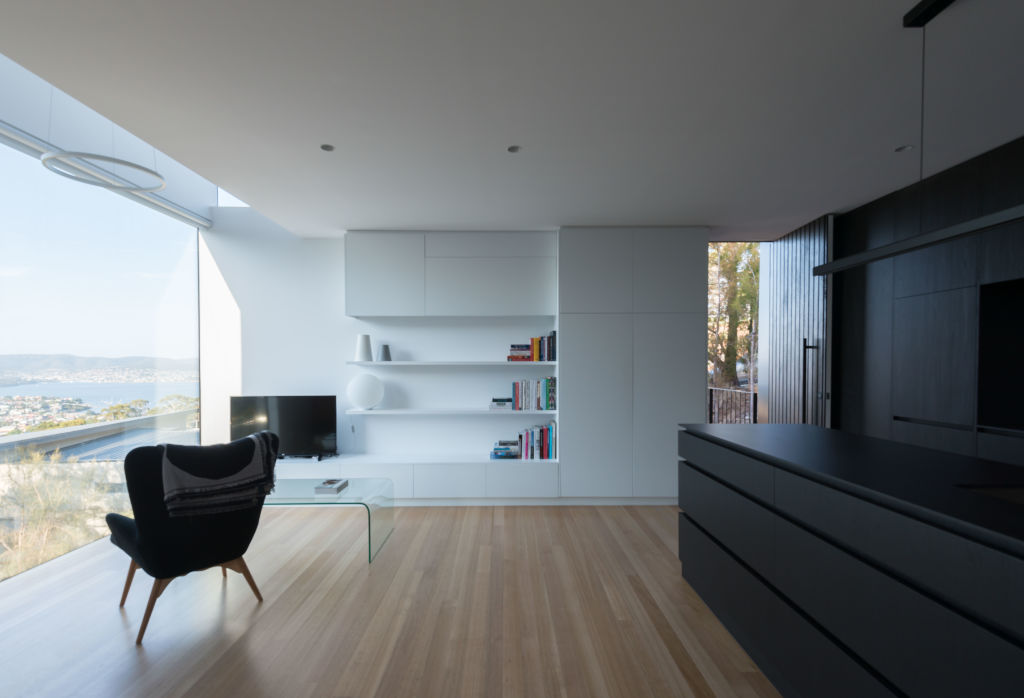
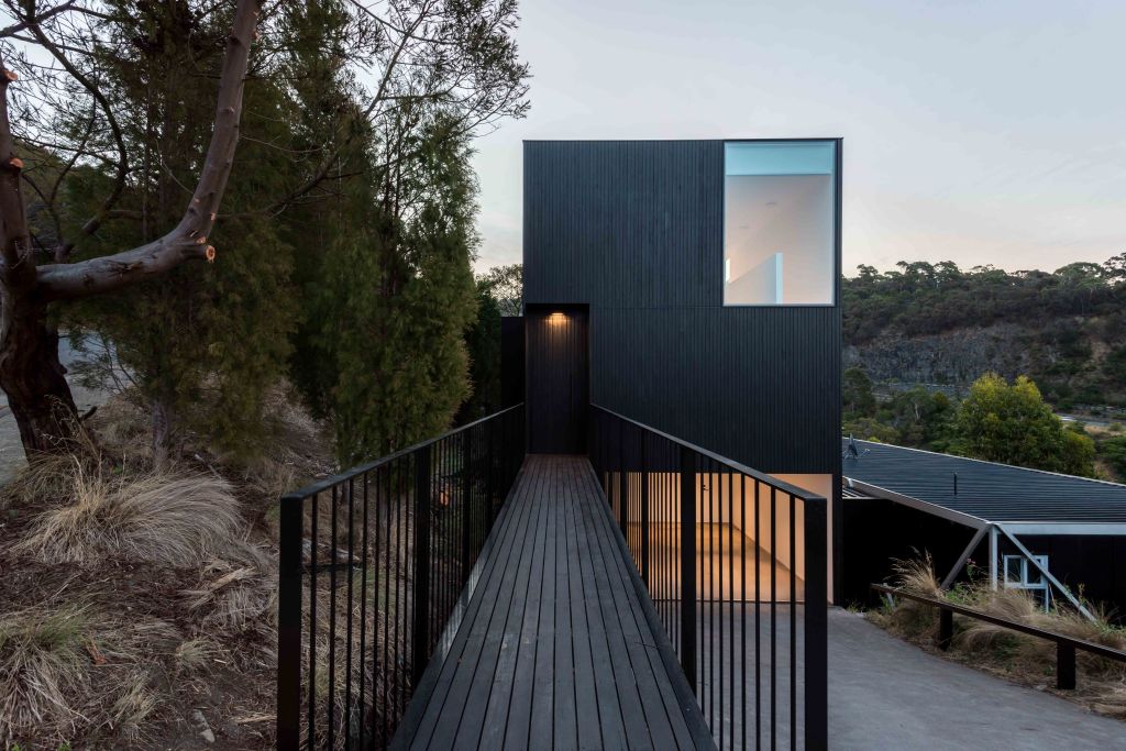
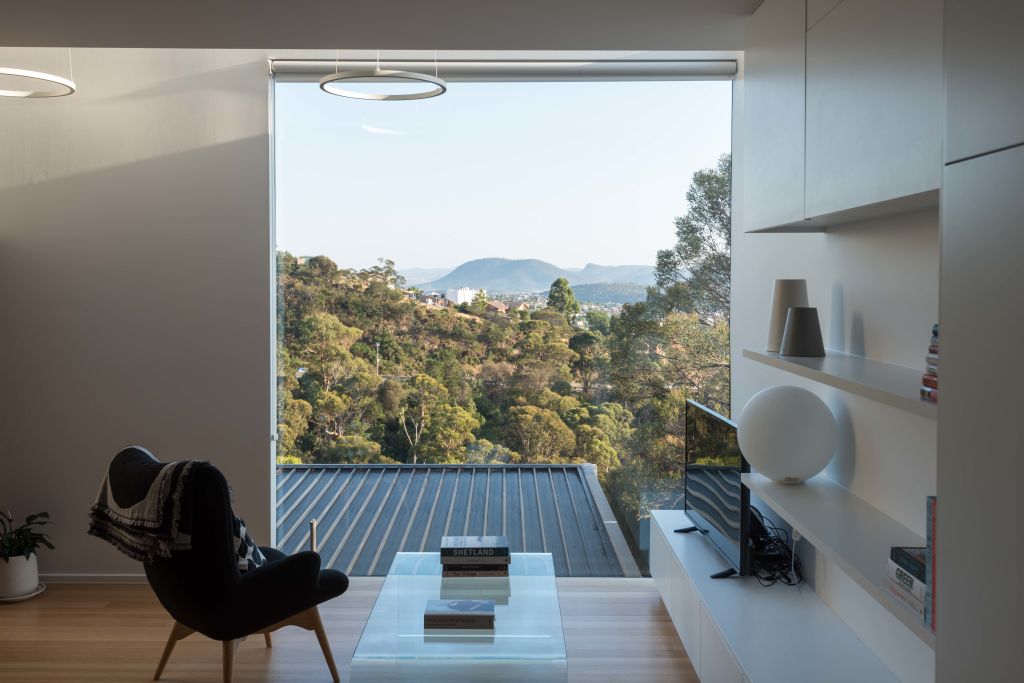
On a street overlooking the Derwent and above a mid-century house, Nathan Crump’s neighbour asked him to design a rear ancillary building for his mother that would bring her into the family orbit but give her the independence an 80-something-year-old insisted upon.
So, on two levels, with living below and a single bedroom on a mezzanine above, both enjoying never-boring outlooks, he says “a real hip gran has embraced the minimalist style”. The Crump Architects principal says she uses the ramp connecting her little digs to the street like a stoop “and it allows her to remain connected to the community”.
Mum and Dad’s treehouse retreat
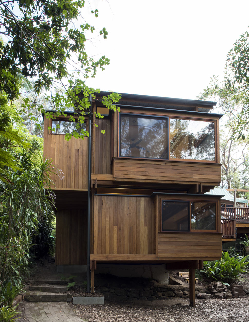
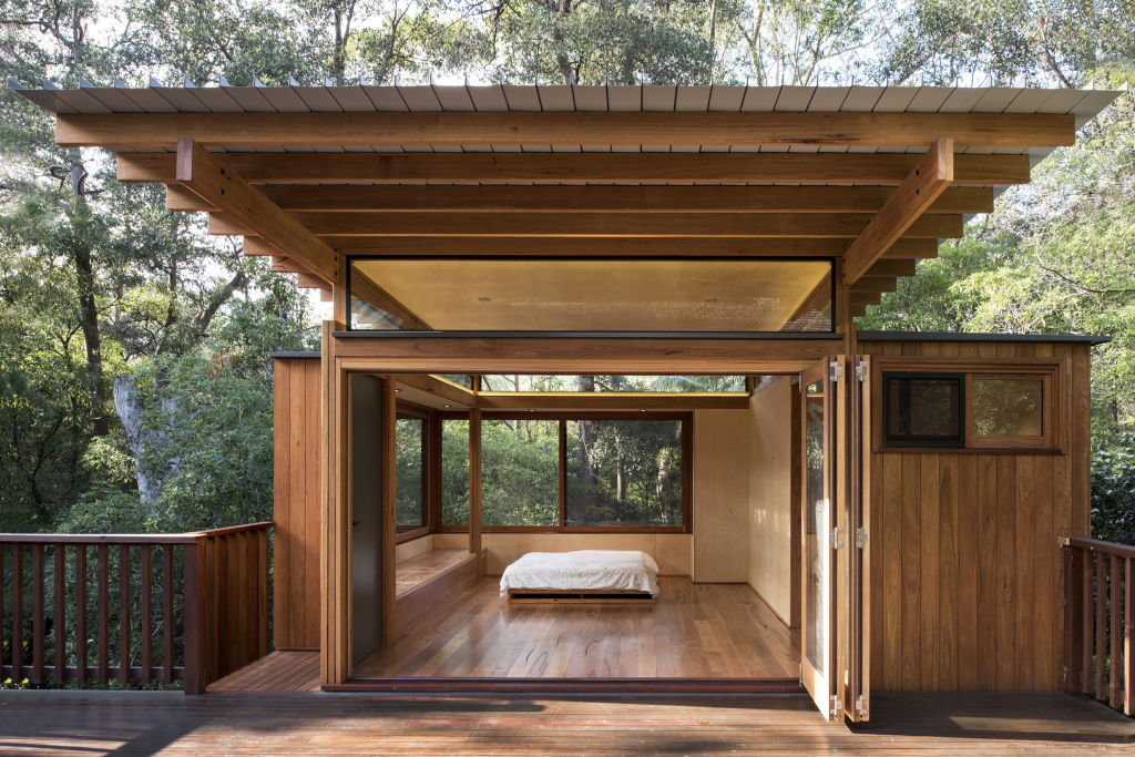
The kids showed no sign of fledging, so the parents opted to move out, actually across the deck to a lovely new, Japanese-inspired wooden treehouse that gave them a master bedroom and ensuite above, and a studio office that overlooks the downsloping bush of their Castle Hill, Sydney block.
Architect James Pedersen says builders Matt Adams and Scott Heldorf did a masterful job on a glazed and timbered structure that gave nowhere to hide anything that wasn’t beautiful to look at or to touch.
Tree Haus is calm, apt to its setting and, he feels “with a scale and logic that feels really free flow”.
We thought you might like
States
Capital Cities
Capital Cities - Rentals
Popular Areas
Allhomes
More
