Take a look inside this completely transformed ex-government brick duplex in Lyneham
Who: de Rome Architects with Braithwaite Building.
What: Ziwa House, named after the Swahili word for “a body of water” as a nod to one of the owners’ father’s Tanzanian background.
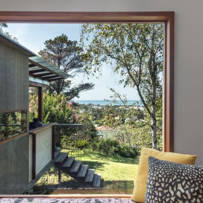
Where: Lyneham, backing directly onto wetlands.
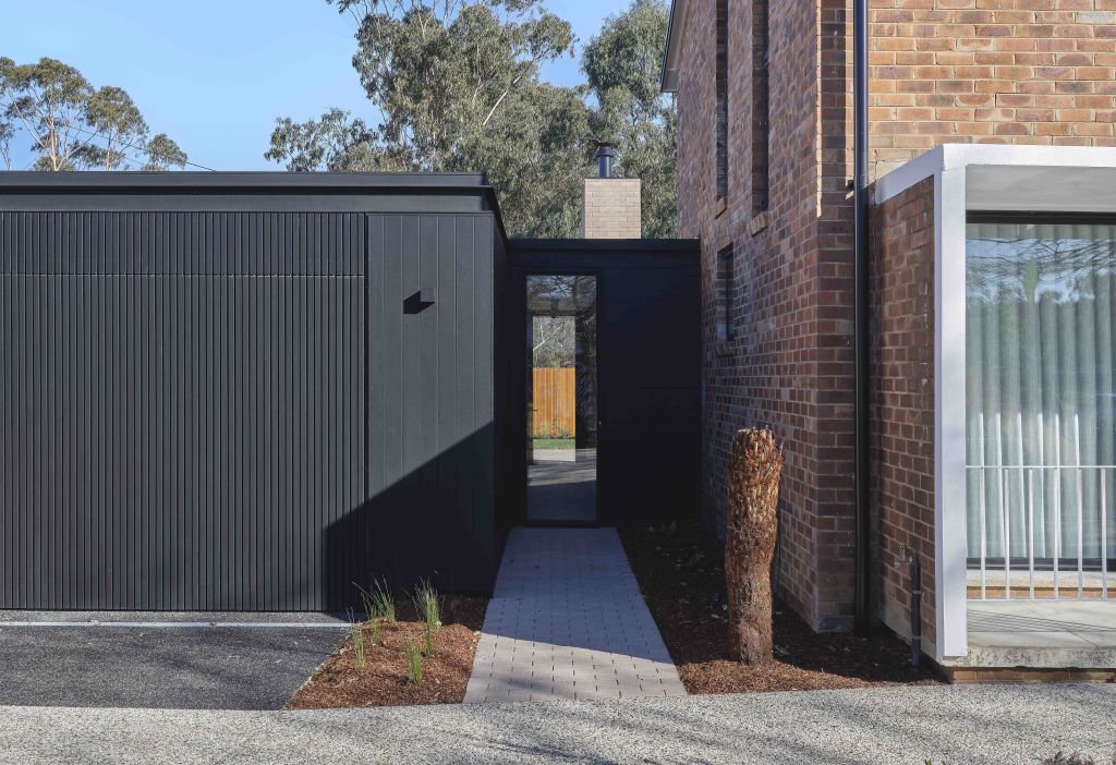
Double-storey, ex-government brick duplexes are a common sight lining the streets of inner Canberra suburbia, but they’re becoming rarer as new owners buy the homes and flatten them for a modern replacement.
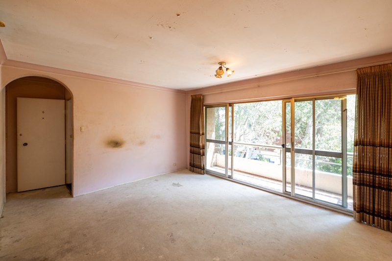
When a 1950s duplex home in Lyneham hit the market in late 2018, most people could only see the rundown, dated interior, which had barely been refreshed in 60 years and used as rental housing for students since the mid-2000s.
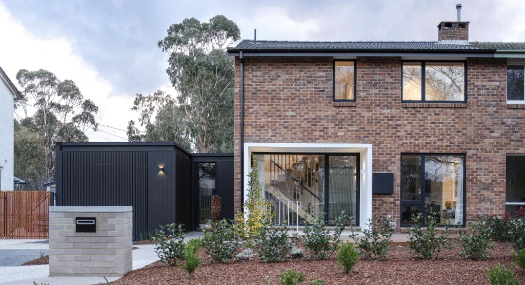
Instead, one couple saw an opportunity – a relatively affordable inner-north block backing onto wetlands with a modest house that could be turned into something special.
Tasked with its transformation, architect Jessica de Rome from de Rome Architects says the plan was to retain the home’s character and make the most of what was there while achieving a space that suited the owners.
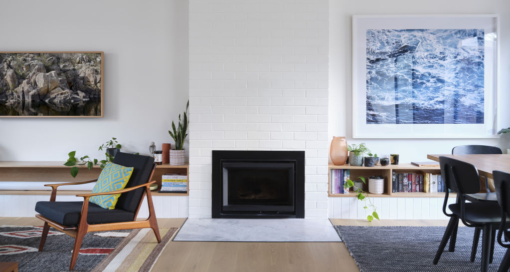
Internally, the ground level – previously a “rabbit warren of spaces” – was modified to open up the living areas. A new floating staircase leads to the upper level, which had minimal changes to the layout. Instead, two bedrooms were given built-in wardrobes, while the third was converted into a multipurpose space that works equally well as a study, reading nook, dressing room or spare bedroom.
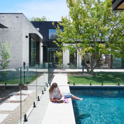
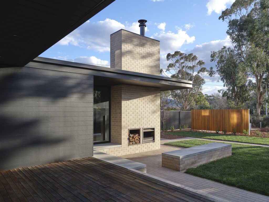
Downstairs, additional floor space was added in the form of a light-touch extension that complements the living spaces with a laundry, bathroom and garage. It frames a connection to the large backyard, while one external wall incorporates an outdoor fireplace, complete with a covered area and built-in seating.
While the external structure remains largely as it was, the interiors both upstairs and down are now a modern blend of textures, materials and joinery, with contrasting light and dark surfaces, all inspired by the couple who now call it home.
“The clients did have their eye on a few specific products and materials that they wanted to use. So we just built each of the colour schemes off one of the anchor materials that they brought us,” says Jessica.
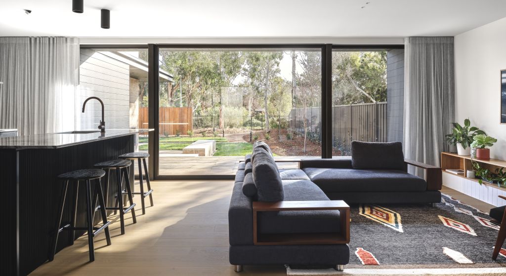
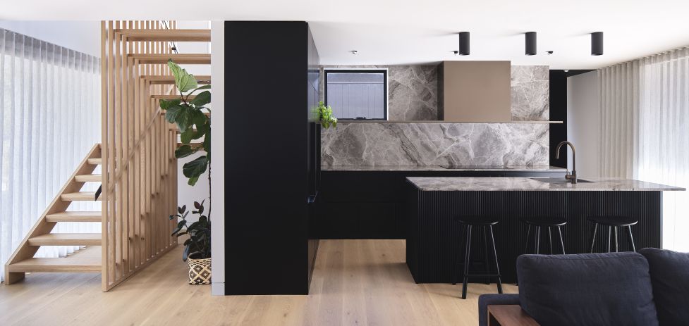
Upstairs, black terrazzo tiles cover the floor and walls of the bathroom, with a narrow concrete vanity. Downstairs the second bathroom blends white marble with white finger tiles and a white ceramic sink. The striking kitchen is black on black, with dark marble stone, black cabinetry, and black ribbed joinery along the kitchen island.
Jessica says the success of the project, which was completed in mid-2021, comes from the willingness of the owners to make the most of what the home was and not try to force it to be something it’s not.
“They were very willing to adapt how they use the space to make the best parts of it work really, really well, rather than everything being a slight compromise,” she says.
“They were very willing to work with the parameters that were there and not force a square peg into a round hole.”
We recommend
States
Capital Cities
Capital Cities - Rentals
Popular Areas
Allhomes
More
- © 2025, CoStar Group Inc.
