'Character and quirk': The Adelaide Hills septuagenarian with a pop of colour everywhere
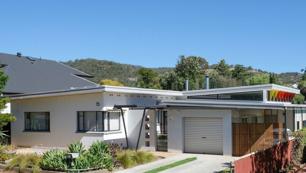
It’s all in the name Taylor Buchtmann Architecture has given to this delightful reboot of a little old house in the Adelaide foothills.
“Mid Century Modest” defines its 1950s-style provenance and the intent of both the architects and clients “to keep the character of the house and update it simply”.
By extending the era-typical skillion roofline over the new rear addition of kitchen and living area, plus laundry and bathroom, and putting an opposing roof slope over the old garage, they’ve instated a composition that potentially judgey critics very much enjoyed for its “character and quirk”.
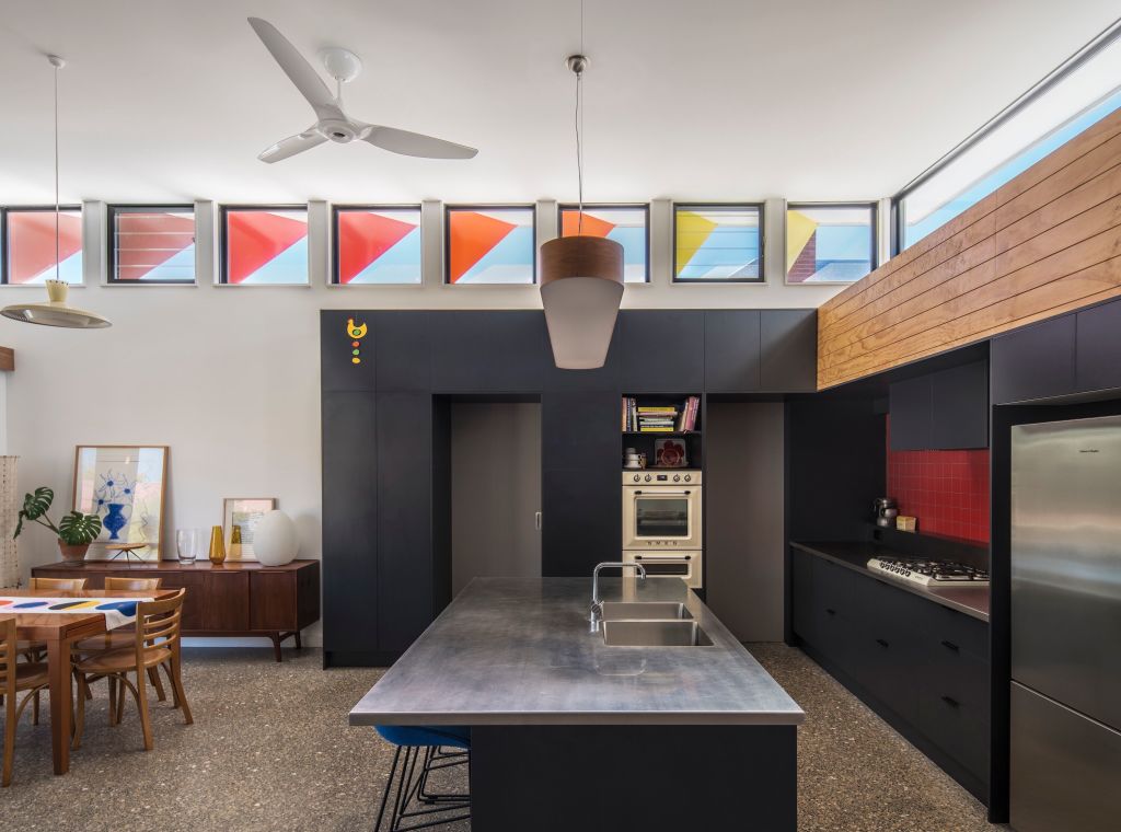
While tba* gained a commendation in this year’s South Australian AIA awards, the jury wrote of how much they admired “the unassuming addition” as “such a joyful, positive piece of architecture”.
The pops of colour Anne Taylor and Michael Buchtmann have introduced into the interior and exterior schemes are a big part of what makes a structure “of simple resolution” into a place of perennial “optimism and cheerfulness”.
Buchtmann says the practice’s primary design philosophy is to “simplify things so nothing looks obvious”. According to Taylor, “after we’ve worked up highly resolved plans, we then add another level that allows us to personalise [a project] to the clients”.
“We’re interested in decoration and do quite a lot with colour,” she says.
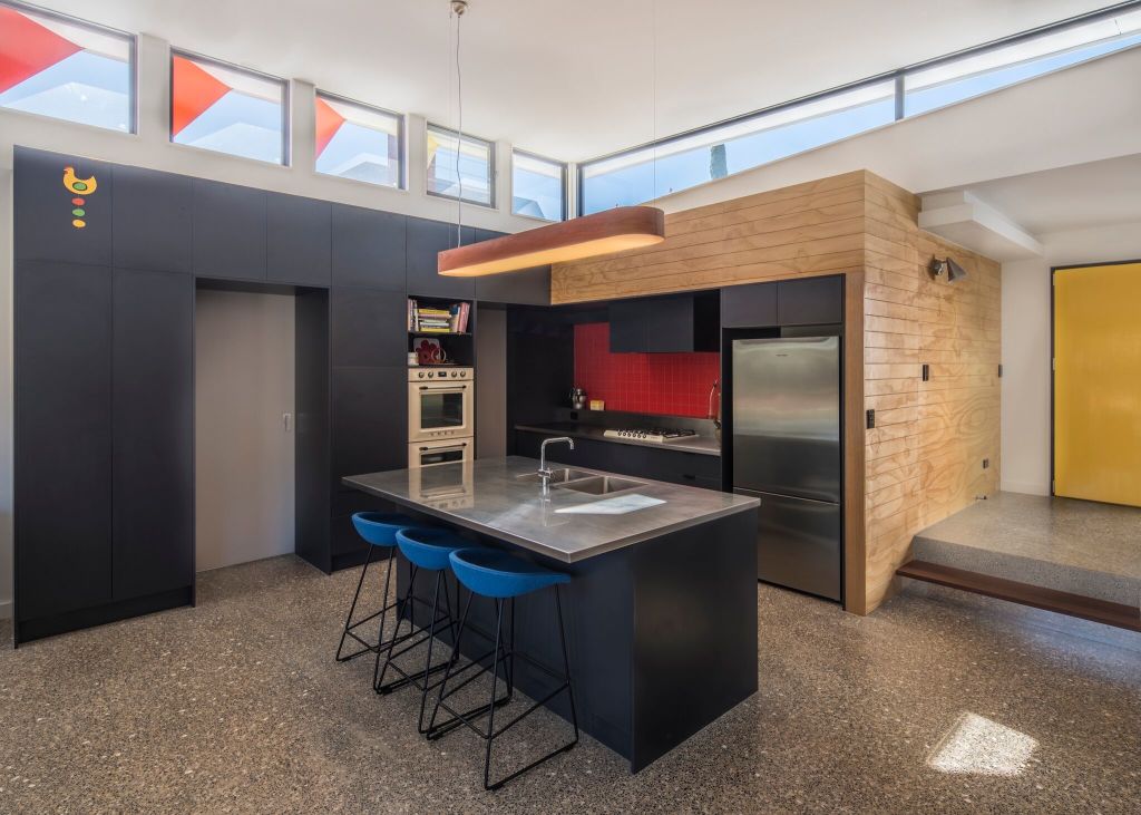
The placement and practicality of the bold colour insertions is much more than good fun. It has to do with site and stylistic memory and with moderating western summer sun blasting the new interior through the high wedge of clerestory windows.
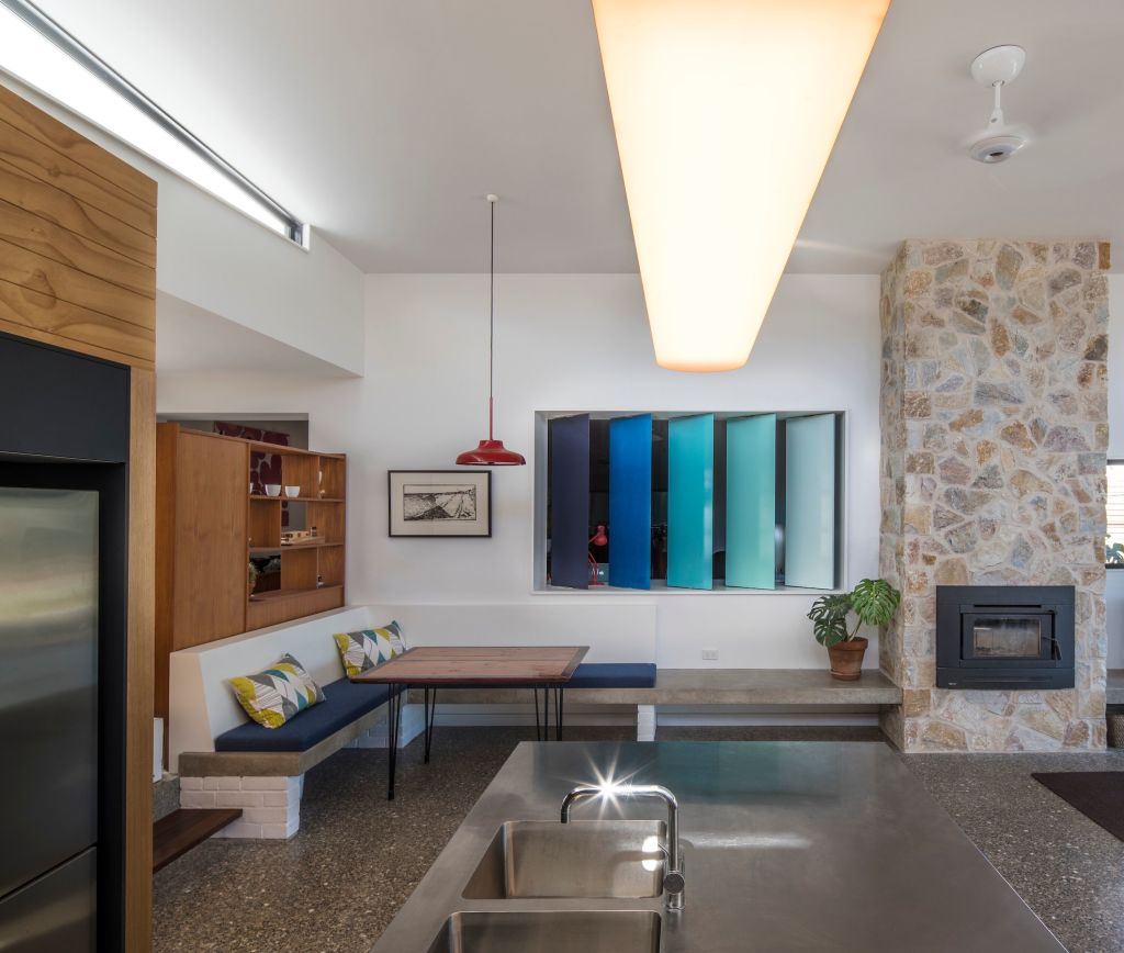
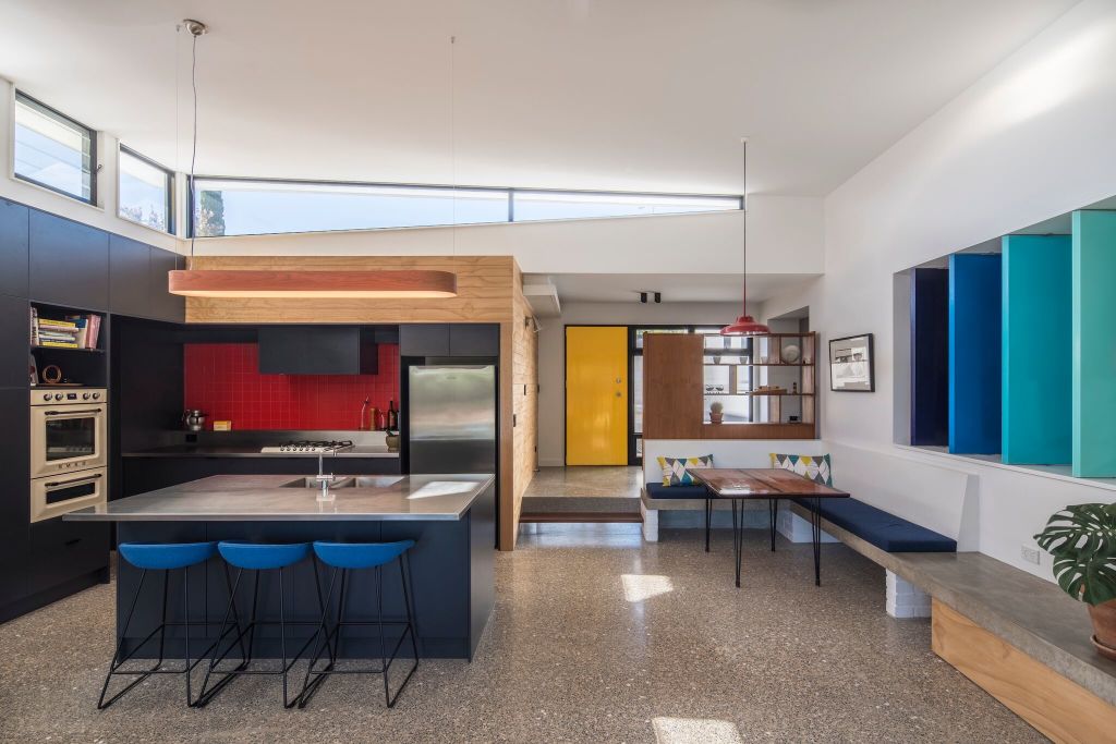
Taylor says the moveable vertical louvres set between the step-down living room and the study “that can be opened and closed as much or as little as you want”, referenced a blue roll-down canvas blind that was once on the window of what was an exterior wall.
“I see them in terms of a mobile,” she says. “I see them like a piece of art.”
The warm-end spectrum oranges and yellows that make a recessive small house a bit of standout on the street, and that are such a visual entertainment when see from the inside, came off Michael Buchtmann’s desk.
“They’re pointed north-west so that the winter sun can come in and warm the pebble-flecked polished concrete slab of the addition,” he says.
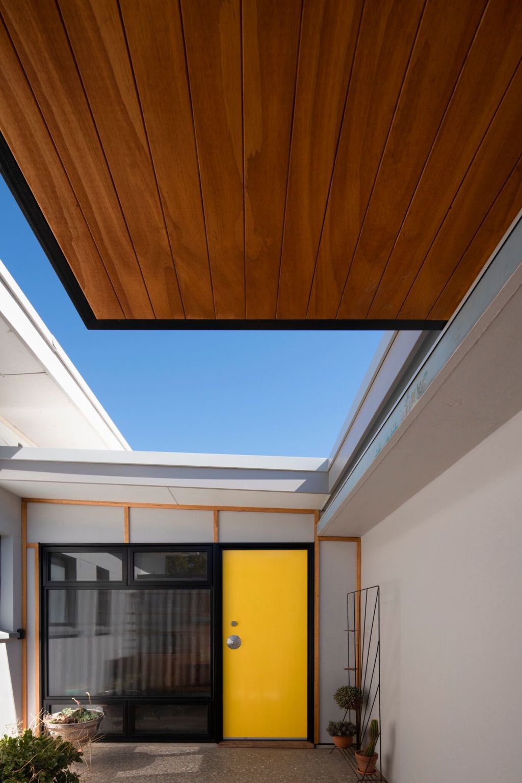
Buchtmann was also responsible for the simple, timber-lined canopy that shelters and frames the entry courtyard and that in-your-face yellow front door.
Is this all this high colour the contemporary accretion to Mid Century Modest? No, says Buchtmann.
“If you look back at the work of the early Modernists, a lot of the photographs we see are in black and white. But look at Le Corbusier.
“His buildings were incredibly colourful. We have his paint charts.”
In the mid-century, “colour,” he says, “was a real break from the war years”.
“And like the Modernists,” adds Taylor, “we also wanted to be optimistic.”
We recommend
We thought you might like
States
Capital Cities
Capital Cities - Rentals
Popular Areas
Allhomes
More
