Clear run proves to be white decision
Something wonderful can happen when an architect’s vision for a house redesign gets a clear run without being derailed by the often-conflicting schemes of owners, which can sometimes so muddy a design’s potential that it become a mishmash of compromises.
The extended Californian bungalow belonging to Northcote couple Peter Bergin and Kathy Jordan exemplifies this situation.
Having engaged architect Ben Milbourne to replace a 1990s extension to a 1920s classic “Cal bung”, they stepped right back and let him do his thing, right down to choosing door furniture, tiles and paint, which is white with platinum and silver flourishes.
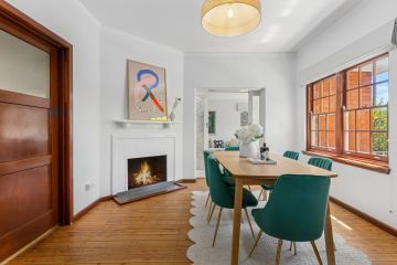
Even the Baltic pine floor, which flows from the old to the new two-storey back extension, has been stripped to paleness and coated with a clear matt that won’t yellow. This fresh, honest floor does more than tie the original to the addition. As the architect says, “it starts bouncing the light”.
The owners invested their faith in Milbourne because, as Ms Jordan says, “we’ve seen what happens when people get too involved. We know what we like. But honestly, I’m an educator and Peter is a financial officer. We don’t know about this [architectural] stuff.
“We had a lot of trust in Ben so there was no debate from us.”
They did know they wanted a fourth bedroom and the potential to “zone” living spaces that would work for their son Jack when he is a teenager. They wanted enhanced privacy from their neighbour and something of a “wow” factor. What that might be, they weren’t sure.
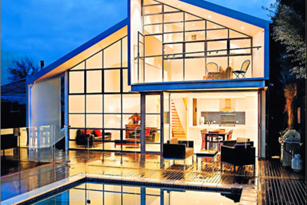
What Milbourne gave them was a house of fascinating texture in terms of volumes. The wow factor is the folding, pitching, ever-changing roof line that creates a series of subliminal sensations as one moves from the original rooms through to the addition and, especially, upstairs in the new mezzanine lounge and the attic-stashed study/fourth bedroom and bathroom.
The extreme interior angles of the extension’s roof are mitigated by the scale of the main back living-kitchen. On one side it rises as a two-level void of 8.2 metres. The whole back wall is a huge, double-glazed, two-storey window, divided into panels that open electronically for cross-ventilation.
The window is as industrial-strength as it appears because it also works structurally as “steel portal framing” to firm the addition into Northcote’s shifting soils. “It’s the big-ticket item and has a fantastic heaviness to it,” Milbourne says. “It’s the real focus of the house.”
Ms Jordan was happy to spend $65,000 on the window, which claims the eastern sky for the living room. Bi-fold glass doors open the room to the pool deck and garden.
The roof’s the thing though: the architect claims that by eliminating traditional roof trusses and exploiting the resulting voids in a series of intersecting, dipping and rising planes, “we’ve gone into that space and used it.
“The different articulations were a conscious decision. Walking through compressed ceiling spaces and moving out to open spaces makes it all quite dynamic.”
In the most compressed roof spaces, the architect inserted plenty of storage that also has thermal benefits. Into the tangential wall of the new study he inserted a diagonal window to slice through urban views and sky. “By mixing all the different spaces together we ended up with something different,” Milbourne says. “We took quite conventional elements and recomposed them so they work in an unconventional way.”
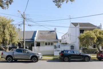
It’s true. From the street, all that is visible of the new is the slashed window and the sudden cut of a sharply descending silver roof line.
Another element of interior wow warranting mention is the sculptural Tasmanian oak staircase. With open-backed risers, it allows light to penetrate right down a once-dark central hall.
Along with the blond-on-white colour scheme, the result is an uncluttered dwelling of almost Scandinavian freshness. It also displays what can sometimes happen if you let your architect see the job through with minimal interference.
For the tradies, who had a huge job with the plastering, tiling and setting the silver Zincalume panels on to the angular exteriors, the project was a challenge and a joy.
“The tradies loved it because they said they almost never get to do anything creative,” Ms Jordan says.
Milbourne says from his angle, the whole project was “enormously successful. I’ve been fortunate with Kathy and Peter because they were fantastic clients who came all the way.”
The clients are more than happy, too. Peter Bergin says: “It came out better than we thought we wanted.”
Ms Jordan is really enjoying the space-shifting aspects. “We didn’t want a box. Now, in every space in the house, you get this subtly different experience. It’s a sensation that you somehow feel.”
CONTACTS
Architect
BiLD architecture, 9018 8187
bild.com.au
Builder
Dick Reynolds Building, 0419 996 102
We recommend
We thought you might like
States
Capital Cities
Capital Cities - Rentals
Popular Areas
Allhomes
More
