Coastal surroundings inspire this Anglesea renovation
A more precise description of Emma Mitchell than “Anglesea-based architect” would be that she is essentially “the architect of Anglesea”.
Raised in the west coast town and now living on a bush block in the nearby hinterland, the largest body of Mitchell’s portfolio is in residential Anglesea.
Having absorbed the unselfconsciously casual vernacular of the weekender and summer resort, Mitchell’s buildings carry through the key aesthetics of the local building traditions that were largely formatted in the 1960s and ’70s.
In a new, L-shaped, three-bedroom home on a sloping block with the Point Addis coast and ocean glimpses to the south, and views to the north interrupted by the former Alcoa power station, she has used what she sees as the essential form and materiality of retro Anglesea: “Economical buildings clad in fibre cement and with certain colours picked out”.
As utilitarian as Anglesea 5 – the permanent family house – presents from the outside, the architect worked extremely carefully to create what she says is a relaxing home that can be enjoyed at all hours of the day.
Mitchell calibrated its appearance in tones that accord with the landscape.
“The grid-like (timber) battening reinforces the rhythm in the building,” she says.
At 160 square metres internally, it’s not a big house. But in so precisely placing windows to block out the power plant and capture the sun; in changing floor and ceiling levels, and manipulating the circulation flows, Mitchell says there is a lot of variance that stops the building feeling too linear or claustrophobic. She also says she spent a lot of time at the sketch stage getting the siting and windows right.
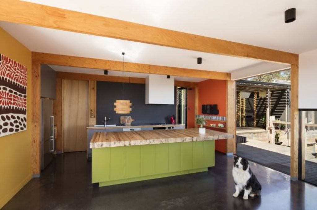
A demonstration of this thoroughness is the implicit diagonal transit from deck to deck that crosses the kitchen so that it frees up movement in the house.
All these divergences make the house appear bigger than it is. “And the stepping down of floor levels allows the building to follow the natural terrain,” Mitchell says.
While anchored to the ground at entry – where the colours on the cladding are dark, as the house moves down the block – it gets lighter on both its footings and in the colourations.
“The dark colours are a reflection of the ironbarks that grow on the site,” Mitchell says. The yellow is part of the environment – particularly in spring when there is an explosion of wattle. The orange is the colour of the ground and the cliffs.
In another interesting inversion, the timber posts, beams and battens inside are heavier than those outside. Again, Mitchell says, it makes the house very direct in its expression.
The shelving inside, which includes wide window frames, is another expression of the language of the portal framing.
“It just made sense,” she says.
It’s not only the inventive surfboard letterbox made by a local artist, and the parked Kombi that hints at nostalgia for the simple lifestyle of earlier Anglesea, the whole building is an affectionate reference to a retro, sandy-footed era.
“I guess I am trying to hang onto something of the old Anglesea,” Mitchell says.
We recommend
We thought you might like
States
Capital Cities
Capital Cities - Rentals
Popular Areas
Allhomes
More
