Design of Newcastle house is out of the box, but on a penny-wise budget
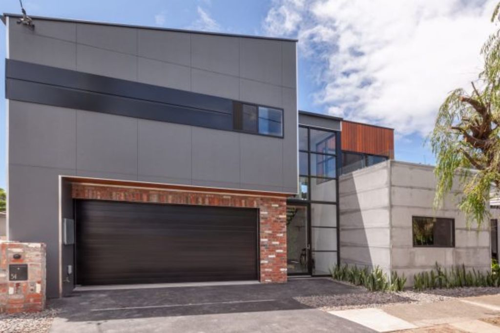
This interesting boxy house is a bridging building sitting at the nexus of a residential area where it seeps into the light industrial zone of a long Newcastle street.
Now a refreshing reflection of its location, it was conferred on the tight triangular block courtesy of “a slip of the hand of an excavator driver” and an army of white ants who put paid to an intention of reformatting a Victorian cottage.
“When building started,” says architect James Clarence of Newcastle’s SDA or Space Design Architecture, “we took down some of the (cottage) walls but found that termites had done the rest. So we had to clear the site.”
A home for Guy Bunder, whose Made Architectural Constructions team built it “with an incredible level of detail”, Clarence says the apparently casual assemblage of blocky shapes that are picked out in different materials including Blackbutt timber, recycled bricks, painted fibre cement, Colourbond, and form-poured concrete, is “unashamedly raw” and entirely apt to context.
The profiling of the three-bedroom-plus-study home that takes up almost all of the 130-square-metre site resulted “from a very careful juggling of form that stepped the scale down so that it worked on one side with the residential context and on the other with the urban-industrial”.
Because of the displacement of external space, an outdoor deck was placed upstairs, and two different “gardens” of greenery were introduced indoors as vertical plantations; one 5.6 metres tall and scaling the double-height of the brick wall in the stairwell foyer, the other as a verdant feature in the kitchen/dining area.
There is hardly any place in the ground floor, Clarence says, “where you can stand without seeing one of those green walls”.
At the same time, there is hardly any place where you can stand inside and not experience an enveloping sense of being in a very private sanctuary.
The apparent serenity of what is really quite sophisticated architecture, and the extreme refinement of a basic material palette, disguises the fact that this house was built on a penny-wise budget.
“We don’t do architecture for architecture’s sake,” says Clarence. “Our idea was to use standard materials arranged in a more interesting way than is usual. The vertical green wall systems came from Bunnings…The glass windows are just commercial aluminium windows.”
But given that Urban Eclectic House scored the Residential New Homes prize in the 2016 Newcastle AIA chapter awards, we think Clarence’s summary that “it was nice to see it come off and work so well”, doth protest such an obviously worthy winner a tad too much?

We recommend
We thought you might like
States
Capital Cities
Capital Cities - Rentals
Popular Areas
Allhomes
More


