Disciplined designer shows the gentle touch
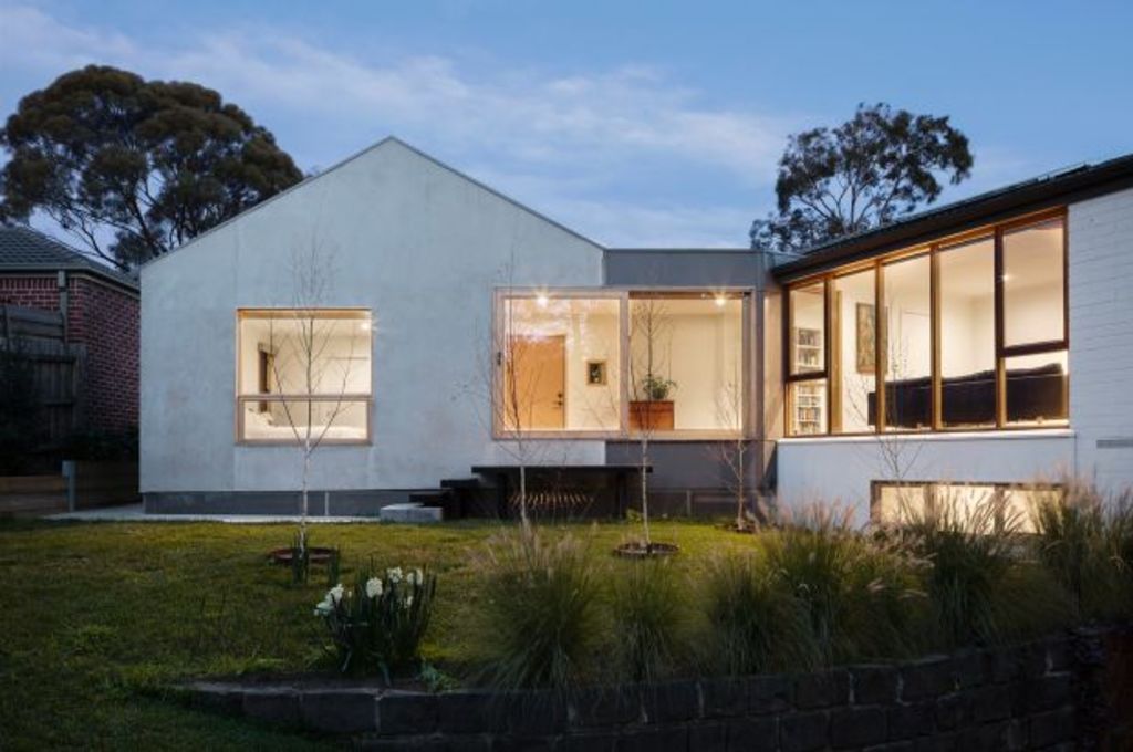
Architects’ own homes are the projects where they can experiment and push parameters in ways they usually can’t when bridled by the budget and specific needs of paying clients.
Many “own homes” endure as famous game changers because they can end up being so daring and distinct.
In this context, John Liu’s Doncaster family home sits at the opposite extreme.
The ’70s brick house to which he added a new side adjunct structure containing a master bedroom suite and second bathroom, is a clear and quite lovely statement of a strongly held philosophy about how to approach extensions and renovations.
“The way I look at old buildings is that, unless it’s atrocious, I like to appreciate the old building, consider what it wants to be and then touch it lightly,” he says.
“Unless it’s necessary, I try not to interfere with the original because you never know what you’ll uncover and because once you chop one thing, you will need to change so many things.”
The existing three-bedroom house with the under-croft rumpus space (now Liu’s office) was stereotypically ’70s suburban. “A simple rectangle … but perfectly oriented,” he says.
On a triangular block, the big backyard was on the north side. “The existing living/dining room had full-height widows,” Liu says.
To an architect weaned on ESD (environmentally sustainable design), the appeal was the orientation.
“The house had got it right,” he says.
Able to fan the composition so the structure now opens its wings wide to the backyard, the new layout compresses the front arrival sequence through two phases, and then utilises the new bridging corridor to perform multiple functions, another of Liu’s pet principals.
“The new entry is progressive,” he says. “You walk down the broken bluestone path to the timber deck, above which is clear roofing. A timber gate buffers the second part of the entry from the street and is a great, over-lit place to leave shoes and bikes before entering the actual front door.”
Once inside the link space, the through-view to the yard is framed by a pair of two-metre-wide sliding window/doors that lead out onto the deck platform where the kids play.
“It is very usable,” Liu says.
In a step-down section with a four-metre-long bench/step, “we also made the corridor a place to actually enjoy”, Liu says.
“In ESD, comfortable living environments are about more than just performance ratings.”
And the step down was to create a hierarchy of space.
Externally too, the hierarchy of old and new is discernable. Liu has replicated the shallow gable form but with cement render and facade planes that rise clear to the roof edges, the addition has a very attractive subtlety that will keep it relevant long after statement-making architecture has become embarrassingly dated.
“My personal taste is subtle,” he says. “I want to complement, not complete. I want it to be ‘now’, but I also want it to be ‘me’.”
Liu’s approach is very much informed by his background as a musician – a drummer.
Instead of bashing out the beat, he says: “I like to have a presence that is almost part of the background. I make the structure and the rhythm bit and it’s like I’m not there.
“I design shapes rather like that. They don’t draw attention to themselves.”
We recommend
We thought you might like
States
Capital Cities
Capital Cities - Rentals
Popular Areas
Allhomes
More

