Doherty's Design Studio add bold colour and dramatic surfaces to Hawthorn house
“It was,” says interior designer Mardi Doherty, “music to my ears”.
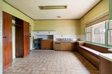
Clients with a dated four bedroom home in Hawthorn wanted to modernise and make relevant to their young family “a stunning 1980s home that looked a bit grey … a bit commercial”.
“They wanted to ramp it up. They were keen on colour … and we don’t often get to do colour.”
Respecting a wonderfully interesting, if highly angular, house by Cocks and Carmichael, a Melbourne firm whose plans are included in the collections at The Powerhouse Museum in Sydney, Doherty says “we had to choose very carefully where to use colour. We needed to be quite strategic”.
Opting to limit the palette to two unusual colours as a combination – “an aqua green and a deep purple” – the injection of new tone is there in the kitchen tiles, the rugs, on a couple of carefully chosen feature walls and in the floating furniture.
The withholding strategy was deliberate. “Spatially, the house was in such amazing condition that we only needed to touch it lightly.”
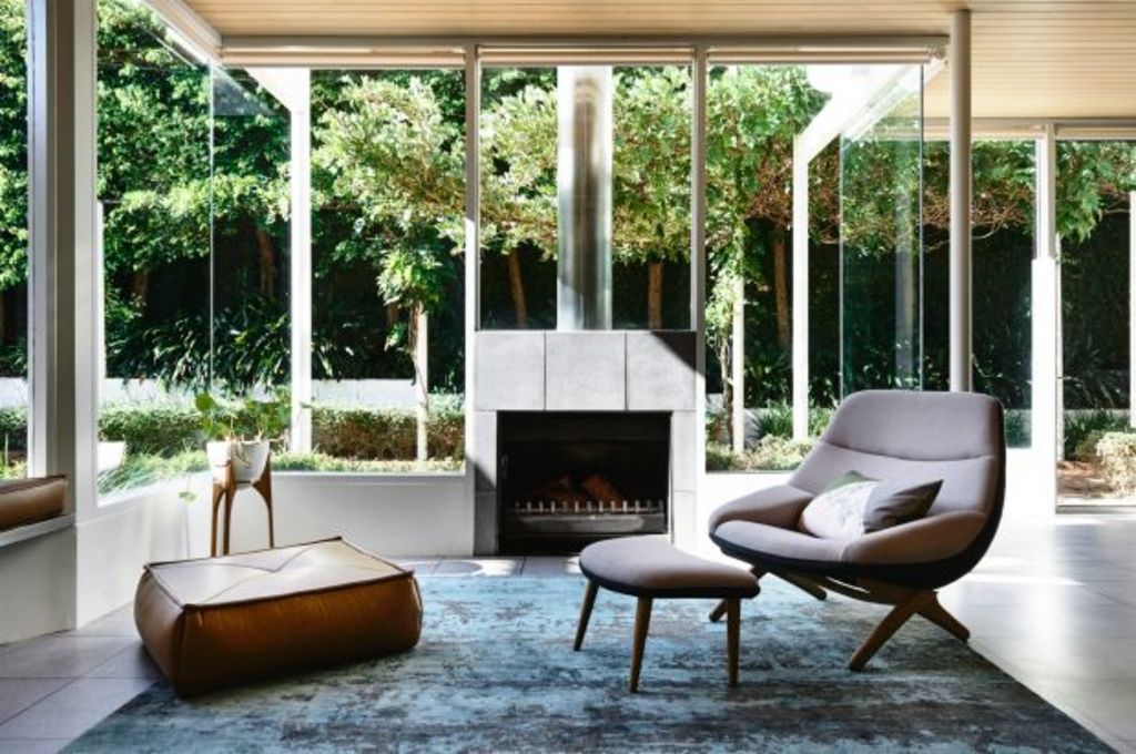
It was in other raw and natural-surface introductions that things got more venturesome. Wanting “to add drama to a house that already had confidence to it”, Doherty’s Design Studio rebuilt the stairwell and gave it a sawtoothed application of matt sheet copper. “I’ve always been interested in ’80s Memphis design, but without making it too cliche.”
The copper next appeared on the breast of one of the living room fireplaces “where it becomes the focus of a room that needed a beautiful focal point.”
Beneath it, the wall is faced in chevron-patterned grey tiles. And from there on, chevrons become a repeating theme in many rooms: In the kitchen they are the scheme of the splashback blue tiles. In the master bedroom where they pattern the wood-veneered wall rising behind the bed, they are an artful piece of crafted joinery.
“On the outside, and within the house,” Doherty says, “there was quite a lot of geometry; squares and triangles. So because our job was very joinery-focused, we used the chevron shapes to show how important that geometry was.”
Triangles also determine the shape of the wooden table that abuts the kitchen bench at an angle. “The family tends to congregate in the kitchen/family room, which has quite a bit of space. So we made the triangular table to be a place where the kids could do their homework, do their Lego, or eat.”
In the corner of the same room is a study bench, “a family admin area that we’re incorporating into a lot of homes nowadays”. A further reference of angles is in the zig-zag chair from Cult Designer Furniture and Lighting. Like the flawless ’80s house, “it was perfect”.
We recommend

We thought you might like

States
Capital Cities
Capital Cities - Rentals
Popular Areas
Allhomes
More
