Eye say: the trick of a small project
It sounds counterintuitive but small and tight budget projects are very often the ones for which architects do some of their best work, because they need to think so hard to problem solve and to spatially justify every move.
These testing builds are often where the most thoughtful detailing and finessed tailoring for scale and practical function show up.
In a “modest” and unconventional building in a Richmond backstreet that he thinks was originally a terrace house’s stable or garage, Wilson Tang, of Sonelo Design Studio, landed a commission to make “liveable” what had recently become a funky but clunky loft residence.
“It had a couple of peculiar things going on,” he says. Beneath exposed roof trusses were two mezzanine spaces accessed via two perilously steep “ladder-like” staircases.
The kitchen was tucked into an awkward corner, but virtually empty was a long corridor between the front door and the living area, tacked on in a four-by-five metre section.
The floor had retained the garage reference in rough, “not quite level”, concrete.
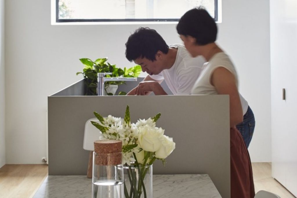
Reorganising how the building flowed involved Tang recasting room functions and constructing two proper staircases to a bedroom and a study. But “the keystone of the project”, he says, “was reformatting the synergy between the kitchen and the dining room”.
Applying cunning architect tricks, his main aim was to draw the eye and the logic of physical progress through from the entry to the living area without getting snagged on the working components of the kitchen.
In that 6.7-metre gable-ceilinged gallery that needed to be both kitchen and main transit zone, Tang admits he “manipulated the eye” to ensure the detritus of daily living didn’t become the feature. “It’s all very subtle.”
But there are readable clues.
Playing on what he calls a “Scandinavian industrial warehouse feel”, the colours were clear and cool. Crisp white plasterboard contrasts with grey, small, square tiles in the stove alcove, which is also back mirrored for light bounce and space extension.
The kitchen sink “island” is shrouded by what he calls “a canvass of five millimetre thick mild steel. Screening that bench is very important to hide any mess when you entertain.”
Gridding the tiling as small, uniform squares – a theme that repeats in soft green and soft blue tiles in the two bathrooms, was about cost, “we could only afford to put marble on the table”. Mostly, it was “about playing with optical perception in terms of the real scale of things”.
Even the apparently random lighting arrangement of variously sized and shaped hanging shades is part of the con job. “We didn’t want to put the lights all at the same height and the arrangement is another way to play with the focus of the room.”
Tang has worked hard to refine and “entertain the eye in a soft way” in a house with eccentric bones but endowed with a lovely quality of natural light. Another place where this is evident is in the placement of a mirror not only above but below the bathroom sink.
“Subtlety and the idea of carefully curated space is something we really focus on in our work.”
We recommend


States
Capital Cities
Capital Cities - Rentals
Popular Areas
Allhomes
More
- © 2025, CoStar Group Inc.
