Former State Savings Bank in Gardenvale updated to become a stylish apartment
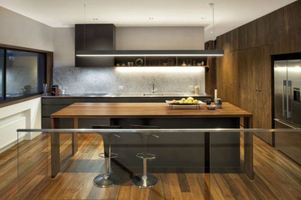
The new one-bedroom apartment extending in double-storey form behind the repurposed 1920s State Savings Bank on the Gardenvale crossroad presents a powerful case for an outmoded idea in architecture:
That of investing deep time into the fine-grain thinking required to ensure the final product is exactly right.
Why Jackson Fitzroy-Kelly of JFK Design and his clients – an empty-nester couple – could afford a decade of tinkering is circumstantial. “JFK” has been sharing office space in the once banking chamber for the 10 years the engineer client has been considering displacing the long backyard with a new dwelling.
By the time the kids had left the manager’s quarters that had been the family home, “conceptually”, says Fitzroy-Kelly, “there had been quite a few planning permutations”. A further two years saw the project await council approval because the bank and its precinct are heritage protected
However, while the delays would have driven most people to distraction, the building designer used the time-on to “pursue the fussy, precise detailing toward perfection that has been the focus of my practise for years”.
Perfection? “An unattainable goal”, he confesses. Yet, in the elevated dwelling with the proportional equanimity in the window settings – “the same height above as below”; the “visual cadence of the rhythm of threes”, by which he means that much of the joinery and material specification has been arranged in threesomes; the “thickness of walls that add solidity”, and the floorplan’s subtle progression “where overlap of function and visual connection” is constantly occurring – he’s come close to a flawless execution.
“It’s incredibly functional,” says the female client, who tells how in love she is with her in-cupboard laundry with the above-head drying line, cross-ventilating window and enough bench-space, “which is king”.
Built in the shape of a box from which a central indent had been excised, clad with vertical zinc or concrete-rendered planes, and on a scale that “respects the power of the bank”, the apartment’s main accommodation is a great room that looks north through 2.7 metre-high sliding doors, east to bird-busy treetops, or back across the void between public and private space to the master bedroom. By the reverse, the bedroom looks through all the glazed transparency to the outside world while losing no privacy at all.
All internal timber is a variation of spotted gum; stair treads, flooring, kitchen island and horizontal shiplap wall panelling, or as joinery units (often in combinations of threes) that use a thicker-than-veneer ply product strong enough to sit on.
The bedroom’s window seat/storage unit is in the ply. So is the book and concealed desk unit in the guest room/study where again, as Fitzroy-Kelly points out, “joinery acts as furniture”.
The detailing is exceptional.
“From anywhere in the building you can see the zinc, which is really luxurious and really easy on the eye,” says the engineer. “We didn’t just put it on for the neighbours,” quips Fitzroy-Kelly.
In every part of the building you can see the designer’s acute sense of “visual appreciation”. The big round bathroom mirror behind the wall of art glass that looks like a frozen waterfall is, for example, one of JFK’s conceptions. It’s a wall cabinet.
“Finessing to this degree made this job a great opportunity. And there is much more that we looked at that is un-documentable.
What is documented about the project known as “Taking it to the Bank” is that in the 2016 Building Designers Association of Victoria awards, the project won three citations: for Residential Design of $500,000-$1 million, for Interior Design, and for Excellence in the Use of Glass.
We recommend
We thought you might like
States
Capital Cities
Capital Cities - Rentals
Popular Areas
Allhomes
More

