From shabby to sensational: Rebecca Judd's bayside cottage renovation

When I collected the keys to a two-bedroom miner’s cottage in bayside Mentone, I knew this would have to be the makeover to end all makeovers.
This little gem, which I renovated over seven weeks for the second series of The Style School, was, as expected, pretty rundown and shabby.
I aimed to create a sense of light and space, and achieved this with a more open floor plan, a neutral foundation for the furnishings and a few design tricks.
First, we needed to knock out the wall which separated the living room and the kitchen.
When starting from scratch, the next step is get the floors and walls sorted. Then comes the fun part – colouring inside the lines.
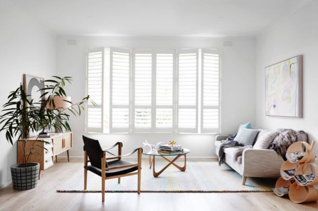
Classic whitewash hardwood oak flooring, which will never go out of style, crisp white walls and sophisticated plantation shutters create the perfect base.

Photo: Annette O’Brien
Plantation shutters are an ideal covering for the living room windows – they don’t swamp the frames the way curtains would, taking up precious space, and I love that you can adjust the light.
Stylist Julia Green and I looked to the breezy local lifestyle, by the beach, for design inspiration, with an added Scandi vibe.
One rule when transforming a compact room is to get the proportions of the furniture just right, to fill the room without cramping it.
A larger rug creates an illusion of an expansive floor. I started with the gelato-toned rug, in a beautifully textured, plaited weave. It gently introduces colour, and can be pared back with feature pieces.

Photo: Annette O’Brien
Artist Ali McNabney Stevens captures those soft tones of the rug, and the light-grey tweed sofa, in her gorgeous custom print.
To counter the feminine, lolly colours in the artwork and rug, I selected a statement arm chair.
The black felt chair with leather arms is a standout, to anchor the room, but it is not overpowering. The trick is that its height is the same as other key pieces; it has the perfect dimensions.

Photo: Annette O’Brien
Playing with shapes creates another point of difference when working within a limited space, such as this.
Boxy sideboards and shelves are a traditional go-to but choosing pieces with unexpected, playful curves, from the legs of the coffee table to the magazine rack, adds a fresh sense of focus and fun.
Don’t be afraid to introduce shapes and avoid being rigid. Experiment with variation to soften and balance the overall look.
We recommend
States
Capital Cities
Capital Cities - Rentals
Popular Areas
Allhomes
More
- © 2025, CoStar Group Inc.


