Furniture designer Mark Tuckey on home styling, career regrets and DIY disasters
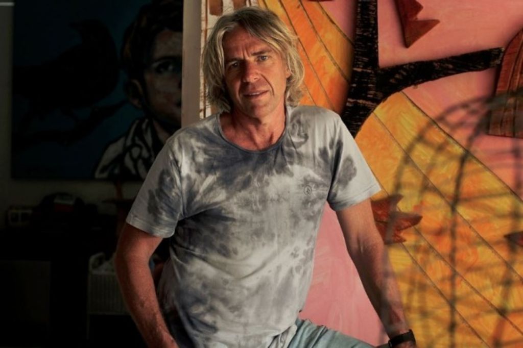
Australian furniture designer Mark Tuckey’s handmade pieces are instantly recognisable.
Known for his signature use of timber and robust shapes, Tuckey’s work is refined, simple and classic.
Headed by Mark and his wife Louella, today the Mark Tuckey company garners a cult-like following, with their pieces a mainstay item in many Australian homes.
Joining us for a new Q+A Domain series, we set out to find what makes this iconic designer tick.
Describe your home’s aesthetic in three words.
Colourful, relaxed, friendly.
What’s been your biggest DIY disaster?
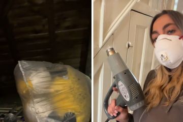
I had a big terrace house in Fitzroy, Melbourne in the typical design that’s wide at the front and narrower at the back where the kitchen was. When renovating the kitchen, I dustproofed the back from the front, but I missed a bit. During the demolition, we discovered the front of the home both upstairs and downstairs was completely full of dust like talcum powder; so bad that you could barely see a metre if front of you – very upsetting!
Building a new laundry on the back of that building without a permit had annoying results too!

What advice would you give someone looking to furnish his or her home from scratch?
I like to see furnishing as a bit of an exciting journey. It should be fun to go out and find things that you like and want to be around.
I think it’s a good idea to live in a place for a while to get a feel for it before all the big decisions are made.
But if furniture is not your thing, find help from someone’s aesthetic you like.
Minimalism or maximalism?
Eccentric, lively and colourful minimalism.

What’s your favourite era for architecture and design?
Old buildings are inspiring to me. The uninhibited design, substance and construction/artisan skills involved are mind blowing; they don’t build them like that anymore.
You can’t go past mid-century Danish designers for chairs.
Right now is also a favourite time for me. Advances in technology, building techniques, materials of all types, even the way traditional things like stone and timber can be machined and installed, combined with some seriously talented designers and architects, is seeing the creation of some mind-blowing beautiful and liveable places.
…Of course, right now some of the ugliest buildings in history are also going up by the suburb-load!
…And the worst era?
Deco – I find it to be too neat and contrived. The angles are awkward, plentiful and not at all calm; frenetic in a word, or forced.

What item in your home did you splurge the most on?
“The Spanish Chair” by Borge Mogensen.
Do you have any design regrets or faux pas moments you can share?
When I started designing in the mid ’80s, country [style] was big – HUGE. A couple of the country-flavoured bits I designed were never going to have enduring appeal!
I regret investing so much in jarrah and redgum. Years ago when I stopped selling red timbers in my shops, it took quite a while to sell the leftovers out of my furniture store.
Also, considering using Asian rainforest timbers for outdoor furniture was a faux pas (I didn’t).

What are the most common mistakes homeowners make when furnishing and styling their homes?
In my opinion, being too minimal. Living in a home that looks like a showroom and displays none of the owner’s personality is no way to live (especially if all the items have been chosen by others).
What’s the most significant product you’ve made?
Dining tables have been a staple of my business.
One of our most iconic items is our eggcup shaped stools.

What’s the most used item in your tool box?
A pencil.
What’s your favourite Australian suburb architecturally?
East Melbourne. Check it out; it’s littered with absolute gems.

We recommend
We thought you might like
States
Capital Cities
Capital Cities - Rentals
Popular Areas
Allhomes
More
